Motorola Droid 2 Review: Rebooting the Droid
by Brian Klug on September 19, 2010 7:00 AM EST- Posted in
- Smartphones
- Droid
- Motorola Droid 2
- Android
- Mobile
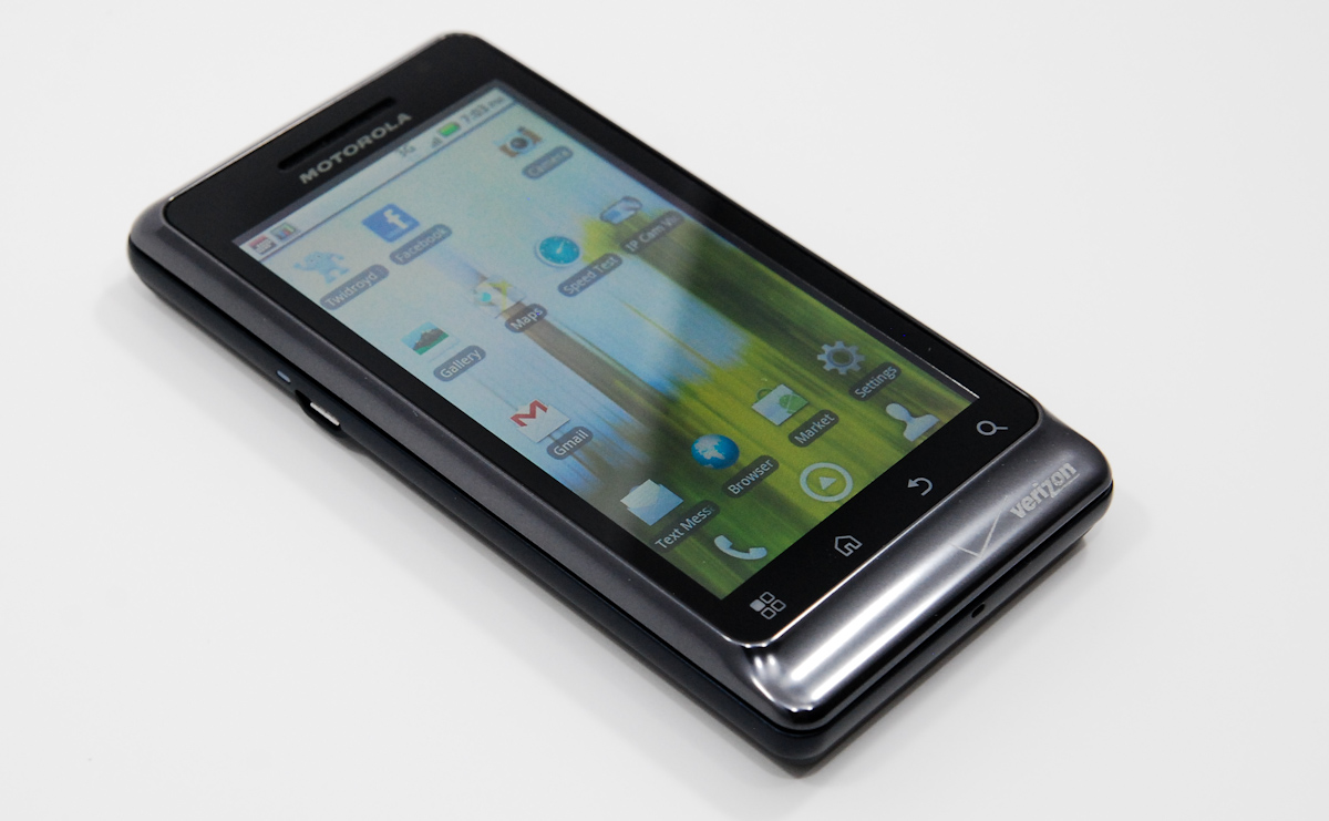
If you’ve played around with the original Motorola Droid, the Droid 2 will feel very familiar. In fact, at first glance, the Droid 2 appears almost identical to its predecessor—so much so that distinguishing the Droid 2 from the original in the hands of passers-by can be a bit of a challenge.
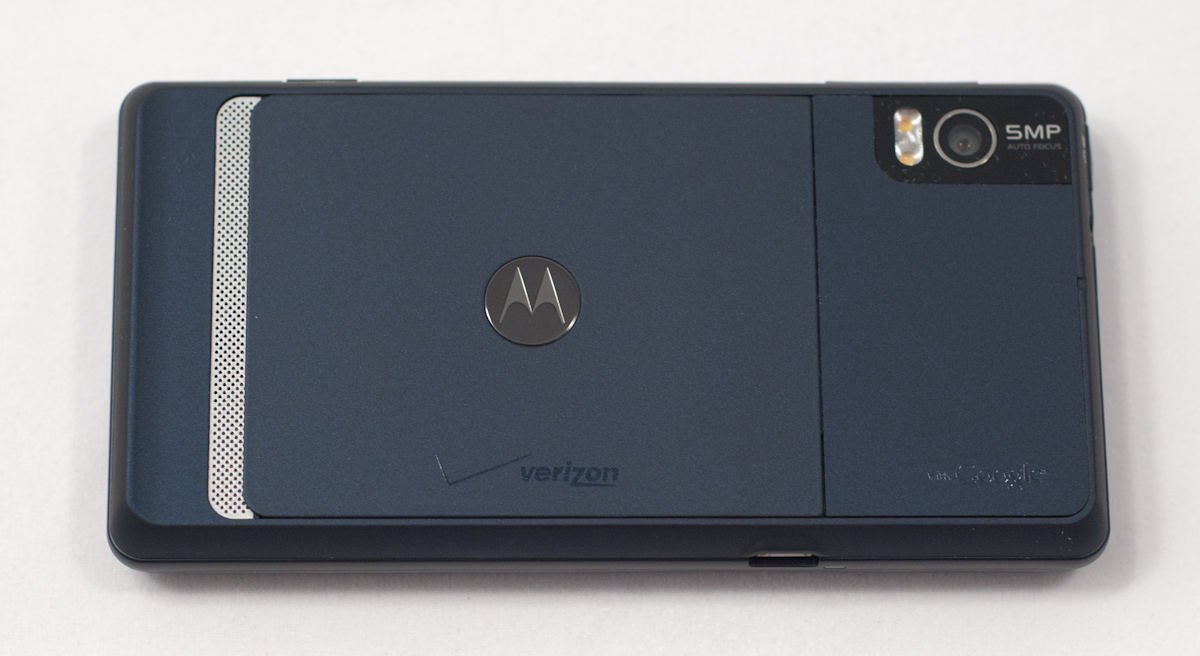
First off, the back of the device isn’t black anymore, it’s a deep navy blue. In fact, basically all of the plastic on the back is a deep navy blue soft touch material. I’m generally not a fan of soft touch backs, as they tend to rub off or discolor from hand grease after a few weeks, but the Droid 2 has done a pretty good job keeping its tack.
The other particularly striking aesthetic change is a dark chrome band running around the top edge of the display. It’s a deeper, darker kind of chrome than I’ve seen on a smartphone before, and gives the Droid 2 a classier look instead of the gaudy fingerprint magnet that chrome usually turns into.
The lip at the bottom is likewise gone, replaced with a tapering chrome slope. Honestly, this space is now somewhat wasted on the Verizon logo. The microphone that used to be here is displaced to the bottom of the device.
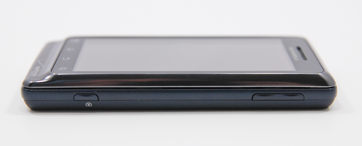
The other physical changes are subtle. The previously troublesome volume rocker has been replaced with a much more solid feeling one with less protrusion, and the hard to click camera shutter button also is gone. Both of these changes are perfectly executed—the shutter button is still two step, but now doesn’t require so much force that you change composition when pressing so hard.
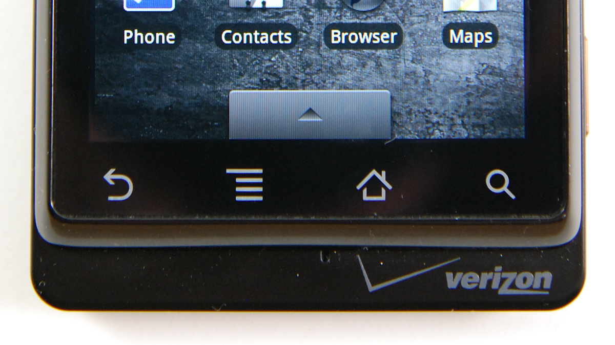
Motorola has kept the same style capacitive buttons from the original Droid, and they work the same as the previous device's. What’s different is the placement.
I’ve already said my piece about this before in the Droid X review. What’s good is that the Droid 2 now has the same button order as said device. What’s bad is that it will no doubt be met with swearing and gnashing of teeth for a few weeks if you’re used to the placement on the original Droid. Hopefully things will settle down now and there will be some standardization. Hey, imagine how I feel regularly using 3 different layouts.
|
Button Placement—DROID, DROID 2, DROID X
|
|||||
 |
 |
 |
|||
The back of the Droid 2 is essentially the same design, but different colors. The gold speakerphone grating is changed—it’s silver now. As I mentioned, the back is now a navy blue color soft touch material. The camera markings and glass/plastic cover have been moved around a bit, but the camera and flash assemblies themselves appear unchanged.

If you pop off the battery door, you’ll discover what lies underneath is basically the same as well. In fact, the Droid 2 appears to use the same BP6X battery the old Droid did, which is a welcome boon for old Droid users—you've now got a backup battery.
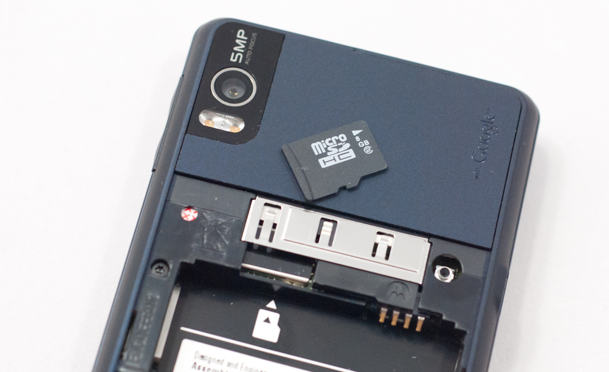
The microSD card slot is still not quite optimal, requiring you to slide your thumb along the top and press to get the card out. I strongly prefer press-click-eject designs as I’m constantly worried about breaking or scratching contacts. I guess Motorola doesn’t expect you to be taking the microSD card out a lot. Oh and the card is class 2, not higher performance class 6 like on the Droid X.
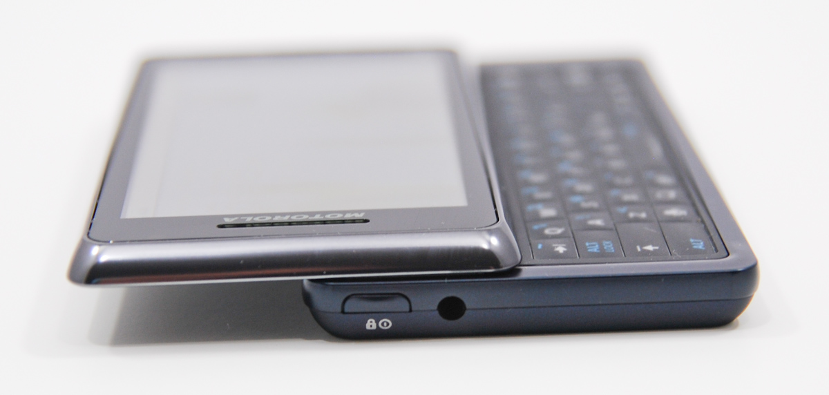
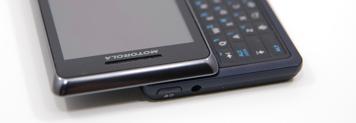
The only remaining subtle tweaks are up top. The power button is similar in shape and style to the other buttons, sporting a rounded top that blends into the case. It’s sometimes a bit hard to locate the power button by sliding your finger along the top of the case, but not impossible.
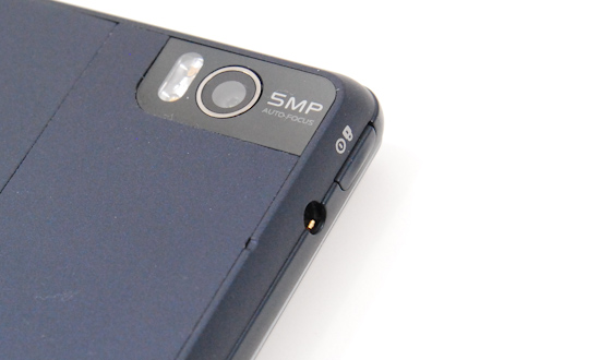
If you look carefully, there’s also a tiny notch right at the edge between the flat back of the device and the top—this is the port for an internal microphone for noise canceling. I’m a bit concerned this could get blocked with lint or grime. It’s seriously tiny.
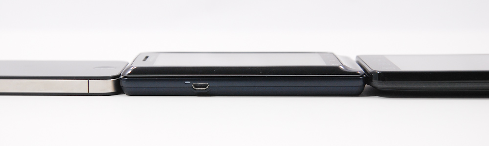
The phone is essentially exactly as slim as its predecessor, but still not super thin. You pay a price in thickness for getting that hardware keyboard (which is excellent—more on it in a second), but not a big one.
Lastly, the Droid 2’s packaging isn’t anything special or extraordinary. It’s similar to the packaging the Droid X came in, with the device in a nook at the right, and a flip up cardboard piece with accessories underneath. Motorola and Verizon aren’t going for flashy with the packaging, they just want to fit a heck of a lot of them in a box for shipping.


39 Comments
View All Comments
Brian Klug - Sunday, September 19, 2010 - link
Thanks for calling me out on that, I totally suspected I had forgotten something important. Can't believe I did that. /facepalm-Brian
stlc8tr - Sunday, September 19, 2010 - link
"The Droid 2 has pulled a complete 180 from the original Droid’s travesty of a keyboard. I’d say the device has gone from having one of the industry’s worst smartphone keyboards to arguably one of the best, if not the best. "Really? Have you tried the Touch Pro2 keyboard? Good travel. Nice offset. Numbers row. Good spacing between keys. It's nearly perfect. That is by far the best keyboard that I've ever used.
http://www.mobileguerilla.com/images/htc-touch-pro...
Brian Klug - Sunday, September 19, 2010 - link
I had a Touch Pro and Touch Pro 2 for a long time. I have to agree - HTC has dominated the landscape keyboard landscape for a while, but on Android platform it's hard to beat the Droid 2 right now.Until we get the landscape HTC device that we've seen spy shots of. I don't think it has a codename yet, but it has that Touch Pro 2 keyboard.
I think we definitely agree.
-Brian
wyvernknight - Sunday, September 19, 2010 - link
I think the blur animation that you're talking about when you open and close the app drawer is simply a stock Android 2.2 animation and not a Motoblur add-on.hansel2099 - Sunday, September 19, 2010 - link
muy buen celularlunarx3dfx - Sunday, September 19, 2010 - link
This is very disappointing. Your reviews are always very informative and for the most part all inclusive, but I've noticed in the last few reviews the Palm Pre has been absent. Now, I know that most would say, well it's Palm, and they are pretty much dead. However, unlike the Nexus One, which is included in all these reviews, I'm sure there were more Pre's sold than the Nexus One meaning that there are probably a few consumers out there that would like to see how it stacks compared to a new phone that they might be considering. It's just a suggestion.Also, for those who might be wondering, my overclocked to 1 GHz Palm Pre scored as follows:
Browsermark: 24492
Sunspider: 11228
I'd like to point out that those scores are still pretty high up on the list.
Brian Klug - Sunday, September 19, 2010 - link
Hey lunarx3dfx, I've got a Palm Pre Plus here that we got in for review, so I haven't really been able to include benchmarks from those suites until now. It'll show up in the new benchmarks though. On stock clocks I get 22298 ms on sunspider and 12936 on browsermark. Those 1 GHz speeds are actually pretty impressive.-Brian
ol1bit - Sunday, September 19, 2010 - link
I think it's awesome that you are reviewing Smart Phones now. After all, they are truning more and more into computers.I've been into computers since the TSR-80 Color computer, and can't believe how far things have advances. http://oldcomputers.net/coco.html
Anyway Thank You!
AnnonymousCoward - Sunday, September 19, 2010 - link
Brian, I commend you for this engineering review and attention to detail. You made some great observations, like the ridiculous waste of space when text messaging.The inability to delete the stupid verizon and google bookmarks is inexcusable. Not mentioned is also the inability to delete or even just hide the garbage apps that come by default, including Blockbuster and Amazon MP3. So much for "Droid Does". Droid Doesn't let you delete the preinstalled crap. Besides rooting of course.
I noticed in a Verizon store using the X with the 2 side-by-side that the 2 has noticeably worse scrolling performance in the app list.
As for that 1cm of empty space to the right of the keyboard, they should have used that to make the keyboard even bigger! It was wasted, in order to have the phone dip down 2mm near the edge, which really doesn't accomplish anything.
A huge gripe I have is how syncing with facebook causes your entire contact list to be overtaken. The only remedy seems to be not not add facebook as an account, and give yourself a link to facebook.com on your desktop.
I am disappointed with the ever-present touch screen lag. Clicking and scrolling anything has a lagged effect from your input. Unfortunately, many people lack lag sensitivity, so we end up with displays and phones that exhibit an acceptable amount of lag to a few designers or testers, which is unacceptable to guys like me.
evilspoons - Sunday, September 19, 2010 - link
I find it amusing how you're talking about the Droid 1 as if it's a dinosaur from the land of ancient, forgotten technology... yet it's still a year newer than the Blackberry I use all the time (Nov 2009 vs Aug 2008). Hmmm. Maybe it's time to upgrade.Only one of the local wireless carriers has the Droid 1 (sold as the Milestone because Droid is licensed to Verizon from Lucasfilm) and we just got it recently. The only recent-ish Android phone my current provider (Rogers) has is the Xperia X10. Ugh.
It's really just an iPhone 4 or a 6-12 month out-of-date handset for us up in the Great White North.