BlackBerry Torch 9800 Review: Keeping RIM's Flame Alive
by Brian Klug on September 1, 2010 7:00 AM EST- Posted in
- Smartphones
- Torch
- BlackBerry
- Mobile
The whole device is rimmed with a shiny silver chrome that feels slippery but surprisingly doesn’t show fingerprints. So far it’s gone a solid week in my pocket without picking up any scuffs. The chrome band extends to the top and around to the back of the phone.

While we’re on the back, up top on the left is the 5 megapixel camera, on the right is the LED flash. BlackBerries have been getting more extravagant backsides as of late, with the earlier BlackBerry Bold sporting a leather battery cover. The Torch is a bit different, eschewing real leather for a soft touch grippy material that’s subtly ribbed for your, erm, hand’s pleasure. The chrome BlackBerry logo is inset and does seem to collect dust and grime as a result.
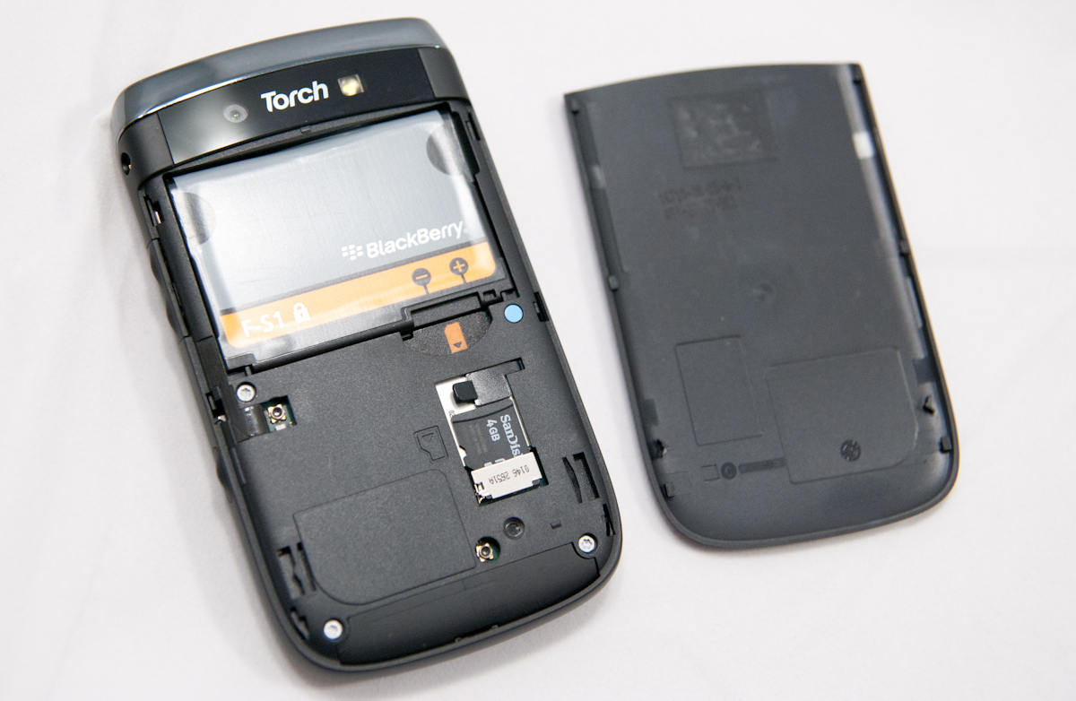
Getting the battery door off is a bit of a struggle since you can’t grip the whole phone - it wants to slide open along the same axis the battery door slides on and off along. I’ve found the best way is to align your hands so you brace against the bottom of the phone, and use both thumbs to press and push the door off. Even then, it’s just a difficult thing to get off. I guess the upside is that it won’t come off unless you really want it to.
After you’ve got that cover off, you can get access to the battery, SIM card, and microSD card. I like what they did here with putting a small rubber flap that stops the microSD card from coming out, but not making removal incredibly complicated. The Torch comes with a 4 GB class 2 SDHC card with SanDisk branding installed, which isn’t anything stellar, but not bad. The Torch uses the 4.7 Whr BlackBerry F-S1 battery, smaller than the 6 Whr battery in the Bold and other BlackBerries.
On the top of the Torch is a long chrome strip that serves as a rocker for two buttons. On the left, the button for standby/lock, on the right, the in-call mute button.
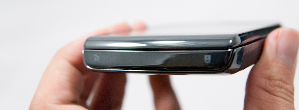
This standby button location is really my only major complaint about the design of the Torch, and is a little awkward. First of all, it’s gigantic. Second, it doesn’t take much pressure to toggle. The combination of both is that I found myself frequently turning the Torch on in my pockets. It’s simple to do, really - if you have capacious pockets like I do and plunk your phone down inside, you run the risk of accidentally turning the phone back on again. The button icons also seem like they’re silkscreened on the chrome plastic - I’m sort of worried that they’ll eventually rub off.
I realize most BlackBerry users wear a belt holster or case and thus enjoy the benefits of the magnet sensor and all that goodness, but I still just use pockets. Either way, if you aren’t using one of those, be careful that you deposit the Torch right end up, or I guarantee you’ll turn the thing right back on again as soon as it hits the bottom of your pocket.
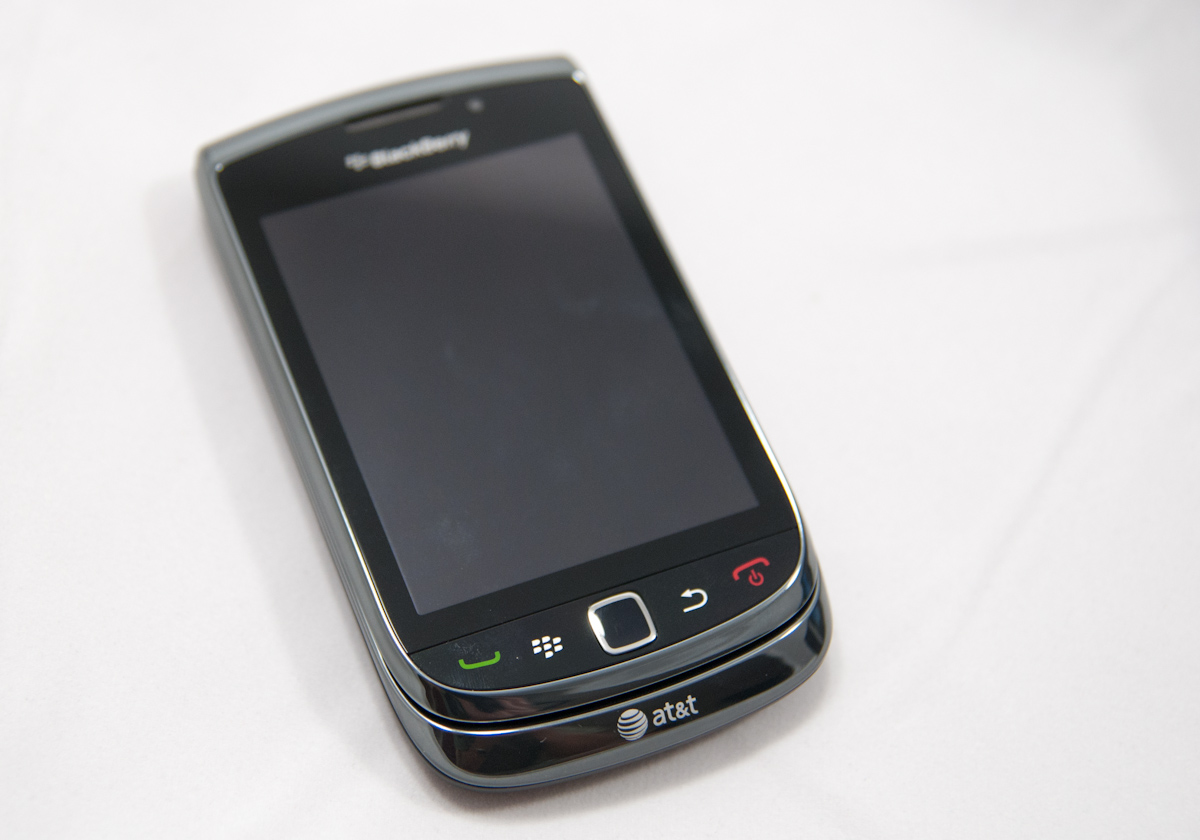
On the front are the four capacitive buttons, and the optical trackpad. The Torch doesn’t go fully capacitive, instead requiring you to press the button down to confirm input. I like this a lot more than the alternative that seems the norm with Android devices - just taking unsanitized capacitive input. The only downside is a small seam between the screen and the buttons where dust and other grime can intrude. The optical trackpad is flawless, honestly. As an aside, the old trackball was an absolutely egregious single point of failure that spelled the end of many a BlackBerry. I find myself wondering how people even got along without a solid state sensor like what’s in here. I’ve been in conference rooms with stray BlackBerry trackball assemblies on the table before, no joke.

The right side of the phone has the 3.5mm headset jack up top, volume up down buttons, and the Torch’s sole convenience button. That’s right, there’s no convenience button on the left side. Apparently this was a design choice to simplify BlackBerry rather than something imposed by space constraints or design limitations. Whatever the cause, if you’re used to mapping things to the left side, you’ll quickly find this annoying. The buttons themselves are rather fascinating, as they’re raised rubber and have a mechanism that’s pretty sensitive.
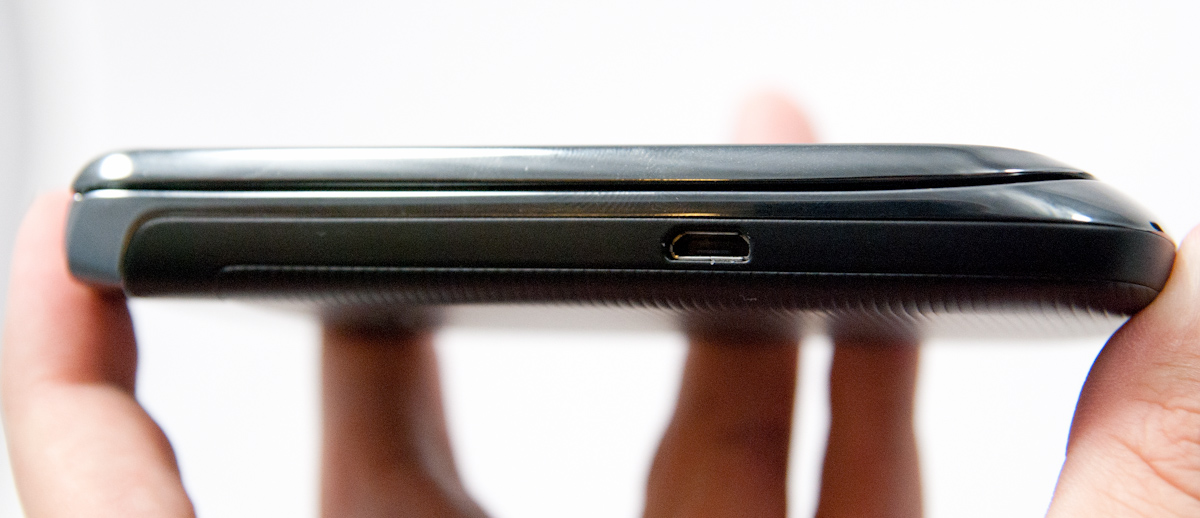
The left side is pretty generic. You’ve got a microUSB port oriented the right way a little over halfway down the side. It makes for a bit of odd typing when trying to use and charge the handset, but everyone is just as guilty as RIM for putting a USB port on the side.
Despite such a huge departure from traditional BlackBerry design, the Torch manages to maintain that singular business feeling so trademark of RIM’s other candybar handsets. Oh and anyone remember SurePress clicky screens like the Storms had? Totally absent from the Torch, thank goodness. I definitely don’t miss that.


41 Comments
View All Comments
Kamen75 - Wednesday, September 1, 2010 - link
Rim needs two different BB lines to meet the needs of the two different types of customers they are selling to. They should have a BlackBerry Professional version of there os for corporate clients and then a "fun" version to sell to the average consumer. These two os's only need differ on a few security points and each gets a different ui, one to look business like and one to look flashy and bright. Underneath they would be the same os and run the same apps. Their current middle of the road, one size fits all approach is turning all customers away.Add in some decent hardware and you would have a competitive BB again. Two year old hardware specs impress nobody.
Zensen - Thursday, September 2, 2010 - link
that's what themes are for...RIM just needs to work on better tools for developers since what they've managed to do on the business level is second to none and I feel the overall improvement of OS 6 has done just enough to grab enough of the spotlight to be fresh yet familiar without being burdened by the lower specs that have dogged it since the its release.
There are still quirks in the OS 6 model that needs addressing such as in the social feeds but nothing that can't be solved via updates and UI changes. OS 6 has thrown away utilitarian menus and brought it up to speed with the other Operating systems. It hasn't leaped over like a triple axel but it's more like a combination of moves that will culminate in a much more successful Blackberry phone in the eyes of the average consumer, hopefully dispelling some of the noise that RIM can't do a touchscreen phone to save themselves.
I'm glad anandtech have finally covered this phone. Good or bad you can rely on these guys for great technical review without putting in ridiculous remarks or bias towards a product that reviews like engadget have seemingly perfected.
zorxd - Wednesday, September 1, 2010 - link
I am disapointed that Acanac fell into the Apple marketing trap which is PPI. Who cares about PPI? Do you really think that it's better to have a 1" 320x480 display than a 4" 480x800? The first one have higher PPI.Apple started to talk about PPI (even before pixel count) when they realized that the competition was going with larger displays. Larger display, with the same resolution, means lower PPI, even if it's better.
What looks sharp is not PPI. It's pixel count. Just hold your 4" 480x800 farther away if you think that pixels are too big. A 1x1 pixel 1000000000000 PPI display is useless.
So please, stop making graphs about the useless metric which is PPI and start comparing what we actually care about: brightness, size, resolution, etc.
raulr - Wednesday, September 1, 2010 - link
Have you actually looked at the iPhone 4 display. It really is quite fantastic. And especially since this review is about the Torch, your display size argument is pointless since the torch is both physically smaller and lower resolution. The point they were making is that the Torch display, while not bad, really doesn't stack up with the current generation of devices.zorxd - Wednesday, September 1, 2010 - link
The iPhone 4 display is one of the best, I agree. Why? Because it has the highest resolution. The PPI have nothing to do with that. The iPhone display would be even better if it was larger, even if that would mean lower PPI.Of course, the phone would probably get larger too, which is a downside.
What I mean is that the highest PPI is never, or at least should never be an priority for any consumer.
The iPhone display would suck if it was 2" instead of 3.5".
MacTheSpoon - Wednesday, September 1, 2010 - link
He is right, though -- nobody cared about PPI before Apple started their marketing. Now suddenly it's the standard by which screens are judged. Weird.I have looked at the iPhone4 screen and while it's nice, it's nowhere near as nice as all the marketing and buzz make it out to be. I cannot read all that sharp yet incredibly tiny web page text without a magnifying glass. I'd say it's about 20% as nice as all the hype. A large screen that lets you see more of your web pages in an actually readable way is certainly nice, too, probably a little bit nicer -- and yet for some reason the iPhone4 gets a pass on this readability issue from all the reviewers, just as Apple hoped. Honestly, having seen the iPhone4 screen, its main benefit is in browsing photos, which look really smooth, but who uses their phone mainly for browsing photos? Not that many people, I'm sure.
I believe that the whole PPI thing came about because Steve Jobs realized his 320x480 screen was getting long in the tooth compared to other phones but a) didn't want to change the dimensions of the current iPhone and b) wanted to make the existing iPhone layout and apps easy to port by simply doubling the screen resolution. So he pushed the PPI angle hard and zombie reviewers got in line.
bplewis24 - Wednesday, September 1, 2010 - link
Great post.Brandon
synaesthetic - Friday, September 3, 2010 - link
Lots of people care about PPI, just not so much on smartphones.I hope Apple's obsession with PPI and the Retina Display pushes the trend into *laptops,* so I can finally stop seeing 15.6" laptops with 1366x768 horrible LCDs.
Jabroni444 - Wednesday, September 1, 2010 - link
I'm confused by conflicting statements in this review. Half way through the conclusion he says, "I’ve described the Torch as anywhere from a quarter to a half generation behind - I think that’s the best way to describe performance." But, the last sentence is, "The Torch is what RIM should have launched years ago in their stead."Combined with the fact that the Torch both statistically and measured performance wise is no better than the iPhone 3GS or other last-gen phones I don't get the quarter to half generation behind comment.
I'm not sure whether even hardcore RIM users are going to be able to accept weak attempt at getting up-to-date.
tech6 - Wednesday, September 1, 2010 - link
A very balanced review. This device isn't for techno snobs or people who like to show off apps - it's still a business communication device. While anecdotal, I know a number of BB users which looked at Apple and Android but decided to go with the Torch instead. Without exception they are happy as it gives them the new functionality they wanted but without leaving the BB strengths and advantages behind.