Apple's iPad - The AnandTech Review
by Anand Lal Shimpi, Brian Klug & Vivek Gowri on April 7, 2010 9:39 PM EST- Posted in
- Smartphones
- Mac
- Apple
- iPad
- Mobile
A Testament to UI Efficiency, Distinctively Apple
I've always called the iPhone OS a very efficient UI. The ease at which you can perform primary tasks on the iPhone is what I mean by that. By comparison, many earlier tablet and handheld computer concepts used full blown desktop OSes scaled down so much that you could hardly get anything done. UI elements were far too small to be navigated with portable screens. On the flip side, if you scaled the iPhone UI to a 22" desktop PC you'd also lose efficiency, the UI simply wasn't designed for that purpose. You use the right tool for the job and that's exactly what the iPhone OS, webOS and Android try to do. They are great smartphone interfaces.
The success of the iPad's UI is really determined by how well it scales up to the larger screen size and resolution of the display. Simply running iPhone apps on the iPad doesn't cut it, something that is made obvious by how little I wanted to use them on my iPad.

An iPhone app running on the iPad
Thankfully, with the exception of running iPhone apps, Apple has ensured at that all elements of the iPad UI are enhanced specifically for the larger screen. The most obvious is the larger keyboard but there's also liberal use of columns in apps. You'll also note that there's very little forced consistency between the look and feel of iPad applications. Their UI is determined entirely by their function.

The popup dialog is also widely used throughout the iPad OS:
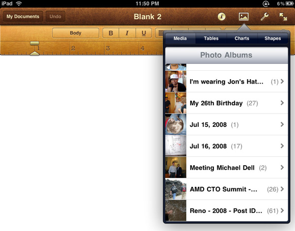

Thanks to the A4 SoC inside, multitouch gestures react even faster and smoother than they do on the iPhone. Particularly the pinch and stretch gestures for zooming in and out. Apple also introduced a new pinch/stretch to zoom feature in its Photos app. To expand or collapse any album or event simply take two fingers and stretch them apart or pinch them together. It seemed gimmicky when I first heard about it but in practice it works really well and I'd like to see it used in more places.

While not really significant to the plot, there are some nice touches that Apple has included with the iPad that are worth mentioning. The home screen is, er, home to a lot of the more prevalent examples of Apple flair. All the icons have a nice drop shadow behind them.
Bringing up the home screen from another app causes all the icons to fly in from the outside as if they're all scurrying home before you get there. Rotating the home screen also results in a sweet zoom out then in effect.
Despite having the screen real estate Apple doesn't get wasteful with UI elements. They are all fairly tiny and not intrusive.

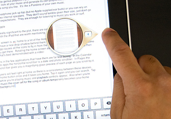
Scroll bars in the few applications that have them are far less boring. In the Calendar and Photo apps the horizontal scroll bar is a date and photo scrubber. In Pages the vertical scroll bar gives you a magnifying glass preview of each page as you scroll by it.
iPhone users will feel right at home as there is a consistency between these devices. Tap the home button once and it takes you home. Tap it again and you can search. Tap it twice while you're playing music and playback controls appear. Also, when you're playing music the cover art for the song or album temporarily becomes your home screen background.
Although there's no mute button, holding the volume down rocker for 2 seconds mutes the device instantly.
There are dozens of little features like these that show an attention to detail that is missing from most products. Rushed or not, the iPad still has the little things that do make it an Apple product.


108 Comments
View All Comments
strikeback03 - Friday, April 9, 2010 - link
My carputer runs fine with temps in the car over 100*F.Mumrik - Thursday, April 8, 2010 - link
Man! You guys must really have been in a hurry to get this review up.It is long, critical and thorough as I expect from you, but there are quite a lot of grammatical errors and you repeat yourself a lot i places. :-D
Sunburn74 - Thursday, April 8, 2010 - link
Anand,When you read the rhetoric between the gtx 470/480 reviews, your most recent Macbook pro reviews, and your current iPad review, its clear the latter is by far the single largest fluff piece ever posted on this site. You seem to have forgotten that people come to your site for one reason. We are the unknowing consumers who turn to your impartial judgement with one, and only one question: should we buy it?
Ryan Smith's gtx 470/480 review was superb. He didn't write "I could see myself buying a $500 gtx 480 for my 4th PC on summer trips to my house in the hamptons where I don't have to be using my real desktop for any real work". He flat out said "Nvidia was too little, too late". He didn't try to sell anyone on what might possibly be on some distant horizon in the upcoming future if you had the extra money; he delineates whether or not people should buy the item right now.
When future potential arrives, then you write another article explaining how the landscape has changed. Anand, your latest article shamelessly bent over backwards to positively sell the iPad in this way. How about comparing the ipad to the ipod touch, the iphone, the blackberry, the android, and explaining if people who own these items that deeply saturate our society what the iPad means to them? How about answering the bottom line question of if I should go buy one right now or if I should wait? How about any statement, however remote it is, on what sort of competition the ipad will face and what that means to the consumer? Who are you serving here? The people? Apple? Or your personal beliefs towards tablet PCs as something you simply want to succeed despite obviously being in infancy?
Anand, don't lose that journalistic sense of justice that requires you tell your readers what they need to know, not how you might use the item if you had extra money for a vacation to australia.
vol7ron - Thursday, April 8, 2010 - link
A couple of annoyances in the past with the iPhone 3g (aside form no-Flash) has been (1) it's lingering keyboard, (2) safari drop down menu assistance, and (3) delayed shortcuts1:
An example of the lingering keyboard is when texting someone else. There is no way to hide/autohide the keyboard once it's open. For the text messaging you can go into "edit" mode or simply go back to "messages" page and then back to the text, but why make it hard? I know my IRC apps make it easy to hide the keyboard, by just touching the screen again, why can't Apple just add a button?
2:
While the scrollable, assisted, drop-down menu in Safari is neat, those long-texted options are inadequate. Especially for cases that start off with the same sentence; for instance:
"I am a customer that heard about this site ..." {offscreen: from the web}
"I am a customer that heard about this site ..." {offscreen: from a friend}
"I am a customer that heard about this site ..." {offscreen: from work}
-- basically, you can't see the off-screen stuff until selected. I don't understand that since Apple has made a zoomable, fluid, paging device.
3:
While certain shortcuts would be effective on the iPhone, I think it's the response time that's lacking. For instance, the touch-and-hold period button has a popup option that allows you to select the ellipsis (tri-dot). That would be effective if the popup was more instantaneous - instead, it's faster to type out 3 periods. It's these menus that I hope are still prevalent in the iPad keyboard, but have a better response time.
vol7ron
----------------------
PS: loved the review. I am thinking about getting an iPad now - as stated before, I will have to wait for a price drop. $500-1000 is not acceptable, especially given the amount of storage. I'd love to see this device price range reduced to around $250-500 (perhaps hopeful future thinking).
Locut0s - Thursday, April 8, 2010 - link
Looks like it. Nice if so!CSMR - Friday, April 9, 2010 - link
We are seeing that limited devices (iPhone, Windows Phone 7, iPad) have an appeal to many consumers, who just want to do a small and finite number of things with them. This type of device can be stylish and effective.But I think Anandtech and other tech sites should have a prejudice in favor of computers rather than locked down devices. Limited devices can be cool, and I'm not saying AnandTech shouldn't review them, but it should prefer systems that are not limited.
Rather than going along with the average consumer tech sites could show the market how to make unlimited systems (tablets running Win7, phones running OSes like android, windows mobile) better designed and more intuitive, and show users how to use these effectively.
The current proliferation of locked-down devices has some strengths but it is a threat to computing. We've been fortunate that computers have been so popular. What if most people no longer use computers, but devices, and the market caters to them? What if the computer market becomes like the console market? What will advanced users do?
Impulses - Friday, April 9, 2010 - link
Anand mentions that the iPad keeps performance decent by relying on solid state memory and a lightweight OS.... I'd like to see those iPad vs. netbook tests re-run against a netbook w/a SSD... I mean, a decent netbook plus a 40GB Intel X25-V is still cheaper than an iPad. ;)I realize that a $120 drive upgrade to a $300 computer isn't something the average consumer does, but it's pretty common amongst us geeks. /shrug Plus we've seen the X25-V as low as $99 (or $75 for the Kingston version). My X25-V gave my Acer Aspire One a nice kick in the pants, sure it doesn't make it play Flash video any better but it significantly improved multi-tasking, app loading, and hibernation.
A CULV laptop + a decent SSD wouldn't be much more expensive than some of the iPads after you factor in some of the options (stand, apps, 3G, higher capacities, etc). I realize they're not the same type of device, just trying to speak purely to the performance side of the argument here...
Impulses - Friday, April 9, 2010 - link
I wasn't quite done reading the article when I wrote that last post... The battery life numbers for the iPad are pretty impressive, heck even the 3GS numbers seem impressive compared to my 2nd gen iPod touch. I don't know if Plants vs Zombies is just poorly optimized, or if the reduced processing capabilities of my touch drain the battery faster, but I'm lucky if I can get more than two hours of the thing with that game. It just rapes the battery life...I guess one reason Apple might've skipped out on Moorestown would be battery life considerations, 'specially when playing back media... The degree to which many games seem to drain smartphone batteries these days makes me wonder why we even bother though, I can't possibly consider gaming on my smartphone if it means the battery's not gonna last me thru the day because of it... Despite the fact that this one of the few things I do like about the direction Apple has taken the iPhone OS in (the gaming environment/potential).
Mr Alpha - Friday, April 9, 2010 - link
I can of the top of my head think of two reasons why the iBooks app isn't installed by default.1. The iBookstore is US only, and the iPad is international. This means they would either have to ship the iPad with an app people can't use or have two sets of firmware, one for US and another one for the rest of the world.
2. The developer license agreement states that you can't duplicate functionality. So if they had included the iBooks app by default they would have had to either kick all other ereader apps and catch hell for it, or ignore it and come of a hypocritical while undermining their own license agreement.
dagamer34 - Friday, April 9, 2010 - link
The iBooks app does not come with the firmware of the iPad, it is a downloadable app like Remote and iDisk.