Anand's Google Nexus One Review
by Anand Lal Shimpi on April 3, 2010 3:40 AM EST- Posted in
- Smartphones
- Mobile
Notifications: Better than Apple, Worse than Palm
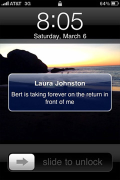
When Apple introduced its notification system on the iPhone, I was pleased. If you’re using your phone and you get a SMS, a little bubble appears on the screen and you get to read/dismiss the SMS:
That was three years ago. The iPhone can do a lot more now and the notification system is beginning to show its age. It’s annoying if you’re trying to do something else with your phone and you keep getting notifications. And it doesn’t scale well to getting tons of notifications, you’re just shown the most recent with no indication of what came before it.
Palm improved on Apple’s system by claiming a line or two of screen real estate and displaying notifications at the bottom of the screen. It was far less intrusive than Apple’s method but still gave you the same functionality. If you wanted to see more, just tap the notification bar and you see more of the message. This works for IMs, text messages, etc...
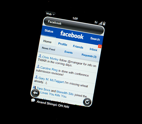
Notifications on the Palm Pre at the Bottom
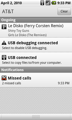
Google takes a similar approach to Palm, although you don’t lose any additional screen real estate. The upper left hand corner of the screen is reserved for notifications. It’s a part of the status bar so there’s no screen resizing at work. If you get a message, missed call, IM, or anything you get a preview in this corner. The entirety of any message is displayed here; if it can’t fit on a single line, the message appears piecemeal.
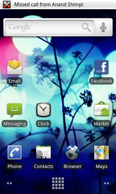
Notifications can build up over time. Here we have a missed call, USB connection message, debug mode message and Pandora running in the background all at the same time:
Kinda crowded, right? Here’s where it gets awkward. To see all of your notifications simply place your finger at the top of your screen and drag down. You’ll reveal all of your notifications in list form:
It feels awkward if you’re used to using any non-Android phone. It’s functional, it gets the job done, but it’s just a strange UI construct. In fact, Android is riddled with such things.


95 Comments
View All Comments
Johnmcl7 - Sunday, April 4, 2010 - link
Very much agreed, I thought far too much time was wasted on Iphone references which given the Iphone generally does everything worse I really couldn't care less about it. Most noticeably multitasking was only given a brief mention despite being being detailed extensively for the Palm Pre reviews.I didn't understand the complaint about the notifications either, to me as a non-Android user the system makes perfect sense - it seems entirely logical to have icons for each notification which when tapped show a list with text on each one.
John
jamawass - Saturday, April 3, 2010 - link
Great review Anand. do you think the speech recognition worked well enough to be a complete subsitute for typed entry? I've been averse to touchscreen only devices (gave iphone to my wife) because I hate typing on them. Also did you try gesture search which has a highly publicized feature not too long ago?I'm currently using a treo pro windows mobile and even with all it's lack of polish it does feel like I am carrying a portable computer with me. I was hoping Windows7 series would enhance this but it appears as if MS is going to take the Apple approach in this regard. Looks like Android has picked up the windows mobile torch and literally flown to the stars with it.
Sidharthmodi - Saturday, April 3, 2010 - link
I liked the Depth in this Product Review. Thanks Anand.has407 - Saturday, April 3, 2010 - link
Appreciate the depth and that it's based on extended use. Using the 3GS for comparison is spot-on (everything is relative). Thanks again.Chloiber - Saturday, April 3, 2010 - link
Can we expect a review on the HTC Desire or Evo 4G?I know the specs are really quite the same (especially on the Desire) but HTC Sense UI gives the whole thing really a different touch and, according to first reviews, a much better usability.
Anand Lal Shimpi - Saturday, April 3, 2010 - link
We've been trying to get in touch with HTC to get review samples of both of those products. So far we haven't received any response but we won't stop trying :) Worst case, we'll just buy an EVO 4G when it comes out.Feel free to write HTC to provide some encouragement if you'd like :)
Take care,
Anand
Chloiber - Sunday, April 4, 2010 - link
Well, I'm waiting for my desire too :PEvo 4G will probably take even longer....to test Sense UI one can use the HTC Legend, Desire or Evo 4G - shouldn't make any real difference.
Anyway, I'm looking forward to it :)
relativityboy - Saturday, April 3, 2010 - link
If you already have an Android powered phone you can find the Sense UI online, and run it with the appropriate Rom and tools. I just saw it running on a G1 today. It was pretty fast. :)relativityboy - Saturday, April 3, 2010 - link
A very lengthy and thorough review of the bits, but I didn't come away with a solid understanding of how the device fits together as a user experience...the review feels, disjointed.The keyboard is narrow, how does that fit with the voice transcription?
Sometimes scrolling in the 'app drawer' is slow, but what else was going on in the background? Were you pulling data, listening to music, what else was going on in the phone? The device/os is a true multi-threaded environment for applications. I didn't notice any emphasis there (a major win over iPhone).
Did you try doing any benchmarking? Use 'Task Killer' or 'Setcpu'?
Android is OPEN, unlike apple's mobile products.
You can install apps that aren't in the app store.
Memory is super-upgradeable (when was the last time a 4Gb or 8Gb iPhone could be upgraded to 32Gb for the price of a micro-sd chip?)
The comment "It's Mac vs PC all over again" I think is totally missing representing what's going on here. Yet you hit the nail on the head later when you said Apple sees it as a device that's peripheral to laptops/pcs while Google is aiming for what it could be. Apple had a great idea, the iPhone. Google had a great idea a mobile environment/platform to allow lots of people to have great ideas. Google wants to let the world do the creating. The Nexus One as a device is a punctuation mark in a much larger story that includes the G1, Devour, HTC Evo, Droid, and others. Software development kits are available for-free for just about every platform you can shake a stick ate. Google is harnessing the creative powers of everyone who wants to get in on the game... The iPhone is just, well, Apple's 'one thing'.
A very respected developer friend of mine once said, "In a contest between your software/idea and the real world, the real world always wins." Google knows this. Apple doesn't.
I'm definitely an Android person, both by UI preference and ideology, but I don't feel like you've really tried, or given yourself enough time to 'get' what this platform is about.
jasperjones - Saturday, April 3, 2010 - link
Agree that Android's openness is of huge importance. On an iPhone, you can't even install an app that features a woman in bikini, Apple won't allow it. In this context, I always have to think of Tim Bray's statement that"The iPhone vision of the mobile internet’s future omits controversy, sex, and freedom, but includes strict limits on who can know what and who can say what. It’s a sterile Disneyfied walled garden surrounded by sharp-toothed lawyers."