Dell UltraSharp U2711: Quality has a Price
by Jarred Walton on January 22, 2010 2:00 AM EST- Posted in
- Displays
Dell U2711 Color Quality
We'll start with a look at the color quality of the U2711, broken down into two areas: Color gamut and color accuracy (i.e. Delta E). We'll start by explaining the former. Color gamut refers to the ability for a display to represent all of the colors in a defined selection of colors. In this case, we use the Adobe RGB standard to define the base gamut, and we measure the percentage of that standard that a display is able to cover - higher being better.
Delta E is the difference between a requested color and the color that actually appears on the display, with lower being better - i.e. the displayed color doesn't have a large delta relative to what was requested. If a display has perfect color accuracy, Delta E will be 0.0; in practice, anything less than 1.0 is nearly perfect and no one will notice the difference. A Delta E of 2.0 or less is the desired result after calibration, meaning no one color measures higher than 2.0 on our standard 24 color palette. Such a result would be fit for use in any professional imaging environment. Finally, while Delta E of around 4.0 is visible to the naked eye, it's really a question of reference points; if you don't have something better nearby and you're not going to print or view content on other media, a result where all colors measure 4.0 or less is very good.
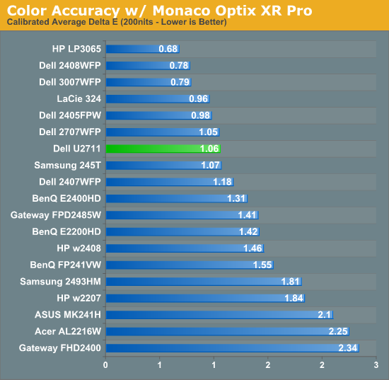
So how does the U2711 do in these areas? First let's look at the charts, and then we'll discuss what they mean. We used the Graphics and Adobe RGB setting on the U2711, with brightness set at 36% (~200nits) and contrast at the default 50%.
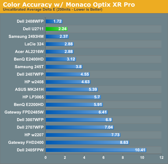
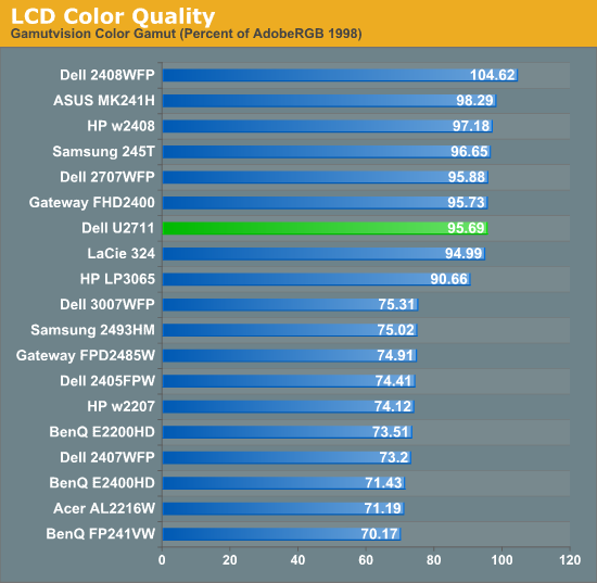
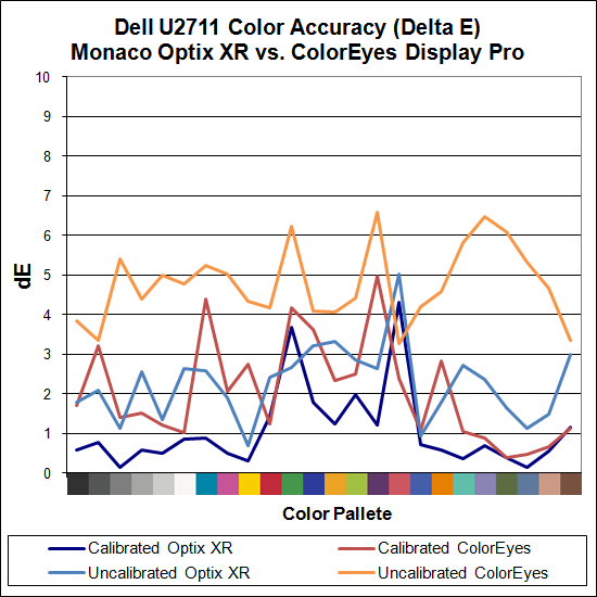
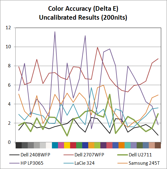
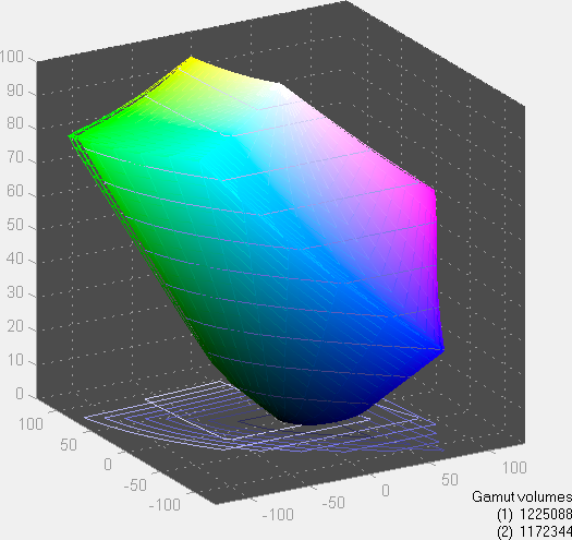
The U2711 scores extremely well in color gamut, and it achieves the 96% of Adobe RGB that Dell claims in their literature (not that most users would really notice the difference between any of the displays rated 90% to 105% - at least not after you eliminate the TN panels). Color accuracy on the other hand is a bit of a mixed bag. Dell ships a paper with test results showing the color calibration of each individual U2711, with the claim that the displays will have an average Delta E of less than 5.0 without any end-user calibration (when using the sRGB and Adobe RGB settings). Dell uses Minolta Color Analyzer CA210 and 32 test colors while we test with ColorEyes Display Pro and Monaco Optix XR Pro and 24 test colors, but our Monaco results confirm their claim. We're not sure why, but we continue to get better results using Optix XR Pro than with ColorEyes Display Pro.
As far as Optix is concerned, the U2711 achieves the rated Delta E of < 5.0 at just 2.24 without calibration, which is an excellent result. In fact the U2711 has no colors in the standard Gretag Macbeth 24 color palette score higher than 5.0 (and only reddish-pink scores a 5.0 measurement). The only LCD we've tested that did better is Dell's own 2408WFP (which also, interestingly enough, had an Adobe RGB color gamut of 105%). ColorEyes also gives an average Delta E of less than 5.0, but at 4.78 the score isn't nearly as remarkable, with nine color measurements well above 5.0. The uncalibrated (Monaco) results put the U2711 ahead of the HP LP3065, Dell 2707WFP, Samsung 245T, and LaCie 324 - and just about every other LCD we've tested.
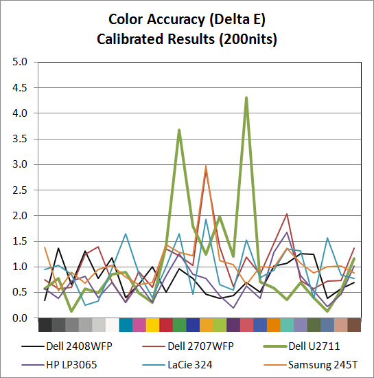
Switch to the calibrated results and the U2711 doesn't impress quite as much relative to the competition. Monaco gives the U2711 an average Delta E of 1.06, which is great, but there are two results above 3.0 (the worst is reddish-pink again, this time at 4.31) compared to displays like the HP LP3065 where the highest measured Delta E is just 1.68. Dell's own 2707WFP, a three-year-old offering, also delivered a similar average Delta E but with only two colors above 2.0 (and still under 3.0). For a better LCD (i.e. not a TN panel), the results are really only slightly above average. It is possible different calibration software would achieve a better end result, but really we're talking about a "problem" that only the most demanding users are likely to ever notice.
Color Consistency
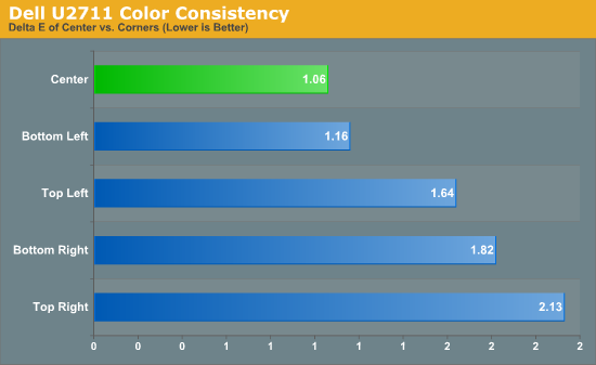
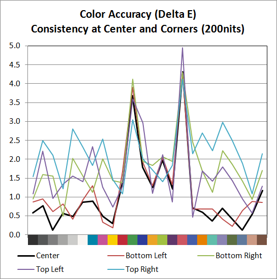
We added another test to try and measure the panel consistency across the entire surface. We measure Delta E at the center of the display, but what happens on the edges? To test this, we used the same profile generated in our best Delta E test result and measured Delta E again at the four corners. Most of the scores are similar, with a slight increase in average Delta E relative to the center measurement. The bottom-left corner is nearly identical to the center measurement, the top-left and bottom-right are a bit worse, and the top-right corner gets the overall worst result. While on the one hand we could say that the Delta E on the top-right is twice that of the center measurement, it's not a case of being "twice as bad". In fact, the color consistency is very good, and we didn't notice any "hot spots" are areas where the colors were clearly off relative to the rest of the LCD.


153 Comments
View All Comments
MadMan007 - Friday, January 22, 2010 - link
Yup I wish more sites would go in to the implications of wide gamut but sadly it seems most just buy in to the MOAR=BETTER marketing hype. Given the depth of some articles at Anandtech it's kind of sad to see only the positives written, almost like marketing material, even if it is ostensibly in the context of professional use and applications.JarredWalton - Friday, January 22, 2010 - link
I have never noticed any problems whatsoever when viewing images on a high gamut display, but perhaps that's because I have calibration tools available. On the U2711, if you're running standard applications, just set the LCD to sRGB instead of Adobe RGB and your LCD will be running in the reduced gamut.Again, I'm not sure how having a wider gamut is supposed to oversaturate colors. Just because a display has a potentially wider gamut doesn't mean you have to use it. Oversaturated reds and blues is a calibration problem, not something inherently wrong with having a higher gamut.
I've heard this complaint before, and I've just never experienced any problems with this. I've even searched for information on what you might be referring to, with no luck. If you use a standard sRGB color space on a wider gamut, you're going to only use 82% of the available gamut. There should be a mapping for reds to reds, blues to blues, etc. that occurs with the display regardless; red shouldn't suddenly map to bright red.
Anyway, if you have a link to somewhere that explains how you encounter this problem, post it and I'll go see if I can replicate this issue (with and without calibration).
10e - Tuesday, January 26, 2010 - link
Sorry Jarred, I have to disagree with wide gamut not oversaturating colors in a practical sense, especially with a monitor that has multimedia aspirations like Dell's latest releases.I also have calibration tools, and one cannot "calibrate out" wide gamut on my Dell 3008WFP and NEC LCD2690WUXI. Wide gamut works fine with color managed applications like Photoshop, or color managed OSes like Mac OS X, but even using the Color Mgmt control panel and loading in the ICM profile in Windows 7 or Vista (or XP) only fixes the oversaturation in Windows Media Player and Picture Viewer, which funny enough ARE color managed. Ty using Media Player Classic and you'll see that it's different from what WMP 11 or 12 show.
This is because color managed apps perform color gamut transformation to correctly "map" sRGB colors to a wider gamut co-ordinate, based on information in the ICM profile. Because a wide gamut screen can effectively show a higher color intensity, a color that is R,G,B 255,0,0 will show a deeper red on wide gamut than standard gamut, because if eight bits per pixel is used, you have the same number of bits defining a wider color space than sRGB. In easy terms, the color difference between red at 254 vs red at 255 is more obvious on wide gamut screens.
Load a photo as your desktop background and load it into Picture Viewer in Vista or Win7 and you will see the difference especially with greens and reds. Even an ocean shot with lots of cyans and turqouises will show up quite obviously. I'm saying to do this, because I have made the same assertion before that wide gamut is not that big a deal, because I was fooled by the built in color viewer of Vista showing me correct colors.
I DO agree, however that using the sRGB mode for PC users and multimedia (console, BluRay) is best. Because otherwise the wide gamut will show up with stronger, unrealistic colors, similar to an old style TV with a color knob.
I have read reviews from other sites that listed wide gamut as being a plus, but I would have to disagree for about 90% of the population out there using tagged and untagged sRGB images.
The0ne - Wednesday, January 27, 2010 - link
You have a perfect example imo. I use this quite often myself for testing."Load a photo as your desktop background and load it into Picture Viewer in Vista or Win7 and you will see the difference especially with greens and reds. Even an ocean shot with lots of cyans and turqouises will show up quite obviously. I'm saying to do this, because I have made the same assertion before that wide gamut is not that big a deal, because I was fooled by the built in color viewer of Vista showing me correct colors."
JarredWalton - Tuesday, January 26, 2010 - link
I'm not sure about video playback... I just tried to compare a movie in WMP11 and MPCHC on a regular gamut LCD, and there's clearly a difference between the two. MPCHC looks somewhat washed out, with lighter blacks and darker whites. I'm not sure if WMP11 is doing some extra post processing or what.AnnonymousCoward - Saturday, January 23, 2010 - link
Jarred, virtually all pictures and video were recorded in sRGB space. With 24 bit color, one pixel might be color 103x50x246. That maps to a different color than it should on a wide gamut monitor. Since wide gamut extends deeper into the red zone, the incorrect mapping will give more saturated reds.JarredWalton - Saturday, January 23, 2010 - link
It only maps incorrectly if your monitor is running in a wide gamut color space (both the monitor and OS) and it doesn't handle an sRGB image as being sRGB. If the applications is color space aware, you don't have a problem. Having a wide gamut monitor doesn't inherently cause the problem; in fact, if you have a regular gamut monitor you get the same effect. It's the images/videos and color space they are created in that can create issues.AnnonymousCoward - Saturday, January 23, 2010 - link
Maybe my understanding is incorrect. The way I see it, regardless of what OS or application is being run, let's say you open a picture on a 72% gamut screen. The color is accurate. Now you crack open the monitor and replace the backlight with one that does 95% gamut. That same picture would appear different and more saturated, right? If so, that would be the case with all sRGB pictures out there, which is nearly every one.Even if software could "up-convert" a low gamut sRGB picture to be high gamut (by lowering the integer color values), for viewing on a high gamut screen, the end result wouldn't be a perfect match since we're dealing with integers.
JarredWalton - Sunday, January 24, 2010 - link
This is not correct. A high gamut screen has the potential to display a wider range of color, but it doesn't inherently do so. The backlight puts out white, and if it's a better white you can get a wider color range (more or less). But if you run in a limited color space, it doesn't make the colors map incorrectly within that color space. The problem only manifests when you view an image that maps to a different color space, and your image viewer doesn't adjust colors appropriately.There's a link above to a site that shows the problem. I can view the "wrong color space" stuff on a low gamut display as well as a high gamut display. So if you want an image to be viewable by your average Joe, you should use sRGB color space. Which, incidentally, the U2711 has a built-in profile calibrated to less than 5.0 delta E.
AnnonymousCoward - Monday, January 25, 2010 - link
I really appreciate the responses =)After looking into this more, I think there are 2 things going on (which happen to relate to the 2 points in my last post). 1) If software isn't color managed, there's an incorrect mapping (see http://tinyurl.com/yk2h9uz)">http://tinyurl.com/yk2h9uz). 2) Even with color management, due to "bits of color" having finite numbers of steps, the conversion for display on a high gamut screen might not be 1:1 (see http://tinyurl.com/y8vocba)">http://tinyurl.com/y8vocba). It seems like #1 is the bigger problem.