Dell UltraSharp U2711: Quality has a Price
by Jarred Walton on January 22, 2010 2:00 AM EST- Posted in
- Displays
We haven't had a display review since our desperately seeking quality LCDs article. That doesn't mean there haven't been interesting displays released during that timeframe, but the trends highlighted in that last article have continued. TN panels are everywhere and are by far the cheapest option, although they do have a bit of competition from E-IPS displays. For example, we have 1080p 23" TN LCDs starting at under $200, compared with 1080p 23" E-IPS LCDs for $300. However, E-IPS isn't the highest quality implementation of IPS (in-plane switching) LCD technology; what if you want to go for the real deal?
Despite the preponderance of TN panels, it's still possible to find some good quality IPS displays. The catch is that you need to be prepared to spend two or three times as much money (or more!) to get that quality. Most consumers will look at the 24" TN panels starting at $200 and then they'll look at an IPS or PVA display costing $550 or more and they'll wonder why anyone would spend the extra money. The answer, quite simply, is quality. Dell offers U-series UltraSharp displays that look to satisfy professional users without quite getting into the professional display price range, and they'll provide substantially better quality than any entry-level display. That brings us to today's review.
| Dell UltraSharp U2711 Specifications | |
| Video Inputs | 2 x dual-link DVI with HDCP HDMI w/HDCP DisplayPort w/HDCP VGA Component Composite |
| Panel Type | IPS (Unknown Manufacturer) |
| Pixel Pitch | 0.233mm |
| Colors | Up to 1.07 billion (10-bit color) |
| Brightness | 350 nits typical |
| Contrast Ratio | 1000:1 advertised 80000:1 Dynamic advertised |
| Response Time | 6ms GTG 12ms TrTf |
| Viewable Size | 27" diagonal |
| Resolution | 2560x1440 (WQHD) |
| Viewing Angle | 178 horizontal/vertical |
| Power Consumption | 113W typical |
| Power Savings | <2W |
| Screen Treatment | Matte (anti-glare) |
| Height-Adjustable | "Yes - 3.5""" |
| Tilt | Yes |
| Pivot | No |
| Swivel | Yes |
| VESA Wall Mounting | Yes - 100x100mm |
| Dimensions w/ Base (WxHxD) | 25.46" x 16.84-20.38" x 7.87" (WxHxD) |
| Weight w/ Stand | 23.06 lbs. |
| Additional Features | 4 x USB Ports 8-in-1 flash reader |
| Audio | 2-channel headphone/line out Optional AX510/AY511 Soundbar |
| Limited Warranty | 3-year warranty standard 4-year and 5-year extended available |
| Accessories | DisplayPort, DVI, USB, VGA, and power cables |
| Price | $1050 MSRP |
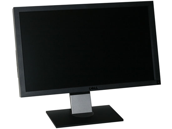
The latest offering in the U-series is the U2711, a 27" beauty sporting extremely impressive features. For starters, it has an IPS panel, but this isn't your granddad's IPS panel. The U2711 has an extremely high resolution 2560x1440 panel - similar to the panel that's used in the Apple 27" iMac. Notice that we highlighted the word similar? That's because the two panels aren't identical; the glass might be the same, but there are definitely differences.
For one, Apple uses LED backlighting whereas the U2711 sticks with CCFL technology. But isn't CCFL worse? That depends on what you're after; the iMac 27 offers a 72% color gamut while the U2711 has a 102% color gamut (based on the CIE 1931 standard). Using RGB LEDs, it would be possible to get a similarly high color gamut, but our experience with RGB LEDs to date is that they cost more and consume more power than regular LEDs, so we can understand Dell's interest in sticking with the "older" technology. (We've only seen RGB LEDs in a few laptops so far, and as one example it's a $175 upgrade on the Dell Studio XPS 16 compared to a regular white LED display.)
Since this is a display rather than an all-in-one computer, there are plenty of other differences between the Apple and Dell LCDs. Dell includes just about every input you might want on the back of the LCD - DisplayPort, HDMI, two dual-link DVI connections (all with HDCP support, naturally); and just for good measure they toss in VGA, component, and composite video connections as well - not that we would recommend using those if you can avoid it, though the VGA connection is always good to have "just in case". Like most UltraSharp displays, you also get a couple USB ports on the back, two more on the side, and a handy flash memory reader.
Besides having a higher color gamut and different backlighting technology, Dell uses 12-bit internal color processing with the ability to output 10-bit color. That means you can get 1024 levels of grey instead of just 256, reducing the amount of banding present in certain situations. 24-bit vs. 30-bit color also means you get a color palette of 1.07 billion instead of 16.7 million, though we were unable confirm this in testing. First, you need to have a graphics card with the ability to output 30-bit color, which typically means you need a workstation class GPU. You also need some sort of "special sauce" - specifically, you need an application that knows about deep color support. We connected the U2711 to a Dell Precision M6500 notebook (Quadro FX 3800M GPU) via DisplayPort. NVIDIA tells us that the GPU is aware of the deep color capability of the display at that point, but it requires an appropriate application before 30-bit color output would start. Despite our inability to test this feature, considering the cost of other 30-bit displays (often they are priced upwards of $1800), the U2711 becomes a very interesting option for users that need (and know how to use) "deep color" support.
So what's not to like? As with so many other things in life, all of these lovely features don't come free. The U2711 has an MSRP of $1050, so it costs quite a bit more than lesser 27" displays. Then again, it has a higher resolution, better features, and it's still $200 cheaper than most 30" LCDs. Overall, the U2711 makes a very good impression if you're after a high quality LCD; it's just not intended for users that are merely looking for a decent display at an affordable price. If you're a discerning image professional or just someone fed up with lackluster consumer LCDs, read on to find out if the U2711 is the right display for you.


153 Comments
View All Comments
jmurbank - Saturday, January 23, 2010 - link
You explain DPI completely wrong. DPI is dots per inch or pixels per inch. It is the space between pixels on the screen that basically has no relationship how graphics is realistically being shown on the display. Lower then 0.28 mm DPI for the monitor is better for computers while higher is OK for TV.The DPI for your desire OS is different than the DPI for your monitor. Each DPI relates to something else, but the DPI you have to look out for is the value in the OS and not the display since you are dealing with formatting issues. The calculation of how fonts are sized includes operating system DPI, so you should not change the DPI at all if you are sharing your work to others. It is best to set to the standard what everybody is using which is 96 dpi for Windows. Then change the operating system font size.
If your eyes are not what they used to be, it is best to use lower resolutions instead changing the operating system DPI or referring to a monitor that has high DPI which can look like you are viewing through a sunscreen screen for your window. Of course lower resolution screens will lose your workspace, but you will not have to rely on high DPI. To gain the workspace back, use multiple displays. Of course lower the resolution and viewing it on a LCD monitor will look blocky, but you will have to live with a poor mans technology until there is something better.
CSMR - Saturday, January 23, 2010 - link
This is nonsense. Comparing non-native low resolutions to a change in dpi at the OS level, sizes of objects are the same, but with the OS change most things are sharp while with the non-native change everything is unsharp. Using non-native resolutions is just incorrect use of the monitor.jmurbank - Saturday, January 23, 2010 - link
It is not about what is sharp and what is not sharp. LCD are basically a poor mans technology and you have to give up quality if you can not see what is on the screen. LCD are designed for notebooks for their portability and not for their quality. If we go back to a better technology such as CRT, everything just works the way it is. Using a non-native resolution is not an incorrect use or a waste of the monitor's capabilities if you can not see anything what you are doing. Sure you can setup a panning which will make a virtual resolution be viewed at a native resolution, but with a sacrifice of panning.I do not recommend changing the operating system DPI just to make sure you can read at ultra high resolutions because it will create problems in the future.
strikeback03 - Monday, January 25, 2010 - link
The only CRTs worth using were the extremely high-end models. The vast majority of CRTs are absolute crap and just about any LCD is better.CSMR - Friday, January 22, 2010 - link
Text isn't smaller when the dpi setting is correct. Unless you want it to be smaller (you might now find smaller text more readable).Some apps do override the dpi setting, in my experience only browsers (and image software - fair enough). There you have to set a zoom level. That will zoom images and text (default on IE, firefox). Well I'm on Anandtech on FF now and it zooms correctly, as do all sites I have ever visited.
Now yes, images that were mapped pixel-to-pixel before are now not as sharp at a higher setting. That's mitigated by most popular software now storing icons at various dpi settings, but is a problem for web images and I usually return to 100% zoom for photographic images. However you get the same problem if you use a non-native resolution, except instead of just a few things being unsharp, everything is including text. So that is the worst possible option you can take.
If you like a 96dpi icon on a 96dpi screen (say), then you should like a 120dpi icon on a 120dpi screen even better. (Assuming the icon has been rendered at 120dpi, which most have.) So the icons comment doesn't make any sense.
You seem to be thinking about display of computer content at a very low level, each element separately. But everything has to have the right proportions and the key measurement is physical distance. Dpi settings allow you to have the right scale while preserving the right proportions.
JarredWalton - Friday, January 22, 2010 - link
When I changed the DPI on my system, all the icons look fine, but the spacing is all messed up. They look the same size as before, but there's now a bunch of empty space surrounding each icon. (This is looking at my desktop.) They look like they use 100x100 pixels instead of 75x75 (give or take).Really, my experience is that just about everything tends to be designed assuming users are running 96DPI... it's getting a bit better, but that's the short summary. There are a lot of screen elements that just run 1:1 mapping and ignore your DPI setting. Windows Vista seems to have done more than Windows XP at addressing this area, and Win7 may be even better than Vista, but no one has really nailed this IMO.
kmmatney - Saturday, January 23, 2010 - link
I don't have great eyes, so I was a fan of larger pixel sized monitors. That is until I upgraded to windows 7. One of the big problems with Windows 7 is that you can't turn off cleartype, or at least its extremely difficult to get rid of it. So, large pixel monitors look like crap. As an example, I was using a HannsG 28" LCD @ 1920 x 1200. This was fine with Windows XP, but absolutely horrible with Windows 7. I had to get rid of this LCD, and get one with smaller pitch, just to comfortably use Windows 7. My eyes are bad enough, I don't need cleartype making things even fuzzier...erple2 - Monday, January 25, 2010 - link
I'm assuming that:CPL\System\Performance Information and Tools\Adjust Visual Effects [sidebar], uncheck "Smooth edges of screen fonts".
Doesn't work? (This was from one of the first results of:
http://www.google.com/search?q=remove+cleartpye+fr...">http://www.google.com/search?q=remove+cleartpye+fr...
)
erple2 - Monday, January 25, 2010 - link
Awesome - Google figured out what I meant. The real URL ishttp://www.google.com/search?q=remove+cleartype+fr...">http://www.google.com/search?q=remove+cleartype+fr...
CSMR - Friday, January 22, 2010 - link
Not sure what's up with your system. XP was pretty awful at this, but on Vista/Win 7 it's a very strange problem to have.