Gateway AMD and Intel Laptops, a Platform Analysis
by Jarred Walton on August 12, 2009 2:00 AM EST- Posted in
- Laptops
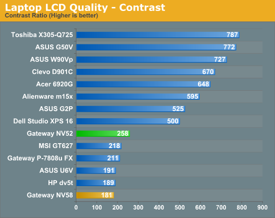
LCD Quality
Wrapping up testing with a look at the LCDs, it's important to note that these are different LCDs in the same chassis. Since these are budget laptops, it's very likely Gateway switches LCD sources as necessary; some of the NV52 series might have LG Philips displays, and some of the NV58 series might use AU Optronics LCDs. We would also be surprised if results were consistent across all LCDs, since budget offerings usually get budget LCDs that can fluctuate wildly even on the same production line.
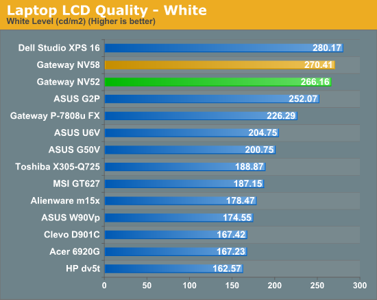
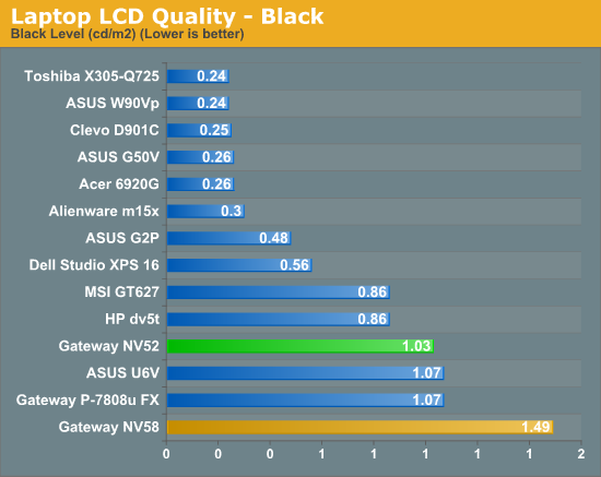
Gateway NV5214u
Gateway NV5807u
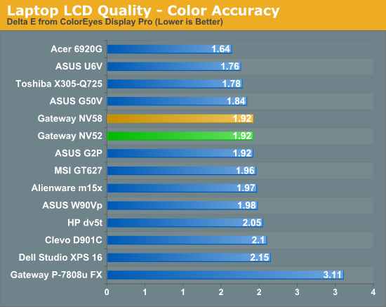
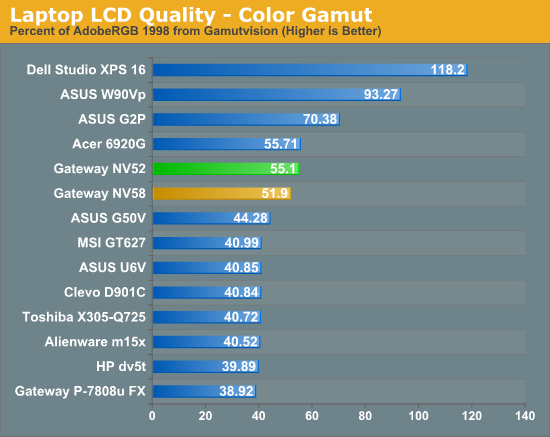
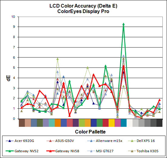
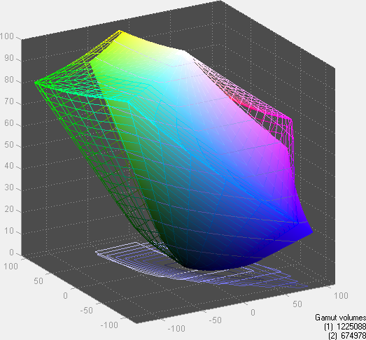
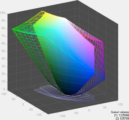
The white levels are similar while the black levels clearly favor the AU Optronics panel, with the result being that the AU Optronics LCD has a 43% higher contrast ratio. In fact, the LG Philips panel has the lowest contrast ratio of the tested LCDs. It's not the end of the world, and we do like the fact that Gateway is using LED backlighting, but these LCDs do little to change our overall impression of what a laptop LCD panel can do. Color accuracy is average (yes, the laptops attain the same average Delta E, though the individual color scores were very different), and color gamut is only slightly better than other laptops. Again, notice that the AU Optronics panel has a better color gamut than the LG Philips panel.


67 Comments
View All Comments
samspqr - Wednesday, August 12, 2009 - link
(I mean the one on page 5)JarredWalton - Wednesday, August 12, 2009 - link
As mentioned in the text, the graphs on pages 5 though 8 use a different format. I chose the format because I feel it provides a quick way of looking at relative performance. The percent labels aren't particularly meaningful, since the bars are not in actual percentages (though the bar sizes are).Spacecomber - Wednesday, August 12, 2009 - link
Although I found the article interesting, comparing the advantages of intel based laptops to amd based laptops, I have to agree that the choice of how to represent the data in the charts doesn't really work for me. I understand what the notion was, representing the data as a kind of tug of war between the two platforms, but the utility used to create these charts didn't provide the means to make this clear. I'm a strong believer that charts should be intuitively obvious and that you should be able to interpret them without looking at anything other than what is contained in the chart.These charts have an additional problem when it comes to the representation of the gaming data (or any data where the same measurement unit is being used). You can no longer easily compare performance for the same platform across different games (or whatever the instances being measure are). For example, it is not easy to see in these graphs that some games don't have playable framerates, regardless of the platform.
Anyway, while I'm sympathetic with the effort to try something different, I didn't find that it helped me to comprehend the data any better, and it seemed to be more of a hinderance, instead.
JarredWalton - Wednesday, August 12, 2009 - link
The problem is two-fold: I had a bunch of data to represent, and I didn't want a ton of small charts. I debated just putting in a table, but that seemed a poor way of doing things - especially since I can show the number labels and you get the chart plus table effect. The issue is compounded by units that are not easy to chart with each other - i.e. PCMark05 has some scores in single digits, some in the tens, and some in the hundreds. Do I break PCMark05 scores into 16 different charts, or does the "100% Stacked Bar" chart option provide all the necessary detail?I'm inclined to go with the latter as a reasonable compromise between the various options, and let people spend a few more minutes looking at the data to draw conclusions. It's great when a chart can be "intuitively obvious", but there are times when complex data requires a more complex chart. The net result is that I had a choice between more aesthetically pleasing pages and a single summary chart, or I could make dozens of smaller charts and get a cluttered page.
I understand some people won't like the representation, but I've been playing with the data for the past hour and there's really no option that's as succinct. Some graphs (gaming) lend themselves to other options, but the PCMark05 chart and Application Performance charts have to be split up, put in a table, or something else.
FWIW, I'll post alternative charts in a bit for those that really hate the current charts. However, I'm still a firm believer in requiring people to READ the text. I get the impression that many of the comments have only looked at a small portion of the text and are making a lot of assumptions - assumption which are, not surprisingly, incorrect.
Wellsoul2 - Wednesday, August 12, 2009 - link
The Chart is still backwards compared to the first article onbattery life. Idle is 111 minutes and DVD 242 minutes.
It's reversed from last article.
JarredWalton - Wednesday, August 12, 2009 - link
Sorry... not sure how that happened, other than sorting charts in Excel. For some reason, the top spreadsheet cell showed up on the bottom of the chart, and so I resorted. Apparently I missed the numbers at some point. I'll correct the chart shortly....mczak - Wednesday, August 12, 2009 - link
Hmm, what about the raw numbers which should show minutes runtime? Idle has lowest runtime, DVD playback largest. That definitely looks wrong...Wellsoul2 - Wednesday, August 12, 2009 - link
Yes...looks like you reversed the numbers.whatthehey - Wednesday, August 12, 2009 - link
Reading comprehension is a great thing!"We are using a different format for the graphing than we used previously.... For this chart, equal performance is denoted by the 50% mark in the middle of the chart. A larger bar means better performance, and the numerical results (in minutes) are available for those that prefer raw numbers."
Ah, yes, the percentage marks are entirely misleading! Shame on you AnandTech for making people read! (FWIW, I had no issues reading and interpreting the graphs, but then I'm a computer programmer.)
Ben90 - Wednesday, August 12, 2009 - link
" quit looking ahead and pay attention to this paragraph! " You should have added that to the page before, my screen was already down in the chart when i read this :)