The All-in-One Battle: Dell's XPS One 24 vs. Apple's iMac
by Anand Lal Shimpi on October 30, 2008 3:00 PM EST- Posted in
- Systems
Insert: Obligatory Matrix Reference Here
Dell has been working quite a bit on improving the industrial design of its products, and while the biggest changes are coming on the mobile side, the new XPS One 24 does look good.
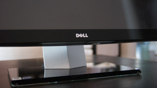
It sits low and wide thanks to the speakers on either side of the display, which are honestly the most awkward parts of the system. However given that Dell opts for function over form here you actually get speakers that aren't terrible, they are at least better than what's in Apple's iMac. You're still better off with an external set of speakers but that would defeat the purpose of the all-in-one now wouldn't it?
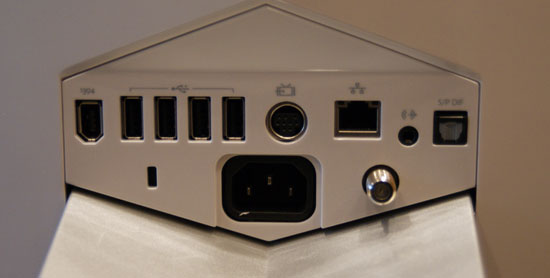
There are a flurry of ports at the back of the XPS One 24, you've got one FireWire, four USB, one video input, 10/100/1000 Ethernet, 1/8" audio out, optical audio out and coax in for cable TV.
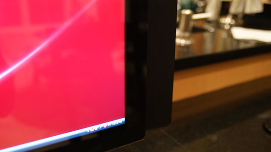
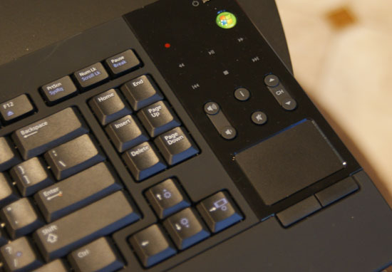
At rest this is what the lower right corner looks like...
By far the coolest feature of the XPS One are the touch controls on the right side of the machine. Bring you hand close to the right edge of the display and the touch controls light up, you can control volume, control music playback or eject a disc. The touch controls do offer some feedback, they will vibrate a little once your input is recognized.
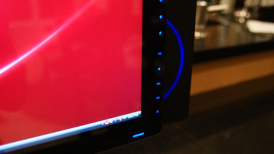
Bring your hand closer and you've got controls
The volume/playback buttons are nice, but they don't work properly with iTunes. If iTunes is in the foreground then you're ok, have it in the background and you're screwed - the playback control buttons do nothing. Obviously this isn't the case with Windows Media Player 11, but limiting the usefulness of these controls to a single application is silly. Part of this limitation may be the unfortunate reality that Dell doesn't control the entire software stack being run on the XPS One, it may simply be a limitation of iTunes under Vista, but regardless of the cause it's an annoyance.
Dell has implemented a nice, very Apple-like brightness and volume OSD whenever you adjust either of these things. But once again there are limitations. I installed Pidgin to, you know, talk to people on this thing - but unfortunately with Pidgin in the foreground Dell's volume control and brightess OSD doesn't appear anymore. Again this seems like a software/OS limitation, but it's one area where the XPS One falls short of something like the iMac.
I'll get to the discussion of what Dell has done to close the Apple gap on the software side of things in a moment, but for now let's keep ogling the exterior.
Dell's claim to fame with the XPS One is that you only need a single cable, for power, the rest of the machine is totally wireless. While there's an Ethernet jack on the back, but you've got a built in Broadcom 802.11n wireless adapter for Internet access and the machine ships with a wireless keyboard and mouse as well as Bluetooth for any additional peripherals.
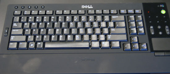
The One's keyboard is quite stylish but it falls short in a few key areas (wow, terrible pun). In order to satisfy the design requirements there's no dedicated numeric keypad, instead you've got to rely on the top row of numbers or use a function key combination.
Like a laptop keyboard, the XPS One's keyboard has a function key that you can use to put the computer to sleep, eject a disk, or increase/decrease brightness. Since the XPS One's mouse is pretty much terrible, I found myself using the keyboard's built in trackpad quite a bit. Now here's where I was surprised - I actually didn't mind, in fact, I wanted a larger trackpad. I'm so used to trackpads from using notebooks all the time that for an all-in-one machine like this a builtin trackpad just made sense, but honestly it needs to be larger. I get the reasoning for a compact keyboard, but it seems like there's just a lot of wasted space on the design, especially near the trackpad. Have a look at Apple's latest MacBook/MacBook Pro, I want a trackpad of that size, maybe a bit smaller and you can do away with the mouse altogether if you'd like (except for gaming of course). The trackpad unfortunately has no way of scrolling, which is a sad limitation. I'd like a two finger scroll gesture here please, thanks.
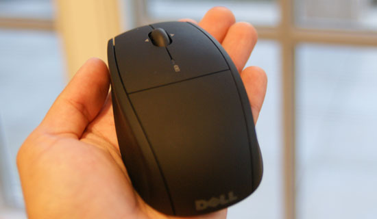
I spoiled much of the surprise already, but I was not a fan of Dell's bundled mouse. While tracking is mostly ok the mouse doesn't appear to be very precise, resulting in jerky behavior when trying to make small movements on the screen. Instead of smoothly moving from one point to another it tends to stairstep. Now the mouse itself isn't reason to avoid the XPS One 24, I would simply encourage Dell to bundle something a little more respectable.
The other issue is that both the keyboard and mouse rely on two AA batteries, two for the keyboard and two for the mouse. It would be nice to have both of these devices be USB rechargeable or perhaps have some sort of integrated charge dock in the base of the XPS. Again, not a deal breaker but room for improvement should Dell decide to perfect the approach to including wireless peripherals.
Admittedly the one-wire setup is a bit liberating, it's very notebook-like in its ability to be put anywhere without disturbing the natural flow of things. For this very purpose I conducted today's review with the XPS One 24 in my kitchen.
A very important consideration for a machine that could end up someplace you normally wouldn't find a computer is noise, or more appropriately, lack thereof. The XPS One uses a Seagate Barracuda 7200.11 3.5" SATA drive which is great from a performance standpoint, but it's deceptively noisy in the XPS One. You can hear disk accesses very clearly, which is distracting since the whole system is incredibly quiet. I hate to keep advocating for the use of SSDs given how expensive they are, but in a system like this it makes total sense. Every other aspect of the XPS One is absolutely silent, but the drive is distracting. It almost sounds like the interference noise you get when you've got a cellphone too close to computer speakers. For an otherwise silent machine, this stands out.


60 Comments
View All Comments
nitrous9200 - Friday, October 31, 2008 - link
There will be an option to show the text next to the program icons in 7, but obviously it will be turned off by default. Of course it's really quite easy to differentiate between programs by the icon since they're usually so different.strikeback03 - Monday, November 3, 2008 - link
Yeah, but if you have several instances of the same program open (for example, I have 2 firefox right now, and multiple Explorer windows is common) then icons won't cut it. I couldn't care less how pretty the interface looks, so long as it is effective at conveying what is going on and allowing me to interact with it.sxr7171 - Tuesday, November 4, 2008 - link
No big deal. You will get a choice which is the downside of Macs. It's either "our way" or the "highway" in the Mac universe which is my big issue with Mac.Wolfpup - Friday, October 31, 2008 - link
I've long felt Windows' interface is considerably superior to OS X. Honestly I'd take 98's interface over 10.5, let alone XP or Vistas. It's really customizable, and...well I could go on and on about the things I prefer.(Two huge ones off the top of my head, you can edit files and folders from a save dialog box, and create new documents where you want them in the file system rather than having to open a program and navigate that way.)
Certainly I vastly prefer the quick launch bar and start menu to the dock.
Expose is the only interface element I wouldn't mind ripped off and put in Windows (though even there there's sort of a version of it in Vista).
slashbinslashbash - Friday, October 31, 2008 - link
Hmmm... how long have you been reading AnandTech? I've been here a good 7-8 years now, and I have grown to have an almost personal relationship with Anand's reviews. I know his thought processes, and he has kept a consistent POV over the years. Look back to 2004-2005 when he got his first Macs and somewhat reluctantly concluded (after all, he had built his site's reputation as a PC hardware review site) that he liked OS X better than Windows. Ever since then, the push has been on. Anand has grown to be more and more of a "Mac guy" and AFAIK largely uses Macs to conduct his day-to-day work. It's to the point now that I think of Anand as my go-to guy for Mac reviews and analysis (as he and his site have always been my go-to site for PC hardware reviews), if only because his voice has been so consistent and I know that he will tell me what he really thinks, and more importantly, that I know how he thinks and I know that he usually thinks like I do. Editorial consistency is so important and usually overlooked.In any case, being surprised at the "obvious pro-Mac OS X bias" shows you to be a pretty non-observant AnandTech reader, IMO. It is no surprise to me at all, and in fact I felt that Anand gave pretty fair shakes to the Dell, which copied the iMac and OS X to an embarrassing degree (the Dock is such a blatant ripoff! And the "Eject" graphic! Even the input/output ports are totally Mac-like.).
As for your criticisms of OS X, "knowing what is running" is far less important on OS X than on Windows anyway. To quote from Anand's 4/13/06 review of the original MacBook Pro: "When I started using OS X I initially hated the idea that closing all the windows of an application wouldn't actually close the application itself. However the more I used OS X, the more I realized that I didn't want to close the applications I used a lot; I wanted their windows out of the way but I wanted the ability to switch to them without waiting on the hard drive to load up that program again. Leaving just about every application I use open all the time and not having to worry about my system getting slow over time was a bit of a new experience for me, but it was a welcome one." I am the same way. I pretty much never quit programs completely on my Macs. It just doesn't make any difference in performance. When they are running in the background, the memory is managed well enough by OS X that they do not intrude on what I am doing.
"Differentiating between the numerous windows I have open" -- nothing does this better than Exposé.
"a central place to go for all your programs" -- OS X does a much better job of this with the Applications folder and the way that Applications themselves are folders in a sense. You click on them to open the application, but all the files and components that actually make up the application are enclosed in the folder that is the visible manifestation of the application in the Applications folder. To give a concrete example: I have an application called "Firefox" in my Applications folder. To open Firefox, I double-click on it. But if I right-click (I have a MS wireless mouse and keyboard -- I'm not a bigot) and select "View Package Contents", I see that this Firefox application is really just a container with a bunch of files and folders within it; chrome, extensions, dictionaries, etc. All of the confusing files and folders that seem to spread their way across multiple locations on Windows confine themselves nicely to that one pseudo-folder on OS X. No .dll files in strange places! No configuration settings hidden in the Registry! Just one place, and if you want to get rid of the program, there's no need for a complicated "Uninstall" process that scours your hard drive for odd remnants, you just drag the whole thing to the trash and be done with it! Wow, what a concept!
As for Linux's "central place to go for all your programs" -- don't get me started on the multitudinous locations of various ./bin folders (/usr/bin, /usr/local/bin, ~/bin, /bin, here a /bin, there a /bin, everywhere a /bin /bin.... I've got a $PATH that is several lines long, and different on every machine that I log into).
sxr7171 - Monday, November 3, 2008 - link
Huh. I used to ask Mac users why they did thought Mac was better in some ways and I many would mention the whole process of installing and uninstalling apps as a drag and drop thing. I never understood why they made such a big deal out of that because I thought dragging and dropping was analogous to clicking the install file.Not until you explained did I realize why they always bring that point up. Honestly now that I understand it, that is pretty darn amazing. It just makes sense. I hate hunting through local settings, application settings, the registry etc.
xeutonmojukai - Friday, October 31, 2008 - link
Um, I'm writing this on my MacBook right now, and trust me, this thing has a much more in-depth task manager than any Windows computer I've ever seen, and even allows you to restart the Finder program (or Main UI, basically) without restarting the computer.I find that my computer can go plowing into the great unknown reaches of the internet and come out clean, without using a firewall or any sort of protection program. It runs as fast as it did four years ago when I bought it.
I also use 10.4, and I've seen a lot of the new things from Leopard in my install of Ubuntu, and I don't need them, honestly. I'm fine with what Tiger has to offer.
Wolfpup - Friday, October 31, 2008 - link
How is Window's task manager less in depth...and you've been able to restart Explorer (ie Finder) separately from the computer in Windows since at LEAST Windows 98, if not earlier.
michael2k - Friday, October 31, 2008 - link
Windows taskbar doesn't give you a progress bar update per application?Windows taskbar doesn't tell you how many emails, IMs, or activity status in the taskbar?
All the Windows taskbar does is tell you which apps are open, which apps want your attention, and how many windows each app has open.
sxr7171 - Monday, November 3, 2008 - link
Not even liking Macs, I have to agree. Even Firefox tabs are easier to navigate and more informative with the right extensions. How many times have I wished for mouse gestures in Windows explorer? I really think Windows 7 will be fixing some of these issues. They seem to be standardizing the ways in which applications interact with the user. The fact that are are working to standardized where and how drivers are updated centrally and even use manufacturer input to build in sync and device management directly into the OS is going to make Windows 7 very easy to use and a much more consistent "mac-like" experience. Only with far more choices in hardware, software, and peripherals. The task they are undertaking is huge, but the results, if implemented correctly will be worth it.