Brightness and Contrast Ratio
For those who have a need to match colors between their computer displays, cameras, and printers, what works well for computing purposes often isn't the best suited for doing other image related work. To help people who work in such areas match their computer colors to their paper colors better, some standards were established. Generally speaking for print work the standard is a gamma of 2.2, a black point of 0.60 nits, and a white point of 100 nits. We attempted to calibrate all the monitors for these settings.
Finding the appropriate settings to reach these levels can be a time-consuming process for some of the displays. It may require numerous iterations through the calibration process to end up with the desired white point, and on some LCDs it might not even be possible to reach a satisfactory result (though that hasn't occurred yet). The nature of LCDs is such that we were unable to get both an accurate white point and an accurate black point according to printing requirements (our black levels always ended up darker than they are supposed to be), but we did manage to get near the desired 100 nits white point on all of the tested displays. For reference, we have included the target value in the following graphs, so the greater the deviance of a display from the targeted value, the less suitable (in theory) a display becomes for print work.
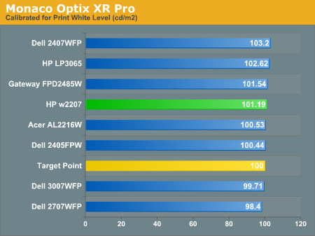
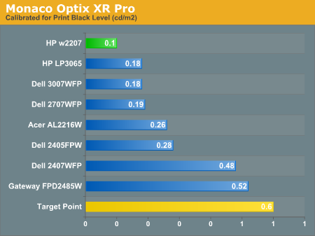
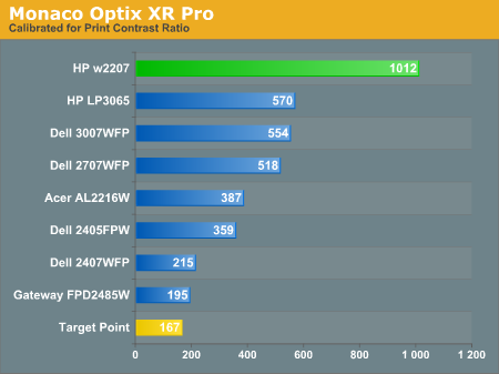
Since very slight differences in brightness are not a huge deal, we did not attempt to get 100% accuracy on the white point, but further tuning of the various displays would have made it possible to get closer to 100 nits. The primary goal was to get the white point near 100 nits. The target black point is nearly impossible to achieve once we have reached the target white point with any LCD that we have used. Due to the reduced brightness, contrast ratios are often lower, but that is expected with print material. The HP w2207 does maintain a very high contrast ratio of 1012:1 even at reduced intensities, which while not necessarily great for color matching with printers may be desirable for other users. Having calibrated the displays for printing, let's see how they actually fare.
Color Accuracy
Given the importance of accurate colors for printing work, the desired Delta E scale needs to be reevaluated. A Delta E of less than 1.0 is definitely the goal here, and 1.0 to 2.0 is merely acceptable. Scores above 2.0 basically mean that a display is not fit for printing professionals.
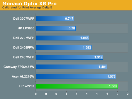
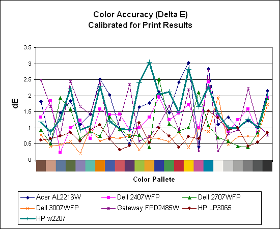
The two 30" displays clearly take the lead in this test, while both of the 22" displays rank at the bottom of the pack. It may be that the TN panels are to blame for the less than optimal results, but the conclusions are pretty clear. If the intended goal is to get all of the scores below 2.0 Delta E, only the 30" LCDs manage this. The HP w2207 ends up with a fully one third of the test colors falling into the 2.0 or higher Delta E range.
For those who have a need to match colors between their computer displays, cameras, and printers, what works well for computing purposes often isn't the best suited for doing other image related work. To help people who work in such areas match their computer colors to their paper colors better, some standards were established. Generally speaking for print work the standard is a gamma of 2.2, a black point of 0.60 nits, and a white point of 100 nits. We attempted to calibrate all the monitors for these settings.
Finding the appropriate settings to reach these levels can be a time-consuming process for some of the displays. It may require numerous iterations through the calibration process to end up with the desired white point, and on some LCDs it might not even be possible to reach a satisfactory result (though that hasn't occurred yet). The nature of LCDs is such that we were unable to get both an accurate white point and an accurate black point according to printing requirements (our black levels always ended up darker than they are supposed to be), but we did manage to get near the desired 100 nits white point on all of the tested displays. For reference, we have included the target value in the following graphs, so the greater the deviance of a display from the targeted value, the less suitable (in theory) a display becomes for print work.
Since very slight differences in brightness are not a huge deal, we did not attempt to get 100% accuracy on the white point, but further tuning of the various displays would have made it possible to get closer to 100 nits. The primary goal was to get the white point near 100 nits. The target black point is nearly impossible to achieve once we have reached the target white point with any LCD that we have used. Due to the reduced brightness, contrast ratios are often lower, but that is expected with print material. The HP w2207 does maintain a very high contrast ratio of 1012:1 even at reduced intensities, which while not necessarily great for color matching with printers may be desirable for other users. Having calibrated the displays for printing, let's see how they actually fare.
Color Accuracy
Given the importance of accurate colors for printing work, the desired Delta E scale needs to be reevaluated. A Delta E of less than 1.0 is definitely the goal here, and 1.0 to 2.0 is merely acceptable. Scores above 2.0 basically mean that a display is not fit for printing professionals.
The two 30" displays clearly take the lead in this test, while both of the 22" displays rank at the bottom of the pack. It may be that the TN panels are to blame for the less than optimal results, but the conclusions are pretty clear. If the intended goal is to get all of the scores below 2.0 Delta E, only the 30" LCDs manage this. The HP w2207 ends up with a fully one third of the test colors falling into the 2.0 or higher Delta E range.


43 Comments
View All Comments
JarredWalton - Wednesday, August 1, 2007 - link
For $1700, I would definitely pick up one of the HP 30 inch LCDs -- or the Dell that matter. Both of those used S-IPS panels and provide back lighting that has an improved color gamut. I certainly couldn't tell you what the NEC offers that would make it worth the price of entry, but unfortunately I have never been able to use one in person.nilepez - Wednesday, August 1, 2007 - link
I think the difference is that the HP apparently has a lot of adjustments that you can make.I'm just guessing, but it may be something like the the old Sony Artisan or Barco monitors, where you could make adjustments to many different areas of the screen, not just the usual 4 (or less) that most had.
strikeback03 - Thursday, August 2, 2007 - link
IIRC some of the high-end Eizo and NEC displays can interface directly with color calibration equipment, and probably have better controls. Who knows, they migh hold their color longer or come with a calibration sheet from NIST or something too. Conceptually similar to the Artisans as a monitor designed to be very good for color-sensitive work.