The Samsung Galaxy S10+ Snapdragon & Exynos Review: Almost Perfect, Yet So Flawed
by Andrei Frumusanu on March 29, 2019 9:00 AM ESTDesign & Ergonomics
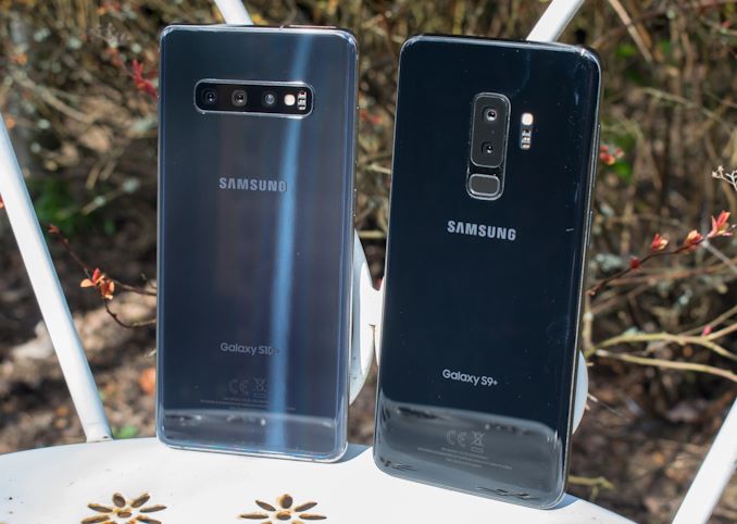
Switching over from internal parts to external features, let’s start with the back of the phone. One interesting thing about the new S10 series right off the bat is their colour scheme. The S10 pictured above is actually the “Prism Black” version, even though it’s glistening in blueish hues. In absence of direct light it does look like a very dark blue, and if there’s any amount of light it has an iridescent sheen to it. Unfortunately it’s still pretty much a fingerprint magnet, and this may be why Samsung chose to sample the Pearl White variants to most media. Personally, I wish Samsung would try out chemically-etched frosted glass finishes, such as those found on the OnePlus 6, LG V40 or Pixel 3, as these are in my opinion the best implementations of glass backs.
Another change of note on the new S10 is that the camera setup has gone horizontal – like on the Note9 – and that the rear fingerprint sensor has disappeared. Qualcomm’s ultrasonic fingerprint sensor has been in the news for a couple of years now, but the S10 is the very first device to actually employ it. The verdict from me is that it's a bit of a mixed bag. The positive thing about the new ultrasonic unit (as opposed to optical units) is that the device doesn’t need to have its screen on to scan your fingerprint. Unfortunately beyond that I’m having a hard time justifying the new sensor compared to other optical implementations.
The core issue here is simply the unlock speed – it’s takes two to three times longer than what the optical sensors on the Mate 20 Pro or OnePlus 6T can achieve. The speed doesn’t seem to be an inherent issue with the sensor itself, as the scanning period isn’t terribly long (still quite slower than an optical sensor), but it takes quite a bit of time for the phone to actually unlock after the fact. Here I have to wonder if the SoC is actually asleep the whole time, and the fingerprint module only wakes it up after having successfully scanned or detected a scan attempt.
It’s to be noted that I tested this with the latest firmware and I didn’t have any issues other reviewers initially described – I can treat it as a usual capacitive or optical sensor, including things like pressing hard and keeping it pressed to unlock. Accuracy has been great and the only instance of failed unlocks has been when I didn’t hold my finger on the sensor for long enough, again coming back to the issue of its slowness. I have to note that I found the Exynos unit to be ever so slightly faster at unlocking, it’s possible that it has newer FP firmware than what's on the Snapdragon unit (US unlocked).
One thing that I very much miss on the Galaxy S10 that I’ve come to love on the S8 and S9 series is the pressure sensitive home button. I wish Samsung at least would mimic the haptics with the fingerprint sensor.
Turning the device to the front, we come to see the Galaxy S10’s most polarising feature: the full-screen display with its camera cut-outs. The new display uses a bigger and wider aspect ratio, now going nearly edge-to-edge, top-to-bottom on the phone. The catch with such designs is that it begs the question of what to do with your usual front sensor and cameras. Samsung last November first talked about the new Infinity displays, and the S10 is an implementation of the Infinity O variant, with a hole-punch cutout.
Now Samsung opted to configure the Galaxy S10+ with two front-facing cameras: one primary module, which is the same as on the regular S10, and one additional optical depth sensor for improved selfie portrait shots. The tradeoff with having two cameras is that you have to choose how to make space for them, either using two holes in the front, or as Samsung chose, a pill-shaped cut-out with both cameras side-by-side. What is actually interesting, and this is visible in sunlight, is that this actually isn’t a pill-shape cut-out at all, but rather two circular cut-outs with a pill-shaped cover just underneath the display glass, above the AMOLED panel. I haven’t seen anybody do a display teardown on the Galaxy S10+ as of yet, but it would be interesting to see if there’s indeed just two holes on the panel with still some sort of covered active area in-between.
The proximity sensor as well as the ambient light sensor have been hidden underneath the screen to the bottom-left of the camera cut-outs. One thing that’s missing from the S10 series – having been dropped by Samsung – is the notification light. Unfortunately at this point in time there’s no substitute for it, and if you aren’t using ambient display notifications, you simply will not see that you have any notifications. Samsung says that this is something that will be addressed in a software update: The plan is that there will be an animation around the camera cut-out serving as a notification light, but this has been delayed for some reason. I also have to wonder what the battery impact of such an implementation would be, as one would have to power on the DDIC just to show such a little light. In any case it is big step backwards in terms of usability and usefulness. I hope the software update addresses this, and that in the future we might have something like a true LED shining from underneath the screen, if it's possible at all.
I’m not particularly a fan of the pill cut-out and haven’t been able to get used to it: Thankfully enabling night mode in the new OneUI settings blacks out the whole top notification area, which drastically reduces how noticeable the cut-out is.
Pitting the Galaxy S10+ against the S9+, we see that the new design hasn’t actually changed the screen real estate much at all at the top of the phone. The bottom of the notification bar ends up at almost the same vertical position on both phones. The vast majority of the notification area is pretty much wasted on the S10+, as its thickness is statically dictated by the camera cut-out. It’s only due to the narrower bottom bezel that we actually get an increase in useable screen-estate for applications.
All of these design tweaks to accommodate the camera cut-out within the UI also means that the area above the camera cut-out doesn't really serve any purpose, as it's not enough space to do anything useful. For that matter, a third of the radius of the cut-out itself is dead area as well, as the camera hole and lens are actually much smaller. The fact that Samsung tries to hide the cut-out in its wallpapers and marketing materials probably doesn't help matters here either – if anything, it makes it look like the company has some level of shame about the feature – so frankly I just don’t see how this offers a better user experience than a notch. Things might look a bit more minimalistic on the S10e and S10, however the issue of vertical space usage remains the same on those variations.
Given all these compromises, one thing seem to be clear, and it corresponds with what I’ve heard towards the middle of last year: Samsung had probably hoped to be able to hide the camera underneath the screen in the initial plans for the S10. However due to technical challenges, they didn’t manage to achieve it for this generation.
In future models, I hope that if Samsung doesn’t achieve a true Infinity display, that at least the hole cut-outs will be smaller and further up near the top bezel of the phone, allowing for better screen real estate usage.
Another very odd design choice for the Galaxy S10s is the new location of the power button. Samsung has shifted this up by a thumb for some reason. This isn’t the first time the button has shifted up, the Galaxy S9 already had moved it up from the S8’s location, but this time the S10 has it in an absurd position.
Usually when I grab a phone I have the bottom right corner dug into my lower palm, and holding it this way it’s simply not possible to reach the power button on the S10+. Instead, I have to readjust how I'm holding the phone just to reach it. This was so annoying for me that I opted to just install Samsung’s One Hand Gesture application, making a gesture just to turn off the screen instead of reaching up to the power button. So far I haven’t heard of any reviewer who hasn’t noticed this big ergonomic regression, and I hope this really is just a one-off design hiccup instead of some conscious design choice by a very long-thumbed Samsung designer. It’s also to be noted that this hardware design goes completely against Samsung’s new OneUI one-handed friendliness.
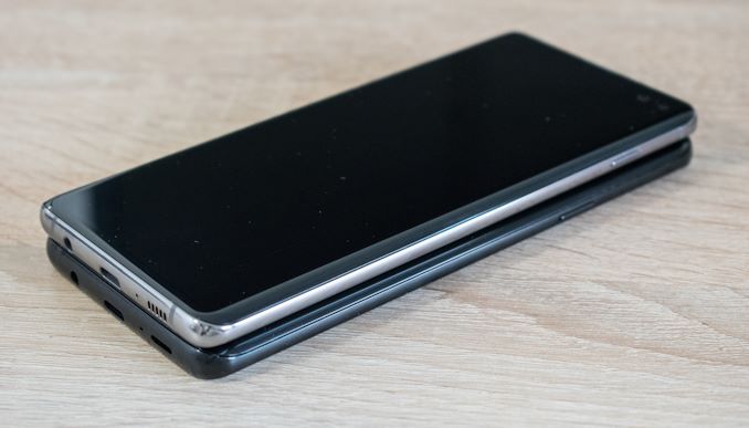
One thing that I didn’t quite notice during my MWC hands-on is that the S10+ is very much a bigger phone than the S9+. The official dimensions can be a bit deceiving here, as although the S10+ is only 0.5mm wider than the S9+, this measurement is for the outer-edges of the devices. What's not listed is that the Galaxy S10 has a tighter radius on its curved edges than the S9, which make the total circumference of the phone a little longer than its predecessor. In other words, the phone is essentially closer to being squared off at the edges than the S9. This despite the fact that the phone is noticeably 0.4mm thinner.
As a result of these changes, subjectively speaking the S10+ feels like a less ergonomic phone than the S9. Last year I’ve eventually got used to the S9+ over the S9, and I’ll try to see how the S10+ goes for further use. But if was given a choice right now I’d probably opt to change for the smaller S10 due to the ergonomic and power button changes. Again, this is all just my subjective experience, but it’s something that buyers should carefully consider if deciding between the S10 and S10+.
Another big change for the S10 colour options is the fact that Samsung's black variant isn’t actually all black anymore. All colour options now come with a glossy chrome finish frame. Apparently gloss is in vogue, although I prefer a matte finish as it makes for better grip as well as collects less fingerprints.
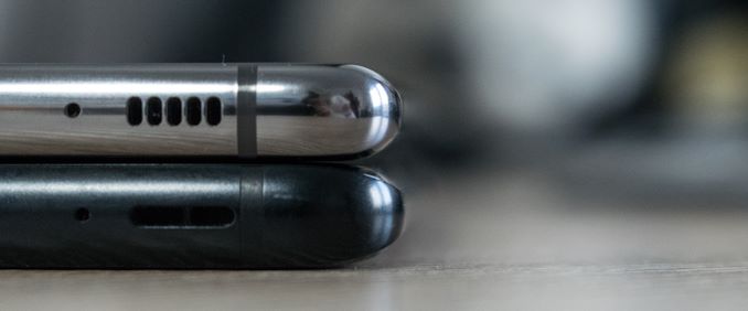
At the bottom of the phone Samsung has reverted to a S8-like grill design for the speaker holes, as opposed to the open slit on the S9. The new speakers on the Galaxy S10 are actually fantastic, and the new earpiece especially shines. I’ll talk more about this in the latter dedicated section.
Lastly, the Galaxy S10 includes a 3.5mm headphone jack. Over the last two years I’ve been very vocal about various manufacturers' irrational desire to remove the jack, and thankfully Samsung is resisting this trend. Instead, Samsung delivers on every single checkbox, including a thin design with a big battery. Though while we're on the subject of audio, it’s to be noted that I again discovered there’s audio discrepancies between the two chipset units this year, something we’ll be addressing a bit later on.
Overall, I think my writing about the Galaxy S10+’s design has been quite critical, more-so than any past Samsung phone. Design aesthetics can be very subjective, so items like the camera cut-out are probably not much of an issue to most people, however I have a much bigger gripe with the S10 when it comes to the ergonomic changes. The one positive change in this regard is that Samsung has managed to noticeably reduce the weight of the phone compared to its predecessors, which helps to make up for some of its other ergonomic changes.


229 Comments
View All Comments
sweetca - Saturday, March 30, 2019 - link
Lol.sonny73n - Sunday, March 31, 2019 - link
No, I don’t have a job. I’m retired but I own a computer repair shop. However I get to repair phones sometime. Building and repairing PCs is just my hobby. It’s hardly a job.I was going to tell you about a few samsung junks I have in my drawer and their problems but It’s pointless trying to educate someone like you. To others, you’re just a fanboy. To me, you’re a low life who has nothing to live for but worshipping corporation and your god is samsung.
bigboxes - Monday, April 1, 2019 - link
derpchrnochime - Monday, April 1, 2019 - link
I want this skill of yours that can tell some random stranger on internet is employed or not just by reading their one post.Kamus - Sunday, March 31, 2019 - link
Someone's jelly...Vermite - Sunday, May 19, 2019 - link
Who pays you to post these moronic comments?Gastec - Saturday, March 30, 2019 - link
As a Galaxy user I'm offended by: upday, Game Optimizing Service, KLMS Agent, Knox Enrollment Service, KnoxBBCProvider, Samsung Galaxy Friends, Samsung Experience Service, Samsung Members and the rest of the shit that I don't want in my device but can't uninstall.flyingpants265 - Sunday, March 31, 2019 - link
It's quite strange how they keep this up for years and years without realising it's a bad idea.It wouldn't be such an issue if the apps weren't hard-coded into the phone and absorb battery life without you knowing it, and if the rest of the Samsung ROM wasn't bloated as well.
s.yu - Sunday, March 31, 2019 - link
How on earth does it absorb battery life if you disable it? Also some of the few that can't be disabled could be put to sleep. Do you have proof that Knox etc. impact battery life in any significant way?niva - Monday, April 1, 2019 - link
Where in his message did he say anything about disabling or putting things to sleep, or even uninstalling?The fact is, that none of those things should be on the phone in the first place. If Samsung, or any other company feels their software is better than what's already on the platform why not make this software freely downloadable for Samsung customers? Because it's not better.
You shouldn't have to uninstall, disable, sleep software on the device in order for it to function somewhat normally. Do you have proof that Knox etc. doesn't impact battery life in any significant way?