The Microsoft Surface Studio Review
by Brett Howse on January 20, 2017 8:00 AM EST- Posted in
- Desktop
- Microsoft
- Surface
- Surface Studio
Color Modes: sRGB, DCI-P3, and Vivid
Next up, let’s take a look at the color gamut accuracy on the three different display modes. sRGB is the one that most people are going to want to use most of the time, because most applications do not have any color management, but in the images below you can see just how much larger the P3 gamut is. It appears P3 is making its way to being the next gamut for computers, but without color management, it is going to be a messy transition.
sRGB
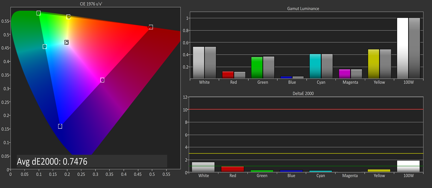
sRGB is still the default target for almost everything, so it is important to get this one right, even more than the others. You can see that the Surface Studio easily covers the sRGB gamut, and it is almost perfect at doing it. Really only the white levels bring the error levels up, with the colors almost perfect for this gamut.
DCI-P3

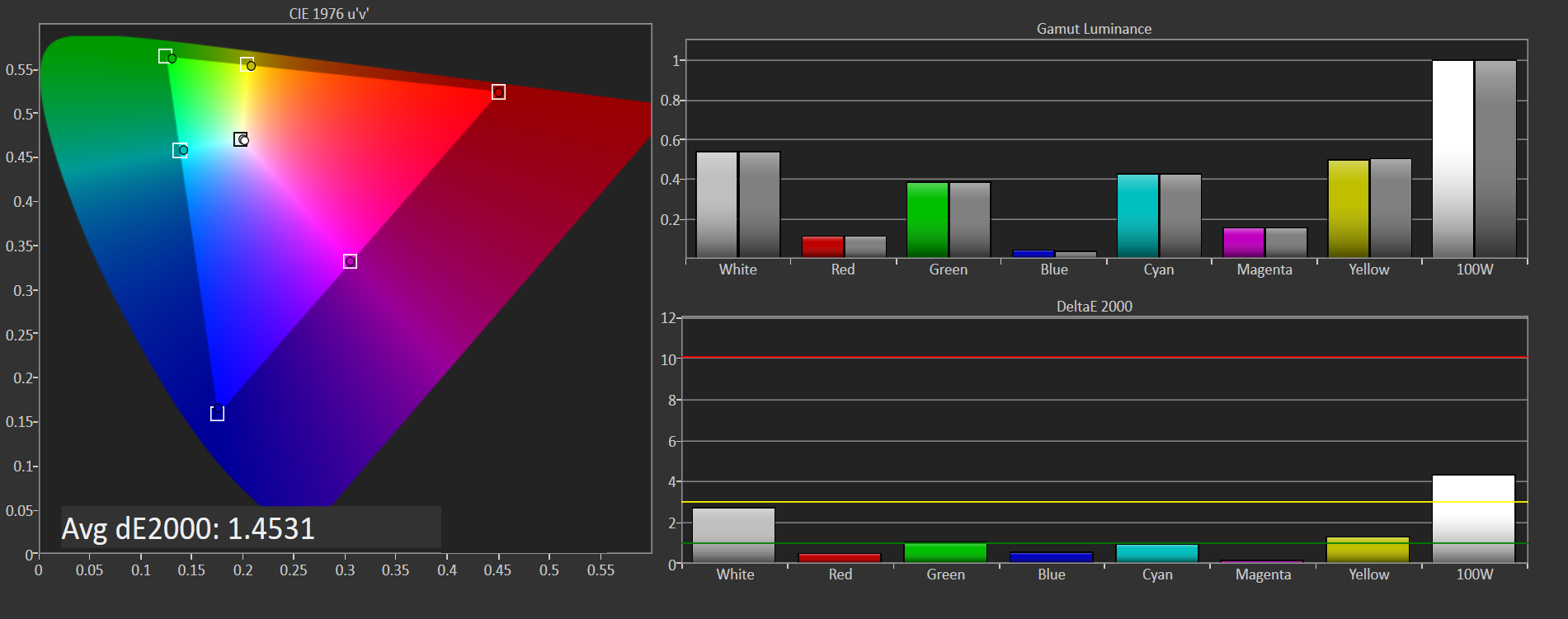
The sRGB gamut coverage was good, but the DCI-P3 is even better, with a much more accurate white point for this color space really helping the average error level here. But take a good look at the actual white point in the image, which is the square inside the triangle. On this color space, the white point shifts much higher into green, and away from the pure white you would expect of sunlight, which we call D65. The DCI-P3 gamut does not use D65, and is therefore not really going to be used much on the Surface Studio.
Vivid
Although called Vivid, this color mode is the correct P3 color space for computers, which is P3 D65. The gamut coverage is the same as DCI-P3, but the white point moves to the D65 point which is sunlight at noon. The Surface Studio is somehow even more accurate hitting this gamut than the two that are correctly named. Using the name Vivid is a poor choice in naming this when the other two color spaces are named correctly, so if you do own or buy a Studio, and you do want to look at P3 gamut content, Vivid is the correct color space to choose for this.
Color Accuracy
Now that we’ve looked at the various color spaces, it’s time to examine each one individually to see how the Surface Studio performs when set to each color space.
sRGB
On the sRGB tests, the grayscale and saturation tests were done to the new 2017 standard of 4-bit steps rather than 5% and 20% steps respectively. This gives a better picture of what the display is doing, and a much more accurate gamma result.
Grayscale
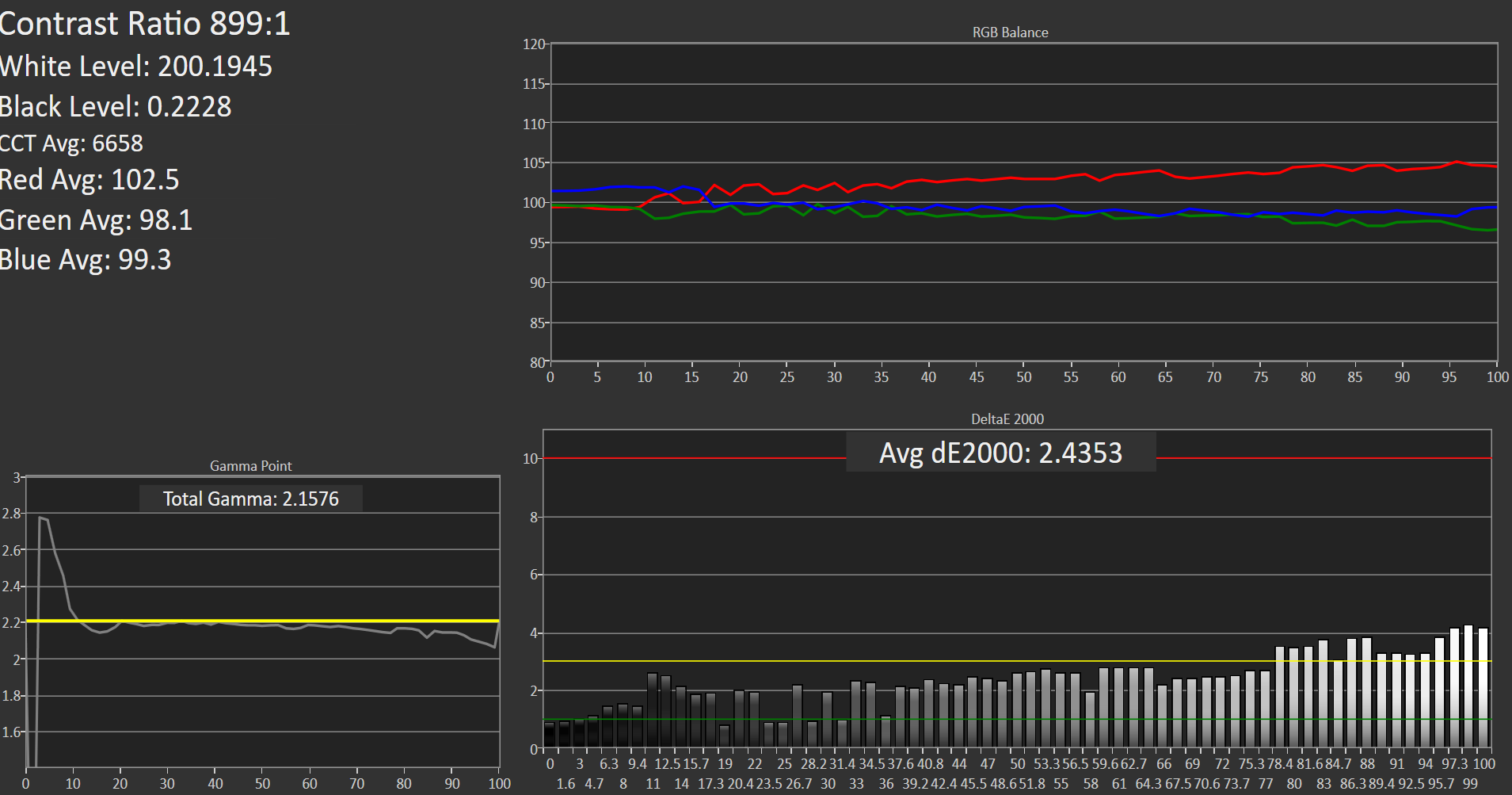
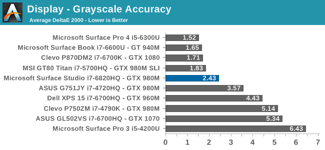
Microsoft nailed the gamma, which should be 2.2, and it very nearly is. However some errors creep up in the grayscale as the image gets closer to 100% white, with the red levels too high, and green a bit low. Overall, it’s still a very good average result, but not perfect. Notice how far they have come since the Surface Pro 3.
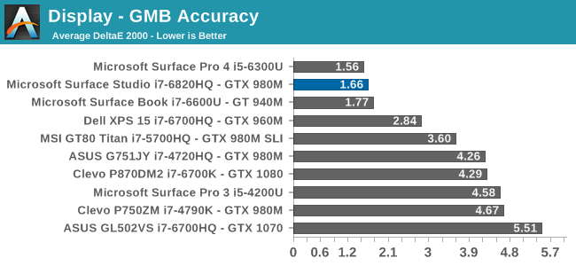
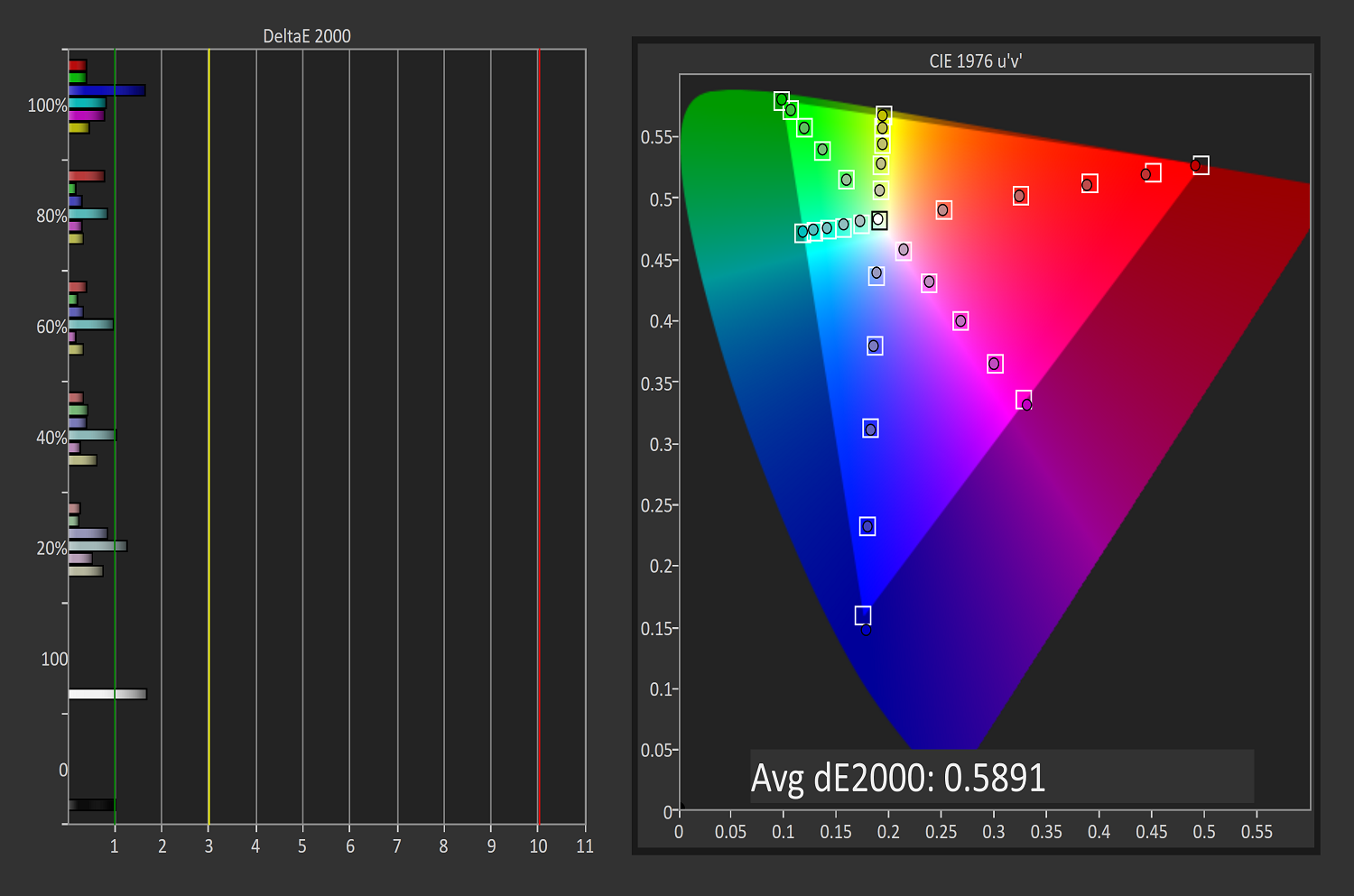
Saturation
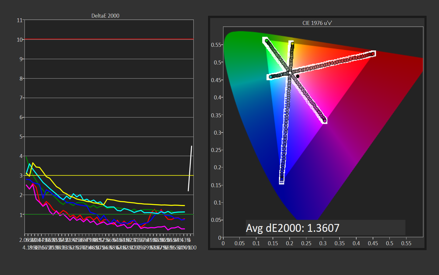
Once again, other than the white level errors at 100% white, the saturation result is fantastic. An overall error level of just 1.36 is very strong, and the individual color traces show that there are no real issues with any of the primary or secondary colors when set to sRGB.
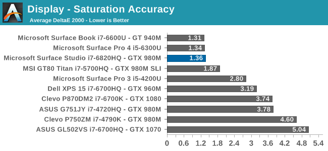
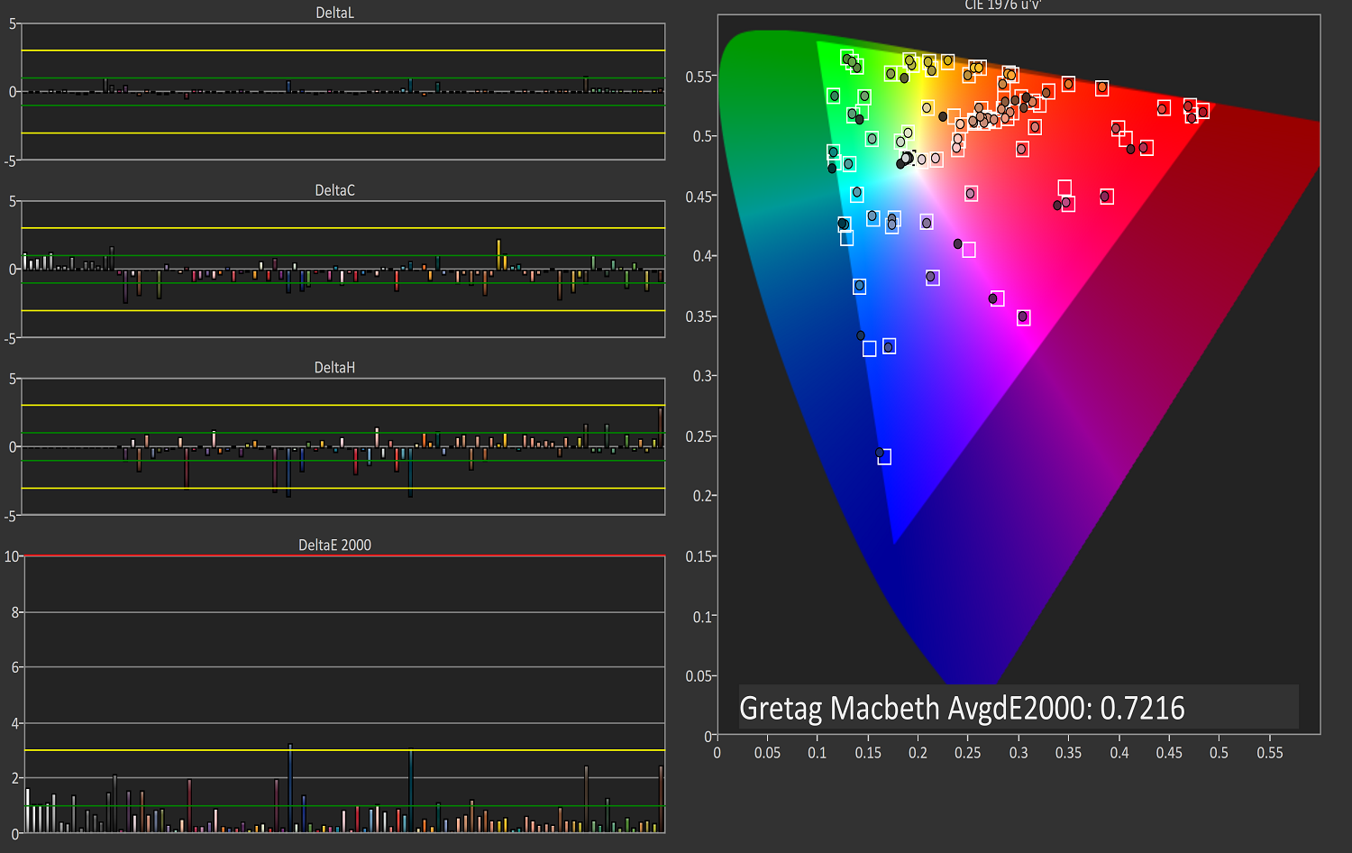
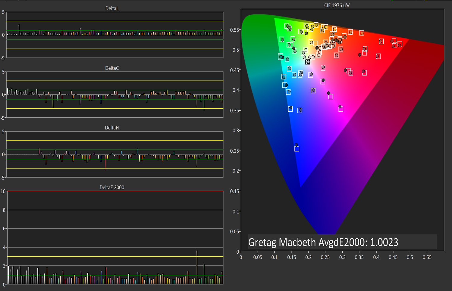
Gretag Macbeth

This test is the most comprehensive test, covering a large number of color points, including the important flesh tones. Here, again, the Surface Studio ends up with a fantastic result, and other than a single color, most of the errors are less than two, with many much closer to one. The sRGB results have started off very strong.
DCI-P3
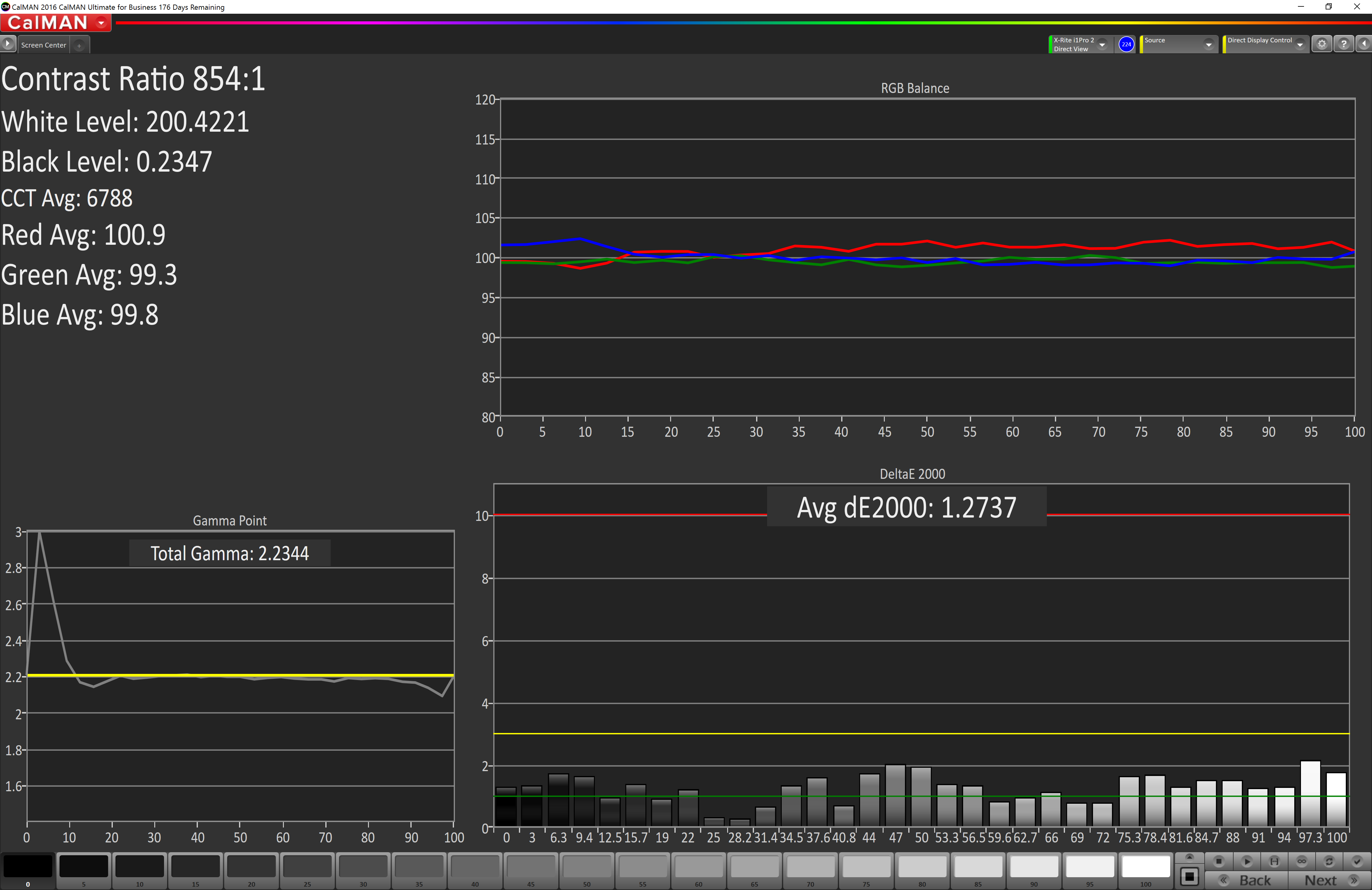
Grayscale
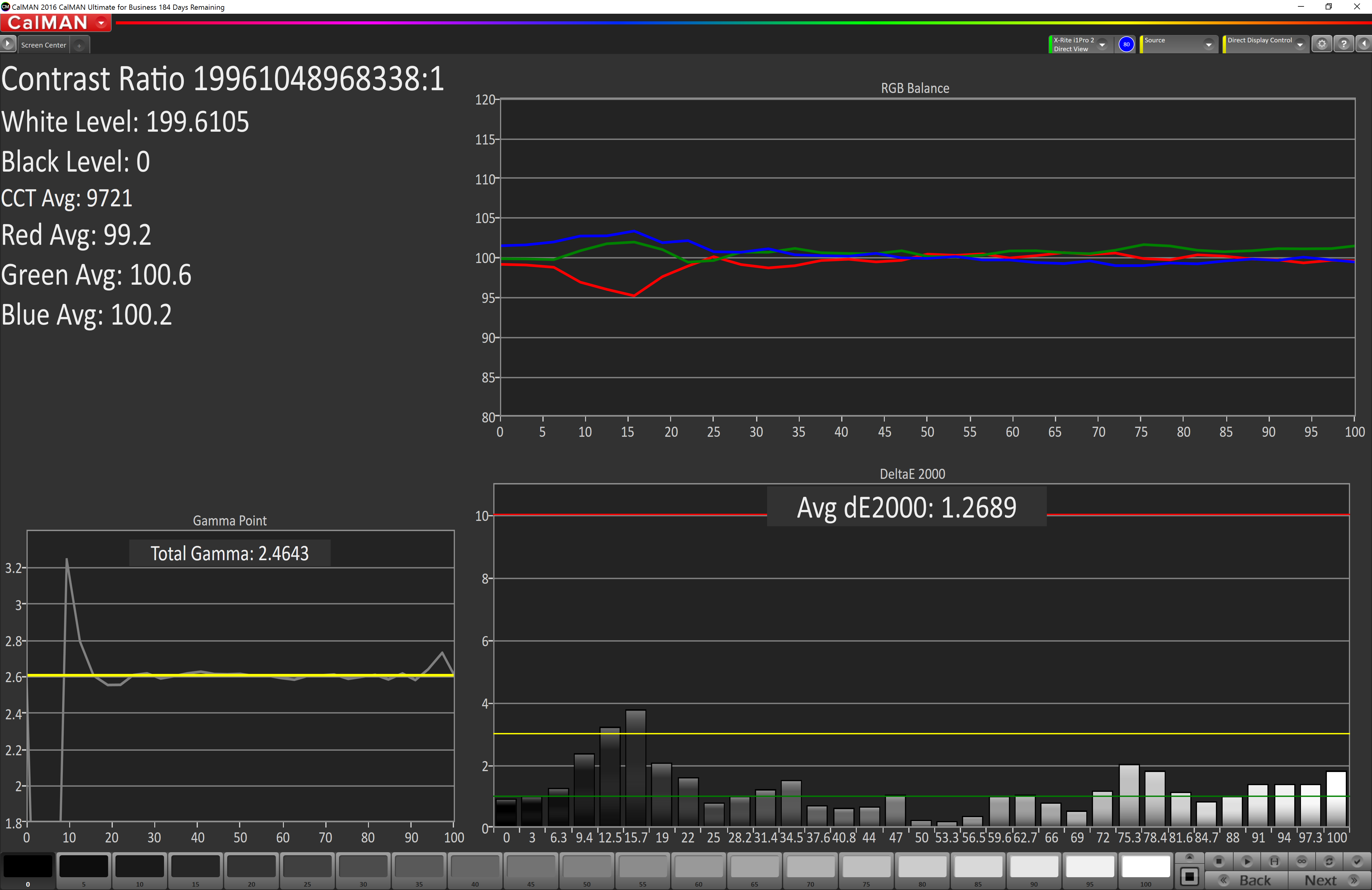
When testing for the DCI-P3 color space, the gamma changes to 2.4, and the Surface Studio correctly hits this gamma as well. Across the entire grayscale sweep, the red, blue, and green levels are very consistent, and the average error level is just 1.27, which is outstanding. The display hits this new gamma and white point almost perfectly.
Saturation
Continuing its impressive results, the Surface Studio is practically perfect on the DCI-P3 saturation sweeps. The blue results and 100% white are the only real issues, but neither of them are really much of an issue at all.
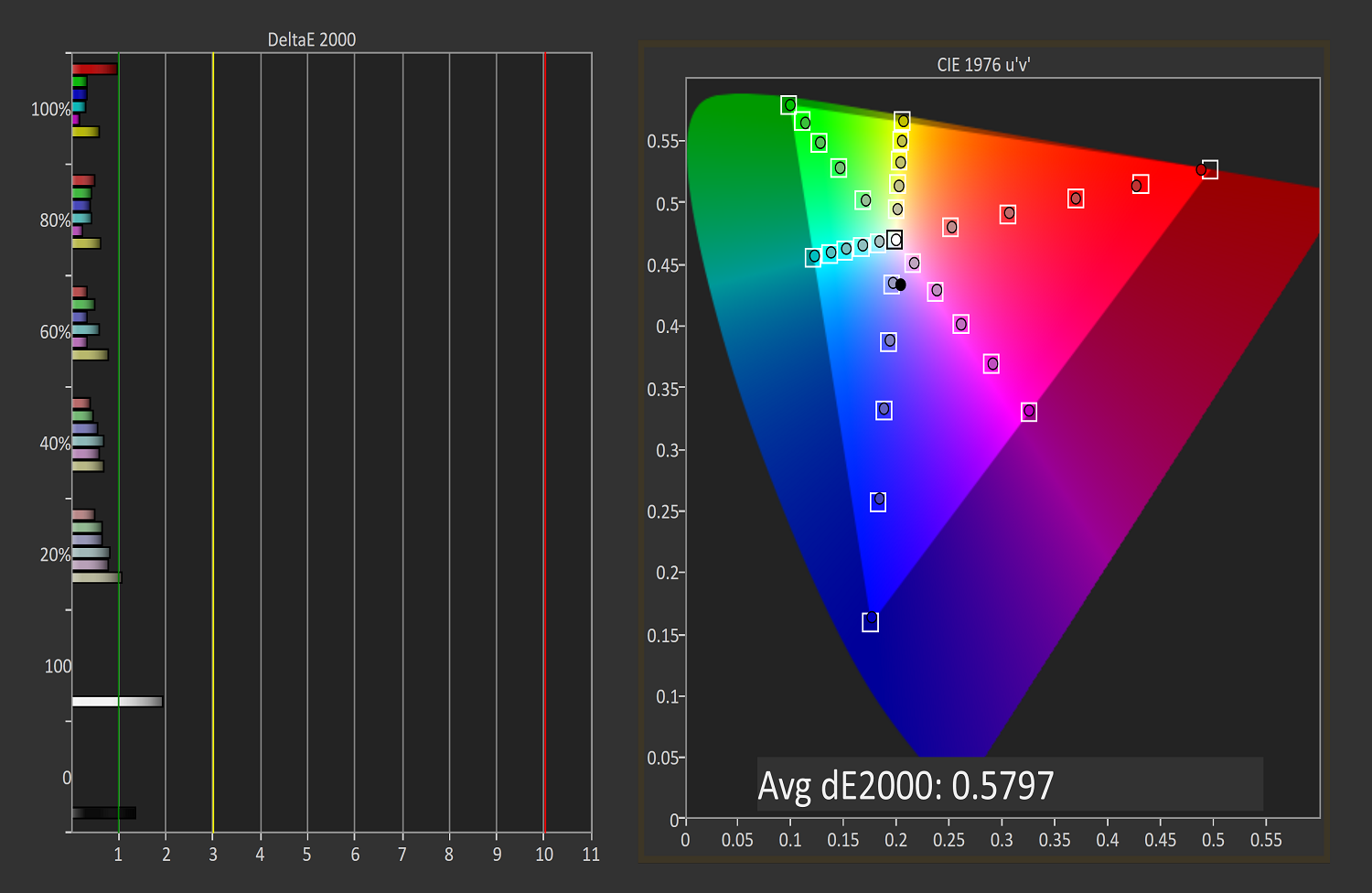
Gretag Macbeth
An average error level under one is a great result again, and although there are a few individual colors that jump up to dE 2000 of three or so, almost every color tested is well under one.
Vivid (P3 D65)
Grayscale
The P3 D65 gamut moves back to a gamma of 2.2, and the Surface Studio nicely hits that. The error levels on the grays are all very low, with only 97.3% white jumping over the two line. The D65 white point is also almost perfect, with the red just a bit higher than it should be, but not to a level that would be very noticeable.
Saturation
The saturation graph is amazingly accurate. Only 20% yellow even crosses the one mark, outside of white and black.
Gretag Macbeth
Finally, the Gretag Macbeth test continues the trend of fantastic display calibration on the Surface Studio. Just a single color tested has an error level over three, with pretty much the rest of the tested colors showing an error level of under one. It is a pretty fantastic result.
Display Conclusions
It’s difficult to not be impressed by the work put into the Surface Studio’s display. Here we have a display with an ICC profile for sRGB, DCI-P3, and P3 D65, and in every gamut, the accuracy levels are near, if not the best, that have ever been tested on this site. It is a fantastic achievement, and a testament to what can happen if a company decides to focus on quality. There is no doubt that the Surface Studio’s display is the stand-out feature on this PC, and Microsoft has taken the time to individually calibrate each display to one of the highest levels of accuracy possible.
The fact that this display also features ten-point multitouch, and pen support, as well as having accuracy that is top-notch, makes the Surface Studio arguably the best computer display targeted towards consumers and prosumers. Combine that with the excellent 3:2 aspect ratio, the high pixel density, and practically perfect display scaling, and it would be hard to find any faults with this display. It truly is a masterpiece.


197 Comments
View All Comments
Gigaplex - Wednesday, January 25, 2017 - link
That doesn't mean much unless you know how much stock they had.fallaha56 - Wednesday, January 25, 2017 - link
this is absolutely itwhat an idiotic idea to release this with anything less than cutting edge hardware
especially the HDD and GPU -MS muppets
Keao - Friday, January 20, 2017 - link
Well to have just one computer for both uses in case you're having a home office and want to unwind playing games every now and then.Also i concur with piroroadkill, I'd love to get the screen + hinge alone to be powered by my desktop unit :-3
tipoo - Friday, January 20, 2017 - link
If you buy a 4 grand machine for creative work, running a game on the side is just a bonus. No one is buying this as a dedicated gaming machine, of course.Gich - Friday, January 20, 2017 - link
Yes, so not really a point to make that it sucks at gaming.Devo2007 - Friday, January 20, 2017 - link
Except that for some reason it has a built in wireless adapter for the XBOX One controller. Can't even play some of the Play Anywhere games like Forza Horizon 3 or Gears of War at the best settings.jlabelle2 - Monday, January 23, 2017 - link
What are "best settings"? I am sure it can play Horizon 3 at 1080p like a XBox One or Battefield.It is an awesome little addition (the wireless controller built-in).
DanNeely - Friday, January 20, 2017 - link
Artists at game companies would be the most trivial example.lefty2 - Friday, January 20, 2017 - link
"Most people would use the pen with the same hand as they would use the mouse, and their non-dominant hand ends up not being utilized."This is not true if you are using photoshop. You have your left hand on the keyboard to quickly switch tools (i.e 'e' for erase, 'b' for brush, etc.)
BrokenCrayons - Friday, January 20, 2017 - link
I love your work Brett, but um..."Even at first glance, the sleek, beautiful lines are readily apparent..."
That's got cheesy written all over it. I know that it's good to help build mental images in the reader's mind when writing descriptively, but you're reviewing computer hardware here and not writing a romance novel. Besides that, you have pictures clearly showing a rectangular screen attached to a little box with an angular base. What exactly is sleek about it? It's blocky, industrial, and machine manufactured and Microsoft's designers didn't appear to make any attempt to hide that fact.