The Microsoft Surface Studio Review
by Brett Howse on January 20, 2017 8:00 AM EST- Posted in
- Desktop
- Microsoft
- Surface
- Surface Studio
Design and the Zero-Gravity Hinge
Microsoft has built a brand around Surface, and that’s not an easy thing to accomplish. The Surface Studio fits in very well with the design ethos of the rest of the Surface lineup, and there has been quite a bit of attention to details paid in the creation of their first desktop computer. The first, and most obvious, is the finish, which matches perfectly with the other Surface devices, despite being made from aluminum rather than the magnesium alloy used on the portable products.
The 3:2 aspect ratio of the Surface Studio display is now a hallmark of the Surface brand (outside of Surface Hub), and having a taller display makes doing most tasks on a desktop a more pleasant experience. The increased surface area can’t be forgotten either, with the Surface Studio offering 17% more screen real estate than what's arguably the Studio's closest competitor, the 27-inch iMac, which amounts to an additional 54 square inches of display. Widescreen at 16:9 has never been a great aspect ratio for PC tasks, but the proliferation of high definition television seems to have moved the entire industry this way in an effort to save costs. When looking at the price of the Surface Studio, it’s important to remember that the entire display industry has moved to 16:9 as a standard, which impacts the entire supply chain and tooling required. Moving to an aspect ratio outside of 16:9 has large cost implications, but the end results are certainly worth it. Hopefully we will see a few other manufacturers use this as a means to source displays like this, much like the Surface Pro 3 and Pro 4 have ushered in more 3:2 devices at that much smaller size. And speaking of attention to detail, the Surface Studio is actually 28.125-inches diagonal, and as we'll see in a bit, that last 0.125-inches is very important.
It seems with Surface, Microsoft always wants to have a trick up their sleeve. With the original Surface RT and Surface Pro, it was the kickstand, which has been adopted by quite a few manufacturers for their own device since it works so well. When they launched their first laptop, the Surface Book, it was the muscle wire locking mechanism to remove the display from the base, as well as the dynamic fulcrum hinge to make the top-heavy laptop more stable. With the Surface Studio, the zero-gravity hinge is most definitely its signature design feature.

With two chrome arms flanking the base, the Surface Studio can almost effortlessly be folded down into a drafting table. The hinge mechanism provides a perfect counterbalance to the weight of the display, making it feel like it has almost no weight at all. The hinge is a single movement as well, so you don’t tip and fold the screen, but instead folding the screen also causes it to move down. While this does limit the functionality somewhat – for instance, you can't move the screen half way down and then fold it up straight again – the result is truly a wonderful design which almost needs to be seen in person.
Because you can’t tip the screen without folding it, once you stop at any angle, the screen is very solid to work with, although it is the most secure when folded all the way down to the 20° angle. You would think a large desktop display would not be ideal to use with touch, but the Surface Studio zero-gravity hinge invites you to be more interactive with it, by keeping the display close and folding it down when needed. More traditional all-in-one computers with a touch screen are nowhere near as easy to work with, since holding your arm in dead-air can be tiring, but the folded display doesn’t suffer from these burdens.
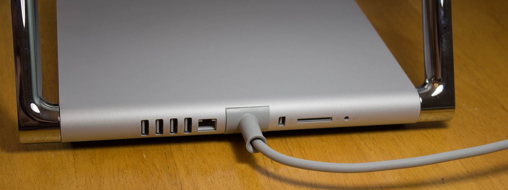
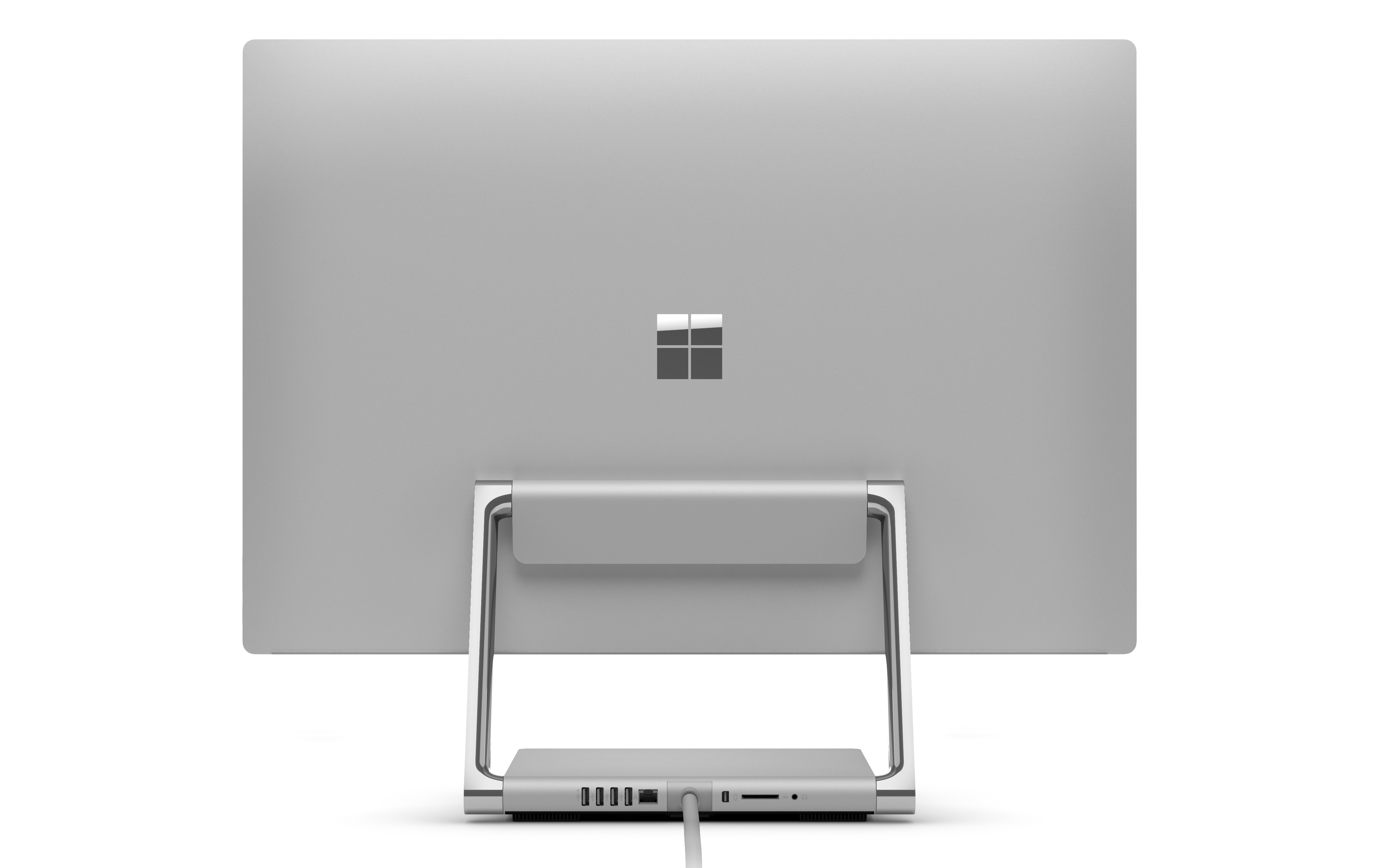
The PC base also exudes Surface quality, with the signature color, and cooling vents all the way around in the same fashion as the Surface Pro and Surface Book. The PC base can be disassembled from the bottom if required, for access to the storage and fans, but the remainder of the system is soldered to the board as you would expect in a small form factor device like this. The most frustrating part of the Surface Studio base is that all the inputs and outputs are on the rear of the device, so connecting something over USB, or inserting a SD card into the PC, is not as simple as it should be. This is a form over function decision, and it would be nice to see some of the ports offered at least on the side of the base to make it a bit easier to access.
The desktop PC market has not been as exciting to watch as the smaller and more portable laptops and tablets, but the Surface Studio sets a new high mark for desktop PC design and looks. Some of the decisions are form over function, but the majority of the design decisions actually improve the user experience. The zero-gravity hinge is a masterpiece of engineering, with such a smooth action that it really does feel like the display has no mass at all.


197 Comments
View All Comments
warrenk81 - Friday, January 20, 2017 - link
what does this sentence mean? "It would be great to see backlighting as well, but that is also not missing."Does it have lights or not?
Ryan Smith - Friday, January 20, 2017 - link
One too many negations, it seems. Let's try this: "It would be great to see backlighting on this keyboard as well, but that is also absent"melgross - Friday, January 20, 2017 - link
About the review. There are a number of errors in areas in which the reviewer doesn't seem to understand,D65 is NOT daylight, the concept of what daylight is is very complex. For many decades, daylight has been standardized as 5.6K, not 6.5K. The reason why D65 was invented wasn't to simulate daylight, but because of practical graphics standards reasoning.
D5 has been the graphics standard going back a very long time. Every light box used for color was D5. So were print view boxes and such. The problem was that in the beginning days of computers entering the graphics space, a problem came up.
While my Barco monitors, in my place, that cost $16,000, could reach D5 calibration, no other could. The problem was that the monitors couldn't be made to display enough brightness. As a result, calibrating to D5 left us with a fairly dim, and very yellow screen. Since the red and green couldn't be brought up enough, the blue needed to be turned down, leaving that horrible screen. The barco was the only monitor that had enough brightness.
So there was much discussion, and as a result, D65 was decided upon as a compromise. It could easily be calibrated to using most high quality graphics monitors, and so that became the standard.
Now, we thing of D65 as daylight, but it isn't. Daylight varies from about D22 to about D20.0 in other words, about 2.2K to about 20K. Where you are in the world, at any given time of the day, or year, will determine what that point is, and it doesn't average D65.
It's why when a photo is taken with sunlight and open shade, the sun portion is very yellow, and the shade is mostly cyan.
This may seem to be a little point to make, but I see people misunderstanding this so often, it's frustrating. I ran a large commercial photo lab in NYC for many years, and we were one of the first to begin to go digital in 1988.
By the way, Windows has never had effective color management. Individual developers such as Adobe have had to write their own management software, which isn't usable systemwide. That means that if you have anything other than an image that is using the sRGB gamut, it won't be correct except when running in a color managed app.
Windows 10 is the first Windows OS to have a working color management system built-in, but it comes turned off, because turning it on at this late stage screws up everything else in Windows, and it's very buggy. Maybe someday, that will change. But for now, you can't view two images with differing gamuts side by side in Windows. Only one will ever show correctly.
This is one reason doing commercial color work on this will be a major headache.
Brandon Chester - Friday, January 20, 2017 - link
All CIE standard illuminants from series D are designed to simulate daylight. I believe by D5 you mean D50, which has a lower CCT than D65. The review is not incorrect in describing D65 as representing daylight. In fact, the actual spec states that D65 should be used for all colorimetric calculations requiring a value to represent daylight. I encourage you to read ISO 11664-2.You are correct on companies having to roll their own color management. However, Windows 10 still uses WCS, it is just as unusable as before, and neither Win32 nor UWP integrate it at all, so there is not some working CMM that is just turned off. This is why brand new UWP apps like Photos and Microsoft Edge still aren't color managed, which would be implicit in a system where the underlying graphics framework is color managed and thus any component that uses it for drawing is color managed.
melgross - Friday, January 20, 2017 - link
Yes, D50, but, hese color spaces do not actually represent daylight. They represent a convenient compromise that allows equipment to be made and maintained, while giving some "sort" of recognizable color while point.This is why the concept of daylight has varied so much over time. I know ISO 11664-2, because I was one of those who was consulted on this standard way back then. As I say, all of these various standards are mechanical approximations of something natural.
So, for example, what is a proper white point? Well, we really don't know. Should it be represented by something that supposedly looks something like "natural" light, whatever that is? Should it be represented by our own eye/brain combination which is most sensitive to yellow/green?
So when you look at the sky, it's about 20K. But that's not what's always reflected off an object, which could be closer to 3K, which is what we're looking at, and what our brain recognizes as "correct", with its ability to adjust its perception to various light sources.
I've undergone many permutations of these questions over the decades. And it will change again.
I did say that WCS is so buggy that it's still turned off. But that's not the only reason. Microsoft's customers don't care about color management in a large enough percentage for Microsoft to really care. They only added this, years ago, to satisfy those screaming for it, but without bothering to really work on it. Enough said, they think, that it's there.
You basically said what I did, it with more explanation. Yeah, it's always been a mess, and it's not likely to be fixed anytime soon. Android, by the way, has no color management whatsoever, and isn't likely to get any, which is why wide band screens on Android products are almost useless.
id4andrei - Friday, January 20, 2017 - link
I'm curious, in the case of something like a Samsung Galaxy phone, when you select the supposedly exceptionally accurate "basic" profile is that not akin to switching colorspaces on the Studio? I mean Samsung does not use pure Android which as you said is completely inept at color management, but a modified and skinned Android that might have some rudimentary color management. Is it not?Brett Howse - Friday, January 20, 2017 - link
How do I put this. If there was color management, it wouldn't matter what gamut the display was able to use, since the colors would be transformed to fit that color space, assuming the display color space covers both. So, as an example, if you were viewing a sRGB photo on a P3 D65 display, the colors would be correct because there is color management, and it knows the photo is sRGB, and it knows the display is P3 D65, so it can use some math to put the sRGB photo into the correct P3 D65 space.If you don't have color management, and something is 85% red in sRGB, but your display is P3 D65, it will appear as 85% of the larger space, and would be oversaturated.
We should really have Brandon write up a piece on this outside of the few times he's addressed it.
Some Windows apps do have color management, and some respect the color management in Windows, but most do not. For instance the old Photo Viewer does work, but the new UWP Photos app has no color management. Apps like Adobe Photoshop have written their own color management, so they generally work well.
id4andrei - Saturday, January 21, 2017 - link
Aha so viewing a random sRGB picture on your presumably AdobeRGB Android smartphone would look waaaay off. While an AdobeRGB picture would look right.Brett Howse - Saturday, January 21, 2017 - link
Exactly, and that's the case on Android. iOS has color management, so the P3 D65 displays they've started using don't suffer from this issue.Icehawk - Sunday, January 22, 2017 - link
I bet this is why colors were off viewing a file in the new Photo app (like way off) but using the old Photo Viewer it looked right.