The Apple Watch Series 2 Review: Building Towards Maturity
by Brandon Chester on December 20, 2016 8:00 AM EST- Posted in
- Wearables
- Apple
- Apple Watch
- Apple Watch Series 2
Display
On the surface, the need for a good display on a smartwatch may not be as evident as the need for a good display on a laptop or a smartphone. After all, your watch is tiny, you don’t do any color-critical work on it, and you generally only glance at it for short periods of time. However, even from the perspective of sharpness alone, the difference between a good smartwatch display and a poor one is immediately evident. While smartwatches go beyond the functionality of a traditional watch, at the end of the day they exist to tell the time, and in many cases they do so by mimicking the interface of an analog watch. When trying to digitally represent a physical object that everyone is familiar with, any issues in the representation will be obvious. In the case of a watch, you have to render thin straight lines with a level of sharpness that is competitive with a physical object that will obviously not have any sort of aliasing at all.
To give some perspective, I wore the Huawei Watch back in 2015. It has a 1.4” 400x400 circular OLED display. This gives it a pixel density of 286ppi, which doesn’t sound that bad for a watch. However, that’s 286ppi on a PenTile OLED display, which is significantly different from 286ppi on a standard RGB display. When you factor in the artifacts that PenTile causes on the edges of lines, along with the reduced red/blue resolution, it’s really not an exaggeration to say that the rendition of lines and text on that screen is, at best, equivalent to Android devices from six or seven years ago with 200-230ppi RGB displays. This is clearly not a sufficient level of sharpness to mimic the interface of an analog watch, and it’s certainly not suitable for rendering fonts at the small sizes required to fit information onto such a small display.
In designing the original Apple Watch, Apple was clearly aware of the issues that would arise if the display did not have a sufficient level of sharpness. At the same time, the Apple Watch was Apple’s first device with an OLED display, and using OLED has traditionally come with the issues of the PenTile subpixel arrangement that I outlined above. In designing their own OLED display, Apple managed to avoid these issues by pushing a pixel density equivalent to that of their iPhones, while also avoiding the use of a PenTile subpixel matrix.
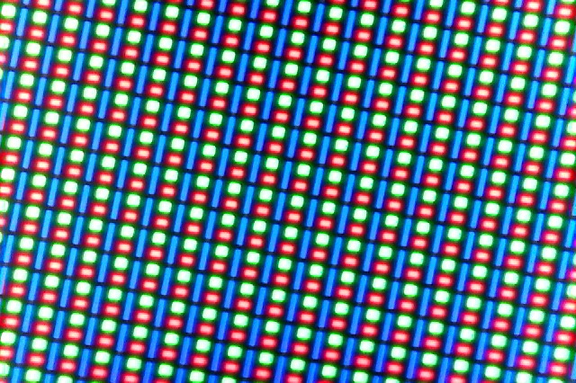
The image above shows that Apple’s subpixel arrangement does have three subpixels for each pixel, which means that the red/blue resolution is just as high as the green resolution. This arrangement is similar to that of Samsung’s S-Stripe pattern, which uses three subpixels per pixel but with different sizes for each subpixel, and an arrangement that places the blue subpixel vertically where the green and red subpixels are horizontal, rather than having all three oriented in the same way. This arrangement is not perfect, and it does have some visual issues that are not as obvious on a typical RGB display, such as more noticeable chromatic aliasing on the edges of lines. However, the overall sharpness is essentially equivalent to that of a standard RGB display, and in practice the Apple Watch is far sharper than any Android Wear watch that I’ve seen, with the only true competitor being Samsung’s Gear S2/S3 which sports a 302ppi S-Stripe AMOLED display.
As I mentioned before, nobody is going to do any color-critical work on their Apple Watch. However, we’ve seen in the past how Apple values color accuracy across their devices, and the first generation Apple Watch was actually more accurate than many smartphones at the time. If you’re going to ship a color display, it’s worth trying to achieve some level of color accuracy so applications will actually look like they did when developers and designers created them on their own calibrated monitors. The Apple Watch also allows you to view photos synced from an iPhone, and it’s not a good experience to have photos look wildly different based on the device they’re viewed on.
Testing display accuracy on the Apple Watch presents issues that don’t exist on smartphones, with the most significant being that you cannot manually set the brightness. The display has three brightness settings, but this just serves to bias the auto-brightness curve, and you cannot actually set a fixed brightness like on a smartphone. This doesn’t really present a usability concern, as the auto-brightness algorithm works very well, and manually setting brightness would just lead to situations where the display is too dim or too bright for the environment. However, it does make it challenging to match our standard testing brightness of 200 nits. Fortunately, I was able to create a lighting situation that set the display to 203 nits and kept it there, and from there I was able to use an application I created for our internal use to run through the display patterns without the display shutting off and adjusting its brightness accordingly.
The first area I wanted to tackle was the display’s peak brightness. The first Apple Watch had a peak brightness of around 450 nits at 100% average picture level (APL). This means that when the display was pure white the brightness was 450 nits, and the nature of brightness on OLED displays means that in many scenarios the brightness was actually higher than that due to watchOS’s dark interface style.
With Apple Watch Series 2, Apple is advertising a peak brightness of 1000 nits. This is quite a claim, and the instant I heard it I suspected that it would not be applicable at 100% APL. It’s worth noting that Samsung reached such brightness levels on the Galaxy Note 7, but this only occurred when the display APL was 1%, which means that the display output was equivalent to 1% of pixels being white and the rest being completely black, which is a worthless data point because such a scenario would never occur.
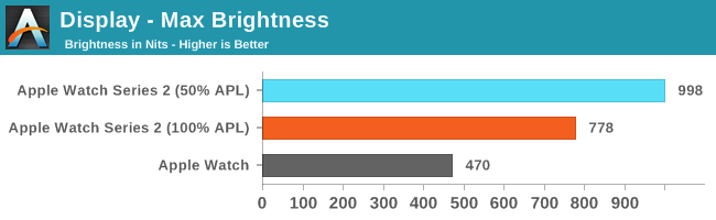
As you can see in the chart above, Apple is actually able to reach this level of brightness with an APL of 50%, which means that half the display was lit up to 100% white and the other half was black. This is very impressive, and as I mentioned above, watchOS often is much darker than that, so this level of brightness can generally be achieved by the display when necessary. I cannot keep the display awake long enough in order to see how long this can be sustained, but that’s also indicative of the Apple Watch’s interaction model making it unnecessary to sustain this level of brightness for a long period.
As for the display at 100% APL, it still reaches an impressive 778 nits. This is much brighter than the first generation Apple Watch, and the difference in visibility outdoors is immediately apparent when comparing the two.
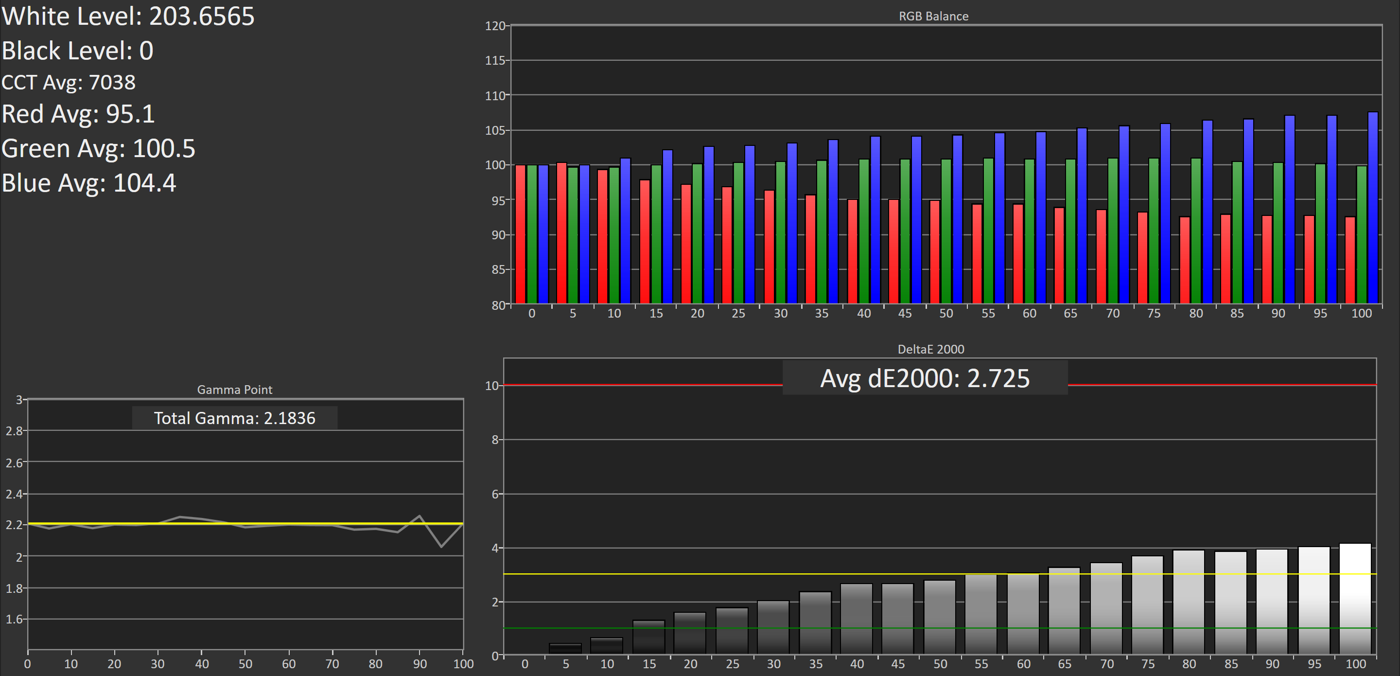
Next up is our standard greyscale accuracy test. It’s clear that the Apple Watch is skewed toward blue, which is interesting given that the blue emitters have the shortest lifetime and are the least efficient, so I’m unsure why Apple would calibrate the display in this manner. However, the gamma is quite straight, and tracks closely with the target of 2.2. Ultimately the average error is below three, and most of the error comes from the bias toward blue. I cannot think of any scenario where this would pose a usability issue, and it’s actually impressive to see Apple putting this level of effort into calibrating their watch.
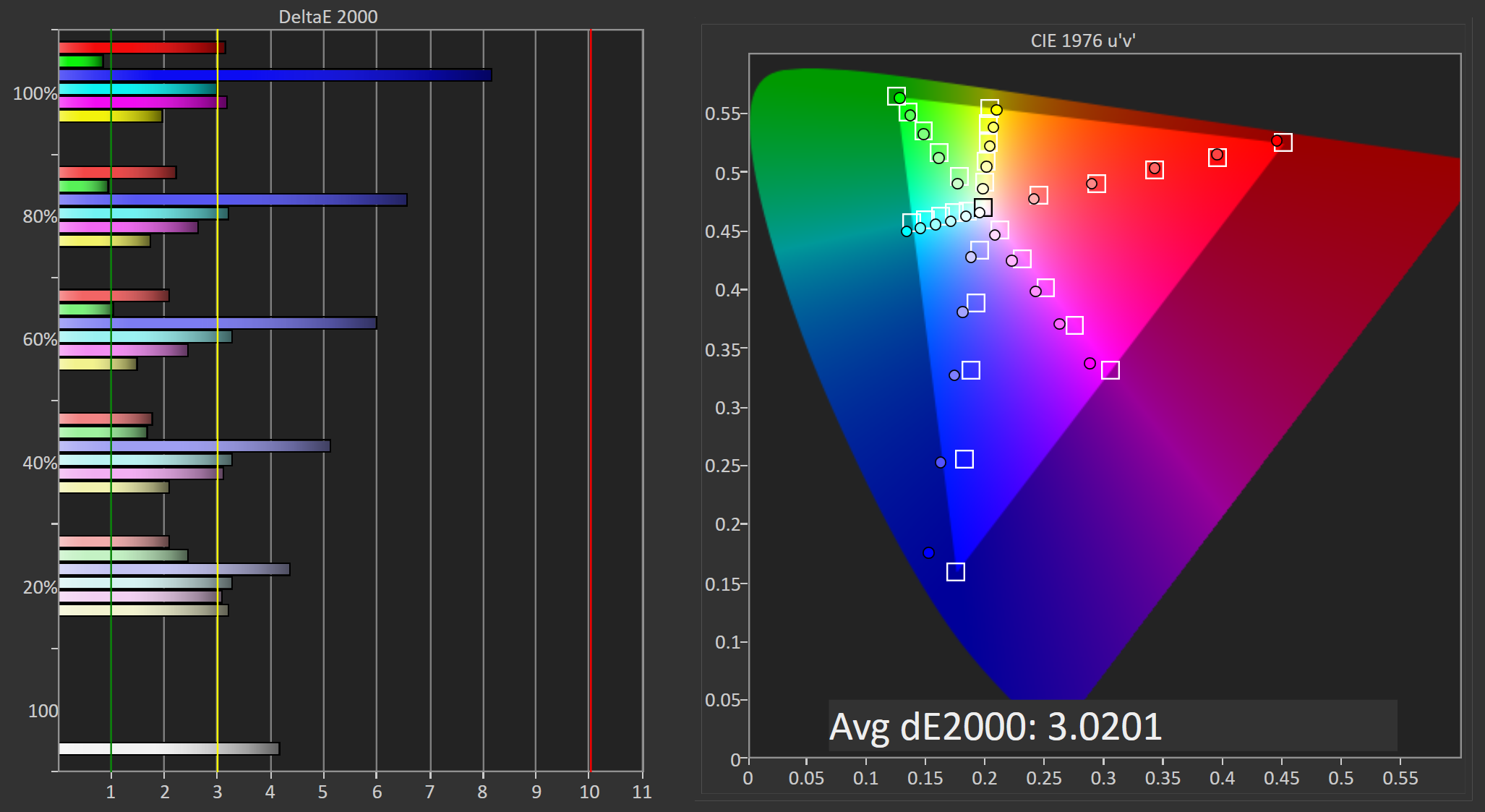
Saturation accuracy is generally quite good. The errors with blue contribute to most of the overall error, with all other colors coming in at a DeltaE of three or lower. The overall error is 3.02, and if blue was more accurate it would be significantly lower. It’s worth noting that the accuracy is very similar to that of the original Apple Watch unit that we reviewed, and I’d be interested in finding out why Apple is calibrating the displays in this manner.
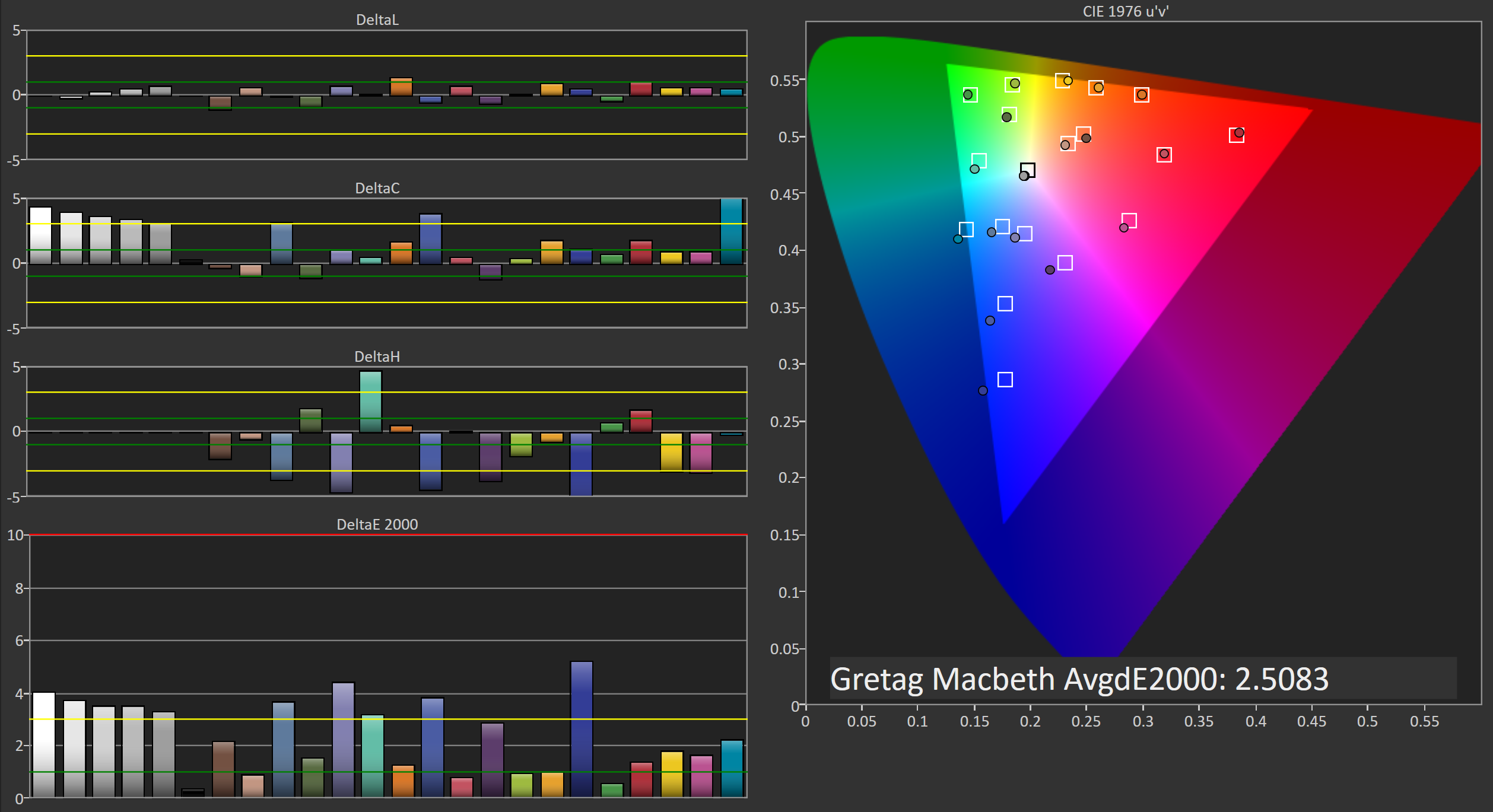
Finally, we have the GretagMacbeth ColorChecker test, which examines the accuracy of a selection of surface colors that occur naturally. In this test Apple Watch Series 2 also does very well, with an average error that would probably be suitable for amateur photo work, and much better than one would expect from a watch. The major errors are in the greyscale shades and colors that have a significant blue component, which isn’t surprising when you consider the results of the greyscale and saturation tests.
The original Apple Watch’s display was quite impressive for a first-generation OLED display from Apple, as well as Apple’s first ever smartwatch. At the time, the one major issue with the display was that the peak brightness wasn’t enough to overcome reflections on the display, especially when outdoors. This was especially true of the sapphire models which have a higher reflectance than the less expensive models that use standard glass on the display. Apple Watch Series 2 basically overcomes this by pushing the brightness to a level where it can overcome the reflections on the glass. The display could definitely benefit from an improved anti-reflective coating as well, but simply pushing brightness does work as a solution on its own.
Given Apple’s recent improvements in display technology, the one area I expect to be targeted for improvement is the color gamut on the display. Again, this honestly isn’t that relevant on a watch, but it mostly comes down to maintaining the same rendering across all Apple devices. With Apple deploying their Display P3 color space on their Macs and iOS devices, it makes sense to bring it to the Apple Watch as well so designers can use the same set of colors across all devices. At this point I think it’s merely an issue of power consumption, as we’ve seen that properly tuned OLED displays can handle covering the gamut defined by DCI-P3 with little difficulty, but pushing a wider gamut incurs a power penalty that a smartwatch can’t really afford.
Beyond that, I really can’t find anything wrong with Apple Watch Series 2’s display. The display of the original Apple Watch was already very impressive, and Apple Watch Series 2 is even more so. As far as sharpness goes, Apple is still leading in this space, and they can now push the brightness higher than an OLED TV with HDR support. It’s honestly kind of crazy that this is the level of quality that one can expect from a watch, especially because you aren’t even guaranteed it on smartphones or computers that cost substantially more.


126 Comments
View All Comments
goatfajitas - Thursday, December 22, 2016 - link
"IMO, I think the wearable craze for premium wearables has/is fading quickly"- It never was a craze. The whole "hype" around it wasn't customers clamoring for it, it was all generated by OEM's trying to create a new revenue stream... There simply was never the demand to match the hype. It's just not needed. Why would large volumes of people want to buy a product that is slower than their phone with a much much smaller screen that has some, but not all of the functionality they already have in their phone? Of course some people want it, but most couldnt care less.
FunBunny2 - Thursday, December 22, 2016 - link
-- Why would large volumes of people want to buy a product that is slower than their phone with a much much smaller screen that has someumm, because they're convinced that the Dick Tracy stories from 1946 (see: the wiki) were actual history. also, such folks likely voted for Donald thinking that all those obsolete factories would be re-opened and give the $50K/year jobs. people believe what they want to believe, when it makes no sense at all (Mellencamp).
goatfajitas - Friday, December 23, 2016 - link
Key word = large volumes. OEM's are trying to create another huge market with huge revenue streams and it just isnt happening. I agree some people will buy them, and already have, but it will never be as big as OEM's are hoping it will... The screen is simply too small. The market has already proven that people want larger screens, even though Apple fans denied it for years until Apple invented large screened phones of course.jmke - Friday, December 23, 2016 - link
here is a reason why you will be very thankful to have one on your wrist:"I was in a pretty serious car accident the other day. I was hurt, and I hit my head head against the roof of the car right above the door. My phone was in the cupholder because I had started some music playing, and during the accident my phone flew out and I wasn't sure where it went. Thanks to the apple watch, I was able to call 911 and my wife got a text that I had called 911 and sent her my exact location. After a couple minutes I was able to get up and out of the car, and off the highway, my watch even helped me find my phone before it was put on the tow truck."
https://www.reddit.com/r/AppleWatch/comments/5jqig...
Valis - Saturday, December 31, 2016 - link
I totally agree, I haven't worn a wrist-something for over 15 years, or so. Don't think I will start now.ibex333 - Tuesday, January 17, 2017 - link
Because the apple watch, unlike the $50 crap you mentioned tracks your heart rate, and steps "ACCURATELY". Something that most other wearables cannot do.TheSerpentSays - Wednesday, March 1, 2017 - link
You're asking why people might want different things than you.Jumangi - Tuesday, December 20, 2016 - link
What a pointless tech vanity device...Ironchef3500 - Tuesday, December 20, 2016 - link
+10WinterCharm - Tuesday, December 20, 2016 - link
not vanity, just convenience.Notifications on your wrist before it rains? filtering out the most annoying notifications and only getting relevant ones on your wrist? health and fitness tracking?
And it looks nice.
Luxury device, yes. Vanity device? no. Pointless? absolutely not.