The iOS 10 Review: Refining the iOS Experience Both Over & Under the Hood
by Brandon Chester on September 13, 2016 12:00 PM ESTThe Evolution of Apple's Design
For its first six iterations, the design of iOS remained fairly constant. The original design made heavy use of skeuomorphism, with interface elements mimicking real life objects and surfaces. Game Center had green felt like a game table, the calendar had wood borders and simulated paper pages that could only be viewed one at a time. Perhaps the most ridiculous situation was the Contacts application on iPad, which had black borders on the top and bottom because the application itself had to mimic the dimensions of a book or a planner. This type of design was helpful when introducing the world to multi-touch interfaces, but as time went on it became impossible to ignore how they imposed the same limitations of the physical objects they mimicked onto the device's digital interface.
There's more history beyond the design shift from iOS 6 to iOS 7, but the changing of Apple's executive positions isn't really interesting or relevant from a consumer perspective. Suffice to say, iOS 7 brought about the first major redesign in the history of iOS, and that design had to be put into place in a very short span of time. Because iOS 7 was a rapid redesign, it didn't have the level of refinement that one could expect from a mature user interface. The beta cycle for iOS 7 made this very clear, with the first releases using incredibly thin font weights that Apple soon thickened as feedback came in from developers and users about the poor balance between aesthetics and usability.
Perhaps one of the biggest changes in iOS 7 was the removal of the lines and borders that had previously been used to separate the different parts of the interface. While iOS 6 made it very clear that a button was a button by giving it shading, a drop shadow, and a border, in iOS 7 a button was just some text or a glyph sitting on a view. Views themselves often didn't have obvious separators either. As Apple refined their design in iOS 8 and iOS 9 it became more obvious which parts of the UI represented buttons and other views that the user could interact with, and Control Center provides a good example of this.
iOS 10 brings the biggest change to the design of iOS since iOS 7. iOS 7 pushed the design ideology as far as possible, and it ended up going too far by making it difficult to distinguish different parts of the UI. iOS 10 takes a step backward from that and finds a middle ground between the bleeding edge design that iOS 7 adopted and the more segmented design of an OS like Android or earlier versions of iOS. To illustrate what I mean, I've included some screenshots below illustrating how key areas of the interface have been revamped in iOS 10, including the previously mentioned Control Center.
As you can see, iOS 10 makes it much more clear how different views are separated from each other using what could be described as bubbles or cards. The use of cards seems like something many operating systems are moving toward, with Android using paper-like cards for the UI ever since the original launch of Google Now. In Apple's case, the cards replace what were previously rectangular views that bordered the edges of the display with sharp corners and minimal separation between elements. In the case of notifications and widgets, what were previously sections in a table view with completely transparent backgrounds are now individual bubbles for each item. The improvement to clarity here is pretty obvious, and having a separate card for each item makes it more obvious that they're a tappable element

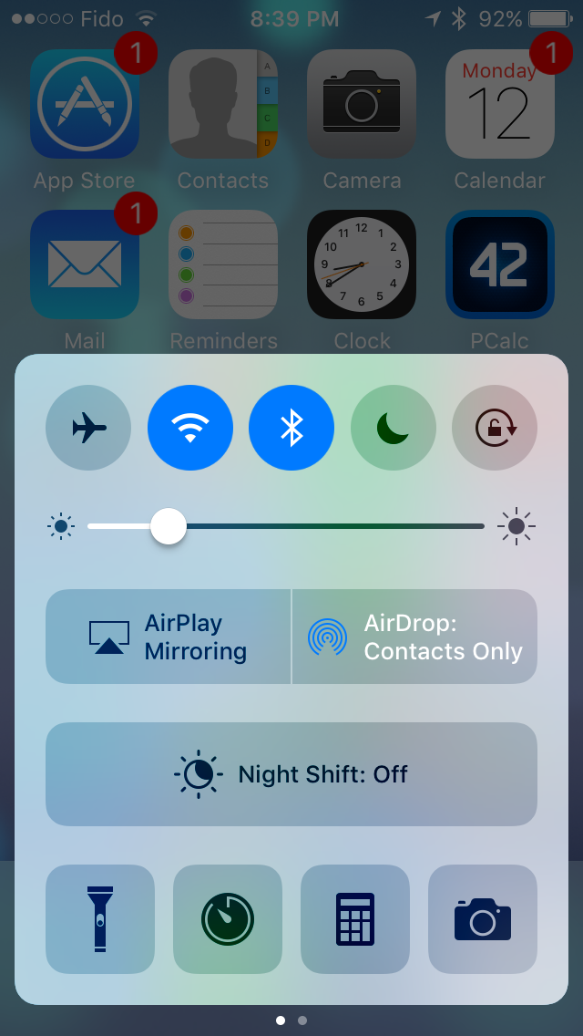
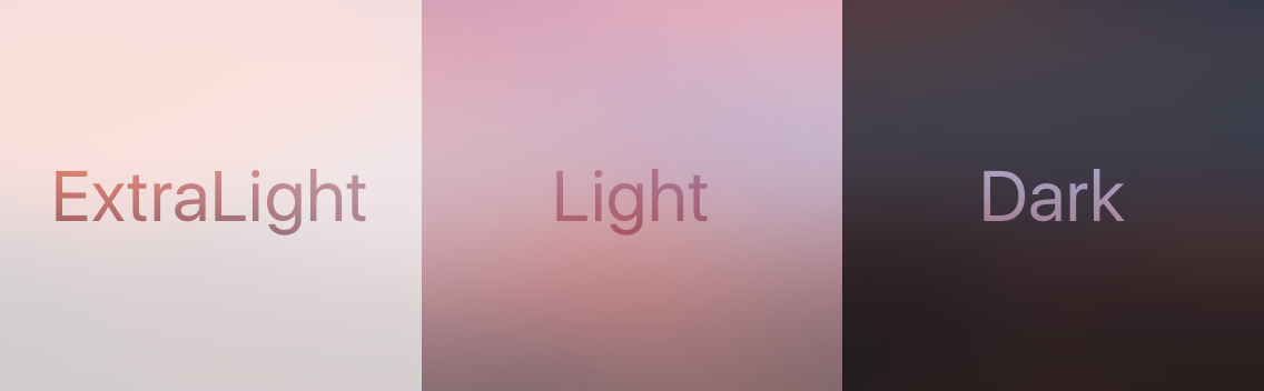
Control Center receives significant visual and functional changes as well. Like notifications, it's no longer a rectangular view, and is instead a card that comes up from the bottom of the display. Apple has continued their trend of making the distinction of buttons and their selection states more obvious as well. In iOS 7 the buttons were just icons that turned from black to white when tapped, and in iOS 8 apple removed the borders and instead distinguished the icons by using a different transparency effect to separate them from the background view. They also used a full white fill to indicate selection instead of changing the button outline from black to white. In iOS 10, the buttons are now even more distinct, with an ExtraLight VisualEffectView being used for the background and the buttons using something closer to the Light VisualEffectView setting. It's now much more obvious when buttons are selected as well, with the fill color being blue and the inner glyph changing from black to white.
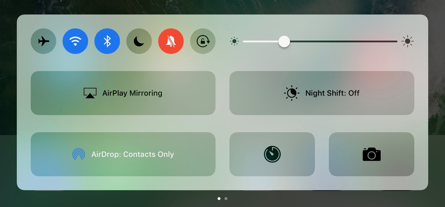
The other big change to Control Center is the new layout. Previously Apple placed all controls on a single view, but in iOS 10 Control Center now uses a PageViewController to place the toggles and settings on one section, and the music and Airplay audio output controls on the other. This allows Apple to increase the size of controls that were difficult to hit, such as the sliders for music playback and brightness. However, they've made some very questionable decisions with the size of buttons. I don't understand why Night Shift needs such a giant button when it's still just a toggle like the four buttons below it. This situation gets even more ridiculous on the iPad, which still uses two separate pages and just has comically large buttons in both sections. There's no reason the controls couldn't have been fit onto the screen at once, and UIKit's PageViewController class provides a really simple way to achieve exactly that functionality when space permits.
What is nice about the larger buttons is that you'll rarely have issues hitting the music controls. Having the second page dedicated to music means that the scrubber and buttons can be much larger, with more spacing between to prevent tapping the wrong thing. Control Center also remembers your last page so if you generally use toggles or music more it will remain positioned on that page when you bring it up again. As far as usability goes, the new Control Center is a definite improvement. I prefer the new aesthetic as well, but I find some of the size and layout choices to be questionable, especially on the iPad.
The same design changes that you'll find to Control Center and notifications exist across the entire OS. Views that were previously rectangles that bordered the edge of the screen are now floating rounded rectangles, which I generally refer to as cards even though Apple hasn't really given them an official name. The use of translucency has also been toned down in a manner of speaking. Areas that used VisualEffectViews still do so, but Apple has changed many to use the more opaque ExtraLight transparency style rather than the Light or Dark styles. In fact, everything seems to have moved up a step, with the use of Dark VisualEffectViews being almost entirely removed except for a certain part of the Maps app, having been replaced with Light views, and Light views being replaced with ExtraLight.
The design of iOS 10 still traces back to the original design principles put in place with iOS 7, but with a level of refinement that simply wasn't possible with the rapid redesign that Apple did in 2013. iOS 7 really pushed its design to the edge, with gratuitous use of transparency, no shadows, no textures, no gradients, and nothing but thin lines to separate the various parts of the interface. iOS 10 recognizes the value of separating different views into different sections, and in doing so makes it clear which objects can be interacted with and which are static.


 Facebook
 Twitter
 RSS
RSS


113 Comments
View All Comments
yhselp - Wednesday, September 14, 2016 - link
Most definitely; I agree, but I was not talking about notifications, I was talking about notification banners. Banners are a type of notification that pops up at the top of the screen when you're using the device, as opposed to when it's in your pocket. Like when you receive a message while browsing in Safari, for example. Those used to be slick, took little space, and were very easy to respond to or dismiss without opening Messages. Now they're large bubbles, it takes more swiping to interact with them, and when engaged open in full-screen on the 4-inch devices. Since I frequently send quick replies while doing other stuff, life is definitely harder for me now. How about you? Do you find banners better or worse in iOS 10 on your 5s and why?Donkey2008 - Wednesday, September 14, 2016 - link
The notifications are definitely bigger but not a showstopper IMO.lilmoe - Thursday, September 15, 2016 - link
Glad things worked out just like you wanted, or at least close.You mention that the battery life is holding up. Would you say it's the same as before? Little less or little more?
My friends are asking me constantly whether they should update. I told them to hold out for a bit, and I'm glad I did after the bricking thing (which should be fixed now).
yhselp - Thursday, September 15, 2016 - link
Hey. The battery life has kept holding up on the 5s. By this point, I highly suspect it's not going to be something to worry about. I'm pretty sure I'm imagining it, but I have a feeling I've been getting just a bit more battery life, or perhaps slower drain under some circumstances, which, in turn, might be offset by others; besides, you never know how the OS is reporting battery charge. Short and to the point: I would say it's the same as before. My SO hasn't had any trouble with the 6s either.I just can't get over the fact that these cards or bubbles, as the reviewer calls them, have been used throughout the whole OS. They work great for widgets, and similarly so in Notification Center, however, I can't overstate how much worse banners can be on any device. I think it's worth warning your friends about this. If they're used to sending quick replies by engaging banners, they might end up very irritated by iOS 10. The way it used to work is you got a banner at the top of the screen with the contents of a message you've just received while doing something else like browsing the web; if you wanted to send out a quick reply without exiting Safari and opening the Messages app, all you had to do is pull down the banner - it would extend just a little bit to reveal a text box, the keyboard would appear - type a reply and hit send upon which the whole thing would immediately disappear, leaving you to do whatever it is that you were doing. There's no need to explain why this used to be an extremely efficient way of sending out replies. The way things work now is the following: firstly, the banner is unnecessarily bigger and it's actually hard to understand where you need to pull; secondly, pulling itself takes more effort, almost as if Apple are trying to prevent accidental pulls by making it so you have to pull down farther; thridly, upon pulling down the banner you're sent into a full-screen view; finally, and most disappointingly, when you hit send the whole thing does not disappear, it just stays there, and you have to dismiss it manually. So, essentially, there're no quick replies on iOS 10. It's virtually the same to just tap on the banner, go Messages, reply, and then go back to Safari or whatever you were using. It's absolutely baffling why this was overlooked, or even worse - why Apple decided to do away with it. It's definitely a pain for me, I hope Apple come to their senses and reintroduce this properly.
"Cards" are not so great for displaying missed calls/messages on the lock screen. I've failed to return a call from the lock screen more than once now, and have instead swiped left to widgets. On a 4-inch iPhone, cards take up took much space on the lock screen when displaying missed calls/messages, as well as when they appear as banners at the top of the screen.
Hope I've been helpful.
lilmoe - Thursday, September 15, 2016 - link
-- "I think it's worth warning your friends about this [banners]"It probably is, and I'll be sure to point it out. As long as performance is improved and battery life isn't compromised, I'm sure it's better to update, for the security enhancements at least.
-- "Hope I've been helpful."
You sure are :) Thanks for the detailed reply. I appreciate actual user feedback much more than redundant "all hail" PR.
Teknobug - Wednesday, September 14, 2016 - link
Apple: With iOS 10 we're bricking your old iPhone and we have the iPhone 7 available for upgrade.Donkey2008 - Wednesday, September 14, 2016 - link
Google: Want the newest Android version for your phone? Buy a new Android phone. Although your carrier *might* release the update in a year or two.The difference; Your Apple conspiracy is just a joke whereas the Google conspiracy is real.
fanofanand - Wednesday, September 14, 2016 - link
Nice job again Donkey! I hope Apple pays you by the word!yhselp - Wednesday, September 14, 2016 - link
Yeah, except it's usually vendors, like Samsung, that decide against releasing new versions of Android for their older devices, and not Google.Teknobug - Wednesday, September 14, 2016 - link
Samsung update the 2 year old S5, HTC and LG updates some older phones too. At least most Androids don't cost $800-1000 when you need to get a new one.