The iOS 10 Review: Refining the iOS Experience Both Over & Under the Hood
by Brandon Chester on September 13, 2016 12:00 PM EST
The momentum of the mobile space has changed in the past year. As the market for high end smartphones approaches saturation, the focus on the software side has moved from massive feature expansions to refinement and optimization. We saw great examples of this with both iOS and Android over 2014 and 2015. Whereas iOS 8 and Android Lollipop were heavy with feature releases, iOS 9 and Android Marshmallow were much lighter. Following up to a large feature release provided both teams a good time to reflect upon their development directions and a focus on improving the user experience.
2016 marks a very special year for iOS. After launching as iPhone OS back in 2007, iOS has gone through many iterations and a name change, and has now arrived at version 10. Although version numbers are somewhat arbitrary – Apple has been on macOS 10 for sixteen years now – the tenth major release for an operating system is still an important and exciting milestone. It means that a platform has withstood the test of time, and ideally has had ample opportunity to mature. At the same time however, because it’s a milestone, it’s a reflection on both the past and the future; what has come before, and what is yet to come. For Apple and its eager customer base, iOS 10 embodies this well: the company is in a position where they need to deliver a substantial update, if for no other reason than to satisfy expectations.
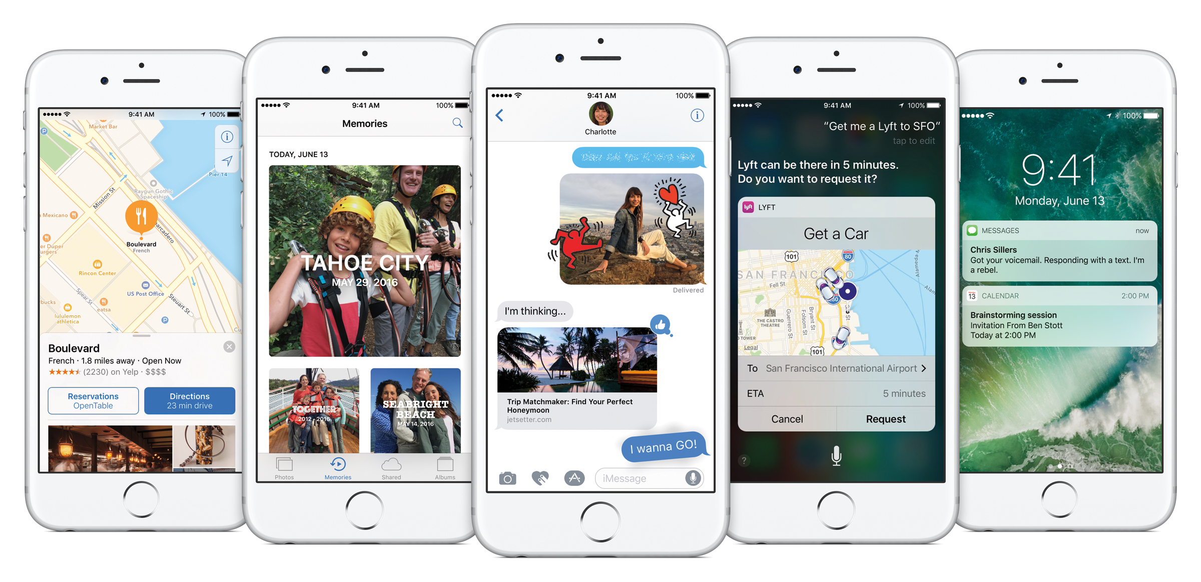
With iOS 10 it's difficult to describe what Apple has focused on. It's really one of those OS releases that makes changes to every part of the system. There are big design changes, and big app changes, plus new features and APIs so developers can make even better applications. On top of all that there are performance improvements to bring back the smoothness to areas where it was lost during Apple's rapid redesign and feature boosts in iOS 7 and 8.
With feature-rich releases it can often be difficult to decide where to start the discussion. To keep in line with my previous iOS reviews I'll start off with a look at what changes Apple has made to the iOS UI before moving on to feature changes at the app level and then finishing with changes at the developer level. Without any further delay, lets dive into the new refined design of iOS 10.


113 Comments
View All Comments
yhselp - Wednesday, September 14, 2016 - link
Most definitely; I agree, but I was not talking about notifications, I was talking about notification banners. Banners are a type of notification that pops up at the top of the screen when you're using the device, as opposed to when it's in your pocket. Like when you receive a message while browsing in Safari, for example. Those used to be slick, took little space, and were very easy to respond to or dismiss without opening Messages. Now they're large bubbles, it takes more swiping to interact with them, and when engaged open in full-screen on the 4-inch devices. Since I frequently send quick replies while doing other stuff, life is definitely harder for me now. How about you? Do you find banners better or worse in iOS 10 on your 5s and why?Donkey2008 - Wednesday, September 14, 2016 - link
The notifications are definitely bigger but not a showstopper IMO.lilmoe - Thursday, September 15, 2016 - link
Glad things worked out just like you wanted, or at least close.You mention that the battery life is holding up. Would you say it's the same as before? Little less or little more?
My friends are asking me constantly whether they should update. I told them to hold out for a bit, and I'm glad I did after the bricking thing (which should be fixed now).
yhselp - Thursday, September 15, 2016 - link
Hey. The battery life has kept holding up on the 5s. By this point, I highly suspect it's not going to be something to worry about. I'm pretty sure I'm imagining it, but I have a feeling I've been getting just a bit more battery life, or perhaps slower drain under some circumstances, which, in turn, might be offset by others; besides, you never know how the OS is reporting battery charge. Short and to the point: I would say it's the same as before. My SO hasn't had any trouble with the 6s either.I just can't get over the fact that these cards or bubbles, as the reviewer calls them, have been used throughout the whole OS. They work great for widgets, and similarly so in Notification Center, however, I can't overstate how much worse banners can be on any device. I think it's worth warning your friends about this. If they're used to sending quick replies by engaging banners, they might end up very irritated by iOS 10. The way it used to work is you got a banner at the top of the screen with the contents of a message you've just received while doing something else like browsing the web; if you wanted to send out a quick reply without exiting Safari and opening the Messages app, all you had to do is pull down the banner - it would extend just a little bit to reveal a text box, the keyboard would appear - type a reply and hit send upon which the whole thing would immediately disappear, leaving you to do whatever it is that you were doing. There's no need to explain why this used to be an extremely efficient way of sending out replies. The way things work now is the following: firstly, the banner is unnecessarily bigger and it's actually hard to understand where you need to pull; secondly, pulling itself takes more effort, almost as if Apple are trying to prevent accidental pulls by making it so you have to pull down farther; thridly, upon pulling down the banner you're sent into a full-screen view; finally, and most disappointingly, when you hit send the whole thing does not disappear, it just stays there, and you have to dismiss it manually. So, essentially, there're no quick replies on iOS 10. It's virtually the same to just tap on the banner, go Messages, reply, and then go back to Safari or whatever you were using. It's absolutely baffling why this was overlooked, or even worse - why Apple decided to do away with it. It's definitely a pain for me, I hope Apple come to their senses and reintroduce this properly.
"Cards" are not so great for displaying missed calls/messages on the lock screen. I've failed to return a call from the lock screen more than once now, and have instead swiped left to widgets. On a 4-inch iPhone, cards take up took much space on the lock screen when displaying missed calls/messages, as well as when they appear as banners at the top of the screen.
Hope I've been helpful.
lilmoe - Thursday, September 15, 2016 - link
-- "I think it's worth warning your friends about this [banners]"It probably is, and I'll be sure to point it out. As long as performance is improved and battery life isn't compromised, I'm sure it's better to update, for the security enhancements at least.
-- "Hope I've been helpful."
You sure are :) Thanks for the detailed reply. I appreciate actual user feedback much more than redundant "all hail" PR.
Teknobug - Wednesday, September 14, 2016 - link
Apple: With iOS 10 we're bricking your old iPhone and we have the iPhone 7 available for upgrade.Donkey2008 - Wednesday, September 14, 2016 - link
Google: Want the newest Android version for your phone? Buy a new Android phone. Although your carrier *might* release the update in a year or two.The difference; Your Apple conspiracy is just a joke whereas the Google conspiracy is real.
fanofanand - Wednesday, September 14, 2016 - link
Nice job again Donkey! I hope Apple pays you by the word!yhselp - Wednesday, September 14, 2016 - link
Yeah, except it's usually vendors, like Samsung, that decide against releasing new versions of Android for their older devices, and not Google.Teknobug - Wednesday, September 14, 2016 - link
Samsung update the 2 year old S5, HTC and LG updates some older phones too. At least most Androids don't cost $800-1000 when you need to get a new one.