The iOS 10 Review: Refining the iOS Experience Both Over & Under the Hood
by Brandon Chester on September 13, 2016 12:00 PM ESTRethinking Widgets
Widgets have been a key part of Android since its earliest days, but iOS has never adopted them in the same manner. With iOS 5 Apple introduced Notification Center, which included two widgets of sorts that pulled information from the Weather and Stocks apps. These really just existed to give a quick update on information when you went to check notifications, and they weren't a persistent part of the home screen like widgets on Android are.
Fast forward to iOS 7 and widgets received an overhaul. They still existed in Notification Center and couldn't really be customized, but they now formed what Apple called Today view, which existed on a separate page from notifications and provided relevant information relating to upcoming meetings and reminders, stock prices, and the weather. With iOS 8 Apple opened widgets up to developers, allowing anyone to present relevant information as a section in the Today view. Of course, this kind of customization was new for Apple and for iOS, and there was conflict between Apple and certain developers who had created widgets that provided functions beyond what Apple had originally intended.
To be honest, I think widgets have provided a poor user experience on both iOS and Android, although for different reasons. My problem on Android is that widgets have no standards for design, padding, and appearance, and so your home screen turns into a mess of mismatched widgets. iOS resolved this by providing a standard interface for widgets that developers would simply provide a view for, and widgets were not placed among the app icons which helped cut down on clutter. Unfortunately, the solution of putting widgets in Notification Center only worked in theory, and in practice you never end up pulling down Notification Center to check your widgets. Android got it right by putting them in the launcher, but there needs to be a better solution for organization and visual uniformity.
iOS 9 actually presented a solution to the widget problem on iOS, although nobody would have known at the time. In my iOS 9 review I talked about the new search screen to the left of your first home screen. This screen had a number of fixed widgets, such as Siri app suggestions and content pulled from News. At the time I remarked on how similar this screen was to Google Now, but that it really didn't provide value to the user and seemed poorly thought out. In iOS 10 that screen has been scrapped to make room for a new space just for widgets.
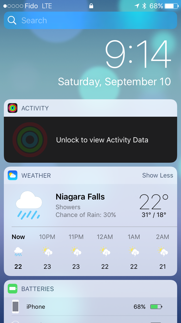
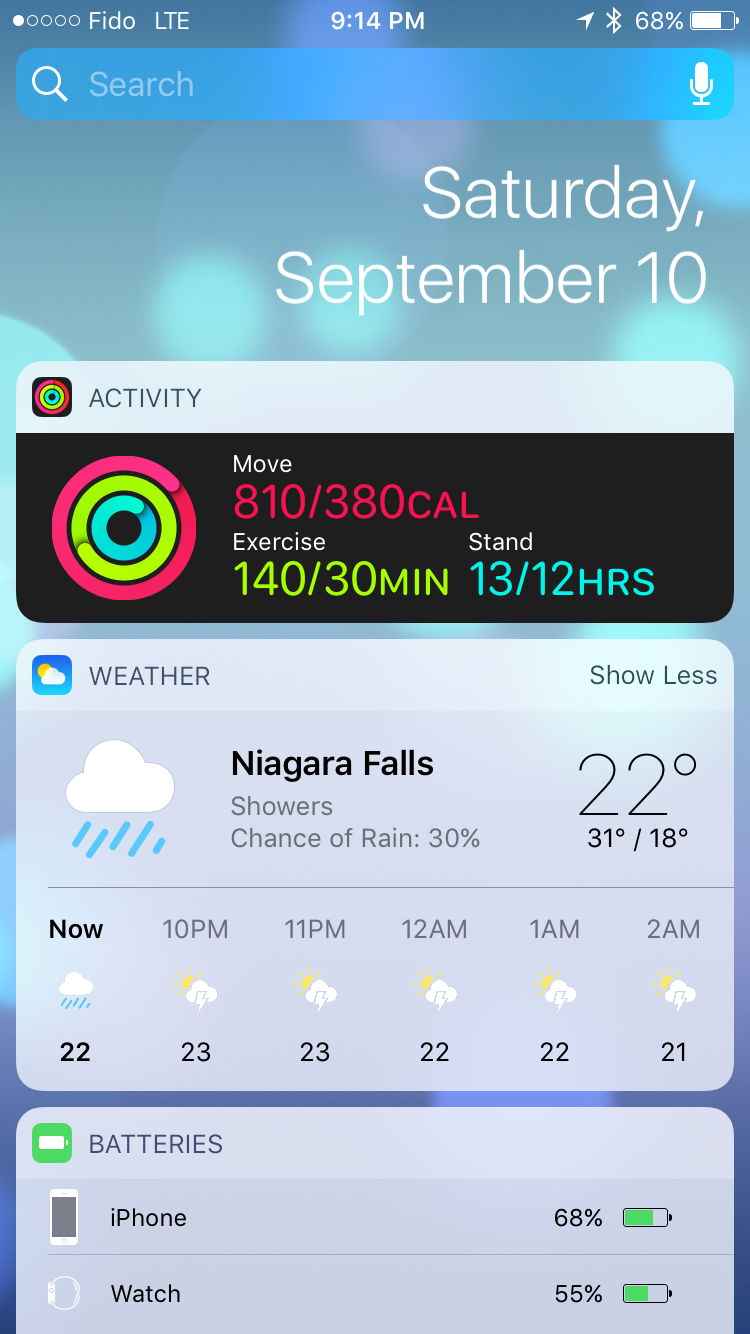
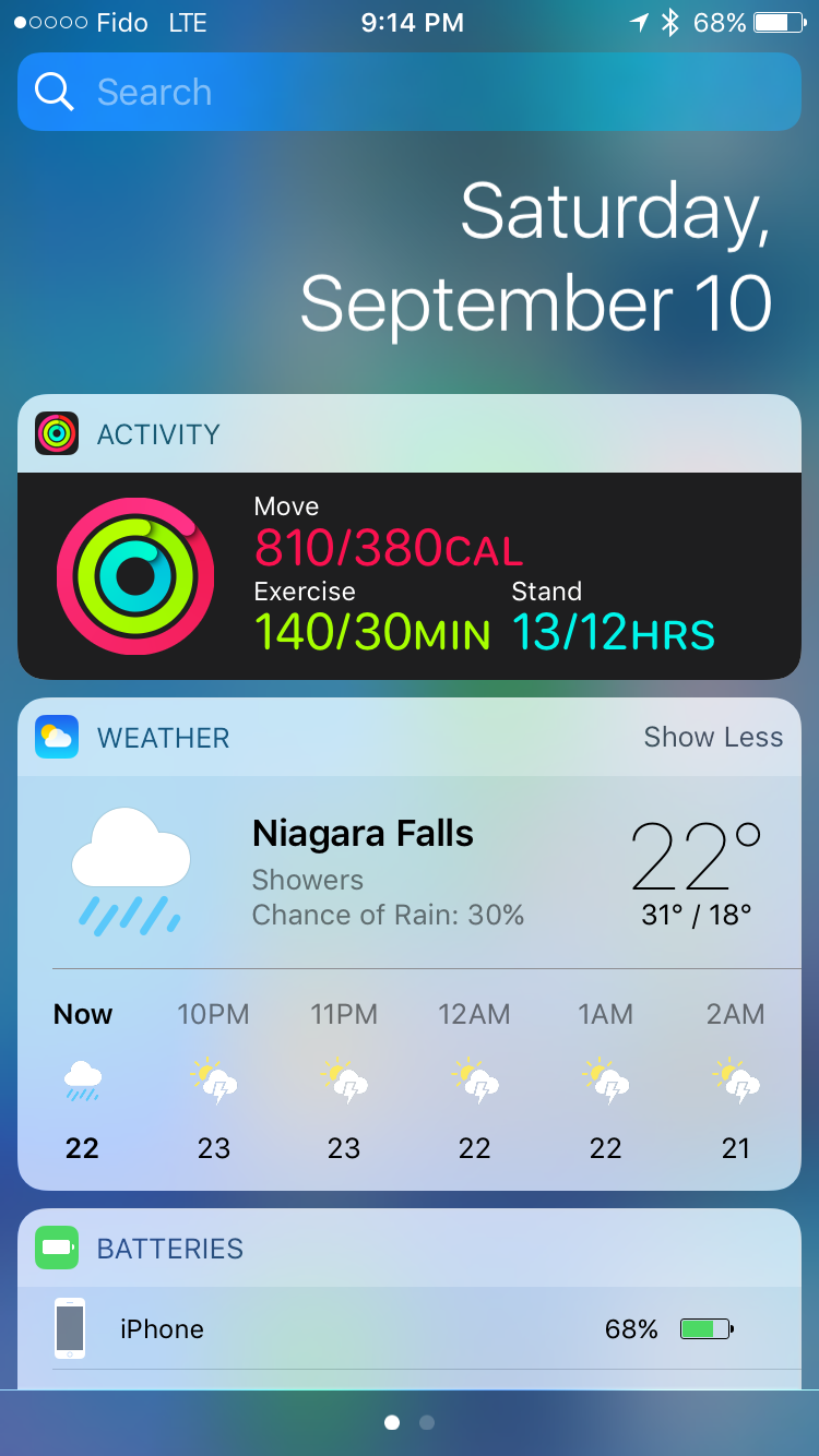
The widgets screen on iOS 10 exists in three places. You'll find it on the redesigned lock screen, on the home screen, and in Notification Center. In all three cases you access it by swiping right, which provides a uniform way to access widgets from any part of the iOS UI. In every situation the interface changes slightly. In Notification Center you have a blurred background, and on the lock screen you get the current time and battery charge rather than the date. The iPad gets some additional tweaks in landscape mode, with the widget layout expanding into two columns to take advance of the available space.
In addition to the new interface, Apple has added some useful widgets that didn't exist in iOS 9. The new weather widget is great, with the current weather and chance of rain being shown in the condensed view, and the expanded view showing the weekly forecast. There's also a widget for the Activity app which shows your current progress toward your three activity goals. Maps also receives some really helpful widgets, including one for transit which allows you to check if there are any service advisories on your favorite transit lines, which has already helped me avoid delays due to subway and streetcar closures that I would not have thought to check for otherwise.
Widgets in iOS 10 provide a much better experience than they did in iOS 8 and 9. Replacing the useless search screen to the left of the home screen with a widgets page was a good move on Apple's part, and in my view it provides the best overall widget experience on a mobile platform because the design and size of widgets are consistent, and they don't have to share space with application icons. I've definitely used the widgets more during the beta period than I ever did during the two years that iOS 8 and 9 were the latest versions of iOS, and I'm sure that I check them more times in a single day than all the times I checked the search screen that they're replacing. Getting users to actually use widgets puts more pressure on developers to offer their own, so it'll be interesting to see if more apps begin to offer widgets after the release of iOS 10.
Expanding 3D Touch
3D Touch was perhaps the most interesting thing about last year's iPhone 6s. Apple's pressure sensitive screen technology quite literally added another dimension to the touch experience on mobile devices. Like most of Apple's new technologies, the initial implementation of 3D Touch features in the OS was fairly limited, and there was basically no API for developers. You could create a hack of sorts by subclassing UIGestureRecognizer and playing a specific AudioToolbox sound to trigger feedback from the Taptic Engine, but Apple didn't provide official support for 3D Touch beyond the Peek and Pop interactions to preview content from a ViewController without actually navigating to it.
Presenting a new technology with an initially limited or non-existent API is nothing new for Apple. When Touch ID launched it was only able to unlock your phone and authorize App Store payments. Since that time it has been opened up to developers for handling authentication in their own apps, and Apple has expanded its use to cover authentication when paying with Apple Pay. With Apple's history of waiting to expose APIs for their new technologies, it's not surprising that iOS 10 is where 3D Touch gets a full-featured API for developers to use.
As I mentioned before, in iOS 9 developers were limited to using 3D Touch for Peek and Pop actions, as well as for Quick Actions from the homescreen by pressing on their app icons. This is still a large part of the 3D Touch experience, and Apple recommends that all developers implement 3D Touch in their application on tappable views that navigate somewhere else, such as tapping on a TableViewCell to move to a new ViewController.
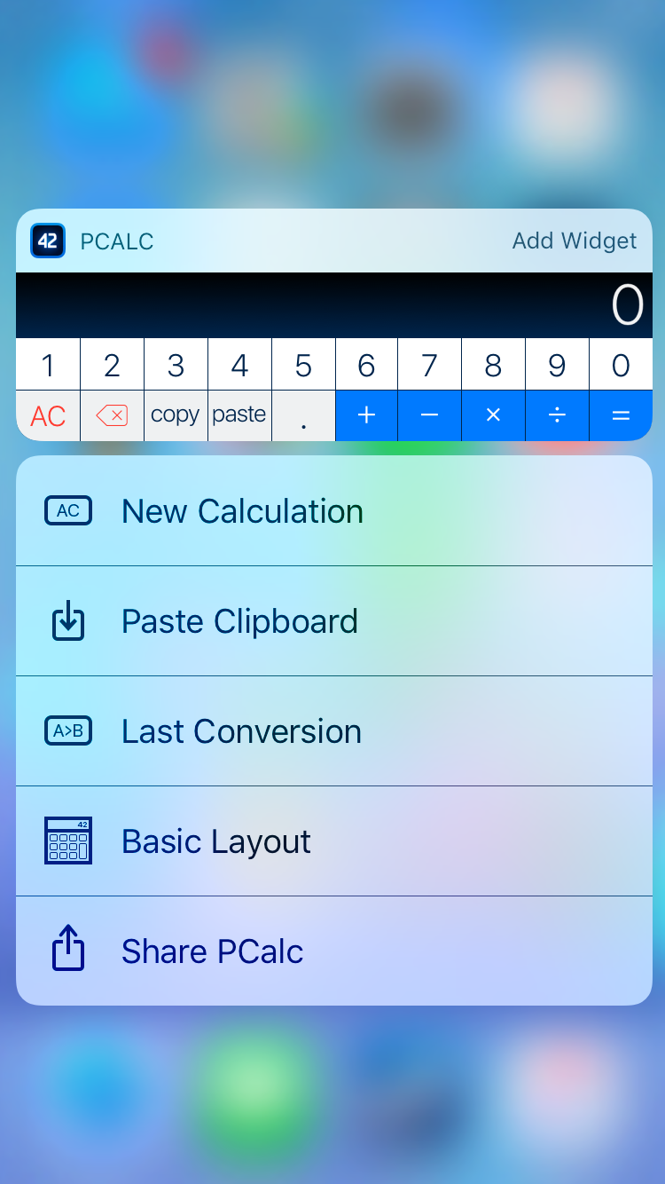
Right now neither Peek and Pop or Quick Actions have changed a great deal, although Apple has seemingly altered the timing functions for the animations that play for these interactions, which makes them feel more responsive and aligned to the amount of force that you're applying. Quick actions on the home screen can also show widgets that your application provides, along with a button to add it to the widget screen if you haven't done so. This is actually the fourth place in the OS where widgets are accessible, and it's quite an elegant solution to avoiding the clutter that mixing widgets and app icons creates, while also expanding 3D Touch's ability to provide access to relevant information rapidly.
The new UIPreviewInteraction class allows developers to move beyond Peek and Pop to use 3D Touch for customized actions in their applications. The kind of UI that this can enable really depends on the application, and the opportunities for customization are limitless. The most common type of interaction that 3D Touch is useful for is displaying a screen where the user can select an object which then triggers an action in the previous screen and returns back.
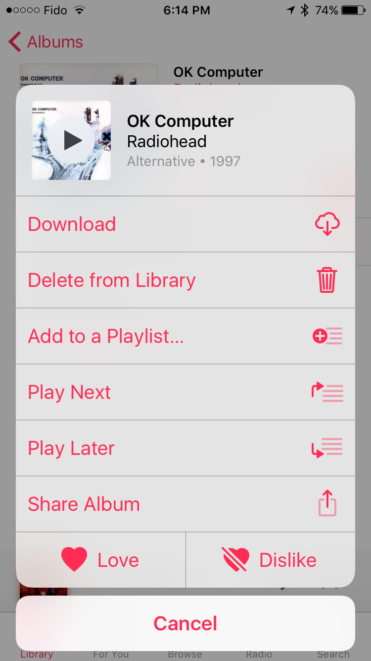
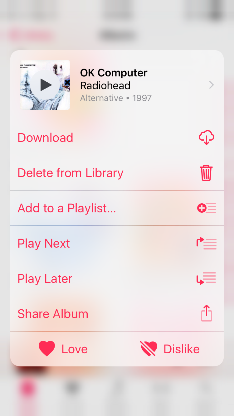
In iOS 10 I've noticed an example of this type of interaction in the Music application. In the new Music app there is a three dot overflow button next to your album art when you open an album. This brings up a Action Sheet with various options, such as adding it to a playlist or setting it to play next. These are actions that apply to the entire album, and it's inconvenient to have to navigate into the list of songs just to get this menu up, set it to play next, and then navigate back out. 3D Touch solves this by defining a custom action on the album cover cell in the CollectionView. By pressing down on the album cover the application creates the exact same view as the overflow menu, giving you access to all the available options. In addition, the menu is designed so that you can move your finger to the appropriate action and then release to select it, which means you don't have to remove your finger from the display. It's a very natural interaction to follow a 3D Touch press, and it lets you quickly access and select one of the actions in a much quicker manner.
It will take time for developers to implement support for custom 3D Touch actions in their applications. Adding support for basic Peek and Pop is incredibly simple and so it already has good adoption among popular apps. Now that Apple has more than two devices with support for 3D Touch there will also be more incentive for developers to find the areas where this kind of interaction can improve the user experience and actually implement it. Only time will tell how widespread 3D Touch becomes adopted in applications, but I think the improvement to user experience is substantial enough to warrant the effort required to do so.


113 Comments
View All Comments
sonicmerlin - Wednesday, September 14, 2016 - link
Really? Hiccups and frame drops make a powerful phone look weak. Smoothness adds to the sensation of fluidity of user experience. Aesthetics are a constant stimuli while using something as personal as a cell phone.tipoo - Wednesday, September 14, 2016 - link
We [probably] live in the first world, what else are we supposed to have?And nor does first world mean developed world.
https://en.wikipedia.org/wiki/First_World
Ranger1065 - Thursday, September 15, 2016 - link
The fact that you feel the need to differentiate between the terms "first world" and "developed world" is symptomatic of a first world mindset, as is quoting Wikipedia as an authority.If people are seriously concerned about " a tiny bit of judder while scrolling in safari,"
count yourselves lucky you don't have any real problems.
I don't live in the first world and I don't give a damn about political correctness or terminological exactitude, when all it amounts to is splitting hairs....just for the record :)
star-affinity - Wednesday, September 21, 2016 - link
I would't say I'm "seriously concerned" about those things, but when you're talking about a device that's beeing used extensively I absolutely think it's worth discussing user experience.Of course a lot of thing seems rediculous when looked at "the grand scale of things", but I still don't thing one thing has to exclude the other. It's always difficult to compare your own life to the rest of humanity, because there will probably always be someone who has a worse situation in life than you. So does that mean we shouldn't strive for quality and a good experience when using smartphones? I think not.
robinthakur - Friday, September 23, 2016 - link
If you don't live in the "first world" perhaps you'd feel more at home at an Android site ;)tipoo - Saturday, September 16, 2017 - link
Or you could look up any other source you wanted with the information at your fingertips and find I'm right about the definition. First world just meant US and it's allies, second meant the USSR and it's allies, and third world meant unaligned. Not anything about riches or poverty.robinthakur - Friday, September 23, 2016 - link
I agree, it got so bad on my iPhone 6 plus about a month ago, that I got judder scrolling from one home screen to the next, so in a fury I went and bought an S7 Edge to play with until the iPhone 7 was released. It's actually very very smooth overall and if it integrated into the rest of my kit and Apple services (Apart from Apple Music) then I might consider using it. Overall, the tight design language throughout the hardware and the operating syMornistem and polished first party features made me order the iPhone 7.iPhone used to be the smoothest scroller and was a major factor in me staying on iPhone before iOS8 because I can't stand frame rate drops (I like my games 60+fps too) so this is also a big deal for the 7/iOS10 and how they choose to optimize in the future. The phone should never feel 'slow' in normal day to day operation using OOTB features...
lilmoe - Tuesday, September 13, 2016 - link
Also, take a look at those improved Javascript benchmarks, seems like iOS10 came with a CPU upgrade too!/s
Meteor2 - Tuesday, September 13, 2016 - link
Now I know Anandtech won't do a day-of-release view of the iPhone 7, but when can we expect to see a review?JoshHo - Tuesday, September 13, 2016 - link
When it's done.