Revisiting The OnePlus 3: sRGB, Memory Management, & More
by Brandon Chester on June 30, 2016 3:00 PM EST- Posted in
- Smartphones
- OnePlus
- OnePlus 3
Last week I published my review of the OnePlus 3. I reviewed the OnePlus 2 for AnandTech, and given that the OnePlus 2 had many problems it seemed appropriate that I should examine the improvements that OnePlus made with their latest smartphone. As I used the phone, I was glad to see that OnePlus had clearly taken feedback from the reviews of the OnePlus 2 to heart and spent the year since then working on creating a truly great phone. From the chassis, to the camera, to the SoC, the OnePlus 3 really delivered a level of quality comparable to phones that cost significantly more.
There was one exception to this trend, which was the OnePlus 3's display. The OnePlus One shipped with a 5.5" 1080p IPS display, and it clearly aimed to accurately render content targeting the sRGB color space, which applies to essentially all content that you'll see on a smartphone. With the OnePlus 2 things weren't so great. OnePlus still used a 5.5" 1080p IPS display, but there was essentially no effort put into calibrating the display. As for the OnePlus 3, it marked a shift from IPS LCD displays to AMOLED displays in OnePlus's flagship smartphones, and this was to be expected based on the launch of the OnePlus X which sports a 5" 1080p AMOLED display.
The move to AMOLED doesn't come with any inherent issues, but there are things that a manufacturer needs to keep in mind. Without any sort of brightness boost mode the display can be more difficult to use outdoors than competing LCDs, due to AMOLED displays typically capping at 300-400 nits when setting brightness manually. Sharpness is also another factor to consider. The use of the PenTile subpixel arrangement reduces effective resolution, especially when rendering areas of solid color. It also has a negative impact on the rendition of text and other glyphs, as you're not dealing with subpixels aligned in a perfect grid of vertical and horizontal lines. This is why I've advocated for remaining at 1080p when using standard RGB displays but moving to 1440p for PenTile displays. In fact, the red/blue resolution on a 1440p PenTile display is still slightly lower than that of a 1080p RGB display, but that's another topic.
The last thing vendors need to keep in mind about AMOLED displays is that, while they can offer a much greater color gamut than your typical WLED-backlit LCD, without color management this will cause distortions in all content you view on the display. For this reason it's important to offer an sRGB color mode which constrains the display so that it matches the color standard used by essentially all content. Unfortunately, the OnePlus 3 omitted such a feature, which is why it ended up performing so poorly in my display testing.
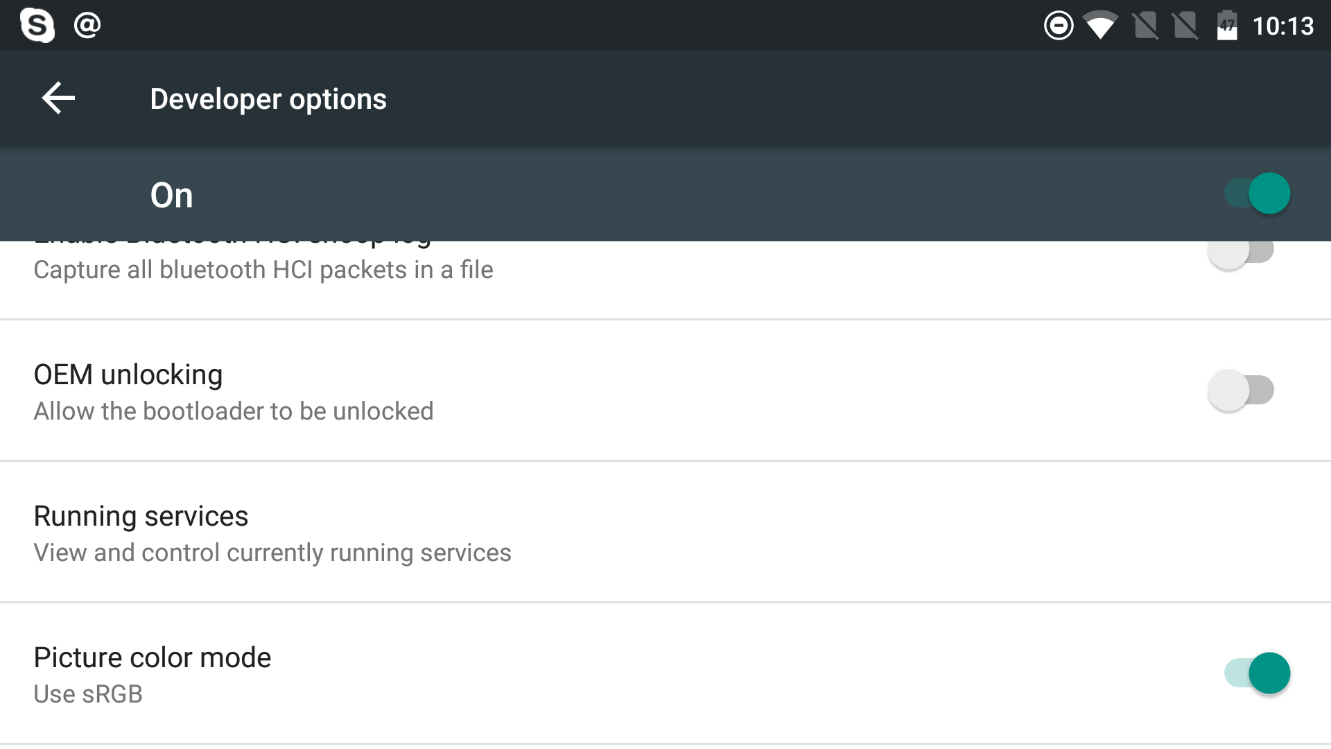
The display section of my review spawned a great deal of debate, and I'll get into that more on the next page. To sum things up, OnePlus was quickly able to ship a preliminary update to review units which added an sRGB mode in the phone's developer settings. Right now this setting resets upon a reboot, but OnePlus says that it will keep its state between reboots when the stable firmware goes out to all devices. With OnePlus making an effort to correct what I felt was the biggest issue with the OnePlus 3, I thought it only made sense to revisit the display and run it through the tests again to see just what sort of changes have been made, and whether they improve the OnePlus 3's standing among smartphones.
A quick word on memory management:
Before discussing the changes that OnePlus has made to the display, I did want to comment on one of the other controversial aspects about the OnePlus 3. I only mentioned this once in my review, but the OnePlus 3's memory management on its original firmware is quite aggressive about evicting apps from memory, which led many people to wonder why OnePlus had included 6GB of RAM if you couldn't use it. With the beta update that they've sent to review units one of the patch notes states that this behavior has been tweaked somewhat. While I'm not able to do any in-depth comparisons due to the fact that I'm now stuck on this firmware, I did want to mention that app eviction seems to be less aggressive. In my admittedly not very scientific testing I was able to have Chrome with three tabs loaded, Twitter, Hangouts, Dropbox, Google Drive, Gmail, Skype, the Files app, and Google Photos all resident in memory at the same time, and none had to recreate their activities upon me returning to them. Pushing any further would honestly be going far outside the set of apps that I use on a daily basis and can keep track of in my mind, and so at least in my view I don't think app eviction is something to worry about on the OnePlus 3 as of this new firmware.
With that out of the way, lets take a look at the new sRGB mode that has been added to the OnePlus 3.


81 Comments
View All Comments
BenSkywalker - Thursday, June 30, 2016 - link
The issue at hand is they picked the MPEG of color standards- sRGB was so poor it was immediately replaced by the professional market for ARGB- in the 90s, yet Apple is just now getting around to supporting wider gamuts(Now that Rec2020 is out they move to close to the twenty year old standard).
Wanting things standardized across their product line I get- aiming for the lowest possible target I don't.
jlabelle2 - Friday, July 1, 2016 - link
- sRGB was so poor it was immediately replaced by the professional market for ARGB -I read this kind of claim all the time but people do not realize that having in real life colors more saturated than sRGB is very VERY rare. I champion every one to go out and try to take a picture where even a small area of the picture go beyond sRGB color space. It will not happen. Except if you are living maybe on a carribean island.
The reality is that what you call "poor" is still enough in 99,9% of the real cases (not speaking of artificial colors created in Photoshop).
Impulses - Friday, July 1, 2016 - link
I live in a Caribbean island... :(BenSkywalker - Friday, July 1, 2016 - link
Firetruck, eggplant- it isn't hard- tons of paints used on cars, I have a set of towels hanging in the bathroom right now- it's actually *very* easy to find objects that go outside sRGB. Even if the color is entirely inside sRGB- 256 gradients versus 1024- smoother and more realistic tones- for all pictures.
jlabelle2 - Monday, July 4, 2016 - link
- Firetruck, eggplant- it isn't hard- tons of paints used on cars. it's actually *very* easy to find objects that go outside sRGB-I take the bet. You think they go beyond but you would be surprised.
- even if the color is entirely inside sRGB- 256 gradients versus 1024- smoother and more realistic tones- for all pictures.-
Actually, it goes the other way around. Taking aRGB colors with 8bits coding (a JPEG) and transforming it in sRGB (still 8bits) means that you are potentially loosing a little bit of fine gradation info as the aRGB has to strech the 256 level with a wider range. Only if you work with TIFF or 16bits RAW files you are quite ok when manipulating / editing pictures between color spaces.
BenSkywalker - Monday, July 4, 2016 - link
JPEGs while discussing accurate calibration...... wow. That's like having a discussion about Formula 1 and you comparing it to your radio controlled car thinking that is a real comparison.http://ninedegreesbelow.com/photography/srgb-versu...
No, I wouldn't be surprised what exceeds sRGB even a little bit- *TONS* of things you see in every day life. Firetruck red and eggplants both do exceed sRGB- that isn't an opinionated statement, it is one of fact.
I brought up lots of colors cars are painted with as I'm familiar with exactly what is involved in that process- I am in no way speculating- sRGB is just trash. It is a garbage color space worthy of your JPEG format.
jlabelle2 - Tuesday, July 5, 2016 - link
- JPEGs while discussing accurate calibration...... wow -What JPEG has to do with calibration? You seem to confuse a lot of things. The encoding of the image (8bits or 16bits or more) has nothing to do with if the color is correct or not. You can have a scene with variation of colors that could be code on 2 bits and still have color completely off.
That is clear that those things are totally misunderstood by the majority of people, even "geek" people commenting on those kind of web site. It is good that Brandon is trying to educate and explain those things.
- sRGB is just trash -
Saying so does not make it anymore true. But if you are dealing regularly with that, can you provide me a picture of one of your car with a color widely beyond sRGB gamut? Should not be that difficult, isn't it?
- It is a garbage color space worthy of your JPEG format. -
This comment is showing the size of your ignorance.
JPEG is encoding in 8bits, which is the number of steps between the extreme colors (256 level on each channel).
Color space is defining the maximum color saturation of the maximum value (be it 256 on JPEG or 65536 on RAW or TIFF).
You are comparing how high is going a ladder (gamut on the color space) and how many steps it has (the encoding bits).
BenSkywalker - Tuesday, July 5, 2016 - link
JPEG as it relates to calibration is the crux of this discussion. The amount of color information in a JPEG is *extremely* limited- very easily displayed by taking any image with a range of 0-255 on any of the channels and looking at it. Very clear banding across the board. You talk about calibration- there are several billion colors that the human eye can see- the odds of you landing on exactly the right shade of any given color is akin to hitting the powerball. It may happen- but your odds of actually seeing the right color are minuscule.So what we are actually looking at is the perception of what people see based on what the image was supposed to portray. In that element, your assertion is that a very narrow color space using a very lossy file format can be calibrated to be acceptable to your standards. My assertion is quite simple- perfectly 'calibrated' sRGB showing JPEGs are laughably inaccurate- they aren't remotely close to being the actual colors- the perceived difference between them and what you want to see aligns with that particular combination. In no way comprehensible is this a matter of accuracy, we are dealing with digital information and sRGB JPEGs are close to 0% accurate when judged in absolute terms- they just are 'good enough' for your end of the discourse.
That isn't a matter of personal preference, these are binary operations- you are looking for good enough for you. That is a matter of what you are looking for- nothing is wrong with that, getting on a soapbox because your wrong way of looking at things is better then someone else's wrong of looking at things is laughable.
Fire engine red is outside of sRGB. It is one of the most common colors in widespread use for the last fifty years. I also provided you a link showing how a box of crayons fails in sRGB space.
As to your attempts at trying to differentiate that there are both issues with width and granularity in the color space- that is an elementary issue- I assume any child would understand this. Internal rendering of image spaces swapped to 128bit floating point color in many fields long ago- Adobe RGB isn't *close* to being 'good enough'- it simply is a massive improvement over the insanely poor sRGB.
My stance still stands- championing that your way of looking at horribly inaccurate images is the 'right' way and any other way of looking at horribly inaccurate images is wrong comes entirely down to perception.
jlabelle2 - Wednesday, July 6, 2016 - link
I see that you do not understand the notions developed by Brandon. I will try to explain one last time but it may be a subject to difficult for you to grasp (not trying to be pedantic but just my observation based on your feedback). So one last try:- The amount of color information in a JPEG is *extremely* limited -
What is the "amount" of information? JPEG is encoding in 8bits which means a given number of GRADATION of colors. But once again, if you have a ProPhoto or DCI3 JPEG, the level of saturation that you can code (and potentiall display) is the SAME as a 32 bits TIFF file.
- Very clear banding across the board. You talk about calibration- there are several billion colors that the human eye can see-
You are throwing a lot of different notion against the wall to see if it sticks.
First, what is your point? What do you try to say in the context of this article on constraining in the sRGB gamut a Android phone screen as Android is not color managed ?
Secondly, regarding the points you raised (for whatever reason) : yes 8 bits gives you less number of intermediate steps as more bits which means potentially more posterization when working on the image.
But generally, no, it is very difficult or impossible for the human eye to discern the difference between a 16 bits TIFF and 8 bits JPEG in term of color gradation. JPEG is allowing 16 millions discrete different colors. You are not just able to see any banding because of the limitation on 8 bits nor is able anyone on earth, despite your claim.
WHY is 16 bits important, it is because when you EDIT and CHANGE the image, then you can start to see posterization with extreme editing. So JPEG is not a problem for the display. 8 bits is a problem as a working space if you make serious editing.
I clarified this as you are confused on those notions.
- your assertion is that a very narrow color space using a very lossy file format can be calibrated to be acceptable to your standards -
It is not an assertion.
Let's not comment again on how narrow or large is the sRGB gamut. I asked you to provide a real example of a picture of yours exceeding the sRGB gamut and you are not able to provide so let's say that the burden of proof is still on yours.
JPEG can be more or less lossy depending on the compression ratio. I defy you or anybody to see the difference between a JPEG with a good quality compression ration (80 or 90%) and the original TIFF. This is like your claim that you can see in 16 millions different colors "very clear banding across the board". That is just bullsh...
And last, sRGB is not "my" standard. And yes, a LCD can be perfectly calibrated toward sRGB color space or another color space...or not. I do not even understand what you are trying to argue against?!?
- My assertion is quite simple- perfectly 'calibrated' sRGB showing JPEGs are laughably inaccurate-
This phrase does not mean anything. Either the display is perfectly calibrated and the colors it shows are accurate (by definition) or they are not.
You are basically telling me that you can have a tachymetre on a car that is perfectly calibrated to display the real speed of the car ... but the car of the speed is "laughably" inaccurate. I don't know if english is your mother tongue the phrase makes just NO sense.
- we are dealing with digital information and sRGB JPEGs are close to 0% accurate when judged in absolute terms-
you are going further in the ridicule. Claiming that you can distinguish more than 16 millions different colors and now even claiming that it you cannot code more than 16 millions, the image that you see is 0% accurate. What to tell...
I propose you a simple 2nd bet (as you declined the 1st one): you can give me any image that you want with any encoding bit size (16 bits, 32 bits), in any color space of your choice.
I will take it and make 2 versions of it: one reduced to 8 bits and saved temporarily in a 90% JPEG, and the other let at the original size.
I will then give you back both in TIFF (so you cannot tell which is which) and ask you to tell me which one is the JPEG. Please take my bet, it will be enlightening for you?
I know already that you will also refuse the 2nd bet because you must have realized by now how wrong you are but if you do not believe it still, take the bet, and you will learn something.
- I also provided you a link showing how a box of crayons fails in sRGB space.-
The link is showing in analysing the image what is going beyond sRGB. What is much more important for me is if someone is able to tell the difference. Thus my bet to you. Find me an image.
I will restrict one to sRGB, another to aRGB and send you back both in aRGB and you will have to tell which is which. Image should be yours.
- I assume any child would understand this-
I restrained myself, especially in forum, to make such comment. Although I am an engineer so those topics are for me quite elementary, I do realize they are not clear for everyone and you are a proof of it. Still, you are not a child and I understand that you could not grasp those notions.
- My stance still stands -
This is why I asked not to take my word and common knowledge for granted and propose you to realize how wrong you are by yourself. Take my 2 bets and you will have a more clear understanding how mistaken you are. If you really want to learn and progress. Otherwise, have a good day.
jlabelle2 - Friday, July 1, 2016 - link
- 30 degrees below zero pictures calibrated for sRGB white points look comically bad and insanely unnatural -Common confusion on white balance (what TrueTone on Apple devices is tackling) and the wider gamut than sRGB standard.
The issue with the OnePlus or every wide gamut screen used in unmanaged OS is that the web, 99% of the camera and pretty much most picture you received and see are done or targetting sRGB color space. Displaying them in wider gamut screen than sRGB will make them all appeared oversaturated. That is simply not good.
- every person I have asked liked the Vivid option the best -
Again a different story. you could perfectly have a screen, for which the gamut is constrained in the sRGB color space, and have an vivid option.
Let's not forget that in 99,9% of the case (in fact, on 70 000 aRGB pictures, I took, there was less than 5-6 so it is more 99,99% of the case), the images of natural things (not flashy designed logos or colors that do not exist in real life) never exceed the sRGB gamut. It is VERY rare to have in real life colors beyond. What it means is that, even in a perfectly color managed OS and workflow, the benefit of going wider than sRGB is impacting only small areas of a very tiny number of pictures.
And even on those small areas of those tiny subset of pictures, you probably cannot tell because the difference could only be spotted when seeing both side by side.
On the opposite, in the case of the wide gamut screen of the OnePlus used on non color managed OS, 100% of the pictures and the entire areas of those pictures would appear oversaturated. Always.
As such, a vivid option could still oversaturate colors, even if still constrained within the sRGB gamut. One is not mutually exclusive from the other. But at least, you give the choice to user.
For instance, i like adding some color saturation to my A7R photos. But the saturation still remains within level that exist in real life and everybody would find strange fluorescent green grass.