The 9.7" iPad Pro Review
by Brandon Chester on June 1, 2016 9:00 AM ESTDisplay Analysis
The 9.7" iPad Pro has what is by far the most interesting display I've seen on a tablet since the iPad 3, which was the first of the Retina displays. Samsung is arguably the only other vendor making advances with tablet displays, since they're the only company that ships a calibrated AMOLED. However, Samsung has been limited with the brightness they can push on the larger AMOLED displays, and at the end of the day when you set to sRGB the only advantage is the black level when there's not much ambient light to wash the display out.
With the iPad Pro Apple has improved upon the anti-reflective coating that they introduced with the iPad Air 2, and they've moved to a wider color gamut while also implementing a dynamic color feature called True Tone. I'll be talking about True Tone on the next page, but for now I'll be running 9.7" iPad Pro through our standard display workflow, along with an additional test to examine the accuracy within the DCI-P3 color gamut.
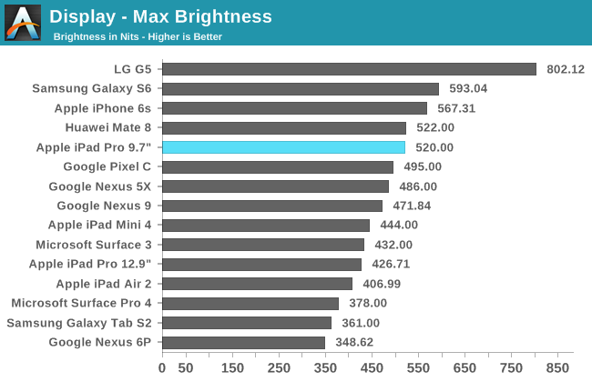
There are two things that I find surprising in the charts above. The first is that Apple actually exceeded their advertised 500 nit brightness. This puts it at the top of our brightness list for tablets, and that's no small feat. Apple's new backlighting array has enabled both a significantly wider gamut and a much higher brightness. Combined with their new anti-reflective coating, the 9.7" iPad Pro handily beats the larger model and the iPad Air 2 as the most usable tablet in bright ambient lighting.
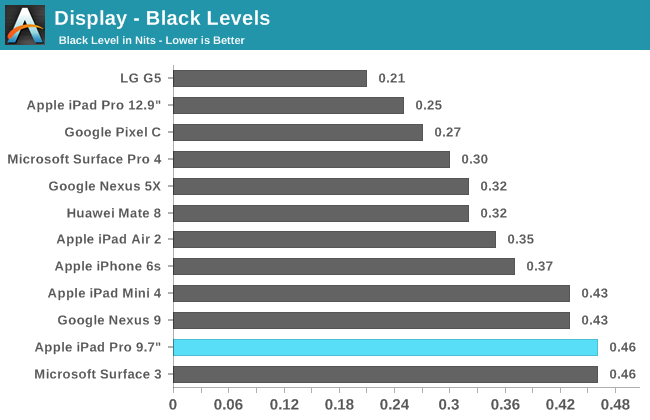
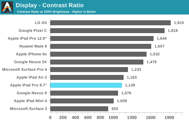
While the 9.7" iPad Pro is quite bright, it doesn't do so well with black levels. Compared to the Pixel C, which has only a slightly lower brightness, the 9.7" iPad Pro's black level is much higher, and the contrast ratio is significantly lower as a result. It's also lower than Apple's 12.9" iPad Pro, and I verified Josh's brightness and black results for the 12.9" iPad against my own to confirm that he didn't just get an exceptional sample. I'm honestly a bit surprised that the gap between the two is so large, as the 9.7" iPad Pro's display is more advanced than the display of the larger model in several respects.
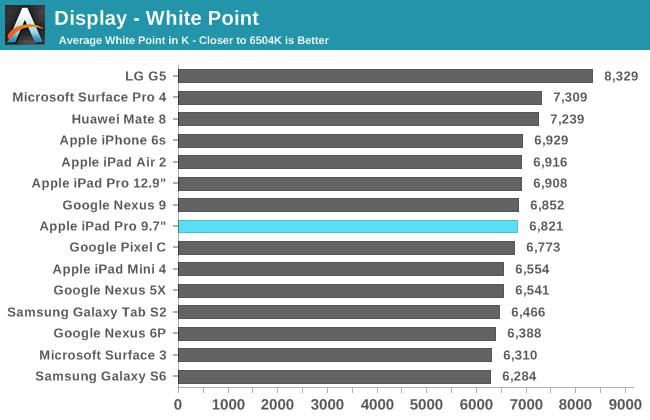
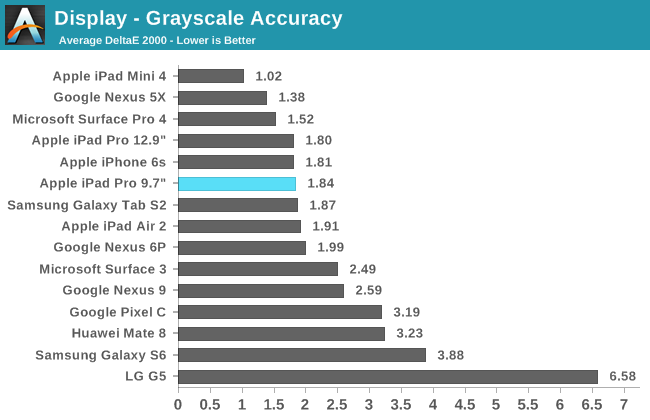
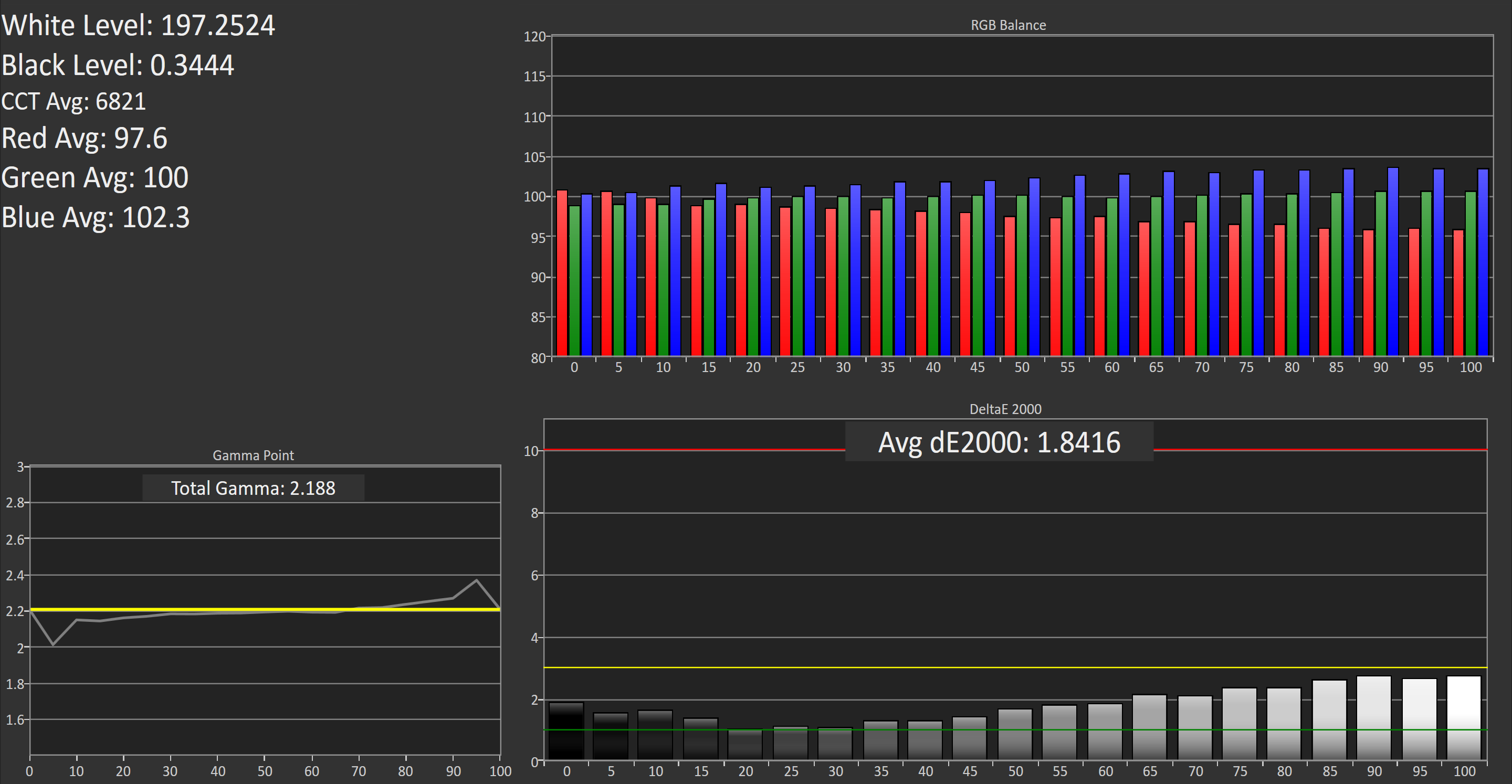
The 9.7" iPad Pro has great greyscale accuracy. Like most of Apple's products, there is a degree of blue shifting, but it's not quite as heavy as on their other products. The gamma is quite straight, and no shade of grey has a DeltaE that hits three, which is generally the goal. The accuracy isn't as high as the iPad Mini 4 which exhibited a surprisingly high degree of accuracy, but beyond the slight blue shift there's not really anything to complain about here.
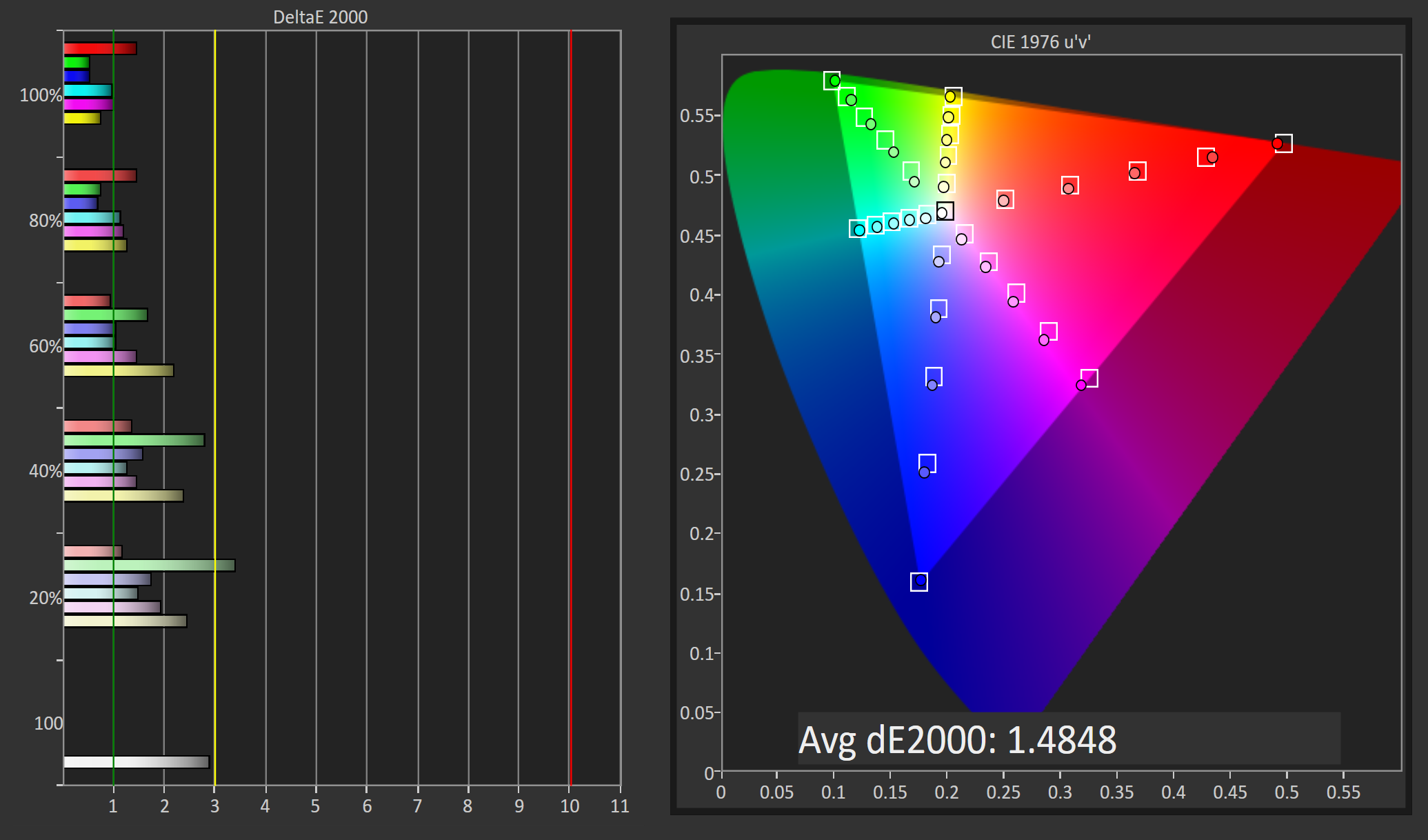
DCI-P3 Gamut Saturation Sweep
The iPad Pro is Apple's second device that has moved to a wide color gamut. The first was the 2015 iMac with Retina 5K display, and from it we learned a number of things about Apple's implementation. The first thing to make note of is that the display conforms to the DCI-P3 gamut, but it doesn't use the corresponding 2.6 gamma that goes along with the standard. Using that gamma would be a mistake because no content coming on UltraHD Blu-ray is going to use that gamma function, so it's not really an issue in practice. While it remains to be seen how Apple's wide gamut devices will handle content that uses the SMPTE 2084 EOTF, Apple has brought color management to iOS and can transform content that uses a different gamma curve than the 2.2 gamma that the display targets.
Because Apple has implemented color management, they're able to accurately render anything designed for color spaces that sit within the DCI-P3 color space, with the most relevant one being sRGB. For devices with wide color gamuts and color management we'll be testing them against their target gamut and the sRGB gamut for our saturation tests. First up is the DCI-P3 saturation sweep, which uses 20% steps like our sRGB test but obviously targets the wider DCI-P3 gamut and uses Apple's target gamma of 2.2.
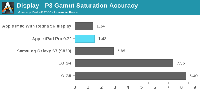
Because only a small group of devices claim to support this color gamut, I don't have as many points of comparison as we usually do. To be honest, the few that we have make it clear that Apple is currently without competition here. The other vendor actively advertising DCI-P3 gamut support is LG, and we've seen that the LG G4 and G5 do not even come close to actually meeting this goal regardless of which gamma target you use. In fact, they're bad enough that Samsung's accurate Adobe RGB mode on the Galaxy S7 accidentally beats them for P3 accuracy here, as it ends up being accurate in areas where the gamuts are very similar and only really has errors along red and with some deep saturations of colors that rely on red or blue.
As for Apple, they're the only vendor that actually covers the red-dependent segment of the gamut and their DeltaE values are incredibly low. The only issue I can see is that green is a bit inaccurate, which seems to be due to the display's blue shift. This is really me looking for criticism though, and with a DeltaE average of 1.48 the only device that beats it is a $2000 iMac.
sRGB Gamut Saturation Sweep
Because each 9.7" iPad Pro is individually calibrated, the color profile included is essentially a perfect description of the physical display's characteristics and color output. Because of this, the profile can be used to map colors from the sRGB color space to the display's native gamut with a high degree of precision, which is only limited by the display's color depth. In fact, this potentially allows for greater accuracy than if the display had been calibrated against the sRGB gamut in the first place, as the small error levels in Apple's calibration are accounted for by the profile and when doing color transformations.
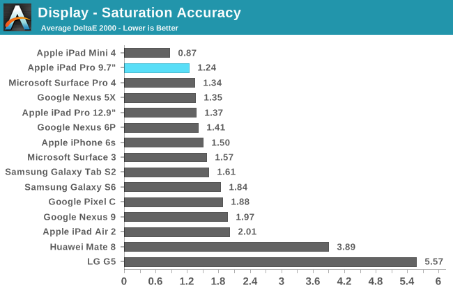
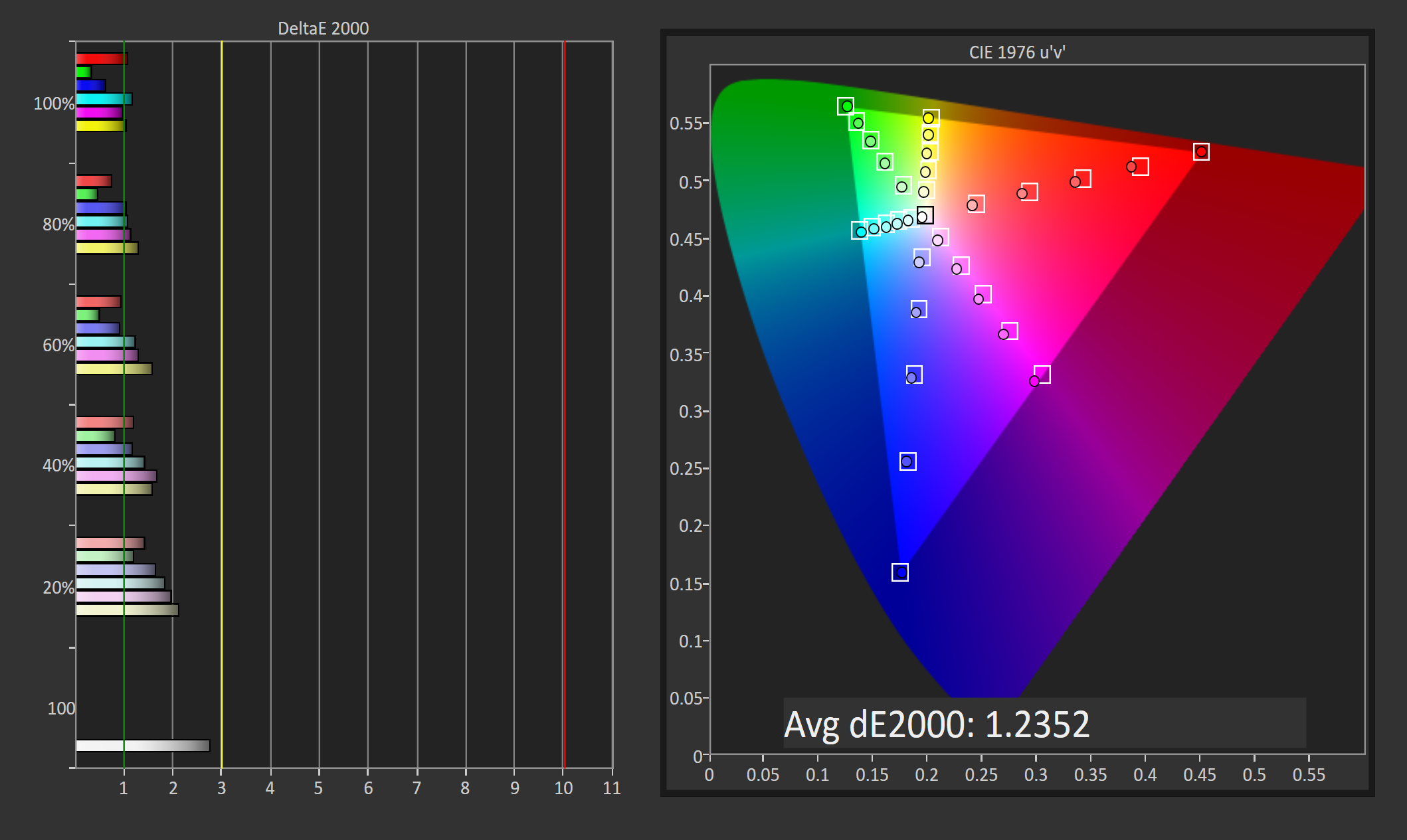
When displaying content designed for the sRGB gamut, the 9.7" iPad Pro is incredibly accurate. It's actually more accurate than the already near-perfect P3 results, with the red, blue, and green primaries being even closer to their target values. The only color that ever has an error above two is 20% saturated yellow, and the largest error is actually white which as we saw earlier is a bit too blue. Aside from those, every color has a DeltaE below two, and many are around or even below one. There's honestly not much more Apple could do here; this really is a professional-grade display.
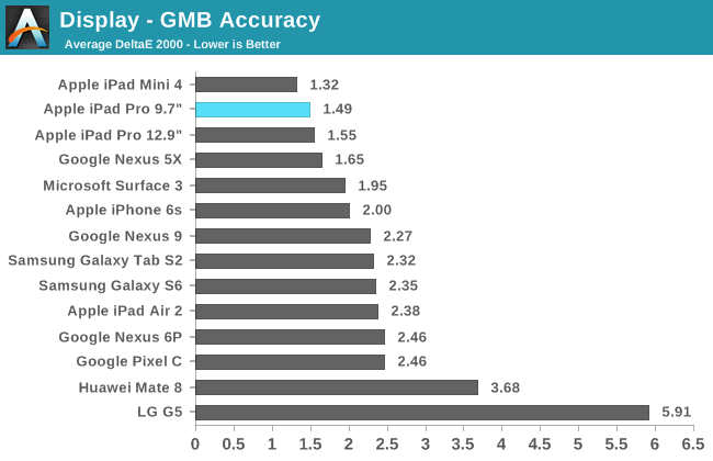
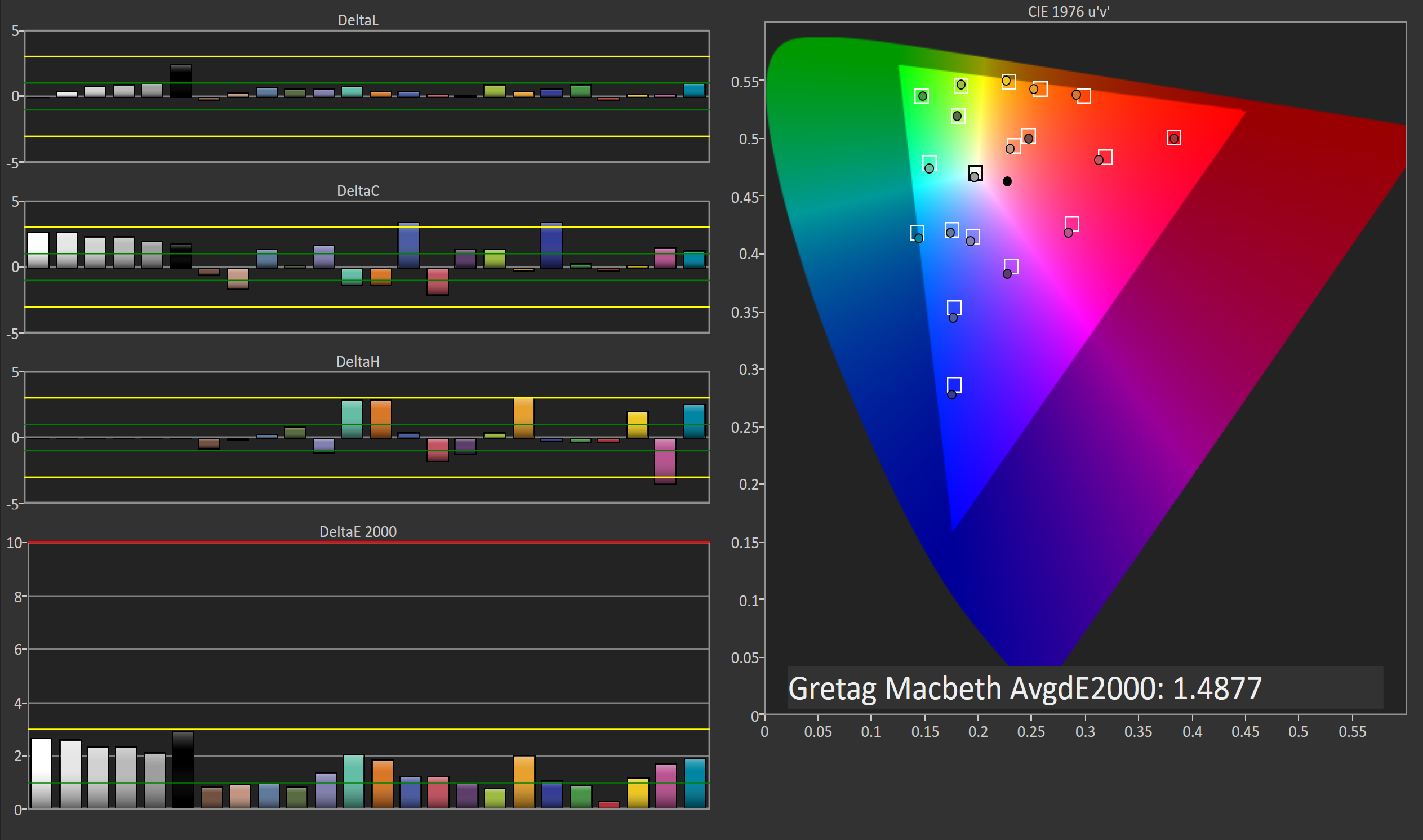
As one would expect, the 9.7" iPad Pro has no trouble rendering the color mixtures from the GretagMacbeth ColorChecker test. The largest errors are actually the greyscale shades, and none of the DeltaE values for colors actually go above two. It's worth noting that the colors in this test are defined such that they should always be the same regardless of the color space, and so the fact that I've targeted sRGB has no change on the test outcome. For reference, changing the target to the P3 gamut produced an average DeltaE of 1.56, and I did that test at a later time so the error is well within the bounds of errors relating to the position of the meter on the display and the small inherent measurement error of the i1Pro 2 itself. This is a good example of Apple's color management at work, as my untagged image files were correctly inferred as having been created with the sRGB color space in mind, and transformed into the display's native gamut.
As far as tablet displays go, the 9.7" iPad Pro has the best one that I've seen. The combination of greatly improved peak brightness, extremely good color accuracy, an improved anti-reflective coating, and support for a wider color gamut all contribute to this, and the usefulness of aspects like the wide gamut will become even more apparent as time goes on and more content supporting it is released.


144 Comments
View All Comments
tipoo - Wednesday, June 1, 2016 - link
The memory scores from Ars's review seemed to more than split the difference from halfhttp://cdn.arstechnica.net/wp-content/uploads/2016...
tipoo - Wednesday, June 1, 2016 - link
Or this review itself, definitely not halfhttp://www.anandtech.com/show/10286/the-97-ipad-pr...
Gich - Wednesday, June 1, 2016 - link
Where is the Surface?Gich - Wednesday, June 1, 2016 - link
*ProUtilityMax - Friday, June 3, 2016 - link
Because Surface is hardly a tablet. It's a laptop or a netbook, with a removable keyboard.CoreyWat - Wednesday, June 1, 2016 - link
Man if I didn't need that Apple Pencil support...I would have totally gone for the Pixel C, very very close race.KPOM - Wednesday, June 1, 2016 - link
Unless you care about display quality. The iPad Pro blows the Pixel C out of the water.grayson_carr - Thursday, June 2, 2016 - link
Except in contrast and black level. Pixel C obliterates the iPad Pro there. And the max brightness is near equal. The iPad Pro has better sRGB calibration, but it's not like the Pixel C is poorly calibrated. It's still good.Vigilant007 - Sunday, August 7, 2016 - link
The Pixel C just looks fantastic. I LOVE their method for attaching the keyboard. That thing looks like Google at it's bestarsjum - Thursday, June 2, 2016 - link
I highly doubt you have actually seen the screen of Pixel C. iPad Pro has advantages for professional photography, but for everything else the Pixel C either matches or beats it in quality. It has an excellent screen.