The 9.7" iPad Pro Review
by Brandon Chester on June 1, 2016 9:00 AM ESTA Few Thoughts On True Tone
Back when I received the 9.7" iPad Pro I published some of my thoughts regarding the True Tone display technology. And while I won't really be going over the topic in great detail again, I do have some additional thoughts on the technology after having using the new iPad Pro for quite some time.
Something I wanted to clarify from my original article is the purpose of my greyscale measurements. Some readers interpreted it as evidence that True Tone didn't work as intended. In actuality True Tone works exactly as intended by providing good relative accuracy. As you move to different environments the color temperature of the display shifts to match how your eye adjusts its perception of white depending on the temperature and brightness of the light around you. This obviously leads to inaccuracy relative to the sRGB standard, but that's missing the point of True Tone entirely. My tests were simply meant to demonstrate how much shifting occurs in different environments, along with a clarification on some misunderstandings I had heard regarding the relationship between True Tone and the DCI-P3 gamut, which are really unrelated technologies.
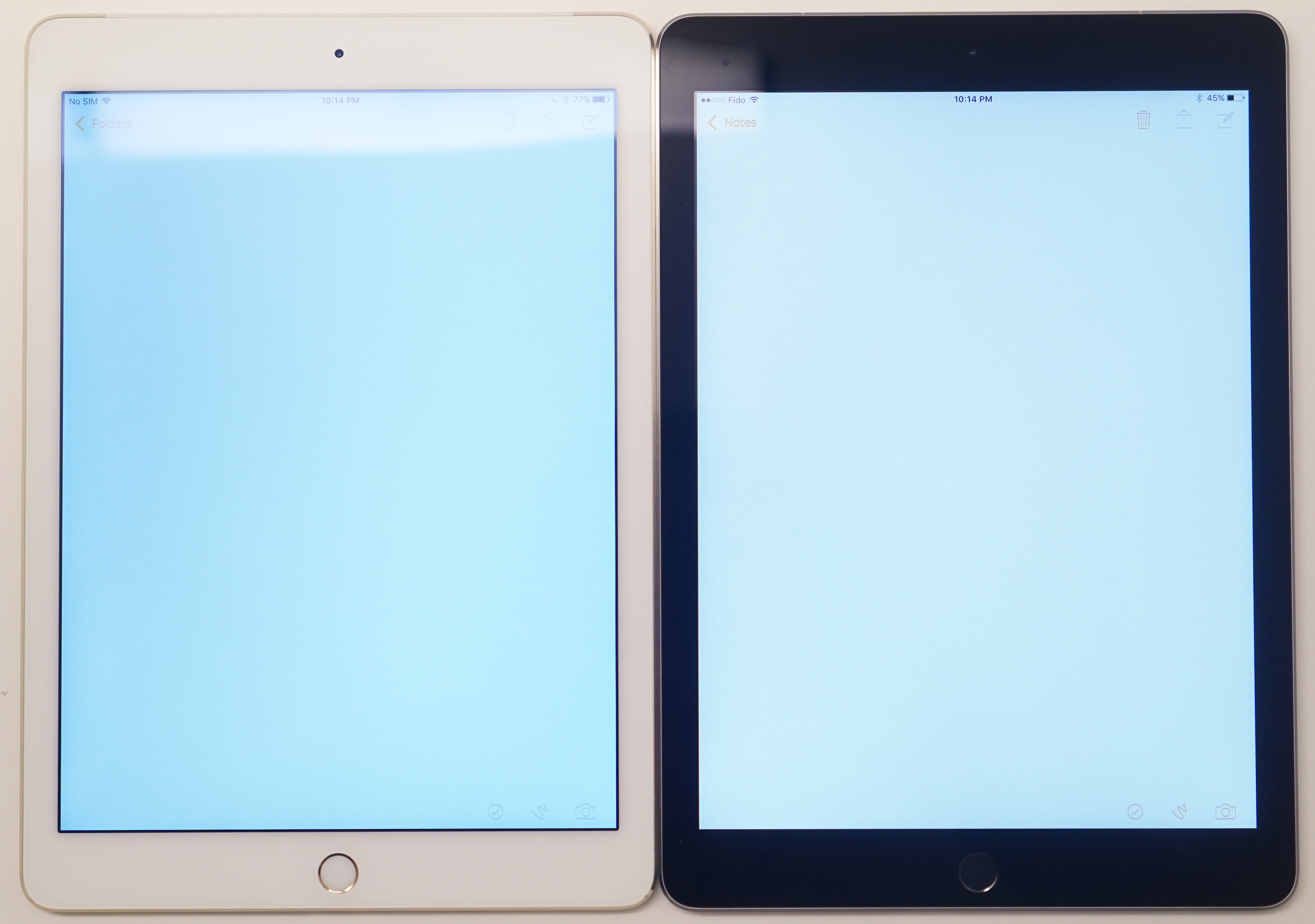
True Tone works very well, and in a way Apple has proven me wrong here because I was initially skeptical. I've seen this attempted before, particularly by Samsung, and the implementations have not been good at all. When I first got the 9.7" Pro I felt like the True Tone mode shifted too far toward the red. However, after using it for some time I began to realize that this was the product of me using other devices that all shift toward blue, which ruined my perception of the display. When using the iPad Pro on its own for reading or doing work, pulling out another device with a blue shifted display is absolutely jarring, as the iPad has adjusted to match how my eyes perceive things in different lighting, while all my other displays are forever blue. In a way, the biggest problem with True Tone is that it's not in everything, and I think this is something Apple should be bringing to all of their portable devices.
Apple's Simulated True Tone Image
It's difficult to photograph True Tone, as depending on where your camera's white balance lands the iPad Pro will look too red, or the other display will look too blue. I really recommend checking out True Tone for yourself, although if you decide to do it in an Apple Store you probably won't see the benefits because Apple's other products are designed to look neutral under the same sort of fluorescent lighting as those stores. If you have a chance to try the 9.7" iPad Pro outdoors or somewhere with warmer lighting I think you'll see why this tech is one of the small things that nobody really asks for, but everyone appreciates once they have it.


144 Comments
View All Comments
dannyzhukovets - Thursday, June 2, 2016 - link
Thank you very much for this review. iPad is a work tool for me, use is in my semi-truck.Replaced my iPad 3 (the first iPad with retina display) with this new 9.7 Pro and gut disappointed again. Paid $1030 for top version to find out that it lacks RAM and won't be a great long term investment like I desired from a product with Pro tag.
Thinking to update to iOS 11 later this year and then refuse to update to iOS 12 in 2017 and after...
Commodus - Sunday, June 5, 2016 - link
Yeah, you won't want to pour a ton of money into the iPad Pro unless you know it'll be your only mobile computer and you specifically need as much storage or connectivity as possible.Also, I think you mean iOS 10, given that we're still on iOS 9... unless you've found a way to travel a year into the future.
grayson_carr - Thursday, June 2, 2016 - link
Love the display uniformity tests! Thank you! It always makes me mad that Samsung's AMOLED displays get great marks for calibration, but no one mentions or tests their uniformity. Spoiler! They have terrible uniformity! Most S6 and S7 samples I have come across have white uniformity so bad that the unevenness can be seen with the naked eye in the form of pink or green tints across portions of the displays. It would be cool if you could retroactively test the uniformity of a couple recent Samsung phones.Brandon Chester - Thursday, June 2, 2016 - link
I forgot to mention this but it's impossible to do on a phone beyond something like a four corner test. The meter is too big relative to the display. When the next Samsung tablets roll around I will definitely be using this test, so keep your eyes open.grayson_carr - Monday, June 13, 2016 - link
Aw, dang. Makes sense. I still think a simple 4 corner test would be useful though.GC2:CS - Friday, June 3, 2016 - link
It would be deffinitelly good to make some broader tests.I actually heard that oleds have near perfect uniformity considering they lack the backlight that is bassically causing that problem. Might be kind of poor argument as I don't think that laying down oled sandwiches is perfect either... And differently aging colors can take a big tool in this metric over time for sure.
AbRASiON - Saturday, June 4, 2016 - link
WARNING:I picked up one of these 3 weeks back, I happen to use it in bed, at night, quietly. It's how I like to go to sleep.
In a silent room, you can CLEARLY hear the buzz of the LCD driving chip, just put your eat right where the volume rocker is in a very quiet environment, then scroll the screen with your hand. It's quite annoying.
My Air 2, didn't do this.
Brandon Chester - Saturday, June 4, 2016 - link
I have it on the table next to me and there's no noise. You might want to get it replaced.R. Hunt - Monday, June 6, 2016 - link
Say what you will, I'm never going back to LCD on a tablet, no matter how good. They're still crap.grayson_carr - Monday, June 13, 2016 - link
Why? Because they don't make photos look like they were taken in a neon cartoon world like AMOLED screens do?