The 9.7" iPad Pro Review
by Brandon Chester on June 1, 2016 9:00 AM ESTA Few Thoughts On True Tone
Back when I received the 9.7" iPad Pro I published some of my thoughts regarding the True Tone display technology. And while I won't really be going over the topic in great detail again, I do have some additional thoughts on the technology after having using the new iPad Pro for quite some time.
Something I wanted to clarify from my original article is the purpose of my greyscale measurements. Some readers interpreted it as evidence that True Tone didn't work as intended. In actuality True Tone works exactly as intended by providing good relative accuracy. As you move to different environments the color temperature of the display shifts to match how your eye adjusts its perception of white depending on the temperature and brightness of the light around you. This obviously leads to inaccuracy relative to the sRGB standard, but that's missing the point of True Tone entirely. My tests were simply meant to demonstrate how much shifting occurs in different environments, along with a clarification on some misunderstandings I had heard regarding the relationship between True Tone and the DCI-P3 gamut, which are really unrelated technologies.
True Tone works very well, and in a way Apple has proven me wrong here because I was initially skeptical. I've seen this attempted before, particularly by Samsung, and the implementations have not been good at all. When I first got the 9.7" Pro I felt like the True Tone mode shifted too far toward the red. However, after using it for some time I began to realize that this was the product of me using other devices that all shift toward blue, which ruined my perception of the display. When using the iPad Pro on its own for reading or doing work, pulling out another device with a blue shifted display is absolutely jarring, as the iPad has adjusted to match how my eyes perceive things in different lighting, while all my other displays are forever blue. In a way, the biggest problem with True Tone is that it's not in everything, and I think this is something Apple should be bringing to all of their portable devices.
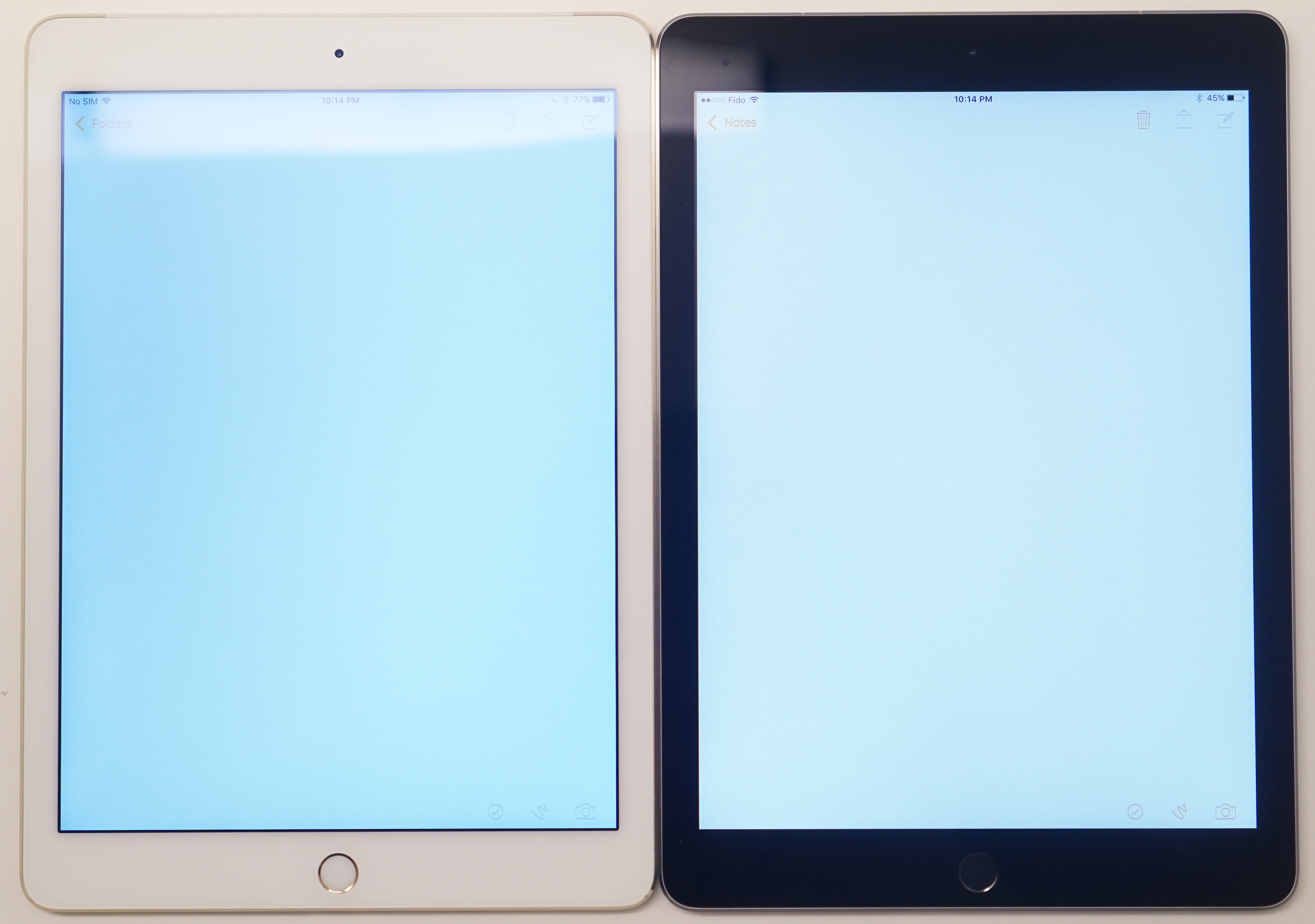
Apple's Simulated True Tone Image
It's difficult to photograph True Tone, as depending on where your camera's white balance lands the iPad Pro will look too red, or the other display will look too blue. I really recommend checking out True Tone for yourself, although if you decide to do it in an Apple Store you probably won't see the benefits because Apple's other products are designed to look neutral under the same sort of fluorescent lighting as those stores. If you have a chance to try the 9.7" iPad Pro outdoors or somewhere with warmer lighting I think you'll see why this tech is one of the small things that nobody really asks for, but everyone appreciates once they have it.


144 Comments
View All Comments
Meteor2 - Thursday, June 2, 2016 - link
Unlike the commenter above, I did notice you say that. Would've been good to name a smartphones which are better though.hlovatt - Wednesday, June 1, 2016 - link
@Brenden,Which note taken app do you use? Is it OCR?
Thanks.
Brandon Chester - Wednesday, June 1, 2016 - link
I used to use Notability but now I use Goodnotes. It has OCR for searching but I don't think it can do translation to a text doc format.KPOM - Wednesday, June 1, 2016 - link
I love Goodnotes.hlovatt - Thursday, June 2, 2016 - link
Thanks for the Goodnotes suggestion, I will give it a try.Loved the review particular the display analysis.
Wolfpup - Wednesday, June 1, 2016 - link
Glad for the explanation of True Tone...quite simple/obvious when it's spelled out like that, and sounds like something we'll eventually take for granted everywhere.That said, don't be scared off of the 12.9" model! I personally don't understand an iPad at all for "productivity"-to me they're fancy eReaders. I bought the 12.9" model because 9.7" has always seemed too small to me for graphic novels and magazines. Like it's usable, but it's compromised.
The 12.9" model, while it's limited compared to like a Surface, is still pretty awesome at being an eReader. The screen's fantastic, and Apple really nailed the weight and size and whatnot. IMO that's not as important in a 10" tablet, but at nearly 13" it could get out of control if it weren't well done-but they've come close to the weight and size and "in hand feel" of my iPad 2 with a screen that can finally display a full sized page without compromise. I was tortured over the decision for ages, but finally decided to go for it, and am glad I did...everything just looks so much better and I don't feel like I'm squinting or compromising anymore.
Apple's scaling hardware or software or whatever seems to do a nice job too. I'm pretty sure that Marvel Unlimited supports the 9.7" screen's resolution, but NOT the 12.9" one yet, but it looks fantastic on the larger screen. Okay, I still prefer physical paper, and I'd prefer an eInk equivalent to this, but it's really good..
Meteor2 - Thursday, June 2, 2016 - link
That's a really good point. The 12.9 Pro, with its 3:2 screen, basically replaces paper. That said, I find the compromise that the 9.7 screen (in an Air for me) makes in terms of size v weight advantageous.arsjum - Thursday, June 2, 2016 - link
12.9 iPad Pro has 4:3 screen resolution, Surface tablets have the 3:2 one.andrejg - Thursday, June 2, 2016 - link
That is one expensive reader :-)trewtrew - Monday, June 6, 2016 - link
Agreed, iPad Pro 12.9" has been perfect for textbooks reading as well as note taking.