A Look At QD Vision's Color IQ And The Philips 276E6 Monitor: Quantum Dots for Wider Color Gamuts
by Brandon Chester on April 28, 2016 8:00 AM EST- Posted in
- Monitors
- Philips
- Quantum Dot
- QD Vision
At this year's CES Josh and I sat down with representatives of QD Vision to discuss their quantum dot display technology, along with where they see the television and monitor market moving in the next few years. QD Vision offers a quantum dot solution for displays, which is branded as Color IQ. The interesting proposition that QD Vision brings to the table with their technology is that it's not just usable in high end displays, but also in less expensive ones where it can be used to bring features that were traditionally limited to high end displays down to a lower price point.
After our meeting with QD Vision, we were informed that Philips would be launching a new line of monitors that use QD Vision's Color IQ technology. Given that these are some of the first computer monitors to come to market with quantum dot technology, I was quite interested in taking a look at it. The monitor in question is the Philips 276E6 monitor, which has a 27" panel and claims to cover 99% of the Adobe RGB color gamut. The full specifications of the Philips 276E6 can be found in the chart below.
| Philips 276E6 | |
| Video Inputs | VGA, DVI-D, HDMI |
| Panel Type | IPS-ADS |
| Pixel Pitch | 0.311 mm |
| Colors | 16.7 million (8-bit) |
| Gamut | 99% Adobe RGB |
| Brightness | 300 cd/m2 |
| Contrast Ratio | 1000:1 |
| Response Time | 5ms GtG |
| Viewable Size | 27-inch |
| Resolution | 1920 x 1080 @ 60Hz |
| Viewing Angle | 178°/178° |
| Backlight | W-LED + QD |
| Screen Treatment | Anti-Glare |
| Tilt | -5° to +20° |
| Dimensions | 640 x 471 x 235 mm |
| Weight | 5.33 kg |
| Accessories | VGA Cable Power adapter |
Before moving forward, there are obviously a few points to address about the Philips 276E6. The first is the resolution and pixel density. At 27", a 1920x1080 resolution is definitely on the lowest end of the spectrum. It's very important to keep in mind that the 276E6 retails for only $300, which really isn't enough to get you a 27" 2560x1440 sRGB monitor unless you can order from Korea and dodge import fees. With that in mind, you're certainly not going to find a 2560x1440 Adobe RGB monitor for $300, and with the purpose of monitors like the 276E6 being to drive down the price of wide gamut displays, this concession makes sense. However, it is true that the pixel density of a 27" 1080p monitor is quite low, and having used a 2560x1440 27" monitor for several years now it did take some adjustment to get used to.
One other point to consider regarding the 276E6 is that, as a wide gamut monitor, it's positioning itself as a product for photographers and other professionals who would like to be able to work in a wider color space. For those applications the relatively low resolution poses less of a problem than applications that involve looking at a great deal of text. The Philips 276E6 is also just the first of many displays that will come to market with this technology, and even for users who are interested in a smaller or higher resolution panel the 276E6 will provide insight into the level of quality that can be expected from this new generation of inexpensive wide gamut displays.
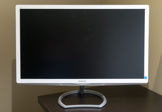
As for the design of the Philips 276E6, I think it's quite unique, but I'm not sure if I'm a huge fan of it. The chassis is definitely on the flimsy side, and the fact that it's made of white glossy plastic doesn't help the visual impression that it's not the sturdiest monitor. The panel has an AG coating, but it's not as heavy as the coatings I've seen on monitors that are really heavily targeted at office use.
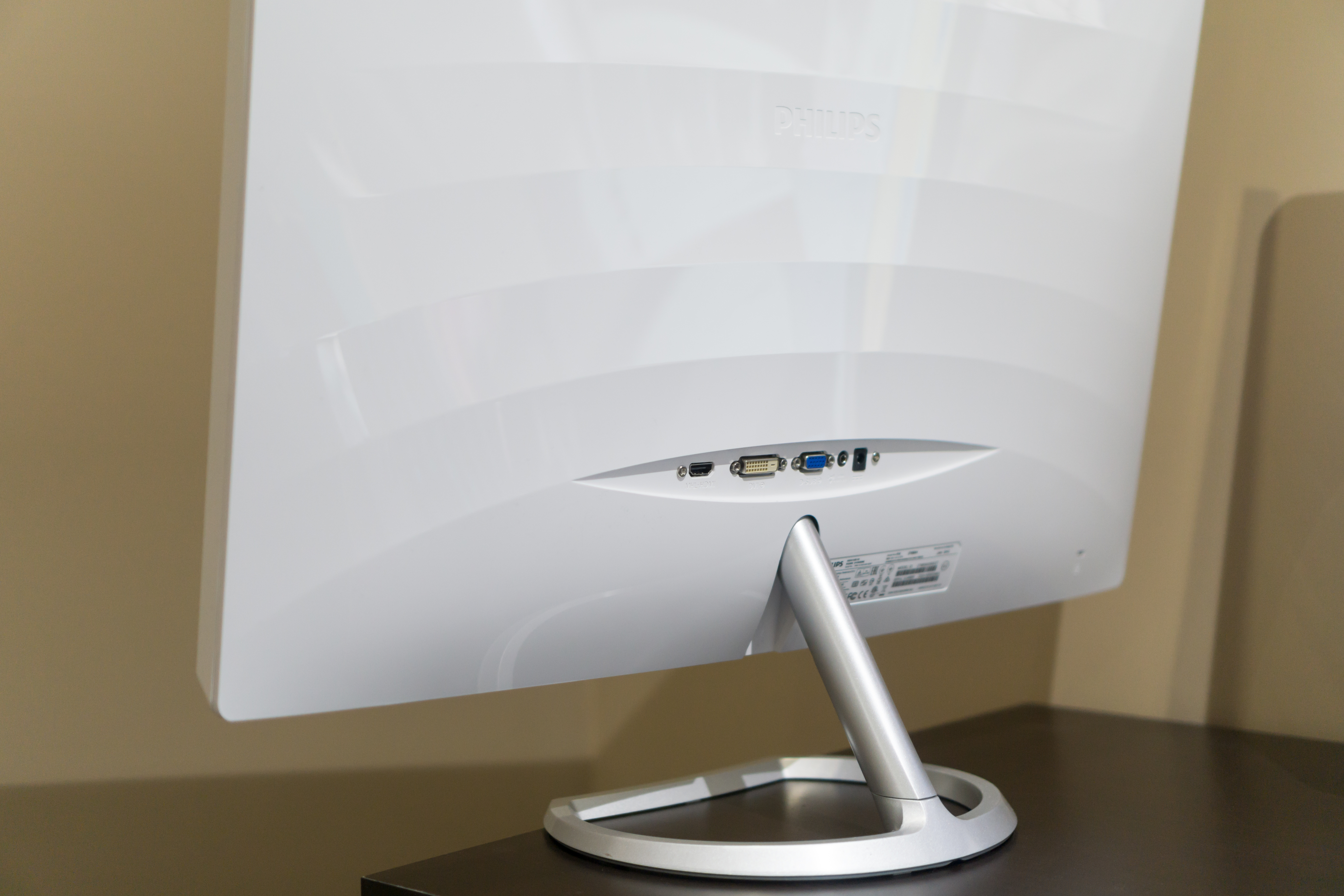
The back of the monitor is the same plastic as the front, although the chassis isn't a single component, so there is a gap between the two parts that runs around the edge. The back has a wave-like pattern, which I think looks sort of odd, but it's not really a problem since it's on the back of the monitor where it probably won't ever be seen. All the ports are back-facing rather than down-facing, and they include a port for the power adapter, a VGA port, a DVI-D port, and an HDMI port. There's also a jack for HDMI audio out.
As for the stand, it looks like a fairly study metal stand. However, that's only really true for half of it. The base of the stand is metal, and is removable, but the shaft is made of plastic and is permanently attached to the display. The stand has a degree of tilt, although tilting it too far worries me because the stand can be quite wobbly and I worry that any sudden shift or an impact on the desk may topple it.
One other thing I wanted to comment on is the OSD and the buttons for accessing it. To be quite frank, the buttons are horrible. The response is inconsistent, and you often end up hitting the wrong button by mistake and closing the menu. I wish manufacturers would just use physical buttons, as they're much easier to use and I really doubt that the impact on the bill of materials is significant.
For $300 you're not going to get an aluminum enclosure for your monitor, and in fact you don't really get that even for $1000 unless you buy Apple's Thunderbolt Display. However, I think darker matte plastic would have probably been a better option, and it should have been possible at this price point. Getting a stand with height adjustments and rotation is going to require buying a more expensive monitor, and the tilt range is as much as you'll need for a monitor of this size. Ultimately a monitor is going to be more about function than form, and that's what we'll get to next.


51 Comments
View All Comments
jlabelle - Friday, April 29, 2016 - link
- In the second corner we have Android. Not clear to me how much better off they are. They have handled DPI a lot better, which is a good start -If you are speaking of Android, you should compare that in Windows Store with Windows apps from the Store.
For those, the scaling is just perfect and it is handling ANY screen size / resolution / orientation perfectly.
Only issue with scaling are Win32 programs not using hidpi API released 9 years ago with Windows 7 (at a time where Android was not a thing).
- As far as I know there is still no color correction built into Android -
Android is the worse on this because you have virtually 0 color management.
bq. In the third corner we have Apple which seems perfectly positioned for all this (meaning that they will likely drive it).
Again, this is misleading.
For instance, iOS way of handling color management (see test on the iPad Pro) make the use of wide gamut screen virtually useless (for now) as there are no ways for a developer to take advantage of it. What it seems to do is basically apply a ICC profile to target sRGB color space.
Scaling is not a question really as resolution are pretty much hard coded but again, Windows app are scaling perfectly.
OS X has some "native" applications color managed (like Safari) but the same issue occur that the program needs to be color managed otherwise you have the same issue.
For scaling, this is exactly like Windows with hidpi API existing like forever and developer just need to use it. Maybe there are more application which are using it. But that's it.
OS X does not have really (from an OS point of view) an inherent advantage compared to Windows on color management / hiDPI screen.
bq. they're now pushing color accuracy both on the camera side (TrueTone flash, high dynamic range sensors)
actually, Apple is using 1/3" camera sensor, one of the smaller size in the industry (or only found in low end phone like Lumia 640XL...) and therefore the dynamic range is more limited than the competition (because it is mainly directly link to sensor size).
- and the screen side -
nothing exclusive to Apple. For instance, speaking of Windows here and therefore the Surface or the Lumia 950, they both have more color accurate screen that all the various iPad and the iPhone (albeit all are VERY good in color accuracy).
bq. "Our colors look good, and look correct, across ALL our devices --- photos on your iPhone look exactly the same on your iMac. Good luck getting that consistency with photo from your Android phone on your Windows screen."
It is no luck. Just pick the right product. If you pick a Surface and a Lumia 950 for instance, you will have the same great experience. And using a Samsung S6-S7 or accurate Android phone will give you the same.
Seems indeed that advertising is working correctly for people to believe that Apple has inherent advantage here.
- the relevance and interest of QD technology is whether it allows larger gamut to move to iPhone this year or at least soon.
Until developer can take advantage of it, it has not advantage for end user. So as good is the color gamut of the iPad Pro, it is useless from an end user point of view.
Brandon Chester - Friday, April 29, 2016 - link
I've already addressed why your understanding of the situation on the iPad is incorrect in my article specifically about it. Please do not spread serious misinformation in the comments or I will have to remove them; this is already an issue that is confusing to many people.theduckofdeath - Friday, April 29, 2016 - link
I don't get what bigger picture I'm missing here. Yes, LCD tech has evolved a lot over the years. But, it's just the faux marketing these manufacturers always stoop to, to give the impression that they're selling something better than LCD. A few years ago it was LED now it's Quantum Dots. Both insinuating that the backlight isn't the usual old flawed edge lit design.alphasquadron - Thursday, April 28, 2016 - link
As a Windows User(not by choice but because it supports a lot of software and games), it is tiring to see the slow pace at which Windows fixes problems. When are they going to get 4k scaling done correctly. And I remember when I got my new computer and going through the same confusing ICC sub-menus to get the actual settings.Also what was Phillips or QD Vision thinking when they sent a reviewer of tech site that is testing their monitor for color accuracy a fake sRGB mode. I mean he just mentioned that there was no sRGB mode on the monitor so what do you think the first thing he is going to test when he gets the new monitor is. I'm still confused whether the mode actually did change something or if they are just that dumb(or they think reviewers are that dumb).
Murloc - Thursday, April 28, 2016 - link
maybe they messed up while doing a quick fix. I hope.Brandon Chester - Thursday, April 28, 2016 - link
For the record, I spent a long time trying to prove to myself that it did do something. Unfortunately, if it truly were constraining the gamut it would be so completely obvious upon toggling it that you wouldn't even need to make measurements. I did measure anyway, and it truly didn't change the output at all.Guspaz - Thursday, April 28, 2016 - link
All this talk of colour management... It all works so easily on my macbook (load the profile Anand made, and everything looks correct), but on my main PC, it's a mess...I've got a Dell U2711 running Windows 10. That's a wide-gamut display, and I do have an ICC profile for it. The display was also factory-calibrated (it shipped with a printed report on the results).
If I want the most trouble-free setup where most stuff looks correct, which of these is the correct approach:
1) Set monitor to default profile and set Windows to ICC profile
2) Set monitor to sRGB profile and set Windows to ICC profile
3) Set monitor to default profile and set Windows to sRGB profile
4) Set monitor to sRGB profile and set Windows to sRGB profile
I'm guessing option 1 is correct for wide-gamut use, but the crappy Windows colour management would mess everything up. So if I want to just go for sRGB, it seems to me that option 4 is probably correct? Or is option 2 what I want?
This is all so confusing. On my Mac I just set the ICC profile and everything works immediately and perfectly.
Murloc - Thursday, April 28, 2016 - link
yeah MacOS got this down unlike Windows.I wonder how amenable Linux is in this regard.
tuxRoller - Thursday, April 28, 2016 - link
Pretty much as good as Mac, actually.Checkout my comments on the recent 9.7" iPad review (the one that dealt with color management).
jlabelle - Friday, April 29, 2016 - link
See my answer in page 2. I was in your EXACT same case.1) I guess you have a ICC profile so you are able to calibrate the screen yourself with a probe or you have a generic ICC profile from a DELL review (which means that you do not consider production variation and variatin over time) ? this is theoretical ideal situation to take advantage of wige gamut screen…except, I do not advise it for the reason describe below.
2) Hassle free solution : same as above but you constraint yourself with sRGB color space. You will have good color accuracy on color managed application. And even for non color managed application, and even if your ICC profile is not very good, you will have not problem of oversaturation or washed out colors.
3) make no sense at all ! It means that you are saying that the DELL is perfectly accurate according to sRGB color space and gamut. Obviously, it cannot be further from the truth so you will end up with all your colors (EVEN for color managed applications) oversaturated. No, no, NO !
4) This is the equivalent as what the article advice for the Philips : you put the screen in sRGB mode. You do not have any ICC display profile (because you do not have the necessary calibration equipement). So you are assuming that it is correctly calibrated and are saying to the OS that you display is perfect according to sRGB. Actually, this is the standard and you do not need to do anything to be in this situation.
The preferred solution is by far the number 2.
To understand why, let’s reverse the discussion and ask you (or people) why they think they benefit from a wide gamut screen ?
• To surf the web ? No because websites are targeting sRGB anyway
• To view pictures received by email or taken by you ? In most cases, no because mobile phone, compact cameras and even most DSLR are setup to take sRGB pictures
• To view film ? It is slightly more complicated but anyway, there is no content with wide gamut (to make things simple) and anyway no consumer video software that would manage it. So you would end up with over saturated colors permanently. Except if this is your thing…
So then, in which case would you have any benefits ?
IF you have your own DSLR/mirrorless and IF you set it up in aRGB mode and IF you make always duplicates of every single picture in sRGB anyway that you want to share / display on the web / bring or sent to printing.
And even if all those “IF” are fulfilled, you will end up having over saturated colors in most of your applications, when surfing the web, when watching pictures of others… All that just to be able to see, on your own pictures, maybe a tiny difference with side-by-side comparison in 0,001% of the case (I am not making this number, it is the proportion of pictures where I was able to spot a difference).
Long story short : a wide gamut screen makes NO sense currently. And there is a reason why it is said that it only make sense for professional for very specific application. And those people do not come here to ask if it makes sense because they are aware of all this.
Bottom line : choose option 2.