The iOS 6 Review: Maps Thoroughly Investigated and More
by Brian Klug & Saumitra Bhagwat on September 19, 2012 2:21 PM ESTApp Store UI Changes
Apple hasn’t made a huge deal about it, but in iOS 6 the App Store UI changes in a dramatic way. The new interface appears to offer greater flexibility for Apple to customize the layout on the fly and change the order of menu items or other features. In addition there are a host of subtle but welcome changes.
The individual app listing page is different, adopting a three-tab system for details about the app, reviews, and a related column with apps by the same developer. There’s a lot more whitespace in the new layout as a whole, and although the changes make the app description pages more inviting I can’t help but shake a suspicion that information density took a hit as a result.
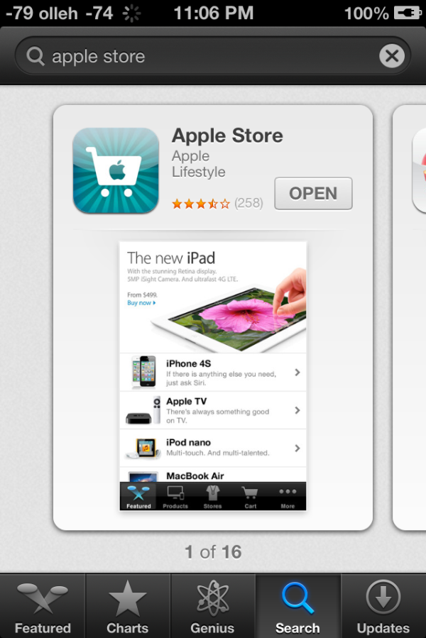
App discovery traditionally has been a challenge for mobile platforms, partly because it’s hard to come up with a good visualization for lots and lots of apps and partly because of the limited display area inherent in a mobile device. Unsurprisingly it seems as though the App Store redesign tries to tackle that problem head-on. First, the bottom bar places Genius dead center and offers a horizontally paginated nearly infinite scrolling list of recommended apps. This basic view also gets copied on the search page – there are pages of apps matching the search term with a big screenshot and install button. Featured gets changed dramatically and Top becomes Charts.

Updates with individual changelogs (Left), New search view (Right)
There are a few friction points which have also been smoothed over. A hugely welcome change is that app updates can now take place without requiring an Apple ID password. Likewise, free applications can be installed from the store without entering a password. Only purchases require a sign-on. The update screen also now has an expandable region under each app for viewing many changelogs at a glance as well. There’s update progress displayed in this menu in addition to on springboard. Newly installed applications also now get a new badge on them which goes away after a first launch.


105 Comments
View All Comments
tipoo - Wednesday, September 19, 2012 - link
Pretty sure the 4S is faster than the 4 :)Ryan Smith - Wednesday, September 19, 2012 - link
I'm assuming you must be referring to the SunSpider results? In that case lower is better, so everything looks correct here.tipoo - Wednesday, September 19, 2012 - link
I think they were changed, when I looked last the 4 had lower Sunspider and higher Browsermark scores, and it also had N/A beside the other two, now the 4S has the N/A and better scores.Henk Poley - Wednesday, September 19, 2012 - link
Related, I consistently get a Sunspider 0.9.1 score of about 3000 +/- 1% on my iPhone 4 GSM. Typo? 33.. instead of 30.. ?dsumanik - Thursday, September 20, 2012 - link
blah blahThe new maps suck...they are a significant step down, in dataset AND functionality.
Users in the US might ALMOST get the same experience but everywhere else on the planet got screwed.
There are spelling errors, missing roads, improperly labeled cities and for the most part, significantly less detailed maps.
I live in a very remote community, in northern canada...there is a GOOGLE STREET VIEW picture of my house and street.
There is no way Apple will ever come up here to offer the same level of detail...im simply in too small of a market.
There isnt even color photos of my town.
LOL!
Jobs would never have let this slide until it was competitive... right now it simply is inferior in every single way.
mrgulabull - Wednesday, September 19, 2012 - link
The "trouble building" you mention actually looks like that. It's the Walt Disney Concert Hall. If anything I'd say the 3d model is remarkably good.Here's an aerial shot from Google Maps
https://maps.google.com/maps?q=walt+disney+concert...
ratte - Wednesday, September 19, 2012 - link
It's the building above that (the Dorothy Chandler pavillion) that looks badBrian Klug - Wednesday, September 19, 2012 - link
OH wow, ok, well that's interesting... Fixing now.-Brian
nathanddrews - Thursday, September 20, 2012 - link
If you had seen the "Get Smart" movie, you would know. :Prd_nest - Wednesday, September 19, 2012 - link
Seriously, whatever I have seen so far, Apple maps are absolute failure in India. It's actually pathetic in terms of actual data. Forget about features, they simply don't have data. It's so bad that I can't even think why they should launch iOS 6 here? Comparison with google maps?? just forget it.. and all those fancy 3D flyover, well probably by 2025 if we are lucky..