Windows 10 Technical Preview First Impressions: The Return Of The Desktop
by Brett Howse on November 13, 2014 8:00 AM EST- Posted in
- Software
- Microsoft
- Windows 10
I’ve said this before, and I will reiterate it now. Windows 8, in general, is not perceived in a positive light. Not necessarily because of the lack of features, or even due to the touch first interface, but because from the start people did not buy into the paradigm. We can argue over why that was, and the specifics are likely different for every individual. But a big part of that was that Windows, which has had a familiar interface since Windows 95, had changed dramatically in look, feel, and general use. The traditional mouse and keyboard PC and notebook is a big part of the Windows user base, and especially at the beginning, Windows 8 did not cater to that crowd. While there were certainly improvements to the desktop, it was not enough to overcome the negative feelings of many users in regards to being productive on their PC. I say this as a fan of Windows 8.1, and I say this despite the positive review from this site. Windows 8 was an OS that worked, but had a steep learning curve that many people did not want to bother learning.
One of the biggest issues facing Windows 8 was just how much people liked Windows 7. Windows 7 was seen as the savior to Vista, and fixed many of its issues. But a lot of the initial problems with Vista were due to a major change in the driver model as well as the security model, which caused a lot of compatibility issues with older programs which expected administrator rights, as well as many hardware devices needed driver updates. With Windows 7, all of those changes were in the rear view mirror, allowing 7 to be a tweak of the overall UI and functionality rather than a rebuild of the OS from the ground up. With Windows 8, the move to touch first caused another dramatic upheaval. This time, rather than incompatible programs and hardware, we got a new Start Screen, a new runtime in WinRT, and a new app model with the Windows Store. For reasons that will never be made clear, the familiar start button was even removed, with the designers relying on hidden functions such as the hot corners to navigate around the OS with a mouse and keyboard. Luckily this change was reversed for Windows 8.1, with the start button returning, even if it still opened the Start Screen. With the Windows 8.1 Update, the system was made much more usable for a mouse and keyboard with the return of the menu bar to close apps, rather than dragging them down off the screen, and several other changes as well which brought the balance back somewhat to cover both touch interfaces as well as the mouse and keyboard.
 Windows 8 at launch in October 2012
With Windows 8, Microsoft tried out an operating system which would work with a single interface across a breadth of hardware, from small form factor tablets, up to 30” monitor desktops. While they certainly succeeded in creating an interface that worked across all of those platforms, it was not ideally suited to any of them. With the tablet mode, the new Start Screen worked very well, and the charms menu and app switcher were fairly easy to use. But many of the settings and programs would be on the desktop, where touch only worked sparingly. Some desktop applications, such as Office, were created with a touch mode to increase the size of the onscreen elements, but overall the experience was subpar. Similarly, on the desktop, the touch interfaces were not ideal, and the hot corners certainly had issues especially on multi-monitor systems.
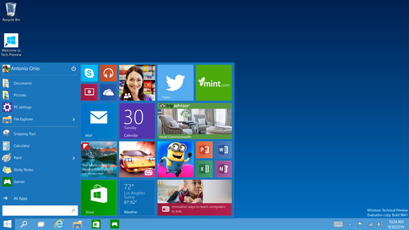
Windows 10 Technical Preview at launch
But now we come to Windows 10. Windows 10 is ditching the “One Interface to Rule them All” mentality, and moving to a more user friendly model of a single store across all platforms, and multiple interfaces to the same OS depending on the current usage model. We have not seen all of this in practice as of yet in the Technical Preview, but Microsoft has demonstrated their solution to this change in input mode with a feature they are calling Continuum.
The goal is that those that are on a keyboard and mouse based system will have the traditional start menu and desktop, with apps in windows, but if you are on a touch based device, or if you go on a 2-in-1 from keyboard to touch, the system will switch to the Windows 8 style start screen with full screen apps.
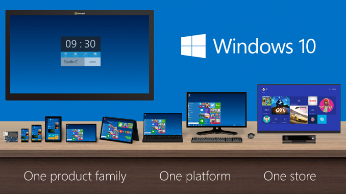
One of the keys to having this experience is an app model that allows a developer to target this different user interface paradigms. Microsoft’s solution to this is Universal Apps.


198 Comments
View All Comments
inighthawki - Friday, November 14, 2014 - link
I have to disagree. The trend clearly began as a way to improve load times on low and limited bandwidth connections by removing a lot of the glam and gloss and relying more on CSS style sheets to expose a minimalist design. The problem is that this turned into a really awful fad of "Me too!" design philosophies and now everyone is trying to fit it in everywhere, just because it worked out in its original incarnation. Flat design works EXTREMELY well, in select cases. An operating system can have multiple uses. On a phone and a tablet, these goals are content consumption - e.g. web browsing, photos, videos, etc. On a desktop, an OS is more of a tool for productivity purposes. Flat design does NOT work well here. It may satisfy some hipster craze for their OS to look "modern" and that might be fine as they use their computers to go browse facebook and post to twitter. But this design is extremely counter productive for power users, since it strips all of the design cues that are there to empower the user, such as high contrasting window borders. skeumorphism design mimics real-world designs for a reason. The real world is an extremely productive environment that humans are familiar with. Giving humans tools in an environment that is recognizable enhances productivity. Having a window frame that appears to be made of real-world materials such as wood, glass, etc, with 3D effects that mimic depth work way better than solid colors with light accents for multitasking.I'm fine with metro on my phone and on my tablet. But on the desktop - it needs to die. This goes not just for windows, but for Office and Visual Studio as well. All the latest versions of each are easily the worst versions Microsoft has ever released.
sphigel - Thursday, November 13, 2014 - link
I used to think the same thing. When I upgraded to Windows 8 and Office 2013 I really hated the look of it. After using it a while, I now think that Windows 7 and Office 2010 are ugly looking. Having said that, I'm really looking forward to the drop shadows on windows coming back in Windows 10. They did go a little too flat with the UI in Windows 8.kmmatney - Thursday, November 13, 2014 - link
I have teh opposite reaction. I use win 8 at work and for my home computer, but also have a few Windows 7 computers at home. Whenever I go on a Windows 7 computer, the first thing that jumps out at me is how much nicer it looks compared to Windows 8.steven75 - Friday, November 14, 2014 - link
Same experience. I also have used Office 2013 for a while, and even in the farsical "dark theme" that is a very very lightly shaded gray, I still HATE the white-everywhere with no contrast look of it.GuardianAngel470 - Saturday, November 15, 2014 - link
I've been using Office 2013 for a while now. I like it, but then I've never really used Office with a Dark theme so, even though "Dark" is light grey, it doesn't really bother me.However, for anyone who does use Dark for anything, I sympathize completely.
andrewaggb - Sunday, November 16, 2014 - link
Yeah the windows 8 color scheme has grown on me as well. Not a big fan of IOS 8's theme.I don't use the start screen at all on the desktop, but I love it on my miix tablet. Definitely was a mistake to try to force it on the desktop, but I think everyone except microsoft knew that. And probably many people there did as well.
jabber - Friday, November 14, 2014 - link
For me what was wrong for Windows 8 was the use of purple on the desktop in so much of the media advertising. Looks wrong.Who likes Purple? Notice that Windows 10 now uses far more neutral blue.
Da W - Thursday, November 13, 2014 - link
9.0/10 for Windows 10 so far.The thing i miss i that i don't clik the start button to see some of my live tiles as often now. Some tiles (facebook, mail, calendar, weater) are useful. They should make them like widget on your desktop (yes bring back the widgets).
Houdani - Thursday, November 13, 2014 - link
Rather than widgets, I'd be happy if they would let us snap a "start screen" to one side of the monitor so we could fill it with a selection of live tiles.croc - Friday, November 14, 2014 - link
"That is what is going to make or break this version for mainstream users (who by in large like win8.1)" I'd have a hard time calling 11% 'mainstream'.http://www.netmarketshare.com/operating-system-mar...