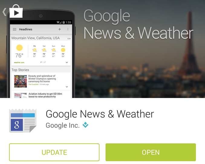
Google's News & Weather App Updated to Version 2.0
by Brandon Chester on August 26, 2014 2:30 PM EST- Posted in
- Smartphones
- Mobile
- Tablets
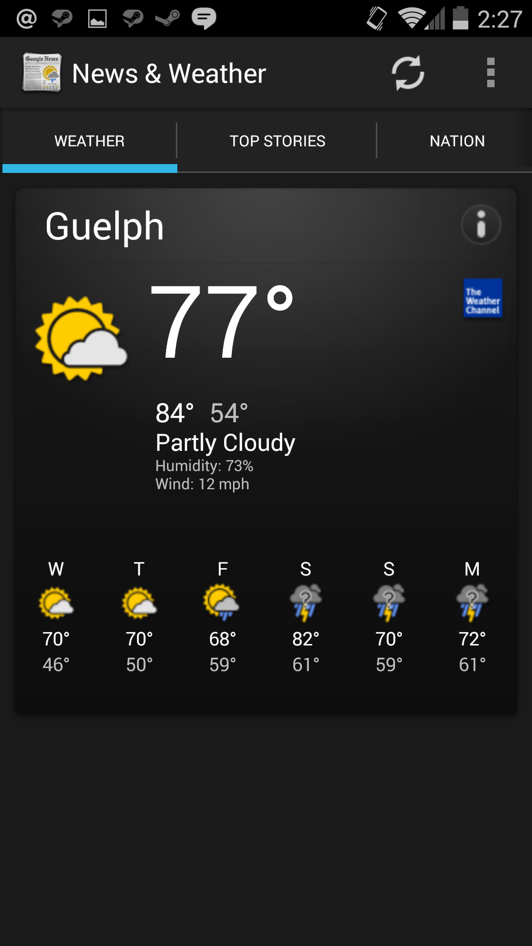
Today Google has rolled out an unexpected update to an app that seemed long forgotten. It's the News & Weather application that comes on Android phones running software maintained by Google like Nexus and Google Play Edition devices. The big change with the update is a complete design overhaul that implements Google's Material Design principles. The app previously sported a design that was like a relic from the distant past, with an interface that seemed like a mixture between Android Gingerbread design and some parts of Google's original Holo design from Android Ice Cream Sandwich. There was heavy use of black, with horizontal scrolling sections and gradients throughout.

Old News & Weather on the left, new on the right.
The new design is like a breath of fresh air. I had not even used the old app to change the temperature units from Fahrenheit to Centigrade because the design was so outdated that I looked to other apps to get weather and news information. The weather images had also not been updated to support very high resolution devices in the 400+ ppi range, and looked quite blurry. The new design does away with the black color scheme and features information displayed on white cards with high resolution weather images. The tabs at the top have also been removed, and all weather and news information is displayed in a single vertically scrolling list. Specific news topics can be accessed by the navigation pane that slides in from the left. Information about temperature and precipitation trends can be revealed by tapping the downward arrow on the weather card.
Old News & Weather widgets on the left, new on the right.
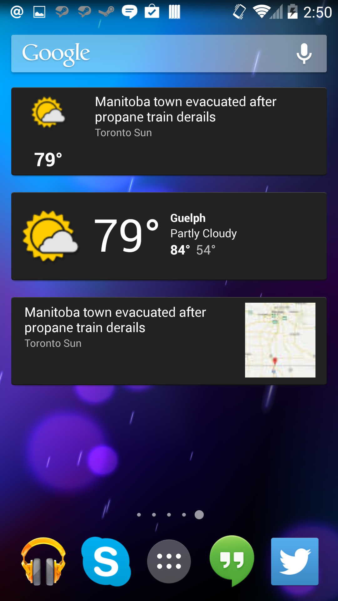
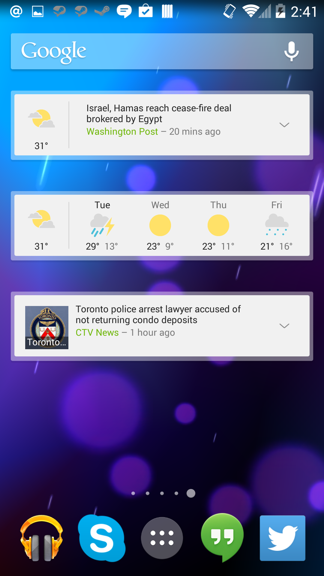
The widgets for the app also receive a makeover. The app maintains the options for news + weather, news only, and weather only, with the weather only widget being changed to display the forcast for the coming days rather than just the current weather. The widgets also have a semi-transparent border around them, which may be another element in Google's new design language.
News & Weather 2.0 is out on Google Play now. Like all of Google's updates, it may take some time before your device receives it.
Source: Google Play


23 Comments
View All Comments
nathanddrews - Tuesday, August 26, 2014 - link
"See how light and airy it is? That's what you want! Trust us!"I'm just upset that they are moving back to black text on white. It's like they want OLED to fail...
pixelstuff - Tuesday, August 26, 2014 - link
If OLED can't display black text on white then it deserves to fail.pukemon1976 - Tuesday, August 26, 2014 - link
Uhm. Misplaced comment? Some people want dark theme options for the sake of battery life. I ran quite a few blacked out apps for a couple of weeks on my note3 and battery life doubled because thescreen oh so much less power. Then there's the too much white is too bright crowd. Not enough contrast and a bugger at night. Then there's the crowd like me. I want it all. Power savings of dark/black themes and the easier on the eyes. Some of like android because of the options. Lately our choices seem to slowly be creeping the way of iOS. Not good. I am seriously hoping a 3rd contender steps up to the plate. I wouldn't mind Ubuntu touch on an oled screen.ABR - Tuesday, August 26, 2014 - link
Try a Windows phone.Solandri - Wednesday, August 27, 2014 - link
The better apps I've seen have an option to switch between white on black, or black on white. Google's apps don't. :( I kinda wish Samsung would make an Android utility which let you invert the colors at the OS level on an app-by-app basis.I pulled my old OLED phone out of storage to lend to a friend (who wanted to try out Android before getting an Android phone). It's shocking how clear and clean OLED is with its inky blacks. And I'm coming from a Nexus 5 which supposedly has one of the better IPS displays. I'm definitely going back to OLED with my next phone.
jvl - Thursday, September 4, 2014 - link
Carbon ROM has a neat feature called 'dark mode' - they basically use the holo dark for the whole OS.Unfortunatelly I haven't been able to test it yet (Moto X still isn't rooted...), but it looks nice as hell. Maybe it's worth checking out =)
Hairs_ - Wednesday, August 27, 2014 - link
Well said. The move towards flat, colorless, white background designs for everything is sad, taking no account of device design or use case scenario.Apparently flatness, whiteness and no graduation or shading is required for everything, even though it's worthless on a desktop/laptop and wastes the benefit of oled screens used by android's biggest selling player.
Back to the old "I use it this way, therefore you all will too" ux designer mantra.
SpartanJet - Tuesday, August 26, 2014 - link
They make some ugly widgets.lurker22 - Tuesday, August 26, 2014 - link
Only available outside USA?jmunjr - Tuesday, August 26, 2014 - link
I use the new and weather apps all the time and like it. I won't be updating it unless the new one at least lets me go to a black/dark theme.