Google Updates Chrome To Version 37 With DirectWrite Support
by Brandon Chester on August 26, 2014 11:00 AM EST- Posted in
- Google Chrome

Today Google updated the stable version of their Chrome browser to version 37.0.2062.94 on Windows, OS X, and Linux. This is a highly anticipated release for users on Windows specifically, as it marks the move from Microsoft's Graphics Device Interface rendering method to Microsoft's DirectWrite text rendering API. Using GDI resulted in significantly worse text rendering in Chrome compared to other browsers like Internet Explorer and Mozilla Firefox. The issue was also non-existent on Google's versions of Chrome for OS X and Linux which use font renderers native to their own operating systems. Switching to DirectWrite has been requested for years by users on Windows, and Google has stated that it took significant rewriting of their font rendering engine which is why it has taken so long.
The issue was more pronounced in some areas than others. Below we have a screenshot of a section of my own website which has always had significant issues with font rendering in Chrome. Somewhat funny is the fact that the fonts used are sourced from Google fonts.
Chrome 36 on the left, Chrome 37 on the right
The aliasing in the font rendered on Chrome 36 is quite apparent. Some letters even have entire areas that appear to be chopped off, like the top and bottom of the letter 'O'. On Chrome 37 the rendering is significantly improved. There's far less aliasing on fonts, no missing chunks from letters, and even the double down arrow glyph inside the circle looks much sharper.
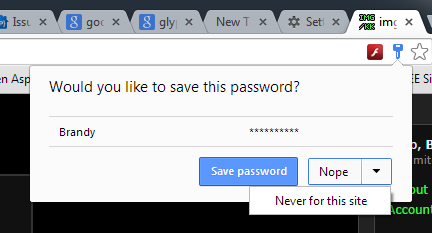
While Google didn't detail it in their changelog, Chrome 37 also includes the new password manager interface that existed on the beta for Chrome 37. When on the login page for a website, a key will appear in the search bar with a list of all saved passwords for that website. This also replaces the bar that would appear at the top asking to save a username and password after entering it for the first time.
Google's changelog also states that Chrome 37 has a number of new APIs for apps and extensions, as well as many under the hood changes for improved performance and stability. There are also 50 security fixes, with the most interesting or significant fixes detailed in the source below.
Source: Google Chrome Blog


35 Comments
View All Comments
Death666Angel - Tuesday, August 26, 2014 - link
Haven't noticed any blurryness on my 1440p 27" screen with the new Chrome and that should be a pretty standard DPI.Should be good on my 1080p 11.6" Laptop where I had to disable the upscaling for Chrome (run Windows at 150% because of touch screen) which made it look non-fuzzy, but also tiny. :D
madwolfa - Tuesday, August 26, 2014 - link
I had to tweak the ClearType tool to get rid of the fuziness on my 1440p 27" screen. Somehow GDI rendering was still a bit sharper for me.HankP - Tuesday, August 26, 2014 - link
Changing the display font size to "Smaller - 100%" did the trick for me. Although now I have really small text in my browser tabs and Windows menus, etc... This is preferable to having all the text too large or fuzzy in Chrome with this new update. I'm running a Dell 24" monitor at 1920 x 1200.HankP - Tuesday, August 26, 2014 - link
To clarify, I meant changing the Windows system display font size to "Smaller - 100%".tipoo - Tuesday, August 26, 2014 - link
Awesome. I always thought Chromes fonts looked too aliased in comparison to IE or Firefox or Opera, though I preferred it in many regards. Though recently it's strangely slow for me, Opera is serving as my best choice right now.sdmarathe - Wednesday, August 27, 2014 - link
Are you kidding me? Directowrite is PATHETIC. it renders fuzzy on standard (aka 720 p) displays - and looks nothing short of crappy. Thank goodness - if you go to chrome:flags - and disable directwrite - to get back to sharp fonts before Chrome 37. Someone needs to stop this Direct write madness - that is one of major reasons why I do not use IE in Windows 8. Due to this IE 11 It looks like crappy fuzzyTegeril - Wednesday, August 27, 2014 - link
Discussing graphics quality on a TN 720p display that is quite possibly 14 or 15" diagonal is rich.bnjohanson - Wednesday, August 27, 2014 - link
uhhh,,,....no it isn't.
fumanstan1 - Wednesday, August 27, 2014 - link
Directwrite made some forums look like crap on both my work computer and at home. Including Anandtech's forums. Disabling it made it look like normal for me.cmdrdredd - Wednesday, August 27, 2014 - link
Yep because it squishes the text together and puts the underline for words right against the letters. This makes everything terrible to read the AT forums.Turning it off is preferable to trying to zoom or change the default font to me.