The LG G3 Review
by Joshua Ho & Anand Lal Shimpi on July 4, 2014 5:00 AM EST- Posted in
- Smartphones
- LG
- Mobile
- Laptops
- G3
While the enthusiast segment is no stranger to LG smartphones, for the most part LG hasn’t received nearly the amount of attention that Samsung has. At first, it doesn’t make much sense. After all, LG is almost as big as Samsung. Both are chaebols, with enormous resources and power that few other companies have. Starting from the Optimus G, it seems that LG has shipped some of the best hardware in the industry, leveraging all the branches of the company from LG Innotek to LG Display to make a product that was easily equal to or better than the competition at the time.
One of the real issues that LG faced was a credibility gap. After the Optimus 2X and 4X HD, LG simply lacked credibility amongst the enthusiast audience. Without this audience and without the marketing push that other OEMs had, LG phones simply didn’t sell. Fortunately, things have gotten better since those days. The G2 brought significant attention to LG phones, and if anything, LG has been the sleeping giant in the industry. LG’s displays have been some of the best in the industry, and as an Android OEM they’ve consistently executed well on hardware. The immense popularity of the LG-made Nexus 4 and 5, even amongst mainstream consumers is surprising, especially because they were supposed to be developer devices.
Hardware
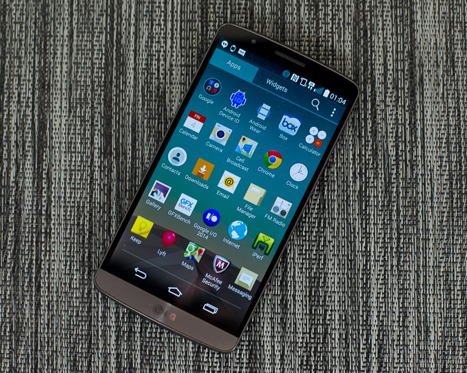
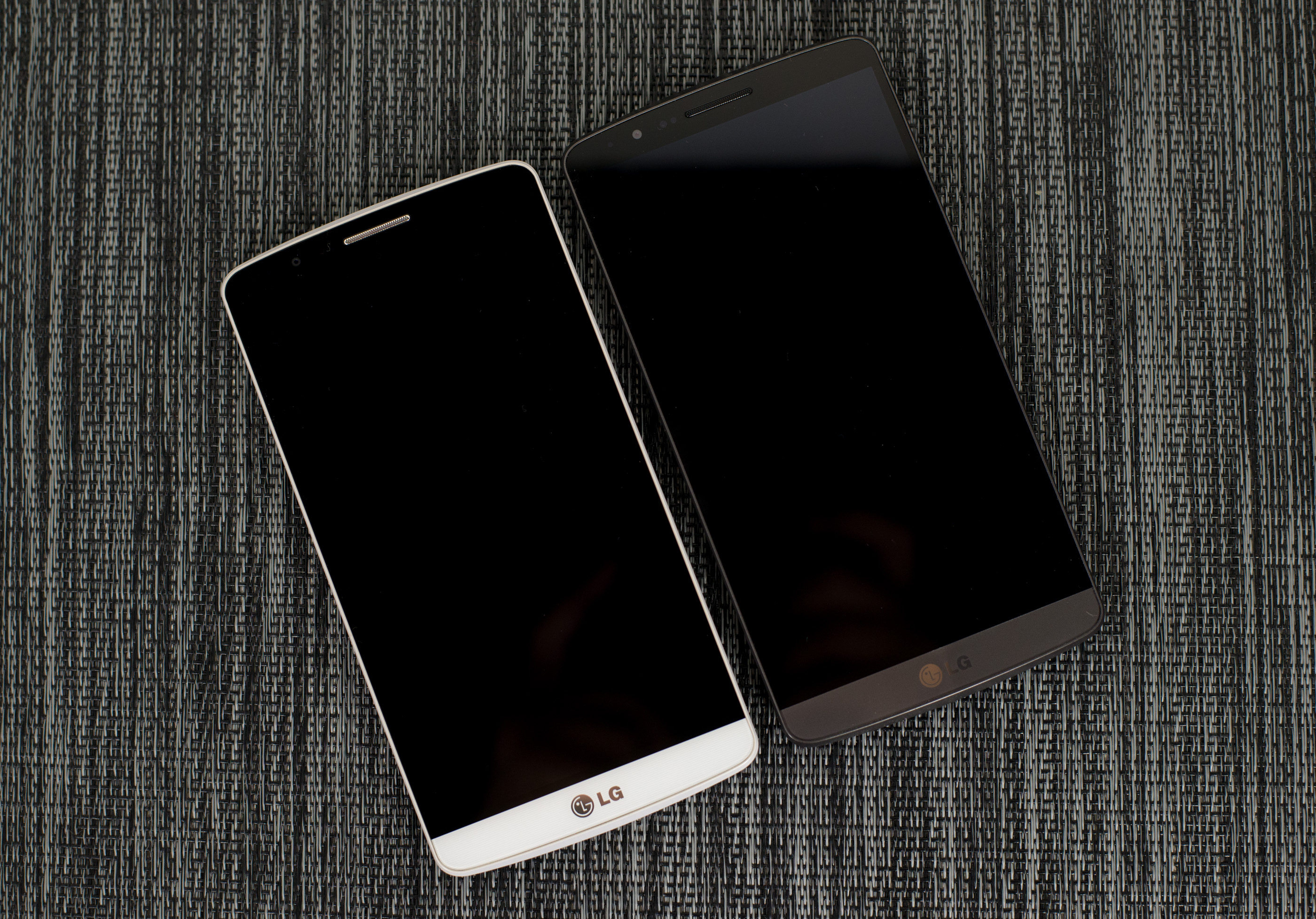
This leads us to the LG G3, which is now available in Korea and ready to be sold internationally. LG now faces the difficult task of succeeding the G2, one of the best phones of 2013. To find out whether they’ve made a worthy successor, we start with industrial and material design. When you first pick up the G3, it’s obvious that LG wanted to make a phone with the look and feel of brushed aluminum. To this end, LG has definitely done a good job. Although the polycarbonate back feels much warmer in the hand, the texture is good, and in practice even after extended use I never felt like the phone was grimy. It’s good to see that most of these OEMs are moving away from glossy finishes. The back cover is also removable, which allows for a removable battery and microSD slot. The front of the display is almost unchanged from last year, with extremely small bezels all around to reduce wasted space. The one change to the front of the phone is a band of color around the bottom that matches the color of the back.
Around the sides, the port layout remains nearly identical. The top has the IR Tx/Rx ports, the bottom has the 3.5mm jack and a microUSB port in the USB 2.0 shape. LG has also added a beveled edge from the display to the sides, which emphasizes the curved nature of the back. On the back of the phone, one can see the camera with the IR rangefinder and LED flash to the sides. The volume and power buttons are directly below the camera. The volume rocker is relatively flat compared to the protruding power button, which also has a noticeably different texture to distinguish the two from each other. The single, 1W speaker is towards the bottom.

Outside of these basic button and port placements, the hardware itself is high-end. The key differentiation points in this case are the camera system, QHD display, and the high-power speaker. I’ve put the rest of the basic specs in the table below.
| LG G3 | |
| SoC | MSM8974AC 2.45 GHz Snapdragon 801 |
| RAM/NAND | 3 GB LPDDR3, 32GB NAND + microSD |
| Display | 5.5” 1440p IPS LCD |
| Network | 2G / 3G / 4G LTE (Qualcomm MDM9x25 UE Category 4 LTE) |
| Dimensions | 146.3 x 74.6 x 8.9mm, 149 grams |
| Camera | 13MP rear camera, 1.12 µm pixels, 1/3.06" CMOS size, F/2.4. 2.1MP F/2.0 FFC |
| Battery | 3000 mAh (11.4 Whr) |
| OS | Android 4.4.2 with LG UI |
| Connectivity | 802.11a/b/g/n/ac + BT 4.0, USB2.0, GPS/GNSS, MHL, DLNA, NFC |
| SIM Size | MicroSIM |
While the spec sheet gives an idea of what to expect from the G3’s size, it’s surprisingly small for a 5.5” display size device. Unfortunately, this doesn’t make the G3 easy to use with one hand. While using the One (M8) and Galaxy S5 with one hand is uncomfortable, the G3 is almost impossible to use with one hand. Trying to tap something on the left side of the phone when using it with the right hand is difficult, and trying to reach for something on the top left of the display is almost impossible. While the division between phone and phablet is relatively clear in my mind, the G3 is in the line between both. I don’t object to the phablet formfactor, but this is supposed to be a phone, not a phablet. In addition, because the G3 has such thin bezels, it's very easy to accidentally activate the touch panel unintentionally while trying to stretch for one area of the display.
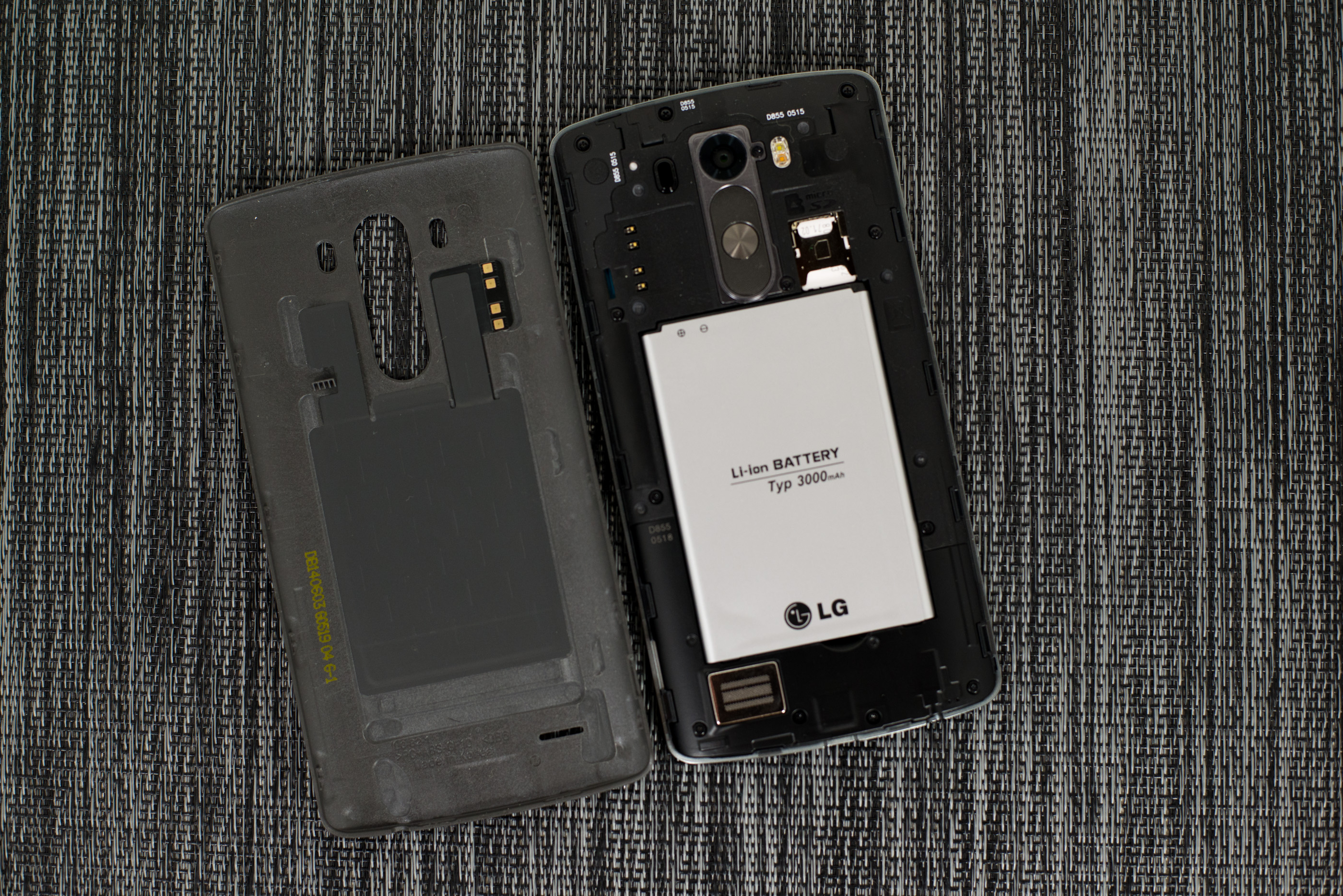
Other than the size, I definitely like what LG has done here. The design of the phone is understated and classy, even if it’s a bit off-putting that LG is trying to make plastic feel like metal. The back buttons are a non-issue, even without KnockOn/Off and KnockCode, and the curved back is great for ergonomics. However, I question the wisdom of moving to a removable battery/back cover in this case, as it means that there’s no stacked battery that we saw in the LG G2 and reduces volumetric efficiency. LG has included a curved battery in the G3, although in practice the curve isn't as aggressive as the one we've seen on the G2.


174 Comments
View All Comments
peterfares - Friday, July 4, 2014 - link
I agree. Give me a damn removable battery and SD slot.Stacking it might get it to have slightly more capacity but not that much. Like 5% more. I'd rather have it be removable.
Krysto - Friday, July 4, 2014 - link
Android OEMs short-sighted focus on marketing gimmicks to the detriment of actual performance is infuriating. As you said, LG could've chosen a higher quality 1080p display, that along with the same battery would've also given better battery life and higher performance. But no, instead they chose to chase the "bigger is always better" gimmick.We have a Full HD display in the palm of our hands - what more could we possibly need? They could've chose a 1080p display with a bigger focus on sunlight visibility, or just leave it the same, and focus on improving the camera even more, or making a more solid device.
ZeDestructor - Friday, July 4, 2014 - link
What kills it for me is the 5.5" Size. As someone who did the Xperia Z->Z1->Z2 route (the LCD did improve successively every generation, especially wrt colour gamut), phones are getting more and more unwieldy. If it weren't for the fact that the Z2 is physically narrower than the Z1, I'd have skipped it and waited for the Z2 or Z3 compact.SleepyFE - Friday, July 4, 2014 - link
I still prefer battery life. 480x800 is enough for me. It doesn't distort smaller letters, so i can still read a fully zoomed out web page (if it's not too wide). And you can have a smaller phone (a must since i keep it in my front pocket). I also prefer a bit more space between the screen and the edge. Right now i can't use my phone with one hand as it detects the tips of my fingers when i hold my phone. My grip has to be too lose for my liking.ZeDestructor - Friday, July 4, 2014 - link
480x800 and even 1280x720/1280x800 suck compared to 1080p. It's not just the ability to render, it's the font smoothing that's required. You need extensive smoothing at lower densities, and while it produces something readable (if fatiguing) for Latin-based, Cryllic and most Middle-Eastern and Indial peninsula characters, far-eastern scripts like Japanese or Mandarin render poorly, especially beneath 300ppi.Here's a comparison between 300ppi and 600ppi by JDI in 2012: http://www.j-display.com/english/news/2012/2012060...
SleepyFE - Friday, July 4, 2014 - link
Yeah with 3mm blown up to 2cm. But that's not how zoom work is it? Like you said, the font smoothing solves it and since there is less pixels the GPU consumes less power as well.ZeDestructor - Friday, July 4, 2014 - link
If you've never read Asian characters for any extended period of time, you'll think that font smoothing is enough. Fact is, it's not. With font smoothing, at small sizes, Far-Eastern characters just look like a blurry, gray mess, so people use hand-designed, pixel-perfect bitmap fonts instead.. For an equivalent comparison zoom it out to around 40-50% (because yay 100ppi on most computers :/). The difference in quality matters in person. Not for us, but for other people elsewhere on the planet.SleepyFE - Friday, July 4, 2014 - link
Another problem with the comparison is the size of Asian characters. In the picture they are the same size as latin characters. They write them bigger on paper for a reason. They would be a blob of ink if they were only a few millimeters. They need to use bigger fonts for their characters. Problem solved.ZeDestructor - Saturday, July 5, 2014 - link
On electronic media, Asian characters are sized similarly to Latin characters.fokka - Friday, July 4, 2014 - link
i also prefer battery life, but i think the z1 compact, moto g and moto x are at the sweet spot of resolution for me 720p is nothing over the top anymore and makes for perfectly fine ppi at 4.3-4.7 inches.1080p is great too at 5 inches and upwards, but that's already where diminishing returns kick in heavily.
but 1440p is just stupid with phones you can burn through in 3 hours, if you really want to.