Color Gamut in Smartphones: Why Bigger isn't Always Better
by Joshua Ho on March 3, 2014 9:22 AM EST- Posted in
- Displays
- Smartphones
- Mobile
Post-MWC, with the launch of at least two of the major high-end flagships in the smartphone space, the basics are becoming increasingly easier to get from OEMs like high DPI displays, the latest SoC, and a plethora of RAM. Therefore, other pieces of the smartphone become increasingly important. One of the most misunderstood parts of the smartphone is a display’s accuracy. Much of this can be chalked up to a lack of existing literature on the subject when it comes to smartphone display quality, which made it easy for subjective evaluation to be the rule.
Of course, even in the PC display space, good displays were incredibly rare because of the race to the bottom for cost. Because reviewers simply didn’t highlight display quality/calibration quality in any objective manner, PC OEMs could cut costs by not calibrating displays and using cheaper panels because people adapted to the color, whether it was accurate or not. The end result was that the early days of the smartphone display race were filled with misinformation, and it has only been recently that smartphone OEMs have started to prioritize more than just contrast and resolution.
Perhaps one of the greatest misconceptions in evaluating display quality is gamut. Many people associate larger gamut with better display quality, but taking this logic to the extreme results in extremely unrealistic colors. The truth, as always, lies somewhere in between. Too large or too small of a gamut makes for inaccurate color reproduction. This is where a great deal of the complexity lies, as many people can be confused as to why too large of a display gamut is a bad thing. This certainly isn't helped by marketing, which pushes the idea of greater gamut equating to better display quality.
The most important fact to remember is that all of the mobile OSes are not aware of color space at all. There is no true color management system, so the color displayed is solely based upon a percentage of the maximum saturation that the display exposes to the OS. For a 24-bit color display, this is a range of 0-255 for each of the RGB subpixels. Thus, 255 for all three color channels will yield white, and 0 on all three color channels yields black, and all the combinations of color in between will give the familiar 16.7 million colors value that is cited for a 24-bit display. It's important to note that color depth and color gamut are independent. Color gamut refers to the range of colors that can be displayed, color depth refers to the number of gradations in color that can be displayed.
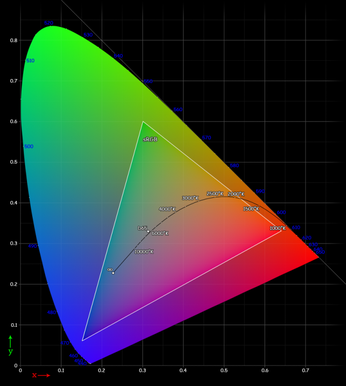
Reading carefully, it’s obvious that at no point in the past paragraph is there any reference to the distribution of said colors. This is a huge problem, because displays can have differing peaks for red, green, and blue. This can cause strange effects, as what appears to be pure blue on one display can be a cyan or turquoise on another display. That’s where standards come in, and that’s why quality of calibration can distinguish one display from another. For mobile displays and PC displays, the standard gamut is sRGB. While there’s plenty to be said of wider color gamuts such as Adobe RGB and Rec. 2020’s color space standards for UHDTV, the vast majority of content simply isn’t made for such wide gamuts. Almost everything assumes sRGB due to its sheer ubiquity.
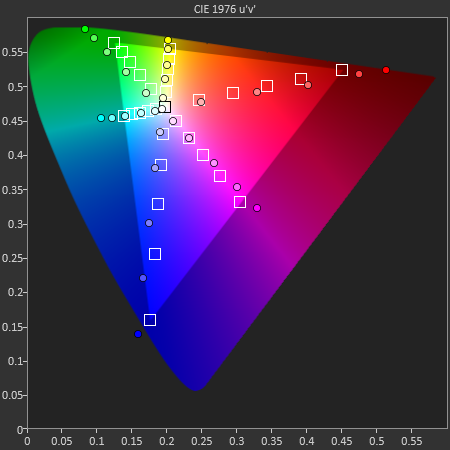
While it may seem that a display with color gamut larger than sRGB would simply mean that sRGB colors were covered without oversaturation, the OS’ lack of colorspace awareness means that this isn’t true. Because the display is simply given commands for color from 0 to 255, the resulting image would have an extra saturation effect. Assuming that the saturation curve from 0 to 255 is linear, not a single color in the image would actually be the original color intended within the color space, and that’s true even within the color space. This is best exemplified by the saturation sweep test as seen below. Despite the relatively even spacing, many of the saturations aren't correct for a target color space.
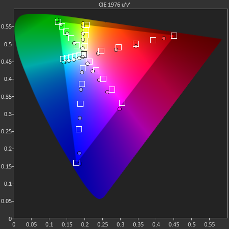
On the flip side, another issue is when the display is constrained to sRGB, but the OEM applies a compression of saturation at the high end to try and make the colors "pop", even though it too reduces color accuracy of the display, as seen below on all but the magenta saturation sweep.
Ultimately, such quibbles over color gamut and the resultant color accuracy of the display may not be able to override the dominant discourse of subjectively evaluated color in a display, and many people prefer the look of an oversaturated display to that of a properly calibrated one. But within the debates that will undoubtedly take place over such a subject, it is crucial to keep in mind that regardless of personal opinion on display colors, color accuracy is a quantitative, objective analysis of display quality. While subjectively, one may prefer a display that has a color gamut larger than sRGB, objectively, such a display isn't accurate. Of course, including a vivid display profile isn't a problem, but there should always be a display profile that makes for accurate color.


57 Comments
View All Comments
jlabelle - Tuesday, March 4, 2014 - link
1. Indpendantly of what the ccds or cmos sensors can capture the vast majority (all ?) cameras are conforming that in sRGB color space. Some DSLR are offering the choice in menu to switch from sRGB to aRGB or ProPhoto but out of the box, this is ALWAYS configured in sRGB.2. Also, I am not saying this is good to throw away additionnal color information but unfortunately, until mobile OS can manage colors (and we are far from it considering that even on MacOS and Windows, IE and Safari are not properly color managed), it is a BAD thing to have wider or lower gamut screen as you throw away the color accuracy FOR EVERYONE.
And having a non accurate color rendition IS a mutilation. Independantly of if you over or under saturate.
The only thing that you gain on a proper color managed complete workflow (calibrated wide gamut screen, color managed programs, pictures with embeded color space information) is to be able in YOUR control environment to enjoy wider gamut picture but outside of YOUR control environment, everyone else that do not have a proper color managed workflow (so basically, almost everyone) will have worse result looking at your pictures.
This is why, whenever my pictures go out, I transform them in sRGB to ensure at least that users with on their tablet, computer, using any browser with a display close to sRGB will see my pictures more or less like intended.
3. A screen is not "calibrated" to a color space. It does not mean anything. A screen is calibrated or not. On the otherside, a screen has a given color gamut (so how saturate he can display colors or not).
Now, if you meant, that a screen with a sRGB color gamut is an abomination, sorry but you don't know what you are speaking about. I can tell you that looking REAL colors (as you named it) and REAL pictures on wide color gamut (with a proper workflow) is not at all a revelation. There are some rare cases where it can make small difference here and there but I can assure you that you would not able to tell if not showed side by side.
Would you care sharing your configuration or workflow ? Because what I think you saw is that you are speaking of looking oversaturated pictures on a wide gamut screen in a NON color managed workflow. Then yes, obviously, it makes a lot of difference because you over saturate your image. But otherwise, the difference is really rather small.
By the way, most of the best online print service are asking for sRGB picture and do not accept wider color space.
Once again, please clarify the workflow and on which material you are seeing those revelation because, I take picture with a full frame Canon 5D mkII on aRGB mode (which is wider color gamut that it allows to capture) with L lenses. I edit my RAW in Photoshop and DDP, 2 color managed application with a 27" DELL U2711 wide gamut which reach 96% of the aRGB color space gamut calibrated with a Color Munki X Rite probe everymonth.
And once again, the difference can in very rare case be seen and even then, it is not night and day. So what do you use in your case ?
baii9 - Sunday, March 9, 2014 - link
If you are editing raw then the camera color mode does not matter fyi.Rdmkr - Tuesday, March 4, 2014 - link
"Last point, I don't know what you mean by your first point about "rasing the retina level dpi for chroma information" (sounds like you smoke before writing that !) but how is a broader color range always a positive feature ? If you do not need this additionnal broader range for instance ?" - it spaces out the real color values, in terms of their position on the electromagnetic spectrum, of adjacent digital color values, meaning that more photoreceptors are employed to distinguish colors from one another. This increases the density of (chromatic) pixels the eye can distinguish at any fixed depth.jlabelle - Tuesday, March 4, 2014 - link
Sorry, even having an engineering background, I read several time and did not understood one bit what you are speaking about.Can you put what you mean in context of the discussion ?
What would an oversaturated picture would produce on the eye that would be an advantage ?
What do you mean by the fact that displaying more saturated colors would make "more receptor to distinguish colors" ?
What do you mean by "increasing density of pixel the eye can distinguish" ? Are you saying that more saturated colors allow the eye to see higher density ? What "depth" are you speaking about ? "depth" of what ?
What don't you answer to my questions about which workflow you are using and where did you see "revelation" ?
josephnero - Wednesday, March 5, 2014 - link
Sony is claiming tehy have a special algoritim to go with their live color led in their developer siteFidelator - Sunday, March 9, 2014 - link
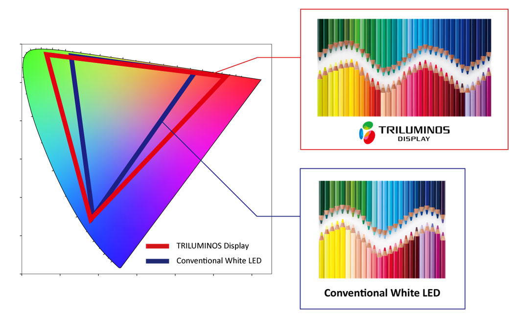
Bigger gamut does mean the panel is better and able to display a wider variety of colors, seeing how displays have advanced in this department in the past few years the standards need to step up, they should really be updated to take advantage of the new, superior tech, We can't be forever stuck using sRGB when our eyes can see much more than that, the more manufacturers using a wider gamut, the more likely we are to see the adoption of new standards, I believe Sony and Samsung are in the right by providing superior panels, there's no reason to complain about the use of Triluminos.Fidelator - Sunday, March 9, 2014 - link
Of course the best way out of this would be is they provided us with software capable of calibrating our displays out of the box.