Windows 8.1 Sings the Blues
by Jarred Walton on May 30, 2013 2:04 PM EST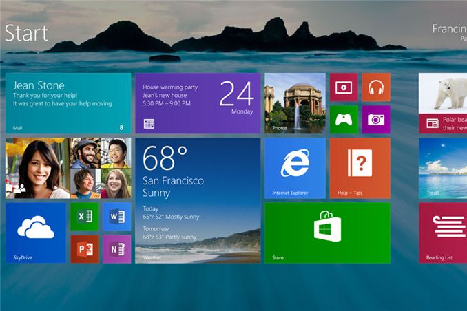
There’s a saying dating back to the early MS-DOS days: “Wait for the point release.” The implication was that the x.0 version of any new MS-DOS was sure to have problems (if you were around at the time, 2.0 and 3.0 certainly had some issues), and you should wait for the inevitable x.1 update before upgrading. That attitude later changed to “wait for the first Service Pack” when we moved to Windows 95 and NT, and while there have been occasions where things more or less worked as expected, there are still many users—and even more businesses—who hold off on upgrading to a new Microsoft OS until it’s been out in the wild for a while. (And yes, this same attitude is frequently applied to other OSes, e.g. Linux, Ubuntu, etc.)
It’s no secret that Microsoft is working on the point-release update Windows 8.1, codenamed Windows Blue. For those that prefer to avoid the issues often found on an initial release, this more or less serves as the first service pack for Windows 8. Today, Microsoft revealed additional details about what changes are in store. These changes range from feature enhancements to performance tweaks, modifications to boot options and the Start Screen, a return of the start button, new tile sizes and split-screen/snap options, better personalization, improved Search, tighter Cloud integration, a better Store, and a host of other updates to the various Windows Apps.
Perhaps the most noteworthy item for many is going to be the return of the Start button, but if you’re expecting something like the earlier Start Menu prepare to be disappointed. For now at least, the only change is that the Start button will appear in the bottom-left corner instead of being a hidden hotspot. Clicking that button on the other hand will still drop you into the new Start Screen interface. The button will apparently always be visible on the desktop task bar, but in the modern UI and apps it will only show up if you click on it at least once (this isn't exactly clear); otherwise, if you use the touch or keyboard shortcut it will return to the current behavior. All of this is customizable, of course. This is basically a bone that Microsoft is throwing to users that don’t have a touchscreen and prefer the traditional mouse and keyboard approach, but as I’ve advocated in the past there are better ways to get a real Start Menu if that’s what you want—Start8 and Classic Shell being the two best options in my opinion.
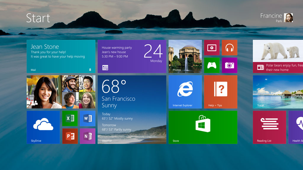
Moving to the personalization category, Windows 8.1 will add a new large and small tile size to the mix. There will also be enhancements to make it “even easier to arrange and group tiles”, though I’m not exactly sure what that means other than press-and-hold or right-click are now required to move things around (so you don’t accidentally move a tile). Additional background colors are also present, along with new background images, and the lock screen can use your desktop wallpaper or, alternately, be set to a slideshow of images (either local or from the cloud via SkyDrive). The lock screen will also allow you to take a picture directly, which is likely more for tablets and smartphones. The Start Screen now has the ability to filter by date installed, name, most used, and category—or you can swipe up from the bottom of the screen to get the “all apps” view. And as a final option in the customization arena, you can configure Windows to boot to something other than the Start Screen now, including the desktop.
For managing multiple applications, Windows 8.1 also brings variable, continuous sizing of snap views and additional options for using multiple apps on the same screen at the same time. Specific mention is made of sharing a screen between two apps in a 50-50 mode, and if you use multiple monitors you can have up to three apps on each screen. There’s also a new option to have multiple windows of the same app snapped together—e.g. two Internet Explorer windows could be open side by side.
Two final changes I want to mention are the PC Settings screen and the new Internet Explorer 11. The latter will build on IE10 and offer improved performance in JavaScript (among other things), judging by early beta reports. IE11 will also let you always show the address bar, you can have as many tabs open as you want, and you can access your open tabs from your other Windows 8.1 devices. The PC Settings screen on the other hand will provide improved access to all of your settings—no more going to the desktop Control Panel is apparently the goal. Among other items, PC Settings will let you change your display resolution, power options, run Windows Update, join a domain, and manage your SkyDrive settings.
There’s obviously more to come, and Microsoft is likely holding many announcements until their Build conference at the end of June. You can read their blog for more details on the improved Store, SkyDrive options, and how Search is going to be the new Command Line (really?). If you’ve already upgraded to Windows 8, the point release will help smooth over some of the rough spots and bring new features and customization options to the table. For those that are still holding off, however, it’s difficult to see any items that would make someone on the fence suddenly change their stance.
Windows 8 was and is an OS designed first and foremost around a touch interface, which means anyone using a mouse and keyboard (or a desktop) may not see much of a point in many of the changes. As someone who has used a variety of laptops with Windows 8, I can attest to the difference a touchscreen makes—the Start Screen seems useful and sensible, whereas with a mouse or keyboard it’s still a bit odd for me. Given the number of laptop vendors I see that still offer Windows 7, it’s clear that Microsoft has created a rift in their user base with Windows 8. The point release takes at least a few small steps towards closing the rift, but I suspect for the time being we’ll continue to see a large number of Windows 7 holdouts.


Source: Microsoft Windows Blog


76 Comments
View All Comments
UltraTech79 - Friday, May 31, 2013 - link
Rich full screen interface my ass. Its not 'rich' its bloated shit that tries to pawn itself off as minimalist. It is neither.mr_tawan - Thursday, May 30, 2013 - link
You can do that, regardless of the menu taking the whole screen (Windows 8) or not (Windows 7).JarredWalton - Thursday, May 30, 2013 - link
No, actually -- there's one key difference. On Win7, type "Firewall" as one example. You get one program at the top "Windows Firewall with Advanced Security", followed by four entries under Control Panel ("Windows Firewall", "Allow a program through Windows Firewall", "Check firewall status", and "Check security status"), and then below that are any documents, pictures, or files that match. Under Windows 8, what you get is "No apps match your search", so you have to go to the "Settings" section where you see four entries, or the "Files" section below that. So instead of "Firewall[Enter]" you end up typing "Firewall" [Down x2][Enter][Enter] and you end up at a slightly different screen.This may seem like a minor detail, but there are numerous other things you might type (Resolution, Network, or anything that isn't considered an app) where you have to go to the Control Panel or Files screens to find what you're after -- there's no "all results in one page" option, though perhaps that's part of what's changing with Search on Windows 8.1.
And then there's the whole "swap out everything on your screen for the Start Screen" aspect. On a tablet or a small display, it might not seem like a big deal, but on a 30" monitor let me tell you: I don't need a freaking 2560x1600 screen just to show me a list of four items, one of which I'm going to click. It's a huge visual transition that just doesn't need to happen, and IMO it looks like crap.
EnzoFX - Thursday, May 30, 2013 - link
Exactly. This should silence those pro-metro start screen, if you could call it that. The question isn't why not, it's why, as far as a Desktop screen is concerned.MisterAlex - Thursday, May 30, 2013 - link
It's especially ridiculous when you're typing your search based on something you're looking at on-screen (e.g. a tutorial in a web browser). I reverted to Win7 on my desktop machine. I sold my Windows laptop and bought a MacBook.lmcd - Thursday, May 30, 2013 - link
what you get is "No apps match your search", so you have to go to the "Settings" section where you see four entries, or the "Files" section below that.--Jarred Walton
This is being fixed according to other sources.
whatthehey - Friday, May 31, 2013 - link
I think you might want to check those "sources". What they're doing is unified search, but not in the same way as the Win7/Vista Start Menu -- now along with a search of your local files, apps, settings, you will be getting Internet searches as well. That might not be so bad, but Bing is the power behind the Internet searching, and I'll be damned if I've ever enjoyed Bing search results -- all of MS' advertising notwithstanding!MrSpadge - Friday, May 31, 2013 - link
"So instead of "Firewall[Enter]" you end up typing "Firewall" [Down x2][Enter][Enter]"That's the only issue I have with the Win 8 start emnu, eh screen. Working around it by going straight to the control panel in an explorer window if I know what I'm searching is in the control panel.
Hubb1e - Thursday, May 30, 2013 - link
No, you can't just start typing. You have to choose between apps, files, or settings first which is worse than windows 7 which included anything. I believe this was done because of slower tablets. I've tried to like windows 8 but it's terrible and this update doesn't really address any of my concerns. Plus it's ugly...Hubb1e - Thursday, May 30, 2013 - link
I should also add that the search bar is way up in the top right corner of the screen while the start button is way down on the far bottom left which is a huge movement of a mouse on a large screen. It's just a terrible UI for a mouse.