Three Months with Microsoft's Office 365
by Vivek Gowri on January 31, 2013 11:59 PM EST- Posted in
- Microsoft
- Cloud Computing
- Office 2013
- SkyDrive
Generally, Office 2013 works pretty similar to Office 2010, with an interface heavily reliant on the ribbons. Now, I’ve always been a fan of the ribbons, which I thought were a good idea in Office 2007 but really came into their own with Office 2010. It’s been six years since they debuted, so anyone that is still complaining about Ribbon UI should really get over it, especially now that Windows Explorer uses it as well.
The aesthetic has been updated to match the Metro visual style that forms the basis of the Windows 8 and Windows Phone 8 UIs. This visual style has left me a bit cold in Windows 8 Desktop - I like the UI chrome in Windows 7, I feel it gives the interface some three-dimensionality and offers more natural interactions. But in Office, the chromeless aesthetic is awesome. I think it works really, really well in Word and PowerPoint especially, where the starkness and simplicity of the UI (particularly in the hidden command or hidden Ribbon modes) gives you a very blank slate to work from. It’s clean and pure in a very fundamental sense, with no visual distractions at all in the UI.
I’ll also note that the refreshed interface has little to no effect on Excel, which has looked and felt exactly the same since I first used it in Office 97 as a five year old. It’s like the Porsche 911 - no matter what changes under the hood, externally it has looked the same for decades it seems like. Not that it’s a bad thing, since I love the 911 and love-hate Excel, but it’s worth mentioning nonetheless.
Generally, it seems like the Office 2013 has a much stronger focus on the visual style of the content being created than I’ve noticed in previous editions of Office. There’s much more aesthetic polish, with rich templates that aren’t worthless like they have been in many previous editions of Office, nicely styled titles and headers, and many more document design capabilities. Until you use it, it’s really difficult to overstate how much cleaner documents that come out of Office 2013 look. It’s now much easier to create content that are visually pleasing - documents and presentations that just look good and are easy to read without needing to spend a ton of time on formatting.
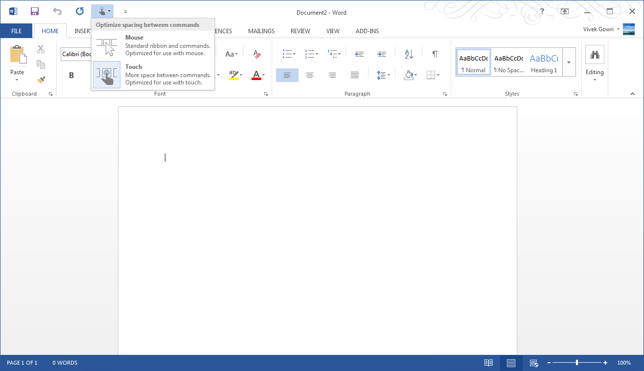
Microsoft is including two input modes: mouse (Office as we know and love it) and touch, which expands the size and spacing between menu options for a more finger-friendly interface without dumbing it down. Look closely at the below screenshot versus the one at the top of the page to get an idea of what I'm talking about. It’s decent to use, but obviously, creating content using the touchscreen keyboard is an outright pain, so this is more for navigation, minor editing, and formatting changes. You will obviously get more out of any office suite with a traditional keyboard and mouse setup, but the new Office at least has a more touch-centric UI as an option.


113 Comments
View All Comments
Da W - Sunday, February 3, 2013 - link
It's not me that says it, it's all of you bitches posting on this site. Lost your start button? Don't like the ribbon? And now what, you don,t like the COLOR of office? Are you freaking serious? GET A LIFE!Tams80 - Friday, February 8, 2013 - link
If we're paying for something, then we are perfectly within our moral rights to complain if we don't like parts of it. Unsurprisingly, I reckon a lot of us have just not bothered upgrading (and thus paying).Touche - Sunday, February 3, 2013 - link
Just as I thought that UI degradation couldn't get worse than 2007->2010:http://blogs.technet.com/blogfiles/office2010/Wind...
They actually managed to make 2013 even less user friendly and ergonomic. Metro "progress" I guess. An the white, OMG, do they bundle sunglasses with the new Office?
Tams80 - Friday, February 8, 2013 - link
At least 2010 had a few updates that outweighed the minor changes in UI. I must admit, 2007 looks better.Do reviews factor in the cost of sunglasses? XD
scarhead - Sunday, February 3, 2013 - link
So from the review, I understand the M$FT's pricing model and that there's a new look that people should just get used to.How about performance-wise? Does Excel handle larger files faster? Large spreadsheets with my i7-3820QM/6G SSD isn't as snappy as I think Excel should be. Any new formulas or macro commands?
I see it's easier to import pictures into Word. Once they're in, any faster?
The Mac version is slightly mentioned once. Any other differences between the two platforms?
enterusername - Monday, February 4, 2013 - link
I've been reading Anandtech for a long time and I'm generally impressed with the quality of articles.This "article" however is just sad. It looks like a blog from a Microsoft fan.
What about security? It it advicable to store all documents on Skydrive?
Microsoft has a very poor trackrecord for securiting their emailservice for instance.
Should people just really get over the GUI if they don't like it? Is that what people should do if they don't like a product?
Is $100/year really a good deal for most people? Do you even know what most people use Office for?
What about performance for people who are using Excel for more than their home-budget?
This is just an anoying article. Please don't degrade Anantech with this kind of crap.
Btw: I'm using Office 2013 every day.
Avenger762 - Monday, February 4, 2013 - link
Someone needs to use spell checker for office. In the picture, the items are spelled "Maoi" when it should be "Moai".The0ne - Monday, February 4, 2013 - link
Finally upgraded from 2003. 365 IS more of a aesthetic/visual upgrade and for me it works very nicely. In fact, the fluidity of working in the new apps is such a joy. The new ribbon is a tad better but I still rely mainly on the single customizable bar. There are templates to get most people going and styles that can easily make your documents nice and pretty.However, there are still a few things buggy about the programs, in particular Skydrive. This Office is really no different than from 2003. Most of the internals are still the same, with most of the same bugs and options. I don't think this is going to change unless the code is drastically changed. I've and a few others on the MS community site have encountered this really aweful bug where an Excel file would take forever to complete a function such as selecting a cell. So far no permanent fix has been issued.
I've been using 365 since beta and Skydrive has a lot of critical bugs that may deter users and even corporate users away. I have many pending critical bugs on their help site but so far none has been able to resolved most of them. I'll list a few examples,
1. Skydrive made copies of each of the file from each of the computer, renaming them to end with the PC name that connected to it.
2. Skydrive can't unshared a file from one or more person. This is dangerous.
3. Skydrive unable to sync properly on various computers even after re-installing several times.
If you are synced to Skydrive you have to realize that it will upload your changes to the cloud. That means if your file is large and depending on your connection and what not it may slow you down in your work. On the bottom of the program it'll tell you that it's updating to Skydrive. Also realize most of these issues are from me sharing and allowing multiple users to the files. For now, I'm holding off until they can at least address the issues I've encounter. I definitely don't want to lose data because Skydrive decided to chew it up.
I would recommend the new suite. The fluidity makes it much more enjoyable to work in, at least for me. I love typing now because of that single feature. Have fun.
rothnic - Tuesday, February 5, 2013 - link
Vivek, nice overview. I do think Microsoft has a little of a communication problem with this recent release in regard to Office 2013 vs 356, and you helped clear it up for me.I recently purchased Office 2013 Professional through one of the employer partnership programs that allow employees to purchase Microsoft software at a big discount. I was able to get Pro for $10, then Visio for another $10. Project was another $10, but I didn't need it at the time.
I also am currently working on my masters through a new distance program (search Georgia Tech PMASE), where we work 90% of the time in teams, have a two dave video teleconference every 3-4 weeks, recorded lectures, and a team assignment due each week. One of the things we found hugely useful was using Google Hangouts along with Drive/Docs. I use Hangouts about every other day, and use Google Drive as much as possible.
The main issue we have with Google Drive is that the applications just do not help you produce the same quality of presentations as Office, especially 2013 (agree about the themes/templates). So we tend to work on Docs through brainstorming and rough drafts then we start the handing of versioned .docx documents back and forth through Google Drive.
Even though my teammates don't currently have 2013, I'd be very interested if you could do a detailed look at the real time editing functionality of 2013. What the differences are between web and native applications, etc. After looking at other articles it looks like it may not be as useful as Google Drive/Docs, but isn't so straightforward.
MrCrispy - Tuesday, February 5, 2013 - link
I really don't like how Windows 8 and Office 2013 have so much shiny wasted white space. And they've taken away the ability to customize color schemes.