The Clover Trail (Atom Z2760) Review: Acer's W510 Tested
by Anand Lal Shimpi on December 20, 2012 10:34 AM ESTReflecting on Windows 8
In our Surface, VivoTab RT and Windows RT reviews both Vivek and I were fairly positive on Windows RT and the new modern user interface that Microsoft introduced with it and Windows 8. My feelings on the OS haven’t really changed since then, I still believe Windows 8 is a good step forward for Microsoft. The improvements to the underlying OS make it a good upgrade for current desktop/notebook users, while the modern UI makes it a great solution for tablets.
Windows RT/8 have sold me on touch when it comes to a notebook or notebook hybrid. I do wonder how much having a good touch experience is necessary when your trackpad experience isn’t perfect, but I find myself touching the screen on older notebooks more than ever before when switching between Windows RT/8 and other systems. I don’t believe ubiquitous touch is going to spell certain success for Microsoft, but it’s a good move.
I also can’t stress enough how big of a deal it is that Microsoft has delivered a power efficient OS capable of hanging with Android and iOS. It wasn’t that long ago where idle battery life on PCs significantly lagged behind even OS X, and now we’re talking about Windows experiences that rival ultra mobile OSes.
The big issue with Windows RT/8 is that the experience as a whole seems to be unfinished. Microsoft has done nothing to advance the traditional desktop UI paradigm. Keyboard/mouse navigation within the modern UI is functional, but it feels like more of a concession rather than an optimized experience. Microsoft of course needs to push the modern UI in order to quickly ramp up its app library. It’s a difficult position to be in and I don’t necessarily know of a better solution that delivers what MS wants while prioritizing the end user experience. Microsoft was one of the first companies to learn that for each device vertical, a custom user experience is necessary (e.g. Media Center Edition, Xbox). Wherever it has failed to keep those learnings in mind, things eventually end up going south. Sometimes it takes a while (Windows Mobile) and sometimes it’s apparent almost immediately (Tablet PC Edition). The fact that tablets/smartphones are the new high-growth markets definitely tilts things in Microsoft’s favor this time around, but that doesn’t mean that Microsoft is out of the woods.
Transitioning between modern and desktop UIs remains abrupt. I wanted to write about this in our Surface review but ran out of time. There's this weird bimodal UI paradigm that exists within Windows RT/8. Microsoft forces you into the modern UI by default, but sometimes it'll vomit you out into the desktop UI without warning depending on what you click. Want additional connection properties about your WiFi network? You're back in desktop mode.
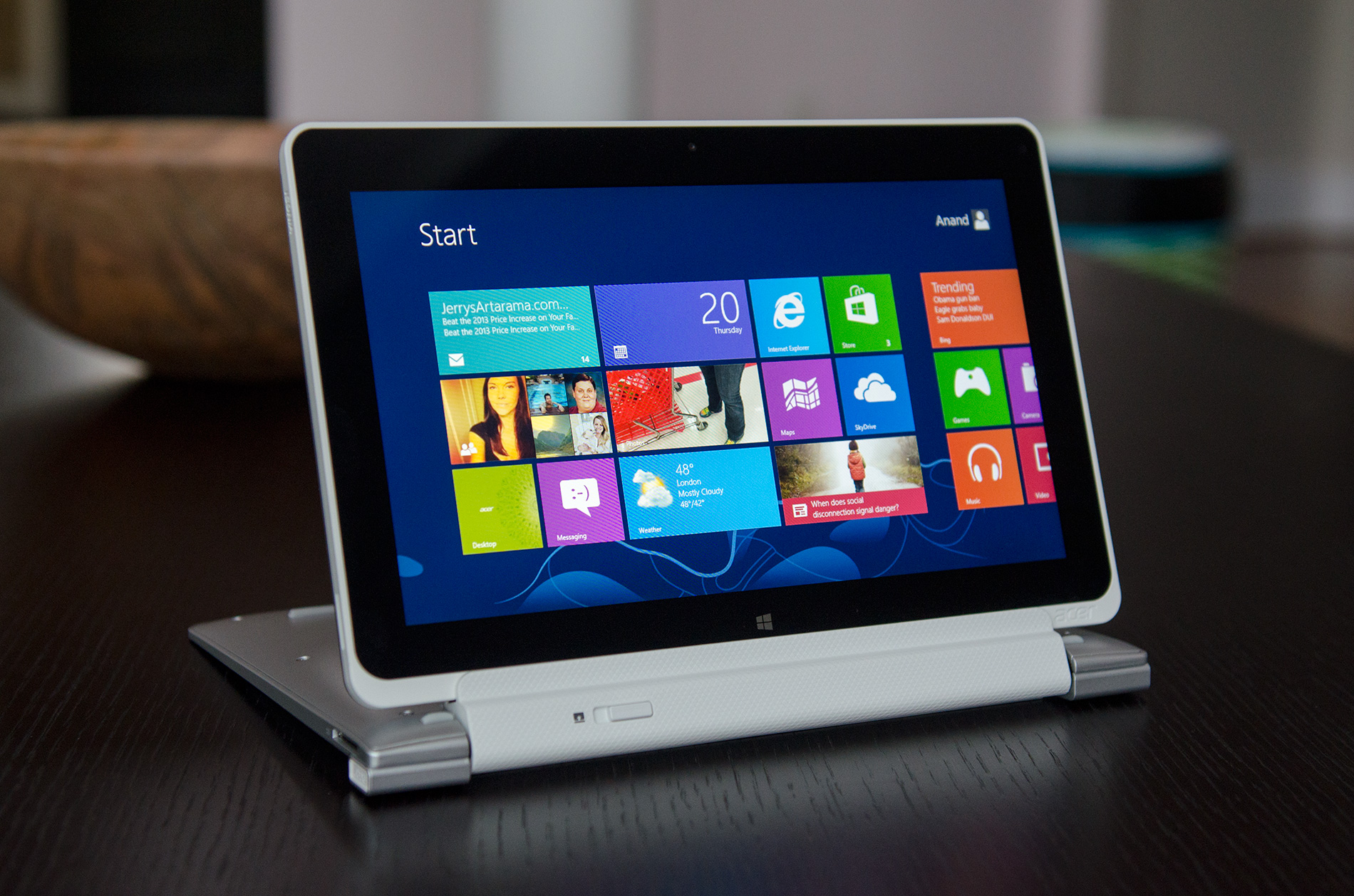
Even within the modern UI there are some things that don’t seem well thought out. If you want OS/firmware updates, you’ll have to navigate to Windows Update - but if you want to update your apps you need to go through the Store app for those.
When it comes to performance, there are still quite a few annoyances. IE10 is better than expected, but it's in dire need of a performance boost. The swipe to go back to a previous page gesture is great for example, but the time it takes to switch from a pre-rendered screenshot to the actual page is unacceptably long.
Many fundamental tasks/apps still take way too long to respond with no real indication of what’s going on. I noticed I had 32 updates in the Store, clicked on the updates link and got this screen for minutes without anything happening:

The same is true for Mail, here's a screen i was faced with while mail tried to connect to my mail server. The process wasn’t quick, i was faced with this screen for dozens of seconds:

The problem when this happens is there’s usually no way to easily back out of the task or even get an idea of the progress of the task. The obvious solution here is there shouldn’t be so many situations where activity happens but no progress is made for a while. The issues aren’t always common but when they happen, they’re annoying and seem to be far less present on Android/iOS. Things just feel like they were rushed.
Microsoft needs to think about winning over Apple/Android users in a major way, as well as addressing their existing user base. There's clearly potential with Windows 8, but the usual model of minor updates that focus on under the hood fixes with major UI updates saved for major releases of the OS needs to go. I don't even know if an annual UI tweak is enough for MS to make up ground here. Microsoft has 12 - 18 months before Apple throws its hat into the converged tablet/notebook game, that's the window of opportunity to make Windows RT/8 a success. Otherwise, the exodus continues.
Microsoft had better not treat Windows 8 like it did Windows Phone 7 and not substantially update the UI for 2 years.


104 Comments
View All Comments
rburnham - Thursday, December 20, 2012 - link
One thing about Windows 8 that continues to bug me is the way that settings are split into two areas. Some settings can be handled from the Start screen, while others take you to the desktop Control Panel. If Microsoft is so keen on this new UI, why not take the entire Control Panel and make it a Modern UI component? I get that they are trying to appeal to touchscreen and desktop users, but merging the settings into one area would help alleviate the schizophrenic feel of the OS a little bit.This is a great review, especially since I have this exact Acer tablet on the way from Newegg. My hope is that I will spend most of my time in the Modern UI, and occasionally fire up desktop software. I am hoping it will be fast to handle some older games, like Icewind Dale, and some non-CPU intense software, like the Zinio desktop app (where I can access publications that the mobile version cannot access). It's going to be an interesting experiment.
My other concern with this tablet is that it is so new, there is a very limited selection of accessories. Specifically, I am having trouble finding some sort of "gel skin" case for this tablet. There are some generic fold out tablet cases, but those are bulky.
By the way, I had hoped to get an AMD Windows 8 tablet, but where are they? I love AMD, but I have to buy based on my needs and what's available, and right now Intel has the only real x86 solution for Windows 8 tablets.
name99 - Thursday, December 20, 2012 - link
"The power adapter itself isn’t anything remarkable, however Acer did use a nifty removable plug that easily twists on/off. The W510 only ships with the plug for whatever region you purchased it in so I’m not sure how useful this feature is, but it’s nice to see design innovation from Acer here."Just for the record, this is not new. Apple's power supplies for MacBooks have done this for, I don't know, 8 years or so. The power supply has a core that is common, and a regional plug that can be slipped on or off. See here:
http://eshop.macsales.com/images/Items/APLMA538LLB...
iPad power adapters are the same. iPhone/iPod are not, I expect because they are so small that they are basically the size of the dongle that would plugin to the socket, so modularizing them this way would basically double their size.
I've no idea if this is original to Apple or not, but it's certainly not original to Acer.
secretmanofagent - Friday, December 21, 2012 - link
I don't think you understand the mechanism. Apple uses a friction fit with a straight downward motion. The connector that Acer uses rotates on, which you can see in the picture the directions to operate. All of the other adapters I've seen (including miscellaneous ones over the years) have been similar to Apple's, usually with a mechanical clip. Acer's method is innovative, but I'm not sure what advantages are offered by it.lorribot - Thursday, December 20, 2012 - link
It's things like that 11GB recovery partition that show how far MS have to go in the light weight sector. The 13 GB for Windows, which will bloat massively with patches and installs is another example of them playing the wrong game.My windows & folder is a typical 21GB add to that a 11 GB recovery partition and that leaves nothing for user docs or programs on a 32GB model.
It would make more sense to stick the recovery partition on a 16GB USB stick or SD Card and use that to recover the system should the need arise and give back some of the expensive internal storage space to the user.
Windows 8, good first attempt but wait for Windows 9 when they fix all the things they didn't have time for and realise two into one doesn't go.
name99 - Thursday, December 20, 2012 - link
Yeah, I was amazed by that 11GB figure.As a point of comparison, the OSX recovery partition is 650MB in size.
Now it it possible that the Win8 recovery partition does more (as opposed to "has more to do [because there are more things that can go wrong]"; I'd be interested in an informed comparison of the two, and a dissection of just what is taking up all that space.
Is it sheer incompetence (for example including 64 bit binaries on a 32bit system)?
Is it including every human language on earth?
Is it because no-one bothered to make an effort to include only the bare minimum OS+support frameworks (as opposed to including the AV subsystem, and .NET, and fifteen ways to talk to a database, and support for MS Office, etc etc etc)?
kyuu - Thursday, December 20, 2012 - link
They do need to do something about the humungous recovery partition, but... you can put the recovery partition on a thumb drive or other removable media and free up that 11GB, if I'm not mistaken.secretmanofagent - Friday, December 21, 2012 - link
It's an incorrect comparison, as the restore for OS X requires an Internet connection."In order to reinstall OS X Lion or OS X Mountain Lion, you will need to be connected to an Ethernet or Wi-Fi network."
"The OS X download is about 4 GB large;"
http://support.apple.com/kb/HT4718
name99 - Friday, December 21, 2012 - link
Yes and no for the Apple restore.The recovery partition has tools that can do a bunch of things, for example run a fsck on the boot drive. If your problem is the sort of thing that can be fixed by fsck, ie some localized damage to the file system, then you will not need the internet connection.
You will need it (sortof) if you want to reinstall the OS.
If MS have the entire OS in their recovery partition, the size makes more sense, but seems more than a little foolish --- wasting so much fast expensive flash when you could ship a cheap USB stick.
In the case of Apple, it is fairly trivial when you first download/install Lion or Mountain Lion to burn a copy to a USB stick, and to use that copy if you don't have an internet connection (or have a slow connection, or pay per MB downloaded, or whatever).
I do think it's less than ideal that they don't include a USB stick of the OS with new machines (they did with the first few iterations of MacBook Air), but it's possible that their numbers tell them that pretty much no-one ever needs to reinstall the OS --- the tools of the recovery partition are acceptable for pretty much all problems. Certainly in my experience that's been true, for both my and friend's machines. I have no comparable experience with Windows.
MonkeyPaw - Thursday, December 20, 2012 - link
Microcenter has the 32GB model on sale for $399, so I took a chance. Your review pretty much matches my conclusions as well. It's generally a nice device, CPU performance is good, etc. The major disappointment for me was terrible game performance. I had lag and choppiness playing Solitaire! In late 2012?! I want to like Windows 8, but to have a card game take up almost 100MB of precious eMMC capacity is just sad. Until storage default size balloons significantly, it's hard to get on board with MS right now.Another thing MS needs to work on is the keyboard auto-correct, or the lack of it. The onscreen keyboard offers no assistance, and text selection is a nightmare. In IE, I could never select text, as double tapping just kept zooming in and out. It was quite frustrating.
I found the camera and its respective app to be horrible. Not just bad, unuseable bad.
I really really wanted to like the W510, but I ended up exchanging it for a Transformer Infinity. I am much happier with it.
kyuu - Thursday, December 20, 2012 - link
As far as the text selection thing goes, if it's anything like Windows Phone, you don't double-tap to select things (as you noticed, that zooms). You long-press instead. It's a little odd if you're in the habit of double-tapping from iOS/Android, but it works just fine for me on my Windows Phone.