iPad 4 (Late 2012) Review
by Anand Lal Shimpi on December 6, 2012 4:40 PM ESTCamera
The iPad 4 features a 5MP rear facing iSight camera and a 1.2MP front facing FaceTime HD camera. The rear camera shoots photos at 2592 x 1936, while the front facing camera shoots photos at 1280 x 960. The aperture and focal length of the rear facing camera haven't changed compared to the 3rd generation iPad.
| Rear Facing Camera Comparison | |||||||
| Sensor | Resolution | Compressed JPEG Size | Aperture | Focal Length | |||
| Apple iPad 4 | 5MP | 2592 x 1936 | 3.4MB | f/2.4 | 4.3mm | ||
| Apple iPad 3 | 5MP | 2592 x 1936 | 3.1MB | f/2.4 | 4.3mm | ||
| Apple iPad 2,4 | 0.7MP | 960 x 720 | 344KB | f/2.4 | 2.0mm | ||
| Apple iPad mini | 5MP | 2592 x 1936 | 3.1MB | f/2.4 | 3.3mm | ||
| Apple iPhone 5 | 8MP | 3264 x 2448 | 3.1MB | f/2.4 | 4.1mm | ||
| Apple iPod Touch 5 | 5MP | 2592 x 1936 | 3.1MB | f/2.4 | 3.3mm | ||
Still image quality out of the rear camera is comparable to the 3rd generation iPad, and clearly better than the iPad mini.


The front facing camera sees the biggest improvement over the iPad 3. The difference is like night and day thanks to the increase in sensor quality and resolution.

| Front Facing Camera Comparison | |||||||
| Sensor | Resolution | Compressed JPEG Size | Aperture | Focal Length | |||
| Apple iPad 4 | 1.2MP | 1280 x 960 | 426KB | f/2.4 | 2.2mm | ||
| Apple iPad 3 | 0.3MP | 640 x 480 | 117KB | f/2.4 | 1.8mm | ||
| Apple iPad 2,4 | 0.3MP | 640 x 480 | 105KB | f/2.4 | 1.8mm | ||
| Apple iPad mini | 1.2MP | 1280 x 960 | 372KB | f/2.4 | 2.2mm | ||
| Apple iPhone 5 | 1.2MP | 1280 x 960 | 400KB | f/2.4 | 2.2mm | ||
| Apple iPod Touch 5 | 1.2MP | 1280 x 960 | 406KB | f/2.4 | 2.2mm | ||
Video
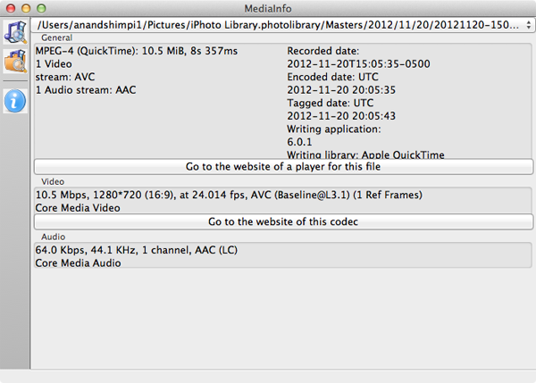
The iPad 4 shoots 1080p video from its rear camera and 720p on the front. Video shot with the rear camera is encoded using H.264 (High Profile) at an average bitrate north of 17Mbps. This puts the encode parameters similar to those of the iPhone 5 and iPad mini. The same is true for the front facing camera.
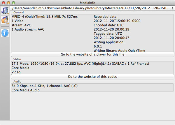
The front facing camera shoots baseline video at roughly 10.5Mbps:
Video quality is pretty good as well:
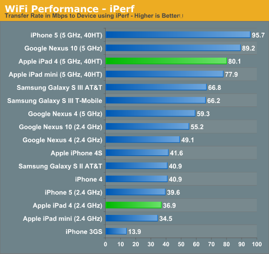
WiFi Performance
Like the iPad mini and iPhone 5, the iPad 4 uses Broadcom's BCM4334 WiFi controller. The 4334 supports dual-band 802.11n as well as fallback to 802.11b/g. On 5GHz Apple continues to support 40MHz channels for a maximum PHY rate of 150Mbps. Performance and reception both remain solid:


113 Comments
View All Comments
vkn - Friday, December 7, 2012 - link
I for one appreciate these tests. There is no easy way to judge displays in showrooms. I now have a system of playing the the same hd videos on each device and evaluating subjectively (which sucks)darwinosx - Thursday, December 6, 2012 - link
You don't know anything. Apple has been doing this on displays for a very long time. Since you are obviously a teenager, probably longer than you have been alive.jabber - Friday, December 7, 2012 - link
Yes funny that.I saw this with NFC.
Before the finer points of the iPhone5 came out tech journos were all "NFC!!! NFC!!!! ITS THE FUTURE!!!"
Then the 5 came out with no NFC and it was overnight a switch to "Oh......NFC isn't really all that important! Whats NFC again?"
name99 - Sunday, December 9, 2012 - link
Really? Show us RESPECTED tech journalists who were, to use your language "all NFC! NFC! NFC!" about the iPhone5.I don't remember Gruber obsessing about this. I don't remember Anand saying this was an essential iPhone5 feature. I don't remember Horace Dediu caring about this.
Apple has made it quite clear, since they shipped the iPhone 4S, that they view BT4 as a better solution for most of the things that NFC is supposed to do. Given the extreme lack of interesting things being done with NFC, that seems like a good call.
Your claim is as ignorant as being surprised that the new iMacs shipped without an optical drives.
Death666Angel - Saturday, December 8, 2012 - link
Me personally, I don't agree with Anand. The eyes are pretty good at adapting to colors. So unless you have a calibrated PC monitor or something to compare to, you will not notice when colors are off, unless they are off by a big, big margin. I haven't seen a lot of that in the android camp and when it crept up, there were easy fixes by the community.cheinonen - Sunday, December 9, 2012 - link
Eyes are very adaptable to what is put in front of them, just like ears are with sound over time. That's why all the measures are done by instruments that aren't subject to the adaptability of our vision system. The dE numbers are designed to tell you how visible an error is. With the older 1976 and 1994 formulas, any dE below 3 was thought to be invisible in motion, with < 1 invisible when side-by-side. The dE2000 formula used in these charts is more accurate (in terms of weighing luminance, hue, and saturation errors), but smaller errors are more visible, so a dE of 3 is now worse than a dE of 3 in the old formulas. The dE numbers have a basis in vision science, though, and let you know if an error is visible.How well you'll notice, or care, about a color error likely depends on your exposure to correct colors. If you've spent years looking at a calibrated display, then you'll notice the errors almost instantly. If you've never seen one, you won't notice as you have no idea what it should look like. The whole point of calibration is just so when you see something, or design something, everyone else sees it the same way.
Also, a global fix for color errors isn't likely to work well, as all displays are slightly different and would need to be calibrated individually. You could make some adjustments, but not make them perfectly accurate.
name99 - Sunday, December 9, 2012 - link
To add to this point, I am not an obsessive about color. I don't do design work, or know Pantone numbers by heart or anything. But it was obvious enough to me that colors (in particular photos of faces in Contacts) looked different on my mac and my iPhone 1 that I submitted a bug to Apple about it.This is, to put it bluntly, the difference between Apple and other people. Other (supposedly technical) people see that a photo of a friend looks slightly different on their phone from their computer --- it's a little too dark or too red or whatever --- and they shrug and say "well, it's always been like that". Apple people say "Why the hell should we put up with this? It's possible to do better." It's this mindset that leads to useful improvements based on actual use cases, as opposed to useless improvements based on spec-boasting.
Focher - Saturday, December 8, 2012 - link
Not sure what the problem is. Everything is tested and reported. It's up to you to decide which attribute(s) matter to you.If anything, we should really appreciate that AnandTech reviews those attributes. In addition to Apple actually making the display quality a market differentiator for vendors who play in this space, AnandTech deserves credit for ensuring we see which manufacturers are delivering improved display attributes.
name99 - Sunday, December 9, 2012 - link
It's silly to claim that Apple has "just started" promoting color calibration.Color calibration was added to the original Mac OS in 1993 (ie WAY before OSX) and every year since then Apple has worked to move it a little pervasively into the system as CPU and GPU speed increases have allowed for more on the SW side, and as tighter control of manufacturing have allowed for more on the HW side.
sprockkets - Thursday, December 6, 2012 - link
Screw the ipad. We want the Nexus 10 review!