The iOS 6 Review: Maps Thoroughly Investigated and More
by Brian Klug & Saumitra Bhagwat on September 19, 2012 2:21 PM ESTOther UI Changes
In each iOS release it always seems like Apple makes some subtle UI changes, similar to what it has done in OS X for years now. In iOS 5, Apple changed the toggles from a rectangular switch to circular, now in iOS 6 the status bar can change color depending on the app you’re inside. This color changes to either the average color of the bottom row of pixels in an application’s top bar, or to a specified value. It’s initially a jarring change since previously the status bar was this immutable iOS feature nobody could touch. It seems those barriers have come down in iOS 6, as now apps can change its color, and others like the official Twitter for iPhone app can even populate it with custom status text when sending a tweet.
The top status bar can now change colors
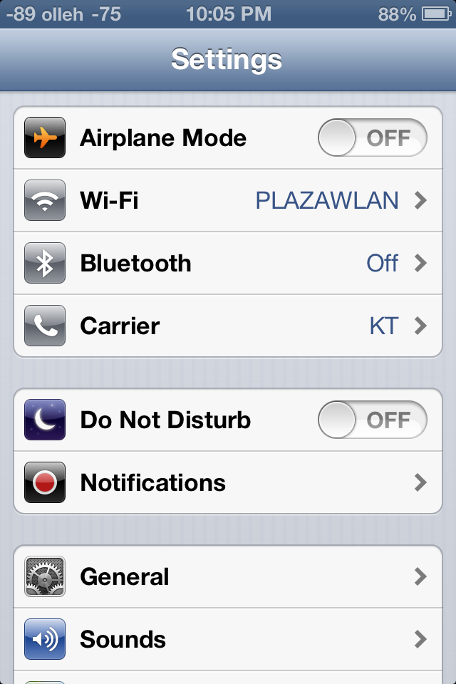
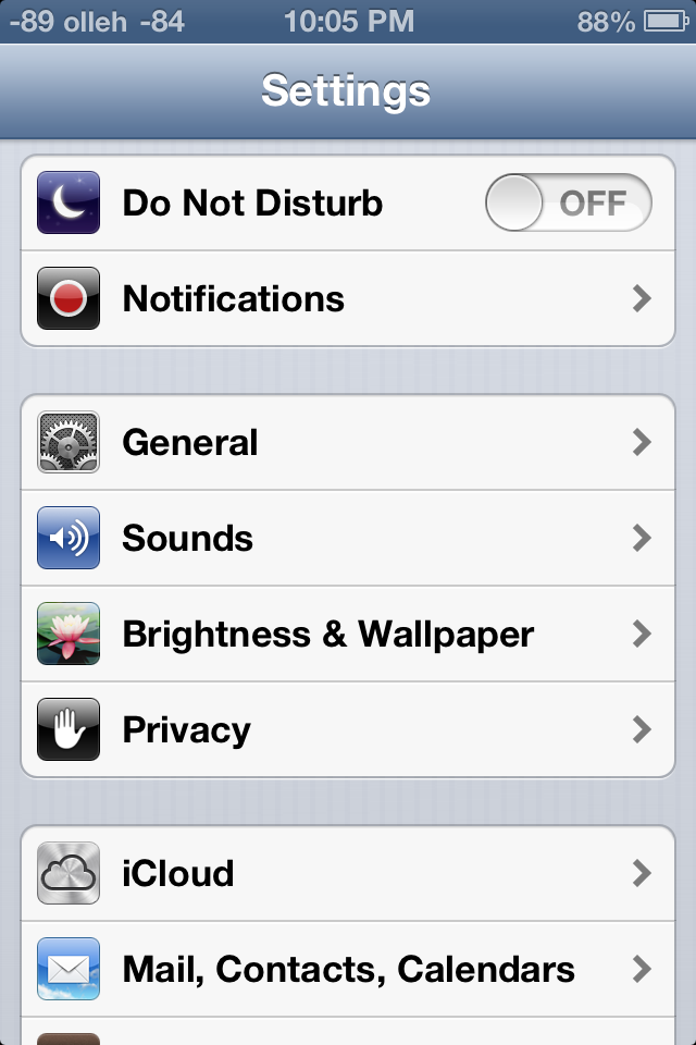
Settings.app gets a big makeover, with a few new items on the front page view and new organization as well. Bluetooth gets brought out of general and placed below the WiFi toggle how it always should have been. Facebook and twitter integration single sign on are grouped together, as are the new do not disturb and notifications center settings. This is just a lot of housekeeping for a settings app that was starting to get crufty as new features compounded over time.
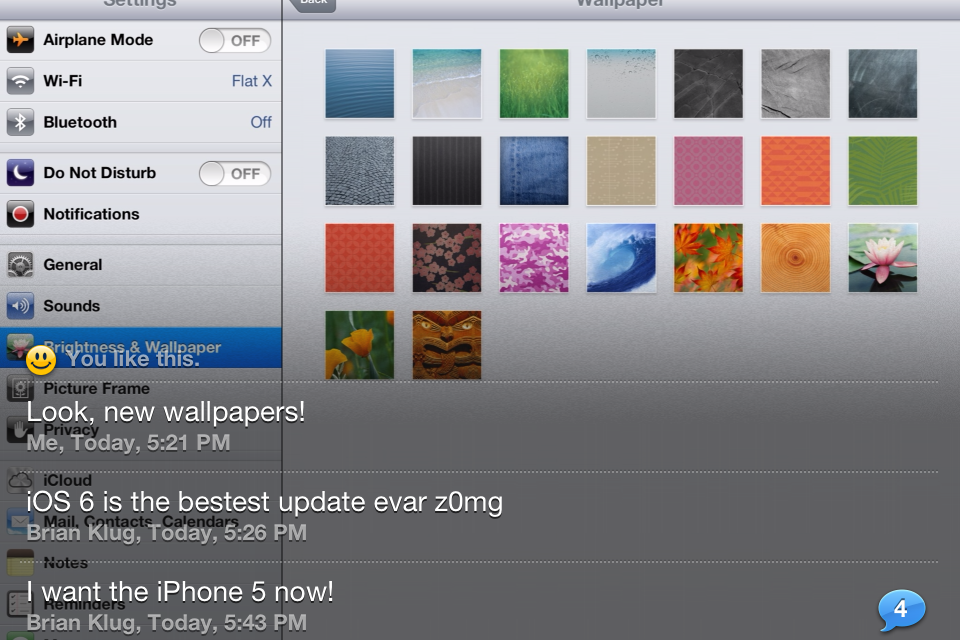
Brightness and wallpaper hasn’t changed (with the addition of a few new wallpapers), but iOS 6 fundamentally changes the functionality and curves for auto brightness. Brightness now seems to be more of a log scale, and the slider seems to set a lower bound rather than a window for the auto brightness function. Where previously I would set brightness to around 50%, I now set it on iOS 6 to around 10% to get similar behavior. There’s a much longer hysteresis for change as well, and though this was initially disconcerting for me, I’ve found less blinding happening with iOS 6 than past releases.
That being said, the auto brightness on the 3rd generation iPad doesn’t seem to function very well. While the brightness is keenly revised upwards under extremely bright environments, it doesn’t seem to show the same enthusiasm to adjust downwards in darker environments. People elsewhere seem to be facing a similar issue on their 3rd generation iPads as well, so I fully expect a fix to be in the works.
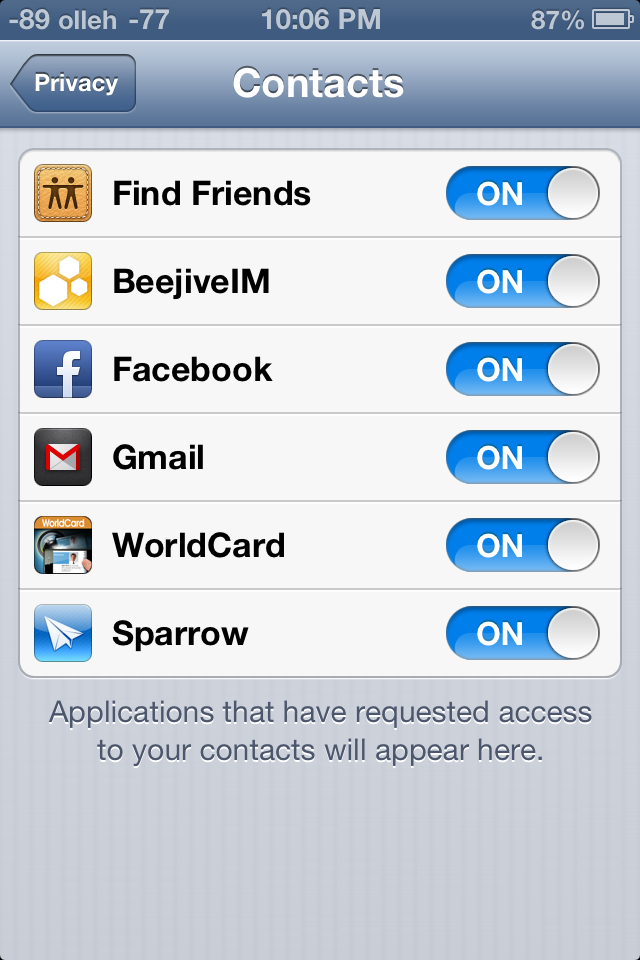
Data Isolation
There’s a new privacy tab which now aggregates all the new iOS 6 data isolation stores. This is Apple’s response to both Android’s permissions system and recent discovery by users that apps frequently send off your entire address book. The system basically extends how iOS treated location services data permissions to contacts, calendars, reminders, photos, and the single sign on Facebook and Twitter tokens. Inside this settings page you can individually see what apps have been granted access, and revoke it.
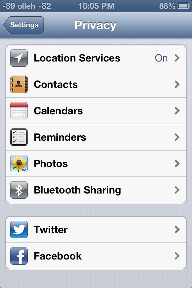
Under location services is the same menu which was introduced in iOS 5. As we touched on earlier there’s a few new items under system services including the “traffic” process which contributes to Apple’s new traffic crowd source database. As usual you can disable these for privacy reasons or to save some power, though traffic seems to only fire up when the phone is plugged into a power source.
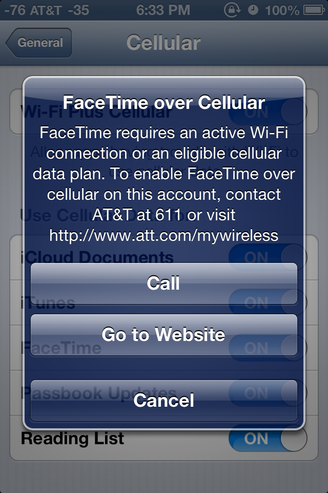
FaceTime over Cellular
Under FaceTime at the very bottom is a new toggle for cellular data. Toggle this and you’ll be able to make and receive FaceTime calls over the cellular air interface, if your carrier supports it. At present this menu appears to implement the same provisioning checks as the tethering pane. I wish I could say I tested FaceTime over cellular, but thanks to AT&T and my unwillingness to change to one of their supported plans I haven't done so.
Panorama for Camera.app
The camera interface in iOS 6 is largely the same as it was with previous versions, in fact this only really makes a significant departure for the iPhone 5 where it now has a larger black bar due to the fact that the camera imaging area is 4:3 and the display is now 16:9.

What's new is the inclusion of Panorama for the iPhone 4S (in addition to the iPhone 5), which oddly enough has been lurking inside iOS configuration plists for some time now. The iPhone 4 and 3GS get left out, however this feature does leverage the ISP and SoC strongly so some of that makes sense.
Instead of taking a few discrete captures at different positions in the panorama, the iOS 6 panorama feature integrates over a strip continuously which definitely helps minimize distortion and edge matching artifacts which normally plague panorama applications. The number of panoramas we've had a chance to make have turned out pretty well thus far. Panoramas can also be shot vertically in addition to horizontally.
Shared Photo Streams
Finally, as a logical extension of Photo Stream introduced with iOS 5, Shared Photo Streams lets you share your your photo albums with friends and family. Shared Photo Stream lets you share only with other iCloud users, so it’s a much more controlled environment for sharing your personal albums. There is however an option to publish the album on iCloud.com that lets anyone with a link to view the album. Photo Stream and Shared Photo Stream are mutually exclusive options; so you can choose to disable one and enable the other, depending on your requirement. Personally, I’ve never kept Photo Stream enabled, primarily due to data and other privacy concerns. But Shared Photo Streams is a nice way to selectively share content without having it publicly scrutinized on Facebook.
Sharing is easy; just create a new album (or choose an existing album) to share from the Photo Stream tab in the Photos app, enter the iCloud addresses that you’d like to share with and you’re done. Invited people receive an email asking them to join. Thereafter, they should be able to see the album on their iOS devices. Shared Photo Stream albums currently do not show up under iPhoto. The shared album naturally also appears on any other devices associated with the Apple ID used to share. Then the spree of endless liking and juvenile comments can commence.
Once an album is created, it’s easy to share it with new people or change other album settings. On the iPad, the interface is somewhat confusing; you have to tap Edit, and then tap any image in the album to being up the settings. On an iPhone/iPod touch, just click on the bright blue arrow next to the album name to bring up the settings. Under notifications for the Photos app, you can toggle Photo Stream alerts to show for everyone, or only from people in your contacts. This should be quite handy if you’ve subscribed to other people’s shared photo streams and don’t want to be bothered with incessant alerts.
Publicly shared albums are hosted on iCloud. The web interface is quite nice and builds heavily on the MobileMe Gallery UI. Unlike MobileMe Gallery though, there’s currently no option to bar people from downloading photos from public albums. Commenting and liking is disabled on the web interface, and for good reason.
Of course as we touched on earlier there’s a new Facebook single sign on function which integrates the service into iOS much the same way Twitter has been. Login here and notification center will include an option to update Facebook status, in addition to syncing with contacts and exposing Facebook as a share endpoint in some dialogs.
iPad Clock.app
A surprising addition to iOS 6 is a slick new Clock app for the iPad. As the icon suggests, the app has a sliver and frosted white interface featuring a world clock, alarm, stopwatch and a timer. The world clock lets you add 6 clocks at the very top, while the map below displays those locations with their weather. The alarm page is also split up, with the top half showing the current alarm time, while the bottom half displays a week's calendar that shows all your alarms. Active alarms are highlighted blue and the inactive ones are gray. You can also tap and hold any of the set alarms and drag them on the calendar to set them manually. Very impressive indeed.
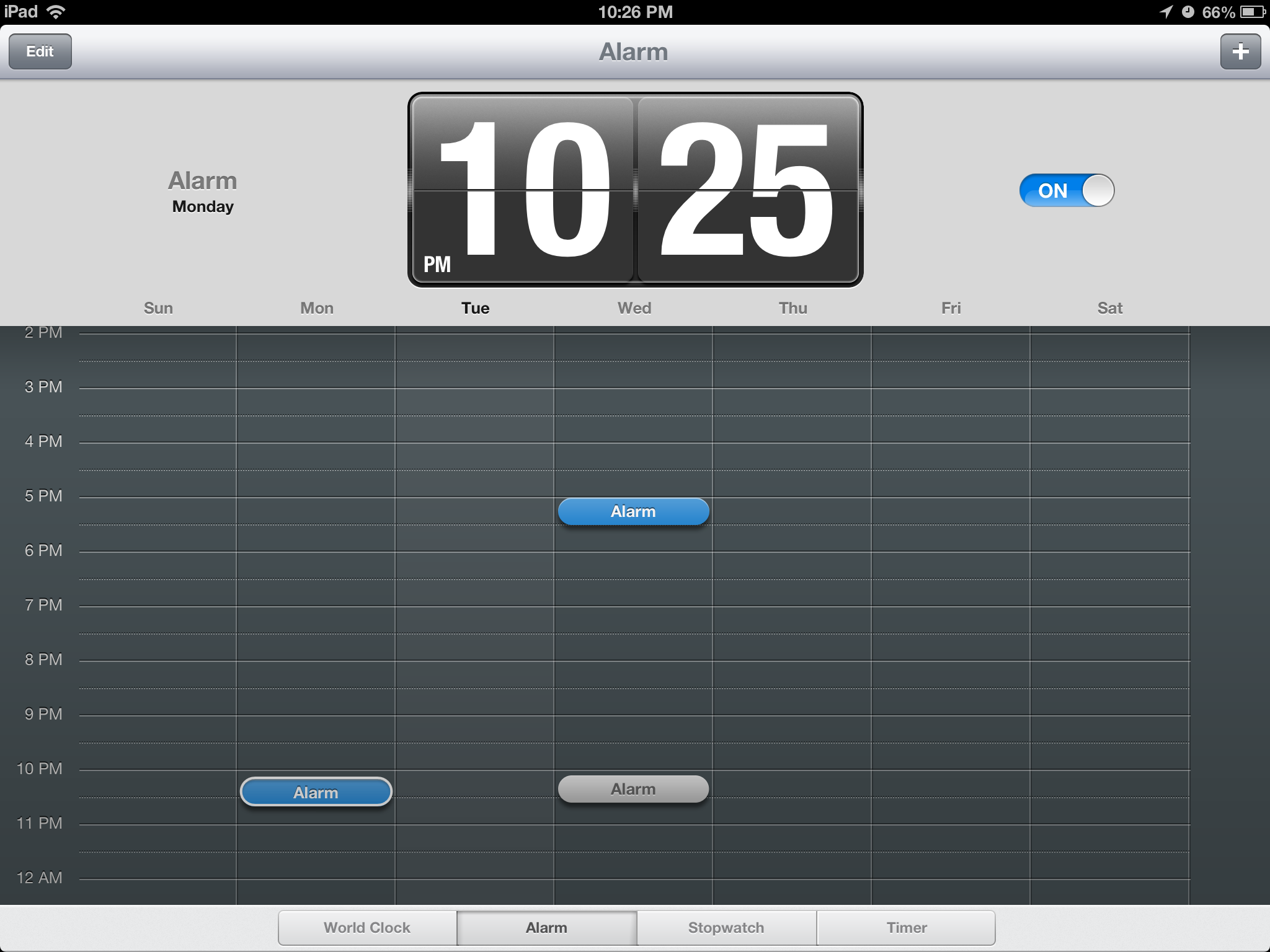
Similarly, the stopwatch shows the timer in the top pane and a list below populates all your lap times. The timer interface feels the oddest, because quite frankly doesn't require a 9.7" screen. Apple's literally gone ahead and pasted the iPhone timer UI and added the Start and Pause buttons around that. Kinda looks like Mickey Mouse with tiny ears. The new Clock app is a fantastic addition to the iPad, and users will enjoy its intuituve UI immensely.
YouTube
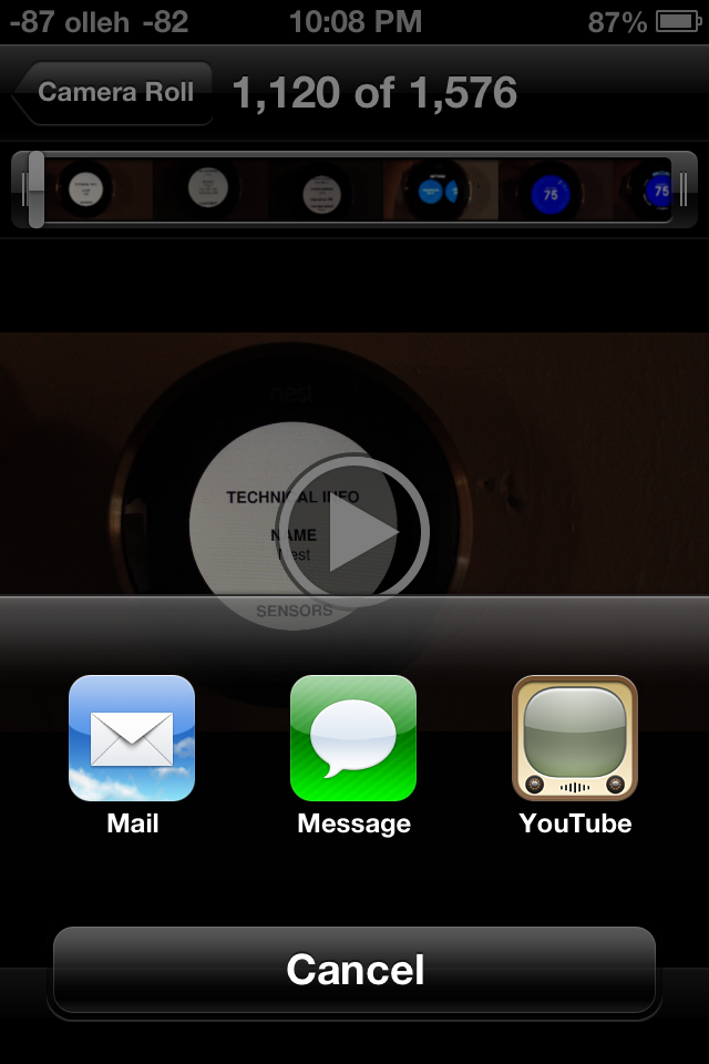
While the big news in iOS 6 is the substitution of Apple-supplied maps instead of Google maps, YouTube is the other Google product to get the boot this release. Though the standalone application is gone in iOS 6, YouTube itself remains an upload target from Photos.app and other places in iOS, but the familiar and oh-so-skeumorphic TV logo is now just a distant memory.
First, a little bit of history. Originally the only way to get to YouTube videos on iOS was through the YouTube app. The reason was actually pretty simple – the app served as a curated gateway to a small but growing subset of the YouTube catalog which was encoded using H.264 (as opposed to FLV). Recall that back in more innocent days, Google and Apple were such great lovers that Google was not only willing to dedicate tons of Xeons to transcoding from FLV to H.264, but hard drives as well to storing a bunch of different versions of the same video. Since then H.264 has pretty much won as the lowest common denominator encode target, though Google also steadfastly makes FLVs and added its own WebM/VP8 video as well. But back then, YouTube.app was the way iPhone users got to H.264 video content that the iPhone’s video decode block could play back. Remember that on mobile, hardware blocks dedicated to some particular use case are the way to achieving power efficiency. Oh, there also was obviously no HTML5 video element.
Since the iPad, Apple has employed a more direct approach, playing back the H.264 stream either in the browser or breaking you out of it directly in to a player. The YouTube app started getting more and more crufty, tied to iOS releases for any minor changes. Google began making its mobile interface better and better, and for years now you could largely view YouTube content on the iPhone or iPad without once launching YouTube.app.
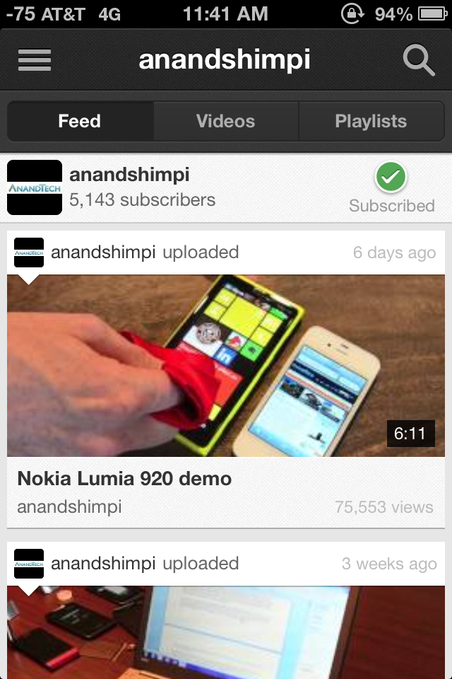
What functionality did remain there were things like quickly browsing subscriptions and other tasks. In its stead, Google has built a replacement native YouTube app whose appearance and functionality almost completely mirrors the Android equivalent. Google has begun directing YouTube videos opened from MobileSafari and other apps to open and play back using their YouTube app as well. Unfortunately what gets lost is that at present there's no iPad application, and also AirPlay from the YouTube player appears to be completely broken. There’s really not much to say beyond that – there's a loss of features at the outset, but if you factor in the fact that Google can now maintain YouTube, freely decoupled from iOS, there's the potential for huge improvements. Of course, their motivations aren’t entirely benign, they want to serve mobile ads, but hey, nothing is perfect.


105 Comments
View All Comments
snoozemode - Wednesday, September 19, 2012 - link
With the increasingly more powerful hardware that runs Ipad and Iphone it only seems like a question of when, we will se Ipads and Iphones running OSX with something like a device-dependent skin and some under-hood tuning to fit the device. IOS feels aged in many ways and a merge in to something new seems natural.solipsism - Wednesday, September 19, 2012 - link
iOS is OS X. The took Mac OS X, brought down to it's core elements and built up iOS from that. At one point Apple advertised it as OS X Leopard and OS X Phone; I think at MacWorld 2008.You won't see the Aqua GUi, printer drivers, etc. on iOS because it doesn't make any sense. There is no advantage to have a user plug a mouse into their iPhone so they can navigate with a pointer. The UI was designed for touch. Why even consider scrapping that?
dcollins - Wednesday, September 19, 2012 - link
You obviously don't use the Mail App with Exchange. It still needs some work. My users have huge numbers of heavily nested folders (100s of folders, up to 5 levels deep) that they use to organize emails. When synced with Exchange, App pulls the entire list of folders and displays them fully expanded; you cannot hide/minimize nested folders! You cannot rearrange folders and moving emails between them is clunky at best.With more and more business users relying on iPhones for work, I would like to see a slew of improvements made to Mail's Exchange support.
robinthakur - Thursday, September 20, 2012 - link
I agree upto a point. Our advice to users is not to nest folders and store the emails to SharePoint, as well as minimise folders. This seems to trip up alot of devices though to be fair, which seem to have problems with Folders in Exchange. Being able to set Out of Office through the mail.app would be a go send also.dsumanik - Thursday, September 20, 2012 - link
or apple could just add collapsable folders.lol
yet another apple ifail
Stas - Sunday, September 23, 2012 - link
Give them a break. They have to invent them first.randomlinh - Wednesday, September 19, 2012 - link
"For now the sacrifice seems worth it as the payoff is something that works very well, but I worry about what happens down the road if you're forced to buy a device not because it's the best device for you, but because buying an alternative would hurt the experience on another, unrelated device"This is exactly what I fear. And I think we're closer to it than one might think
tekzor - Wednesday, September 19, 2012 - link
already happened with app storesGotThumbs - Wednesday, September 19, 2012 - link
Agreed.Apples walled garden offers zero choices for consumers when it comes to shopping for content elsewhere. The simple truth is that Apple controls each IProduct users access, and is expanding those controls continually, should be very concerning for its followers.
While I use two Android devices (Phone & Tablet), Google does not restrict/control my ability/freedom to shop for content outside their market place. Part of what makes an open market great is not limiting consumers options and allows price competitiveness. Consumers win.
Apple's currently in trouble (along with four publishing companies) for imposing price controls/fixing. Do you really care about Apples 30% share or are you more interested in getting the same product at the lowest price? At the end of the day....everyone wants their money to go as far as it can for them.
When you have options and time...you shop for the lowest price. Apple has eliminated ts collective users options/choices and wants to inflict its will on others...ie restricting Amazon's price structure and the economies of scale in selling the same books at a reduced price to consumers.
It simply amazes me how so many of the general public continue to willingly give up their freedom of choice. Do they really just want to be controlled and told what to do and how to hold their phone?
Microsoft NEVER EVER prevented a user from installing and using a different web-browser in Windows...yet they have been sued for millions all over the world....
. Apple builds a walled garden and forces its followers to shop ONLY at its market and even fixes prices so its sure to get its 30% cut on purchases....
...YET the DOJ continues to sit on their thumbs and does nothing.
What is wrong with this country?
OK I'm done with my rant.
btw. I wonder if the driver had followed Google Maps instead of Apples route....would he have avoided the traffic and arrived sooner? Just a thought.
Best wishes,
bplewis24 - Wednesday, September 19, 2012 - link
I'm glad somebody else is as baffled as I am about consumers' willingness to do the same. Eventually they will either wake up or get what they deserve.