Samsung Galaxy S III Review - AT&T and T-Mobile USA Variants
by Brian Klug on June 20, 2012 12:01 AM ESTSamsung didn’t emphasize camera performance very much during its launch event, which surprised me since HTC and Apple have both made steady improvements on the camera experience this generation. That said, the SGS3 does make some iterative improvements of its own in the camera department.
First off, the 8 MP rear facing camera sits behind F/2.6 optics with a relatively wide focal length of 3.7 mm. If you compare to the SGS2’s F/2.7 optics with 4.0 mm focal length, the SGS3 is a fair amount wider, and it’s noticeable when out and about shooting photos. From my digging, I’ve found that both my T-Mobile and AT&T SGS3s contain a S5C73M3 rear camera module - that looks like a Samsung CMOS name to me, but usually Samsung CMOSes start with S5K3 in the 8MP category. This is the same as the International version I’ve seen, though there’s still considerable debate about whether this is a Sony CMOS, but initial reports are that it isn’t the IMX145 from the iPhone 4S. I’ve also seen references to “CML0801” but that doesn’t mean anything to me immediately. Either way, the CMOS is 8 MP with 1.4µm pixels and BSI, images at full resolution are 3264 x 2448.
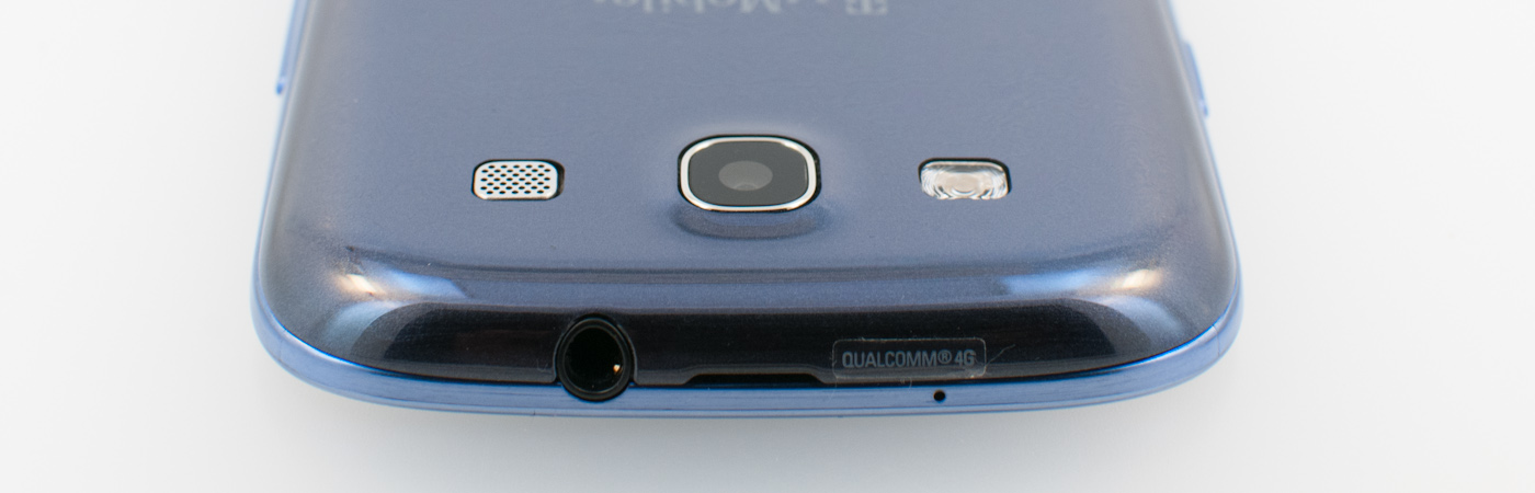
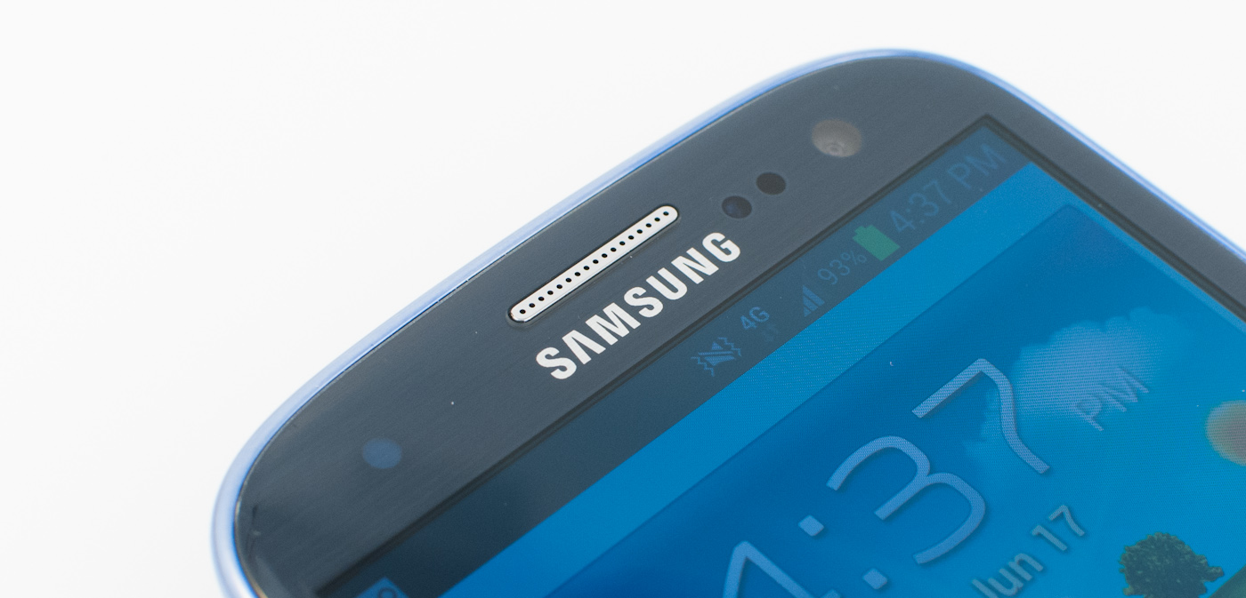
The front facing camera is a Samsung S5K6A3 CMOS which hasn’t been announced or made formal yet, and as a result I’m not sure about its pixel pitch or format. It is 1.9 MP and square - 1392x1392, which is relatively unique. I wager most users will just use 1280x960 and not know that the 1.9 MP option exists, though it is exposed in the camera UI.
Samsung has made some improvements to the camera UI, and though they’re subtle, they’re nonetheless worth talking about. The camera application does launch speedily, which was one of Samsung’s major points. As I mentioned, the shortcut from home screen (if you enable it) is handy if you don’t want to use up one of the application shortcut spaces.
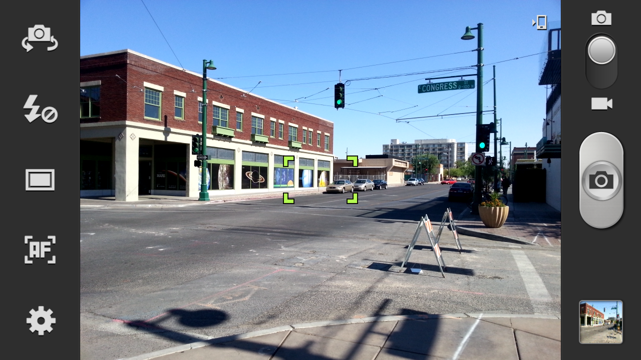
For SGS2 users, the whole application should be familiar, settings is in the bottom left, and all the icons on the left pane can be changed or customized by long pressing. Tap to focus and expose is still here, and capture speed is nearly instantaneous, just like on the One series.


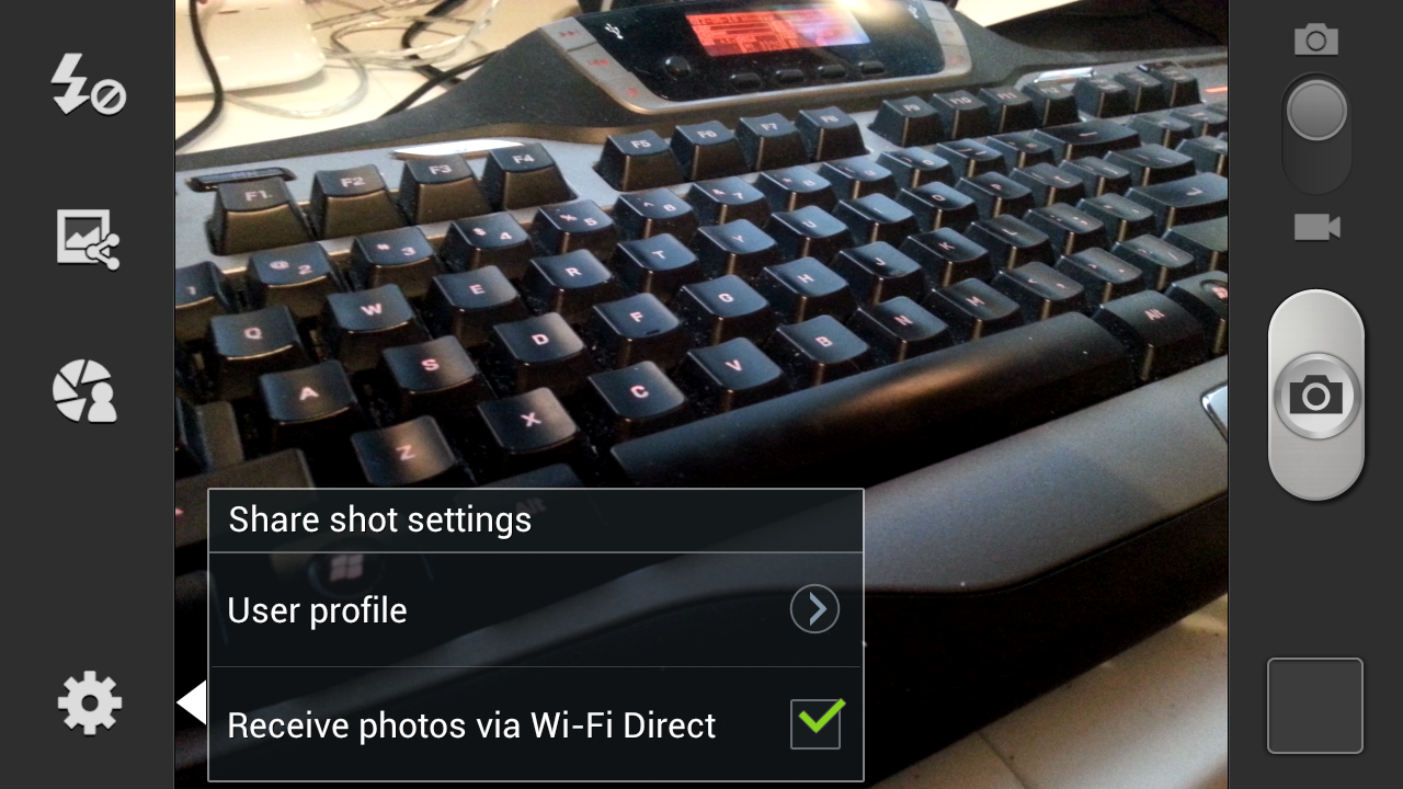
Shooting modes can be changed from single to burst shot, HDR, and a few other options. HDR combines three exposures like we’ve seen on other platforms, paints a progress bar while it computes (which happens impressively fast) and saves the resulting exposure. Probably one of the cooler shooting modes is share shot, which uses WiFi direct to share photos captured from linked SGS3s to each other. Tapping this brings up the WiFi direct pair prompt, and successive photos get put in a received folder on other devices.
To evaluate still image quality we turn to our usual set of tests, which means the lightbox scene with the lights on and off, and our bench photo locations (numbers 3 - 7 remain). I couldn’t get the test charts and lighting setup due to me moving houses while working on this review (everything is boxed up), but will update when that’s settled. For now we have a decent picture of the SGS3 camera performance, but something I would like to investigate more once I can setup my test charts. Consider the following more of a first impression than really my end thoughts on the SGS3 camera’s performance.


Immediately, you can tell that Samsung has tweaked their camera ISP and disabled the sharpening kernel which used to leave halos around contrasty spatial detail. There’s some loss of high frequency detail to noise reduction which is particularly evident in the lightbox camera’s focus rings and markings, but nothing too inordinate. White balance gives the scene a somewhat purple cast. I have to say that the One X image is sharper, but not by much.
With the lights off, the SGS3 does a great job exposing, and focuses with the scene lit up so it doesn’t miss focus entirely. This is still something I see so many other smartphone cameras not doing, and instead just capturing at infinity focus and hoping for the best. Kudos to Samsung for still doing it the right way.
At the bench location photos, I’m kind of left feeling the same way about the SGS3 camera at first glance. There’s nothing really wrong with it, and it seems to have less distortion (the test chart will tell the objective truth) but it just isn’t as sharp as some of the other cameras I’ve seen. Having a wider field of view is definitely something different, and it’s noticeable over the SGS2.


107 Comments
View All Comments
OCedHrt - Wednesday, June 20, 2012 - link
I wish we would get AWS on AT&T's S3 for WCDMA in addition to LTE.richworks - Wednesday, June 20, 2012 - link
Why isn't the International version of SGS3 not included in the benchmark tests? Am I to understand you haven't reviewed it yet?minhajmsd - Wednesday, June 20, 2012 - link
He did mention in the article that his unit hasn't arrived yet.richworks - Wednesday, June 20, 2012 - link
Ah.. thank you. I might have overlooked that part. I apologize for that :)antef - Wednesday, June 20, 2012 - link
Brian, you mention that by Samsung including a menu button that they don't have to include the full-row on-screen menu button that HTC does, but what you didn't mention is how this is still not ideal because it breaks Google's design goals for ICS completely. Google very plainly stated that the Menu key with its hidden functionalities (and sometimes no functionality) was not good design and encourages all developers to move away from it. Yet Samsung decides to include it on a new device built for ICS (probably because TouchWiz is carried over from Gingerbread).This means a few things. First, some app devs might not move to ICS design standards because they think they don't have to with new devices still coming out with Menu keys. Second, even if an app does use the new standards/action bar, the 3-dot overflow button will be HIDDEN because a Menu button is present. This is confusing and hides functionality that should be grouped with the other actions at the top. Finally, it necessitates a long-press of Home for task switching, which is slow and cumbersome compared to a dedicated button.
All around a bad decision on Samsung's part. The full-row menu key necessary for legacy apps on the One X is not ideal either, which is why on-screen buttons like on the Galaxy Nexus are the way to go.
Impulses - Wednesday, June 20, 2012 - link
I agree with you (and Google) on the menu button overall, it needs to go... I was never particularly bothered by it but it was a pretty sloppy design crutch and it confused new users of the platform... I agree that Samsung's implementation now only makes it worse by encouraging devs to continue using it and by messing with the way current ICS UI layouts are presented.I'm not sure I necessarily agree on screen buttons are better tho... IF you can make the device smaller by using them I'd say you have a case, but the Galaxy Nexus is no smaller than the One X so the latter ends up with more screen real estate the majority of the time (only sacrificing space to menu for legacy apps, which seems to be your main argument for on screen buttons).
I really hope Moto doesn't follow Samsung's lead, cause I believe LG has, and this is worse than the old game of musical chairs that manufacturers played with the four classic buttons. I think we've already had some leaks that showed them going with on screen buttons tho, fortunately.
It's gonna definitely gonna take longer than Google would like to deprecate menu...
hat being said, I've always liked Samsung's side power buttons (much easier to reach) so much do that I mod my HTC phones to wake on volume press... And I also kinda dig the physical home button (even tho it's ugly and another point of failure) because it makes it much easier to wake the phone while it's laying flat.
Most of that is subjective tho, Google moving away from menu is not... Not only was it a design crutch, multi tasking feels so much quicker without long press. I know realistically it's not that much slower to long press home, but subjectively it feels slow. I think Duartesaid in an interview that was one of the reasons they were moving away from long presses and towards the use of more swipes etc.
antef - Wednesday, June 20, 2012 - link
I definitely agree with you about Menu being a design crutch and long-pressing Home feeling slow. People might think Menu is no big deal, but they have to consider the broader audience. Why do people think an iPhone is so much easier to use for most people - because everything is right there and easy to explain. Try explaining Menu and long-press to a new user: "You press this button to show more actions - sometimes it will show things, sometimes it won't, you just have to press it and see. And there's no indication of whether an app uses it or not, you just have to remember it's there. And then you press and hold this to switch apps...no, you didn't press it long enough, try again." versus "Press this button to switch apps. Here at the top of the screen are icons for things you can do. If you there are more things you can do you can access them by pressing the 3-dot button right next to it." It's a night and day difference, and like you said this will stall Google's efforts to deprecate it, now a whole new generation of Android users will get accustomed to a Menu key on the SGS III.You are correct that the Galaxy Nexus loses some screen real estate with the on-screen buttons, but I don't see that being much of an issue when you have a 1280x720 resolution screen. The thing is, with 3 physical buttons, you are going to have one of these problems either way, and the on-screen button eliminates that. In addition I think the on-screen buttons are just preferable anyway. They are bold, easy to see, give you feedback when you press them, and appear coherently part of the UI. It looks like a complete package. Versus the off-screen, backlight-lit keys, which appear "separate" from the UI and are typically smaller. I never realized this from pictures, but after actually using a Galaxy Nexus, I much prefer the look and feel of the on-screen buttons.
Definitely also like the side power button, it's practically necessary for large devices like these.
themossie - Wednesday, June 20, 2012 - link
Yes, it does ignore Google's design goals. It also makes most applications far more usable. Why are contextual menus bad? (I understand the inconsistency problem where the menu button on ICS will not pop up on screen depending on the phone, but still...)Seems like many phone manufacturers agree with me here.
Since I'm complaining anyway... :-)
Does anyone else find ICS task switching far less useful than 2.x's "Recent Apps"? With "Recent Apps", I never had to scroll to find the app I wanted - and never had to worry about closing applications to keep the Task Switcher bar reasonably short.
(For reference, I have a Gingerbread phone and a ICS tablet)
Impulses - Wednesday, June 20, 2012 - link
Contextual menus aren't bad per se, forcing people to guess when they exist at all is. Very few applications are better off with a hidden menu than ICS' action bar + overflow menu plainly visible on screen. Many manufacturers = 2 out 5 or so major Android OEMs? Sony, HTC, and Motor have conformed to the new button scheme.Not sure why you're complaining about scrolling on ICS, are you using a 7" tablet? On my 10" the recent app menu shows 9 apps in portrait and 5 in landscape. Previous versions of Android showed either 6 or 8 icons depending on manufafturer, and had no preview of the app.
You couldn't kick apps out of the recent apps pop up either... ICS multi tasking seems like an improvement in every possible way except maybe landscape use or smaller lower res phones, and even then tap + swipe + tap is no slower than long press + tap.
themossie - Wednesday, June 20, 2012 - link
Re: Contextual menus - I do agree that it's bad to force people to guess when they exist. (That wasn't a problem before ICS, when you could safely assume a program has one!) I don't find the ICS icon to be a useful contextual clue to new users - 3 dots does not a menu suggest.Now, for scrolling: (forgive the rant)
That said, from memory:
* CM9 on HP Touchpad (1024x768) - shows 1 app in landscape.
* ICS on Galaxy Nexus - shows only 3 apps in portrait. (images.google "task switcher galaxy nexus")
* ICS on HTC Evo 4G - shows only 1 app in landscape. This may be a Sense issue, experienced other landscape issues.
You have to scroll to do anything!
Compare this with Gingerbread on my Droid 2 (the not-Motoblur), where "Recent Apps" shows 18 apps. With 18 apps in Recent Apps, I no longer need the homescreen to load applications.
I'd still find the stock "Recent Apps" (I believe it's 8 in Froyo, 10 in Gingerbread?) more usable than ICS.