Samsung Galaxy S III Review - AT&T and T-Mobile USA Variants
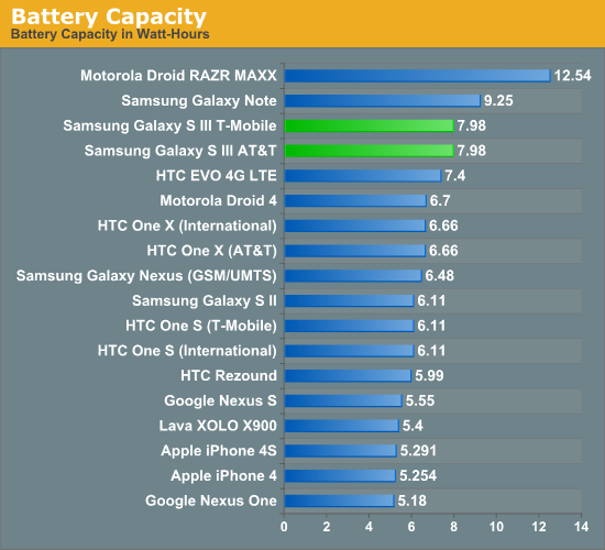
by Brian Klug on June 20, 2012 12:01 AM ESTBattery life is hugely important, and in the case of the SGS3 USA variants the question is just how long you can go with the combination of even beefier air interfaces like LTE and DC-HSPA+, an even larger 4.8" display, and dual core 28nm MSM8960. The SGS3 includes a very large 7.98 watt-hour battery with a higher 3.8V nominal chemistry (2100 mAh * 3.8 V = 7.98 watt hours).
I spent a big part of my limited time with the SGS3s battery life testing, and turned to our Smartphone 2011 suite of battery life tests which I’ve described in detail before. The web browsing tests consist of a few dozen pages which are loaded every 10 seconds with the display set at precisely 200 nits (using a meter) until the phone dies - this is done over WiFi and cellular data. The tethering test consists of a single client notebook attached to the device using its onboard WiFi hotspot function, and four tabs of our page load test alongside a 128 kbps streaming MP3 station are loaded on that notebook until the phone dies.
I was supplied the AT&T and T-Mobile SGS3s, which differ in air interface and band support. The T-Mobile version is on the carrier’s DC-HSPA+ network for testing, and the AT&T version supports both HSPA+ (single carrier) and LTE. Unfortunately AT&T LTE is not lit up in my Tucson, AZ market yet (which would make my life so much easier), so I could only run the 3G WCDMA result. 4G LTE results from that particular device will come shortly and I’ll update appropriately.
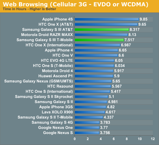
Immediately we can see that the combination of MSM8960 and Samsung’s big battery really pay off for the SGS3. Both the T-Mobile and AT&T versions (on DC-HSPA+ 42.2 and HSPA+ 14.4, respectively) post impressive numbers around 8 hours. This is with the display set at 200 nits in the browser, which is one tick short of all the way to maximum on the SGS3. Samsung has included a ton of battery saving display analysis features in the SGS3 browser, which were turned off for this test. Obviously if you turn those on (I would) you’ll be able to push battery life even further. It is shocking how close we come to the previously untouchable iPhone 4S.
As soon as I get the AT&T LTE numbers (I have to travel to an AT&T LTE market and carry out the test there) I’ll update with that graph here.
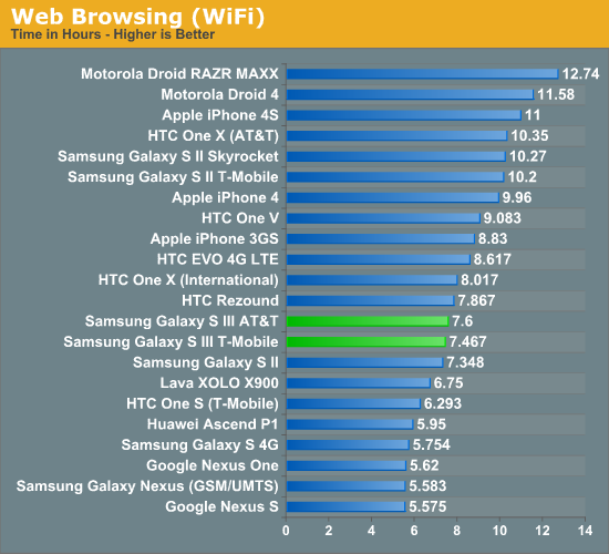
Next up is the WiFi battery life test, which posts numbers right around where the 3G cellular test was. You might be wondering why this is since the SGS3 includes an even lower power WiFi stack (BCM4334 even in the Krait-based USA variants). The result indicates to me that we’re almost entirely dominated by display power draw here. If we ran with a lower brightness, I expect you’d see WiFi longevity pull in front of cellular like you’d expect.
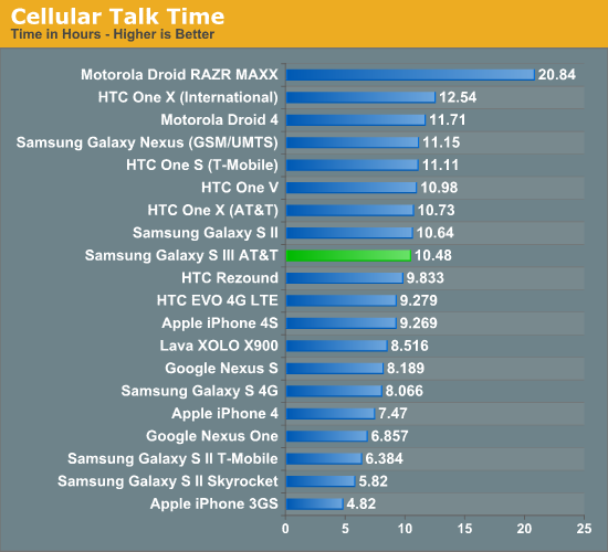
Cellular talk time is starting to get so long that it’s hard to test - I essentially lost an entire day of playing with the AT&T SGS3 to running a call time battery life test. This is a good problem to have, though I’m surprised it didn’t go just a bit longer and match or beat the One X AT&T result.
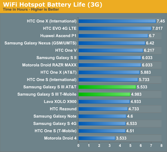
The 3G hotspot test really tells what things are like with the display turned off. Quite honestly I’m surprised the SGS3 doesn’t do much better here – it’s possible there’s room for further optimization of the WiFi hotspot mode on SGS3. Likewise, I’ll update with 4G LTE numbers for the AT&T model as soon as I’m in an area where it’s lit up and I can burn a few hours testing.
Overall, in my time with the SGS3 I would subjectively describe battery life as above average. With AMOLED, 200 nits is actually pretty bright, and you see Samsung and other OEMs clamping display brightness well below the physical limits to both save power and prevent burn-in.
Obviously the other interesting question is how the SGS3 fares on its battery saving mode with the CPU clock capped at 1.0 GHz. That’s also next in line for testing.


107 Comments
View All Comments
OCedHrt - Wednesday, June 20, 2012 - link
I wish we would get AWS on AT&T's S3 for WCDMA in addition to LTE.richworks - Wednesday, June 20, 2012 - link
Why isn't the International version of SGS3 not included in the benchmark tests? Am I to understand you haven't reviewed it yet?minhajmsd - Wednesday, June 20, 2012 - link
He did mention in the article that his unit hasn't arrived yet.richworks - Wednesday, June 20, 2012 - link
Ah.. thank you. I might have overlooked that part. I apologize for that :)antef - Wednesday, June 20, 2012 - link
Brian, you mention that by Samsung including a menu button that they don't have to include the full-row on-screen menu button that HTC does, but what you didn't mention is how this is still not ideal because it breaks Google's design goals for ICS completely. Google very plainly stated that the Menu key with its hidden functionalities (and sometimes no functionality) was not good design and encourages all developers to move away from it. Yet Samsung decides to include it on a new device built for ICS (probably because TouchWiz is carried over from Gingerbread).This means a few things. First, some app devs might not move to ICS design standards because they think they don't have to with new devices still coming out with Menu keys. Second, even if an app does use the new standards/action bar, the 3-dot overflow button will be HIDDEN because a Menu button is present. This is confusing and hides functionality that should be grouped with the other actions at the top. Finally, it necessitates a long-press of Home for task switching, which is slow and cumbersome compared to a dedicated button.
All around a bad decision on Samsung's part. The full-row menu key necessary for legacy apps on the One X is not ideal either, which is why on-screen buttons like on the Galaxy Nexus are the way to go.
Impulses - Wednesday, June 20, 2012 - link
I agree with you (and Google) on the menu button overall, it needs to go... I was never particularly bothered by it but it was a pretty sloppy design crutch and it confused new users of the platform... I agree that Samsung's implementation now only makes it worse by encouraging devs to continue using it and by messing with the way current ICS UI layouts are presented.I'm not sure I necessarily agree on screen buttons are better tho... IF you can make the device smaller by using them I'd say you have a case, but the Galaxy Nexus is no smaller than the One X so the latter ends up with more screen real estate the majority of the time (only sacrificing space to menu for legacy apps, which seems to be your main argument for on screen buttons).
I really hope Moto doesn't follow Samsung's lead, cause I believe LG has, and this is worse than the old game of musical chairs that manufacturers played with the four classic buttons. I think we've already had some leaks that showed them going with on screen buttons tho, fortunately.
It's gonna definitely gonna take longer than Google would like to deprecate menu...
hat being said, I've always liked Samsung's side power buttons (much easier to reach) so much do that I mod my HTC phones to wake on volume press... And I also kinda dig the physical home button (even tho it's ugly and another point of failure) because it makes it much easier to wake the phone while it's laying flat.
Most of that is subjective tho, Google moving away from menu is not... Not only was it a design crutch, multi tasking feels so much quicker without long press. I know realistically it's not that much slower to long press home, but subjectively it feels slow. I think Duartesaid in an interview that was one of the reasons they were moving away from long presses and towards the use of more swipes etc.
antef - Wednesday, June 20, 2012 - link
I definitely agree with you about Menu being a design crutch and long-pressing Home feeling slow. People might think Menu is no big deal, but they have to consider the broader audience. Why do people think an iPhone is so much easier to use for most people - because everything is right there and easy to explain. Try explaining Menu and long-press to a new user: "You press this button to show more actions - sometimes it will show things, sometimes it won't, you just have to press it and see. And there's no indication of whether an app uses it or not, you just have to remember it's there. And then you press and hold this to switch apps...no, you didn't press it long enough, try again." versus "Press this button to switch apps. Here at the top of the screen are icons for things you can do. If you there are more things you can do you can access them by pressing the 3-dot button right next to it." It's a night and day difference, and like you said this will stall Google's efforts to deprecate it, now a whole new generation of Android users will get accustomed to a Menu key on the SGS III.You are correct that the Galaxy Nexus loses some screen real estate with the on-screen buttons, but I don't see that being much of an issue when you have a 1280x720 resolution screen. The thing is, with 3 physical buttons, you are going to have one of these problems either way, and the on-screen button eliminates that. In addition I think the on-screen buttons are just preferable anyway. They are bold, easy to see, give you feedback when you press them, and appear coherently part of the UI. It looks like a complete package. Versus the off-screen, backlight-lit keys, which appear "separate" from the UI and are typically smaller. I never realized this from pictures, but after actually using a Galaxy Nexus, I much prefer the look and feel of the on-screen buttons.
Definitely also like the side power button, it's practically necessary for large devices like these.
themossie - Wednesday, June 20, 2012 - link
Yes, it does ignore Google's design goals. It also makes most applications far more usable. Why are contextual menus bad? (I understand the inconsistency problem where the menu button on ICS will not pop up on screen depending on the phone, but still...)Seems like many phone manufacturers agree with me here.
Since I'm complaining anyway... :-)
Does anyone else find ICS task switching far less useful than 2.x's "Recent Apps"? With "Recent Apps", I never had to scroll to find the app I wanted - and never had to worry about closing applications to keep the Task Switcher bar reasonably short.
(For reference, I have a Gingerbread phone and a ICS tablet)
Impulses - Wednesday, June 20, 2012 - link
Contextual menus aren't bad per se, forcing people to guess when they exist at all is. Very few applications are better off with a hidden menu than ICS' action bar + overflow menu plainly visible on screen. Many manufacturers = 2 out 5 or so major Android OEMs? Sony, HTC, and Motor have conformed to the new button scheme.Not sure why you're complaining about scrolling on ICS, are you using a 7" tablet? On my 10" the recent app menu shows 9 apps in portrait and 5 in landscape. Previous versions of Android showed either 6 or 8 icons depending on manufafturer, and had no preview of the app.
You couldn't kick apps out of the recent apps pop up either... ICS multi tasking seems like an improvement in every possible way except maybe landscape use or smaller lower res phones, and even then tap + swipe + tap is no slower than long press + tap.
themossie - Wednesday, June 20, 2012 - link
Re: Contextual menus - I do agree that it's bad to force people to guess when they exist. (That wasn't a problem before ICS, when you could safely assume a program has one!) I don't find the ICS icon to be a useful contextual clue to new users - 3 dots does not a menu suggest.Now, for scrolling: (forgive the rant)
That said, from memory:
* CM9 on HP Touchpad (1024x768) - shows 1 app in landscape.
* ICS on Galaxy Nexus - shows only 3 apps in portrait. (images.google "task switcher galaxy nexus")
* ICS on HTC Evo 4G - shows only 1 app in landscape. This may be a Sense issue, experienced other landscape issues.
You have to scroll to do anything!
Compare this with Gingerbread on my Droid 2 (the not-Motoblur), where "Recent Apps" shows 18 apps. With 18 apps in Recent Apps, I no longer need the homescreen to load applications.
I'd still find the stock "Recent Apps" (I believe it's 8 in Froyo, 10 in Gingerbread?) more usable than ICS.