HP Folio 13 Review: Deviating From the Norm
by Dustin Sklavos on April 17, 2012 12:30 AM EST- Posted in
- Laptops
- Intel
- HP
- Sandy Bridge
- Ultrabook
In and Around the HP Folio 13
After reviewing nothing but wedge-shaped ultrabooks, the HP Folio 13 is actually a bit of a breath of fresh air. HP's design here doesn't actually deviate all that much from the rest of their notebook lineup; aesthetically it sits right between their consumer and enterprise lines (much as it's intended to), and as I mentioned before they eschewed the wedge shape and kept the build right at the 18mm cusp of Intel's ultrabook spec.
The top lid and interior surface of the Folio 13 are aluminum, while the screen bezel and bottom of the notebook appear to be either carbon fiber or a rubberized treatment on matte plastic; either way, it's soft, light, durable, and attractive. In fact the only gloss on the Folio 13 is surrounding the keyboard and on the screen's interior bezel (which houses the webcam.)
.jpg)
Where HP can claim a major victory with the Folio 13 is the keyboard proper. Ultrabook keyboards, by virtue of the form factor, tend to be very shallow and can be difficult to use. Since HP's engineers seem to have gone in reverse and tried to see how big they could get the Folio while keeping it thin, light, and within spec, the result is a keyboard that has much better depth and travel. It's still not perfect and feels a little on the mushy side, but compared to the others I've tested it's much more comfortable. And as a special bonus: it's backlit.
Unfortunately, despite having an excellent keyboard for an ultrabook, the Folio 13's touchpad is another poorly implemented clickpad. As we've mentioned before and as Anand has even said to me personally, PC vendors still can't seem to get this part of the design down. Honestly I'm at a loss as to why they keep trying, as I have yet to use one that provides a tangible benefit over just using a traditional touchpad and pair of mouse buttons. At this point the only vendor with dedicated mouse buttons on their ultrabook is Toshiba. During testing I found the clickpad had such a hard time detecting misclicks that I was largely forced to use an external mouse.
_thumb.jpg)
_thumb.jpg)
_thumb.jpg)
_thumb.jpg)
_thumb.jpg)
_thumb.jpg)
Finally, the screen on the Folio 13 is another poor-quality 768p TN panel. It's not really worth going through the full rigamarole for something that bothers all of us; suffice to say it's "competitive" with the majority of what's out there in this class, though hopefully the days of dismal notebook screens are drawing to a close as tablet screens push things forward.
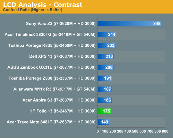
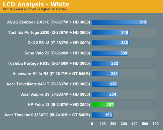
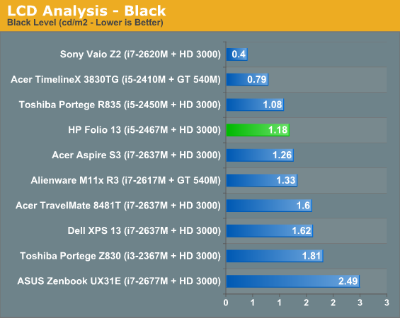
The remainder of the results are available in Bench, but you can tell the Folio 13's screen isn't very good even by ultrabook standards. The best in an otherwise bad bunch are the ASUS Zenbook UX31E, which at least sports at 1600x900 resolution, and the vastly more expensive Sony Vaio Z2, which runs at full 1080p but costs nearly twice what some of the other ultraportables do.


88 Comments
View All Comments
Zingam - Wednesday, April 18, 2012 - link
Dude, you surely have microscope eyes, do you? I have a 13.3" 768p display and I cannot see the dots on it! I doubt there will be any real advantage if it was higher res.Higher resolution might make sense at 15" but it doesn't make any at 13!
I bet your are just trolling and clueless!
snuuggles - Wednesday, April 18, 2012 - link
I'm hoping it's not just a waste of time to reply to you, but here goes:The point is not "I can't see the pixels". The *point* is that a higher vertical resolution allows more work to be shown at once on a page *especially* in windows where the UI can take up a not-insignificant portion of the vertical pixels.
When I work, I want to have as many lines of code on the screen as possible, 768p is simply limiting.
Try to think about it before you call someone a troll or clueless. Thank you.
retrospooty - Wednesday, April 18, 2012 - link
"When I work, I want to have as many lines of code on the screen as possible, 768p is simply limiting."Exactly. This 1366x768 madness has to end. There are so many great laptops out there that would be perfect if they only had higher res options. Even 1440 or 1600x900 is a huge improvement. I cant stand when I cant see the button I need to click becasue its below the screen on a lousy 768 line LCD. Never ever ever again.
french toast - Wednesday, April 18, 2012 - link
I agree, we are not in 2004 anymore are we?? how is the new IPAD getting 2560x1440 and they have the cheek to release this? dont forget the ipad is a fully enavled multiouch display, with gorrilla glass and olephobic coating??We are getting ripped off people, 1080p multitouch should be the standard IMO, with or without a keyboard.
JarredWalton - Wednesday, April 18, 2012 - link
Well, the new iPad is 2048x1536, but close enough. :pLordConrad - Wednesday, April 18, 2012 - link
I agree completely. My HP 15 inch laptop has a 768p screen and it is perfect for me. I had the option of getting a higher resolution screen, but I'm glad I didn't. If the native resolution was any smaller, I would have difficulties reading it. More info on the screen is nice, but it's all useless if you can't read the screen.erple2 - Thursday, April 19, 2012 - link
If you can't tell the difference between the clarity of a printed page and your laptop screen, then please stop reading now. You're right, 768p screens in this form factor is enough.If, however, you can actually tell the difference between reading a (quality) printed page and reading the same thing on your laptop, then please continue reading.
I shudder to say it, but "You're reading it wrong"...
In the modern day age of 3D based desktops, "infinitely" scalable fonts, and scalable vector graphics as icons, low resolution displays simply cannot be justified by "I would have a hard time reading it". That's just flat false.
The beauty of the higher pixel density displays is that, even at the same physical size of a button on screen (say 1/2 inch by 1/2 inch), word of text, icon, etc, there are more pixels to represent that object, and thus the object is clearer to the human perception. The dpi of printed material borders on 300-600 dpi, and IMO is much easier to read than anything on a monitor/display.
I posit that the people that complain about not being able to see/read text on a high-resolution screen are either ignorant of font scaling, or are willfully stupid of it.
Higher Resolution is ALWAYS better than lower resolution, simply because you can always increase the pixel size of the fonts to match the physical size of the fonts.
nexox - Wednesday, April 18, 2012 - link
"""Dude, you surely have microscope eyes, do you? I have a 13.3" 768p display and I cannot see the dots on it! I doubt there will be any real advantage if it was higher res.Higher resolution might make sense at 15" but it doesn't make any at 13!
I bet your are just trolling and clueless!"""
You may actually want glasses. Back in 2004 I had a laptop with 1280x800 in 10.6" (140 DPI,) and I still believe that's about the largest screen size appropriate for that resolution. I currently have a (rather crappy, due to cpu/gpu) netbook with 1280x768 in 8.9" (170 DPI,) and that's got a rather nice DPI, though it's still a bit cramped.
On my desktop I run 120 DPI monitors, and I sit a regular distance away from them. For reference, 1920x1200 in 24" is about 100 DPI, and 2560x1440 in 27" is about 110 DPI. People do regularly tell me that it's impossible to read things on my desktop, so I guess I may have decent vision (with glasses.)
In any case, I use a laptop screen much closer to me than my desktop, and so 120 DPI (1366x768 in 13.3") seems rather crappy. Plus, 768 vertical pixels just isn't enough. For my use, 1600x900 is about the minimum for 13.3" (140 DPI,) and 1080p in 13.3" (165 DPI) would be amazing.
Doesn't look like anyone wants to sell that configuration to me for a reasonable price in the near future.
HanzNFranzen - Thursday, April 19, 2012 - link
It's more about visible area on the screen than pixel density. I too, stopped reading at 768p.snuuggles - Thursday, April 19, 2012 - link
+1. -- just exactly right