Samsung S23A750D 3D LCD Display
by Chris Heinonen on December 17, 2011 2:45 PM ESTSamsung S23A750D Viewing Angles and Color Quality
The Samsung is a TN panel but Samsung advertises improved viewing angles as one feature of the S23A (with the name "Magic Angle Vertical"); you can read about this and additional features on their product page. As you'd expect there's plenty of marketing hyperbole to be found, but in practice I did notice that the S23A has better viewing angles than competing TN solutions.


Most TN panels experience huge color shifts when viewed from the top or bottom of the monitor, and once they get past 20” or so in size you start to see the shift even when attempting to view straight on; by comparison, the S23A looks good when viewed straight on and I didn't see noticeable shifts from my normal viewing area. However, this remains a TN panel and when viewed from accute angles the shift in color and contrast is still present.
Unfortunately, while viewing angles are better than most TN displays, the pre-calibration Delta E numbers are as bad as we've come to expect from consumer displays.
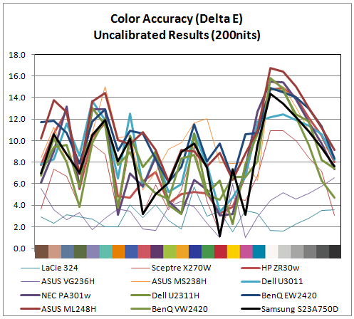
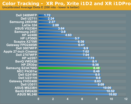
With an average dE over 8 and some of the worst overall numbers occurring the grayscale, the initial numbers for the Samsung aren't very good. The result is similar to competing displays, but still disappointing. Let's move on to calibrated results.
Using the color settings to get the white balance as close as possible to D65 and then setting the brightness and contrast to get 200 nits of light output, I ran the calibration routine in ColorEyes Pro to see if the Samsung could perform any better.
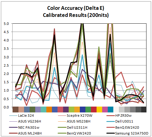
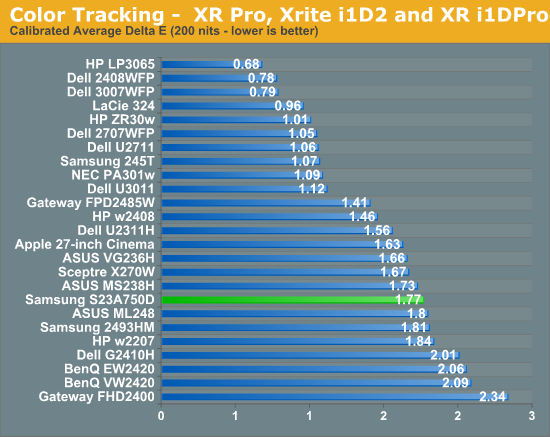
The numbers for the Samsung are overall very good once calibrated. Not only do we get an average dE of 1.77, but the only large errors at all are once again in shades of blue, including the shade of cyan that falls outside of the sRGB spectrum. The entire grayscale spectrum is under 1.0 dE, and only 3 of the 24 swatches are above dE 3, which is the visible level if ColorEyes uses dE76 (which I’d assume, but can’t confirm). Hopefully in the near future we will be able to get all these results in dE94, which is more accurate for measuring color error. I also went ahead and did the same test, though at 100 nits instead of 200 nits, which is what might be used if you are doing print work.
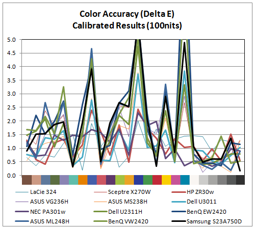
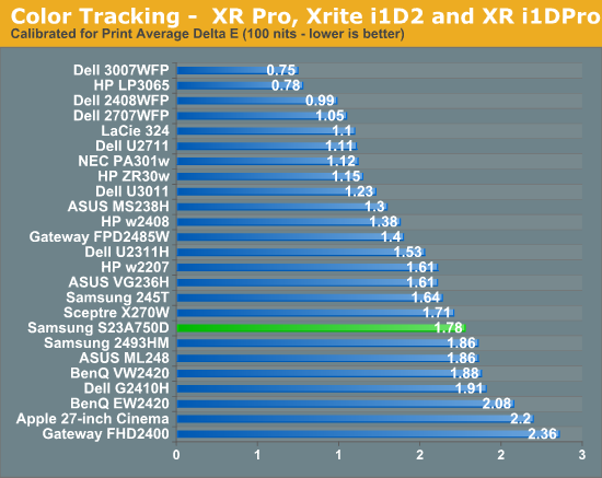
Here the performance is almost identical to the 200 nits data. The grayscale isn’t quite as good, but still virtually perfect, and almost all the issue falls at the same three sample points. Overall the performance here was much better than I expected from a TN panel.


80 Comments
View All Comments
Sebec - Monday, December 19, 2011 - link
"Not everything has to be written like a technical brief presentation or be a class on the electronics of how TN panels work."Maybe not, but on Anandtech, I'm come to expect that level of precision technical writing and explanation.
kris79 - Tuesday, December 20, 2011 - link
Erm, makes me wonder if some of the nitpickers would complain about getting too much money in their EBT checks. Before complaining, one may want to remember that this info is, erm, Free! The writing is fine. Some of them may not use English as their first language. Some of the readers may not either. I, at least, like the chatty style more than the antiseptic, scientific style that more anal retentive types seem to like. I even like comments about power supplies. Naturally, I can understand that some would prefer to change all that to make the rest of us more like themselves. Erm, that is all I have to say...ImSpartacus - Saturday, December 17, 2011 - link
I have a problem with posters that use caps lock in a potentially rude manner.The tone of your post is already flirting with "rude". Using upper case characters nudges it over the edge. I cannot tolerate rude comments from individuals that represent Anandtech.
I suggest not replying using language that could be interpreted as rude.
To help achieve this goal, I suggest reading some of Anand's comments from past articles. He has an especially fantastic tone to every one of his comments.
I hope Anandtech maintains its exemplary reputation of mature and thoughtful staff.
Cheers!
Kristian Vättö - Sunday, December 18, 2011 - link
I used caps because there is no bold (yes, this system is in need of an update). I wasn't trying to be rude, sorry if it sounded like that. I was just trying to get the message out in as short as possible. The poster didn't bother reading the article, so I couldn't be sure that he bothers reading my comment as a whole.Kristian Vättö - Sunday, December 18, 2011 - link
Also, thanks for the feedback. We (well, I in this case) can't really learn without someone else saying what is wrong. If someone bothers to comment about it, it must be something that actually has a value to someone.I'll be sure to pay more attention to my language in the future. Not that I post replies like the above often (first time I think)
Anand Lal Shimpi - Monday, December 19, 2011 - link
"I hope Anandtech maintains its exemplary reputation of mature and thoughtful staff."We most definitely will :)
Take care,
Anand
Iketh - Sunday, December 18, 2011 - link
I honestly did try to give examples. I spent a good 15 minutes trying to copy/paste a few sentences, but I can't change pages in the article without losing the post I'm writing. So then I started using print screen and erased my entire post that was in clipboard, so I said screw it.Here are some from "Lag and Power Usage".
", so the effect should feel like less." Like, for sure!
"The power use of the Samsung was a bit higher than a normal LCD, though this could easily be due to the 120Hz refresh rate that uses more power." should be something along the lines of "Power consumption of the Samsung was a bit higher than a normal LCD, though this could easily be due to the 120Hz refresh rate."
There are tons in the summary page from what little I saw of it.
Hey thanks for calling out a 13-year account as a "hater."
Iketh - Sunday, December 18, 2011 - link
This is what I saw in the introduction."Virtually every game now is rendered in 3D, and so all of the information is there that is needed to show the game in 3D to the user..."
"Virtually every game today is rendered in 3D and thus have all the information needed to be displayed in 3D..."
I did not understand what was being said in the very next sentence. What is "running in active 3D"?
Kristian Vättö - Sunday, December 18, 2011 - link
Sorry about the hater part, I would edit it out if we had that option. It just triggered me because it was the second comment and you clearly admitted that you only took a glance and still said it's bad. Okay, I know taking a glance has varying interpretations but from a writer's standpoint, your earlier comment was among the worst ones.The good thing is that you came back and did what you should have done in the first post: Provided some examples. That is how we can learn and also edit or explain ourselves if needed.
For future use, you can open the article in another tab/window so you can keep posting the comment in one tab/window while reading the article in the other ;-)
lyeoh - Sunday, December 18, 2011 - link
OK, here's my opinion: I don't really want to know about the writer's _off-topic_ difficulty in setting up an environment or rig to test the equipment, unless it's actually very interesting or amusing or written in an entertaining style (but that sort of thing should belong on a blog or a different section ala Byte's Chaos Manor or an entertainment-oriented publication/show e.g. Top Gear).Unfortunately the entire section on the lack of suitable PSU and display card and the resulting solution was not interesting, amusing nor entertaining. An editor would cut that section (and PSU gallery) entirely out. It just gives me the impression that the writer may be shilling for something/someone. Like those clumsy product placements in movies.
The rest of the review is OK from a glance, assuming the measurements etc were correct and done correctly.