BenQ VW2420H Monitor Review
by Chris Heinonen on December 10, 2011 2:45 AM ESTUniformity and Gamut
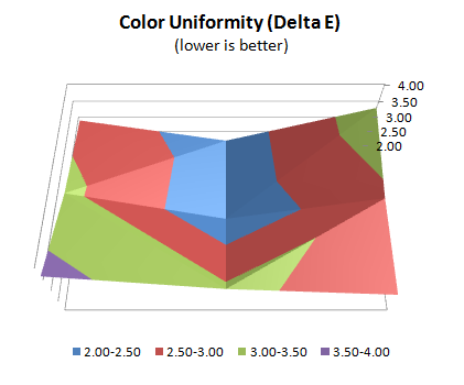
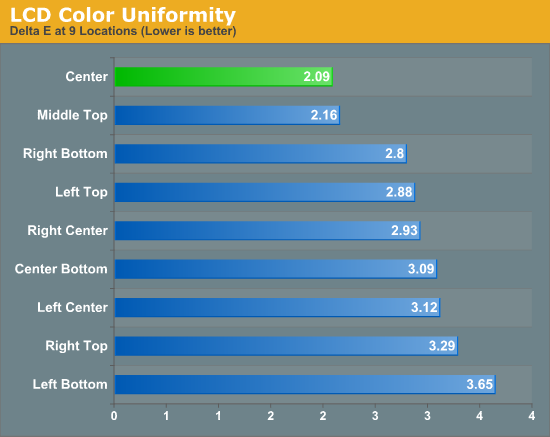
When we looked at the color on the VW2420H, the dE number for the very center of the panel at 200 nits of brightness was pretty decent at right around 2.0. Unfortunately it seems that the center of the panel performs better than the rest of the panel as a whole. The center and top-middle of the display are right around 2.0 for their average dE, but the rest of the panel is closer to 3.0 or higher. For this reason if you are doing color sensitive work, you probably want to keep what you are working on in the center of the screen and use the edges of the screen for other things.
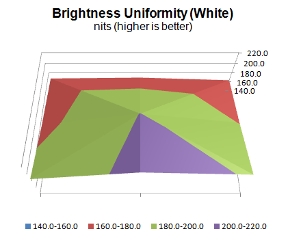
When I looked at the raw data for the uniformity values, aside from the center point the white values were much worse across the display. When we look at the brightness uniformity we can clearly see why that is. While it is a bit odd that the bottom-middle has the 2nd most accurate brightless level but the top-middle has the 2nd most accurate color dE, overall you can see the correlation between dE and brightness uniformity. As the light level changes, the color accuracy of white and everything else drifts from the calibrated values. This uniformity issue will exist with almost any panel using conventional lighting techniques.
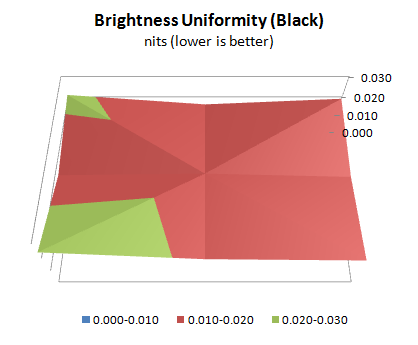
The black level uniformity is a little bit better than the white uniformity, but since this doesn’t have the same level of effect on dE levels that white uniformity does, we are less concerned with it. The higher numbers in the corners could be due to light leakage around the edges of the display, which often happens, but the standard deviation for all the measurements is just 0.002 nits, so I’m not concerned with this at all.
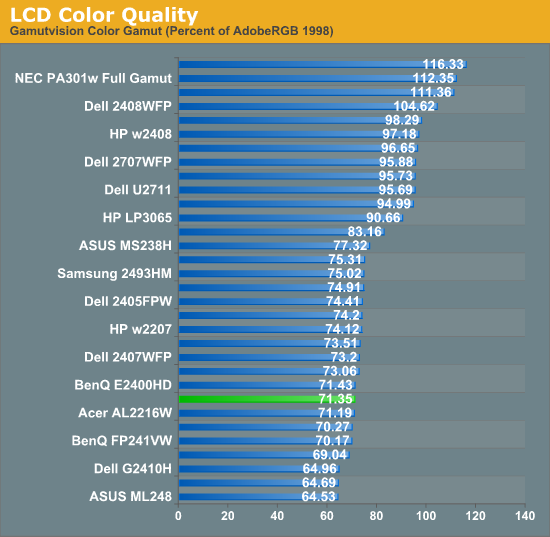
The BenQ offers up a gamut that is in the sRGB colorspace and testing bore that out, showing that is occupies just over 71% of the Adobe RGB gamut as we would expect. There's nothing really surprising or different here, as if you want the full Adobe RGB gamut you’ll need to look for a different backlighting system.


48 Comments
View All Comments
justaviking - Saturday, December 10, 2011 - link
I just bought a 16:10 TV/Monitor.Very cheap, but after recently buying a smaller yet similar product for my wife, which she loves, so I thought I'd give it a whirl mostly because of the aspect ratio, and the bonus of doubling as a TV, and an unbeatable price..
Hannspree ST289MUB 28" Class LCD HDTV - 1080p
1920x1200, 16:10
800:1 Native, 10000:1 Dynamic, 5ms, 60Hz, 2 HDMI, Black
It was (still is) $200 after the sales price and a $50 rebate at TigerDirect.
I wonder how a budget item like this would stand up to an AnandTech review. Is it a great deal or a waste of money?
JWatson - Sunday, December 11, 2011 - link
The Hannspree use TN panels. Meaning the black levels/contrast aren't nearly as good, as well the viewing angles. I used to have the older non-TV version of the Hannspree. It was a great monitor at 27.5 for just everyday computer purposes, but when it came to movies and gaming...well the blacks were not great, nor the viewing angles, or backlight bleed.To see what I mean by poor viewing angles try this link
http://www.lagom.nl/lcd-test/viewing_angle.php
Those letters should all be the same color. If you have a *VA or *IPS the text will have the same color. If you are using a TN panel, it'll show different color for the text depending on your angle.
If you need to do any professional photo editing on the Hannspree...forget about it. You can't calibrate to be accurate enough. You need a *VA or *IPS panel monitor.
If you just want a large, web browsing, office work, semi tv and movie watching, then the Hannspree is great for the price. I still recommend it as a budget monitor. However, If you're looking for quality...look elsewhere.
justaviking - Monday, December 12, 2011 - link
Thanks for the great link. It provides wonderful examples and offers a great tip of viewing at a distance equal to your diagonal size when evaluating the screen.I viewed the images on the $15 montior I have a work. At least I hope they only paid $15 for it. Ewww.
I can't wait to try it on a few of my monitors at home. I figured there would be compromises on the Hannspree. But for the price and features I'm hoping it'll be acceptable.
I don't have very demanding needs (no professional photography work, though I do enjoy video editing). But it'll be fun to compare a couple of the Samsung monitors I like with the Hannspree TV/monitor.
There's no need to test my wife's laptop. It is horrible. A nice i5 processor paired with a screen that has about a 10 degree viewing angle. Gahh!
Thanks again.
SirGCal - Saturday, December 10, 2011 - link
With most games locked to console specs and vertical fov, 16:9 actually has more viewable space. If they don't have locked vertical FOV (rare), then the 10's can show more due to their increased vertical pixel space... But still, since 16:9 is the 'industry' standard in everything accept desktop's, I fully expect the 10's to disappear. Besides, the higher res 16:9's are right around the corner anyhow with Ultra HD. 1200 and 1600 vertical pixels are most likely going away. 1080 will likely be the default standard with 1440 and 2160 being the higher end models. Maybe we'll even see some 4320s... I suspect we'll start to see these more often very soon (some already available...)Personally, I like the wider screen of the 16:9 anyhow, especially with vertically locked graphics engines in many of today's games.
JediJeb - Saturday, December 10, 2011 - link
Honestly I still prefer the 1280X1024 ratio, (4:3 I think it is) since most of my work deals more with vertical space than horizontal.kmmatney - Sunday, December 11, 2011 - link
1280 x 1024 is a 5:4 ratio. LCD monitors with a 4:3 ratio were rare (and now extinct) , but I'm typing on one now (1400 x 1050). It's great very general work, and I prefer it over 16:9, but not 16:10.kkwst2 - Monday, December 12, 2011 - link
I have a 19" 1280x1024 next to a 24" 1920x1200 at home, and used to like this setup a lot. But now at work I have a 30" 2560x1600 next to 1200x1900 (24" oriented vertically) and I like this much better.I use the vertical 24" for displaying Outlook, Word docs, and some more vertically oriented Excel workbooks. Also good for code. The 30" I use for graphics and layout stuff, as well as side-by-side spreadsheets. I used to think I would always want one screen that is more square, but now I really like the two screens with opposite orientation. The 30" is a luxury, but not necessary. When my 19" dies I'm going to two 24" at home with opposite orientation.
ibtar - Saturday, December 10, 2011 - link
I purchased an EW2420 (essentially the same panel) to compare to a ZR24w and just didn't care for it. The only thing it had going for it was it's contrast and black level. Colors just never looked quite right and A-MVA viewing angles simply do not come close to IPS. Despite the contrast ratio being nearly 5 times as high, I simply couldn't keep it.jabber - Saturday, December 10, 2011 - link
And whilst I assume its just a budget E-IPS panel its a very nice monitor to work with.Reasonable adjustment, good viewing angles, calibration report in the box and a matte effect bezel!
All for just £125! For a day to day work monitor its a bargain.
jabber - Saturday, December 10, 2011 - link
In fact just plugged my Spyder3Pro calibrator and ran the full calibration on the USER and sRGB modes.Other than a adjustment on the brightness the difference in calibration was minimal so pretty accurate out of the box.