ASUS Eee Pad Transformer Prime & NVIDIA Tegra 3 Review
by Anand Lal Shimpi on December 1, 2011 1:00 AM ESTThe Display: Perfect
The original Transformer had a display that performed similarly to the iPad, but was far more reflective thanks to a fairly large gap between the outer glass and the LCD panel underneath. I excused the first generation Eee Pad in the display department because it was good enough and $100 cheaper than the competing Apple solution. The Prime reaches price parity with the iPad 2, and as a result it must meet a higher standard. ASUS doesn't disappoint - the Eee Pad Transformer Prime has the best display I've seen on a tablet to date.
The resolution is a Honeycomb-standard 1280 x 800. The 16:10 panel measures 10.1-inches diagonally, giving it a very similar surface area to the iPad 2's 9.7-inch 4:3 display. The increase in resolution more than makes up for the larger screen however, ASUS delivers 145 pixels per inch compared to the iPad 2's now quite-dated ~132 PPI.
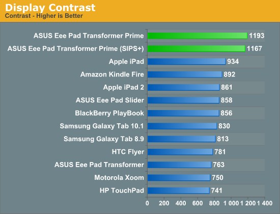
It's not all about pixel density here, the Transformer Prime has better white and black levels than anything else in its class. It also sets the new benchmark for contrast ratio at nearly 1200:1. The huge gap between the outermost glass and the IPS LCD panel has been reduced significantly, in turn reducing glare.
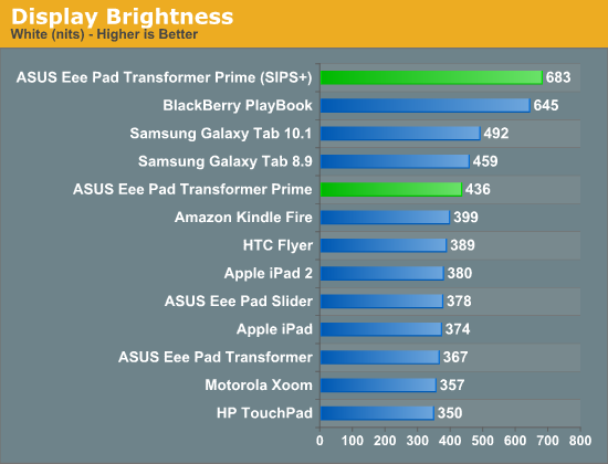
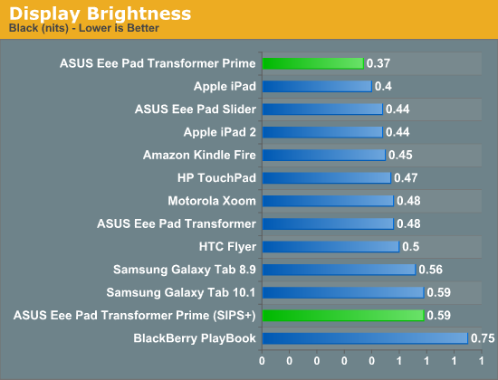
ASUS also has a Super IPS+ mode that drives the display to a class-leading 683 nits. The Super IPS+ mode obviously draws more power but ASUS recommends it if you're trying to use your tablet outdoors. In our review of the PlayBook we found that 600 nits was really the cutoff for usability in sunny conditions, and ASUS easily exceeds that. It's also worth pointing out that while Super IPS+ increases black levels as well, the resulting contrast ratio remains the same.
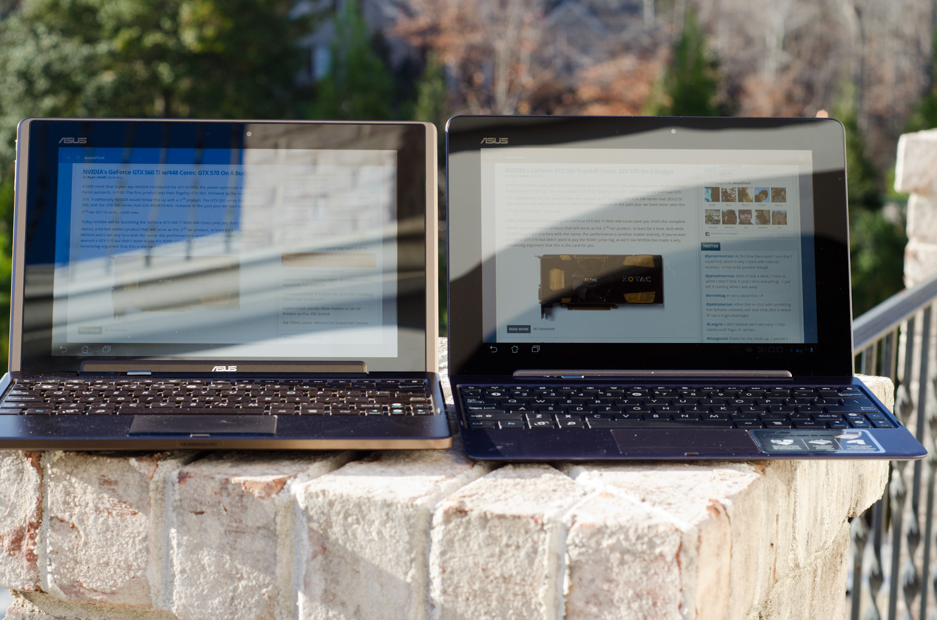
Original TF (left) vs. Super IPS+ enabled on the TF Prime (right)
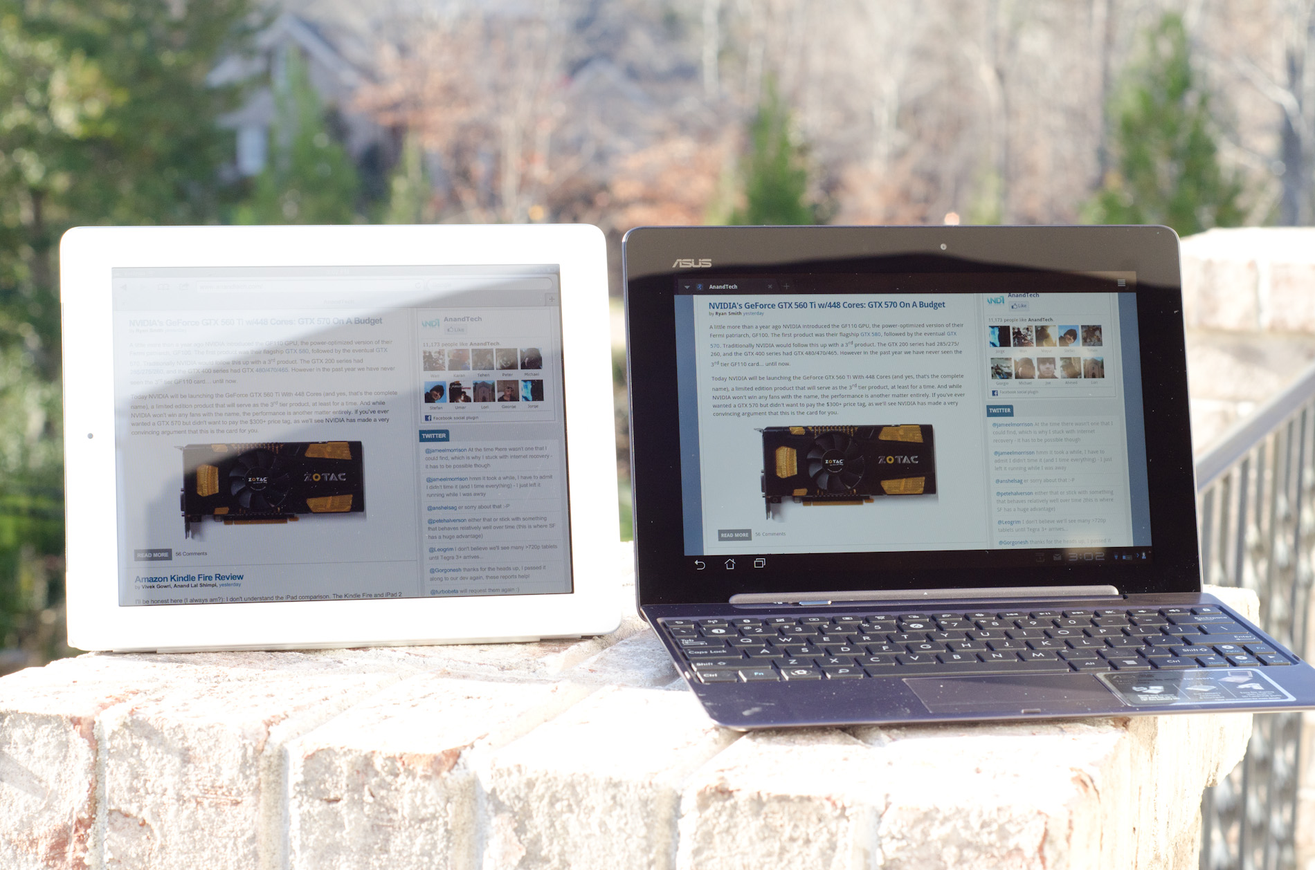
iPad 2 (left) vs. Super IPS+ enabled on the TF Prime (right)
Viewing angles are absolutely awesome. Yes this is the same ASUS that let us down with the UX panels but it definitely got the panel right when it came to the Transformer Prime. Fingerprints are still going to be evident on the display but they don't seem to be as bad as on the original Transformer, and they do wipe off easily. This time around ASUS bundles a microfiber cloth to aid in keeping your Transformer looking fresh.
ASUS, Apple and the rest of the tablet world are in hot pursuit of even higher resolution panels, the problem is yields on these small 1080p and 2048x1536 panels just aren't high enough yet. The Android crowd will have to wait, although Apple is apparently pushing very hard (and trying to buy up a lot of inventory) to deliver a "retina display" equipped iPad 2+/3 by Q2 next year. I'm hearing Q3/Q4 for everyone else and it's still not a guarantee that Apple will be able to meet its aggressive targets either at this point.


204 Comments
View All Comments
Penti - Thursday, December 1, 2011 - link
It looks like they have finally a pretty good product and software, they should dump the Eee pad and the redundant awkward name now and it would be even better :)Would love to see better optimized software, but this is what you could have expected plus with a great screen and I wonder how well it would work as a thin-client with Citrix? Keyboard and touchpad should make it a pretty good experience, does it? Chromebooks can just forget it any way :) Here we have form factor, local software, multimedia (Chromebooks are not even having accelerated H.264 as standard) and so on. With keyboard docked and standard, and not just a browser that was obvious would be replaced by a Android distribution of some kind any way. Maybe that time is now. Even though I wouldn't except Asus to complete that process. Fun to see them kinda getting there act together though.
Malih - Thursday, December 1, 2011 - link
I agree that Eee is an awful name, especially for a flagship/cutting-edge product.Eee is associated with low-end Atom netbooks, since that's the first device that uses the name. And I always hate that Samsung name their mobile devices Galaxy.
IMHO, the name Zenbook sounds good, maybe they should invent something consistent with that for their top-line tablet, Zenpad?
Penti - Friday, December 2, 2011 - link
Zenbook is still kinda awkward but it's better, ZenPad doesn't do anything for me and sounds silly. Transformer Prime is a pretty good name. Transformer might cause some confusion though, if they decide to release one without any keyboard attachment. Their Windows tablet PCs (slates as of now) might as well get some updated finish and release as a Zenbook slate though.MamiyaOtaru - Thursday, December 1, 2011 - link
"The 16:9 panel measures 10.1-inches diagonally, giving it a larger surface area than the iPad 2's 9.7-inch 4:3 display. "If you do your math, this isn't actually true. A 10.1" 16:9 display has a surface area of 43.58", while a 9.7" 4:3 display has a surface area of 45.17". This is one of the main reasons behind widescreen, they get to trumpet a larger diagonal measurement while actually saving costs on smaller total area. I am a little disappointed you fell for it.
MamiyaOtaru - Thursday, December 1, 2011 - link
some numbers you can plug in for verification (rounding all around!):16:9 10.0" display has sides of 8.8 and 4.951. 8.8/4.95 ~= 16/9 (correct ratios). 8.8² + 4.95² ~= 10.1² (correct dimensions for given diagonal, shown via pythagorean theorem).
area then: 8.8*4.95 = 43.96.
4:3 9.7" display has sides of 7.76 and 5.82. 7.76/5.82 ~= 4/3 (correct ratios). 7.76²+5.81² ~= 9.7² (correct dimensions for given diagonal, shown via pythagorean theorem).
area: 7.76*5.81=45.09.
45.09 is larger than 43.96. Ipad2 has a screen with a larger surface area. Run the numbers. Do it without dropping as many places as I did in this post, result will be the same. Again, disappointing
(I don't have a horse in this race, I own no Apple products. I do hate widescreen monitors though)
MamiyaOtaru - Thursday, December 1, 2011 - link
interestingly, the gap was closed somewhat when I dropped more places in typing up the second post. The first is more accurate, and the gap is bigger. But they both show the ipad as having more surface area, and that will hold true with pretty much whatever level of exactitude one wishes to calculate itAnand Lal Shimpi - Thursday, December 1, 2011 - link
It's actually a 16:10 panel, my statement was incorrect. But the Prime's display measures roughly 8.5" x 5.25". The iPad 2 by comparison measures approximately 7.75" x 5.75". 44.625 in^2 vs. 44.5625 in^2, giving the Prime a slightly larger display (albeit negligible).Solandri - Thursday, December 1, 2011 - link
At 9.7" diagonal and 4:3 aspect ratio, the iPad 2's screen is 7.76" x 5.82".At a 10.1" diagonal and 16:10 aspect ratio, the Prime's display is 8.56" x 5.35".
Solandri - Thursday, December 1, 2011 - link
Anand's math is right. His aspect ratio is wrong. The Transformer Prime has a 1280x800 screen, which is 16:10, not 16:9. At a 16:10 aspect ratio, you end up with 45.85 square inches of surface area.Personally I think 16:10 is the "right" aspect ratio for a multifunction device. You waste10% of the screen when displaying a 16:9 video. A 4:3 device wastes 25% of the screen. The extra width is nicer for web browsing too.
Where the 4:3 screen does better is displaying pages scanned from paper or magazines. Subtracting a 1-inch margin along all four sides, a 4:3 screen wastes 4% of its screen displaying a Letter-sized sheet of paper, while a 16:10 wastes 13%. (With A4 paper and 2-cm margins, it's reversed. The 4:3 wastes 12%, the 16:10 screen wastes 6%.)
But that's counter to the whole point of tablets - to free us from the shackles of a paper-bound world. As a media consumption device, I think 16:10 is the better aspect ratio. It's almost exactly the golden ratio too (1.62), so most art which is produced will fit in it better.
GnillGnoll - Friday, December 2, 2011 - link
For browsing the web and reading, portrait orientation is often a better fit. Though it requires a certain minimum width and resolution to work really well.