Amazon Kindle Fire Review
by Anand Lal Shimpi & Vivek Gowri on November 29, 2011 3:31 AM EST- Posted in
- Tablets
- Mobile
- Amazon
- Kindle Fire
- Kindle
The Operating System
There are three reasons why the Kindle Fire is one of the most important tablet releases of the year: software, services, and shopping. The hardware, while nice, plays a definite secondary role here. The user experience, with tight-knit integration with Amazon's full suite of digital media services (Kindle, Appstore for Android, MP3 Cloud Player, and Prime Instant Video), is what makes the Kindle Fire the most formidable threat.
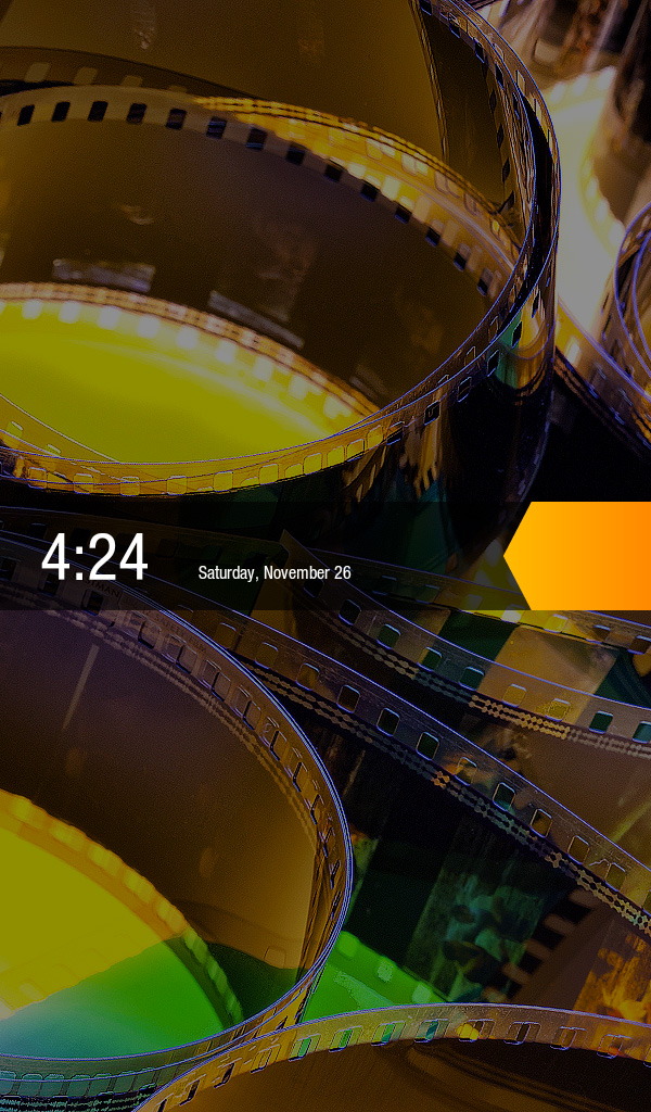
Amazon and Lab 126 have taken the same route as Barnes and Noble here and built the Kindle Fire operating system on top of Android 2.3. This is basically a skinned version of Gingerbread just as you'd find on an HTC Flyer or the old Galaxy Tab 7", but instead of augmenting the stock Android experience, the goal here is to hide it entirely. When you press the (stupidly located) lock button, you're treated to a simple lock screen, featuring a high resolution image of Amazon's choosing and an orange lock slider with the day, date, and time. Note that you cannot change the lockscreen image without rooting the device.
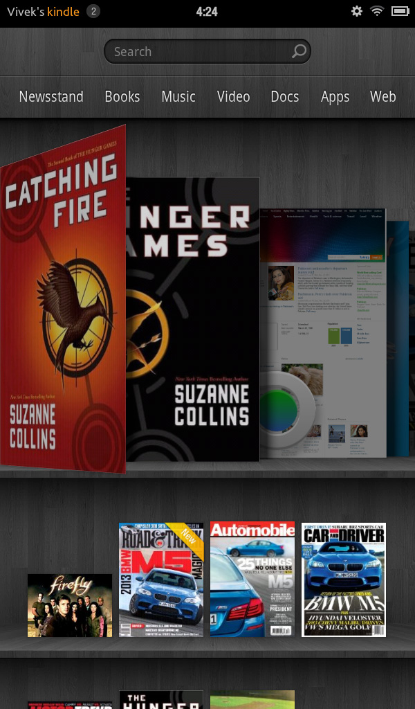
Slide the bar over to get to the homescreen, and you find yourself looking at a virtual bookshelf of apps. The top shelf is called the Carousel. It's a rotating, Cover Flow-style list of recently used files and applications that you can swipe through. It's nice, in that you can switch between your recent windows, but there's too many app windows that are stored. This leads to two problems: there can be some choppiness in the animation if you try to scroll through the entire list quickly, and overall it's a bit visually chaotic and disorganized. It's good, but it'd be better if they shortened the list to just the last 8-10 items. The shelves underneath are made up of items you deem "favorites". You can pin almost any content to the mainscreen - applications, magazines, newspapers, books, albums, playlists, videos, documents, websites; just hold down the icon/cover to add to favorites, then it'll show up on your homescreen. 4 icons per shelf, and the size of your bookshelf grows downwards as you add more content to it. However, as you add more content, scrolling through the bookshelf tends to get a bit choppy.
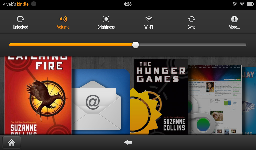
The notification bar from Android 2.x is still there, but the notification drawer is a push-button affair instead of a slide-down windowshade. The left side of the notification bar contains the battery and WiFi indicators as well as a small gear. Press it to bring down the quick setting options, and select "More..." to get to the full settings menu. The quick settings options are the rotation lock, volume and brightness controls, wireless settings, and a manual sync button. The main menu settings are relatively limited compared to normal Android, mostly account and security options, along with the standard device settings: sounds, display timeout, keyboard, network, date/time, and application permissions. The notification tone catalogue is basically lifted from Honeycomb, as are the keyboard touch sounds. The sounds are basically the only personalization options you've got. There's no real wallpaper to speak of other than the dark gray bookshelf, and as mentioned before, you can't touch the lockscreen images.
There are no hardware buttons, so the standard Android navigation buttons show up on a bottom navigation bar. The Home button and back button are always present, joined by the menu button and search when relevant. The menu bar disappears when you're viewing print or video content, necessitating a touch of the screen to bring up the navigation bar.


Above the Carousel is a list of the different content areas. You can access the web or one of the content libraries by hitting the corresponding name: Newsstand, Books, Music, Video, Docs, Apps, Web. Web takes you to the browser, Apps takes you to the main application launcher, and the rest of the content areas are mostly self-explanatory. It's the only way to access the browser, the launcher, and the music player, so you'll use those buttons often. Above the content libraries is a search box that searches through your books, magazines, documents, movies, music, and apps. We'll cover all of these systematically, starting with the browser, which Amazon says is "cloud-accelerated" using the computing back-end of Amazon Web Services. It's called Silk.


70 Comments
View All Comments
doobydoo - Thursday, December 8, 2011 - link
Who buys both an iPad AND an Android tablet, particularly given your irrational dislike for tablets?Very ignorant comments you make.
Kindle Fire IS trying to accomplish some of the same tasks that the iPad does. Eg web browsing - the key part of functionality in the iPad.
The probem is, it does it worse, because it is too small.
iPad and droid tablets are not trying to accomplish what 'laptops do well', at all. They are alternative, lightweight and more simple alternatives when it comes to accessing the web and apps, predominantly. And they do that exceptionally well. There are millions of people who bought them with realistic expectations and therefore kept them, only people with illogical hopes such as the tablet being a work-computer replacement would come away disappointed, and I would be curious which part they didn't realise would happen before they bought?
If anything is a 'tweener' - it's this Kindle Fire. It does the web / app thing - badly. It does the book thing - badly. It's an attempt to combine the best of both worlds, jack of all trades, master of none kind of story.
Which explains why it's cheap.
As for knocking Apple for bringing out devices in 6-12 months (when they have an annual so clearly not a 6 month life-cycle) - how ironic? Lets look at the Kindle release path:
Kindle 2 - Feb 10th, 2009
Kindle DX - July 1st, 2010
Kindle 3rd Gen - July 28th, 2010
Kindle 4th Gen - Sep 28th, 2011
Just over 2 years, 4 products. Ironic much?
It isn't just Apple fanboys who appreciate the use of tablets - it's just people who aren't so ridiculously stupid that they expect a tablet to be a PC. They know what it is, realise its place, and benefit from it enormously.
haukionkannel - Tuesday, November 29, 2011 - link
Well, I am more of e-ink friend because I wan to read books form my tablet. But the option to read allso net pages would be nice, so I am really much vaiting for coulour e-inks displays!They are stin under development, but offer superior display quality over LCD dispays. The problem is speed, so no fast games to colour e-ink, but the consume very little power and offer cood readability to the text!
RandomUsername3245 - Tuesday, November 29, 2011 - link
About 12 months ago I held a prototype color eInk touchscreen display after a talk by an eInk Corporation employee. It was quite impressive, but the color isn't quite up to glossy magazine / photograph quality, and, like you said, it ran at about 12 frames per second.e-Ink consumes power only when switching pages, so when it starts to run at higher frame rates it becomes much less efficient. e-Ink is great when you switch pages every few seconds when reading a page of text, but if you were asking it to play 10 fps animation or support quick-refresh page scrolling, I don't think it would offer much benefit over LCD.
NorthstarNerd - Tuesday, November 29, 2011 - link
I own both an iPad 1 and a Kindle Fire. Both are good products, but different. I'm amazed how much my Fire can do at $300 less than an iPad. Having said that I HATE the Amazon Carousel, and quickly learned how to get rid of it w/o rooting the device!http://www.northstarnerd.org/econtent/2011/11/pers...
genomecop - Thursday, December 1, 2011 - link
No problem on the install, but Kindle Books wont launch from Go Launcher.PeteH - Thursday, December 8, 2011 - link
Keep in mind the iPad is a previous generation of hardware, and I think it's a little misleading to compare the price points and capabilities of products from different generations. Newer generations of technology always do more for less money.adamantinepiggy - Tuesday, November 29, 2011 - link
Hand the Fire to anyone who has never played with one. First thing they invariably do is bump the power button with their hand. Rest the device against your chest (like when you are reading lying down), 1st thing that happens is power button gets bumped. Look at it wrong and I swear the power button gets bumped by ocular telekinesis magic. Yes you could flip the thing upside down, but having to perform tablet acrobatic to compensate for a crappy layout is stupid.It seems not one single person bothered to QA the button design when all that was needed was to move it, or cheaper still, make it recessed or much stiffer.
Stuffster - Tuesday, November 29, 2011 - link
This review has almost everything I could ask for. But it's missing one of the most important questions I have: what about privacy?How effectively can I use the Fire as an e-reader without providing any personal information - for example, can I just provide a username, password, and something like a one-time-use credit card?
Smartphones, tablets, and e-readers aren't exactly friendly in this regard. I'd love for reviews of these devices to include a page dedicated to the matter of privacy.
cbdoc - Tuesday, November 29, 2011 - link
You can choose to not have your CC/account info saved on the device making one-time purchases possible.Stuffster - Tuesday, November 29, 2011 - link
That's good, but this is an Android-based device. Is it necessary to have a Google account to use it (which would mean providing your real name and birthdate, if nothing else)?