Samsung Galaxy S 2 (International) Review - The Best, Redefined
by Brian Klug & Anand Lal Shimpi on September 11, 2011 11:06 AM EST- Posted in
- Smartphones
- Samsung
- Galaxy S II
- Exynos
- Mobile
Software
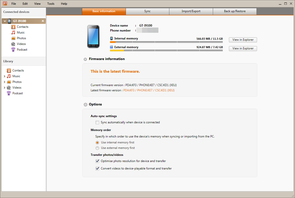
Before we go much further, I think it’s important to go over all of the software running on the international version of the SGS2 we’ve been loaned. I’ve made explicit mention of the fact that we were loaned this device because as a result it makes testing things with custom and leaked ROMs somewhat interesting. For the most part, carriers and OEMs don’t care as long as everything makes it back to them in exactly the same state they were shipped out, but it’s always a grey area. For that reason, I’ve been testing and using the device exclusively with the latest ROM for the phone as shown in Samsung Kies. As of this writing, that’s still Android 2.3.3 and firmware XWKF3. I realize there’s a leaked ROM which is 2.3.4, however we’ve opted to just go with official at this point.
The original SGS1 started Samsung’s trend of adding UI skins to high-end devices, and drew a firestorm of criticism from critics all over. Thankfully it seems as though Samsung has heard those complaints and has lightened things up considerably this go-around with TouchWiz 4.0 which runs on the SGS2. Where TouchWiz 3.0 (from SGS1) looked like a strange attempt at making Android 2.1 and 2.2 look like iOS, TouchWiz 4.0 is a much cleaner, less claustrophobic, and considerably less garish experience.
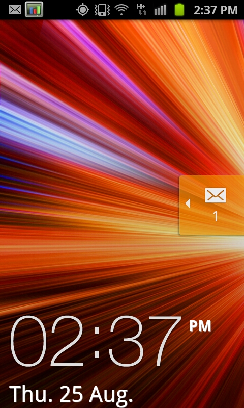
Starting with the lock screen, TouchWiz 4.0 continues the tradition of changing things here. Unlocking is achieved by moving the large graphic and clock off the screen, unless of course you’ve defined a custom lock pattern or PIN. Alerts such as new SMSes can be handled by sliding the notification ribbon across the screen. Of course this background is customizable and discrete from the main background as well. There’s really not much to say about this beyond that I’m still surprised TouchWiz didn’t take a nod from HTC’s Sense 3.0 and add shortcut functionality into this menu.
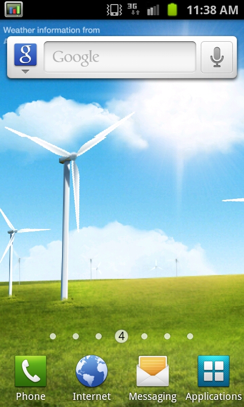
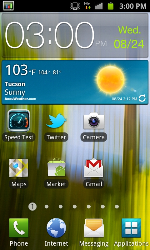
The main application launcher and home screens are what make or break a skin, and here I think there’s more positive than negative with TouchWiz 4.0. To start, home screen one is the far left, not the center. Switching between these is accomplished either by swiping back and forth or dragging on the dots at the bottom. This animation is extremely fluid - I get the impression that the entire TouchWiz 4.0 experience does leverage the GPU for composition and as a result feels very speedy.
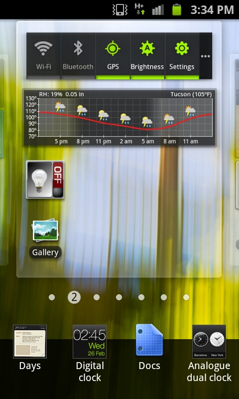
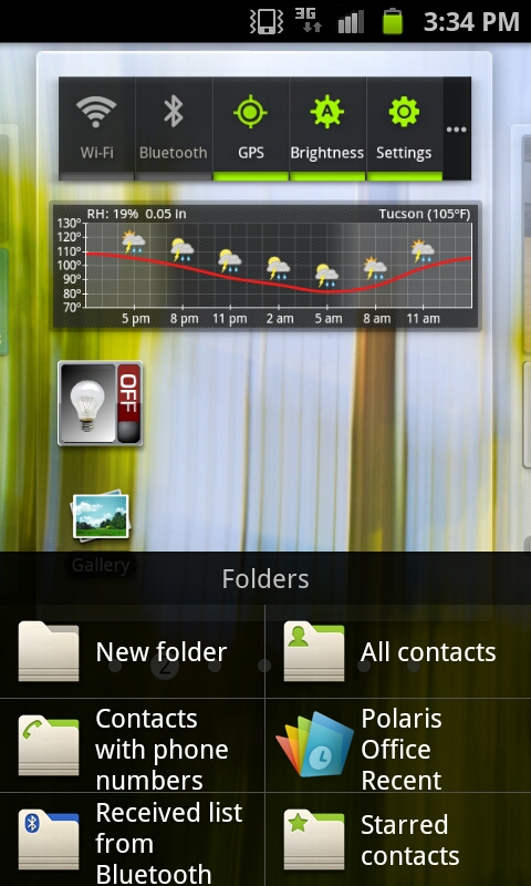
There’s a contextual menu as well where new widgets, shortcuts, and folders can be added. In fact, most of the home screen customization takes a similar - screen on top, menu on bottom - approach, which makes a lot more sense than stock Android’s popup bubble schema. Tapping widgets gives you a long list of available widgets which tilt as you scroll through them. Just like other UI skins, there’s an assortment of skin-specific widgets that support resizing.
For the most part, I find that TouchWiz 4.0 moves away from the social-hub augmented with weird widgets motif set by the last generation of UI skins. That’s definitely a good thing, because most of the time that last generation failed to really deliver social experiences that came close to true first-party experiences.
TouchWiz 4.0 does still keep the bottom row of applications which is another throwback to iOS, and like other skins puts the application launcher shortcut in the far right.
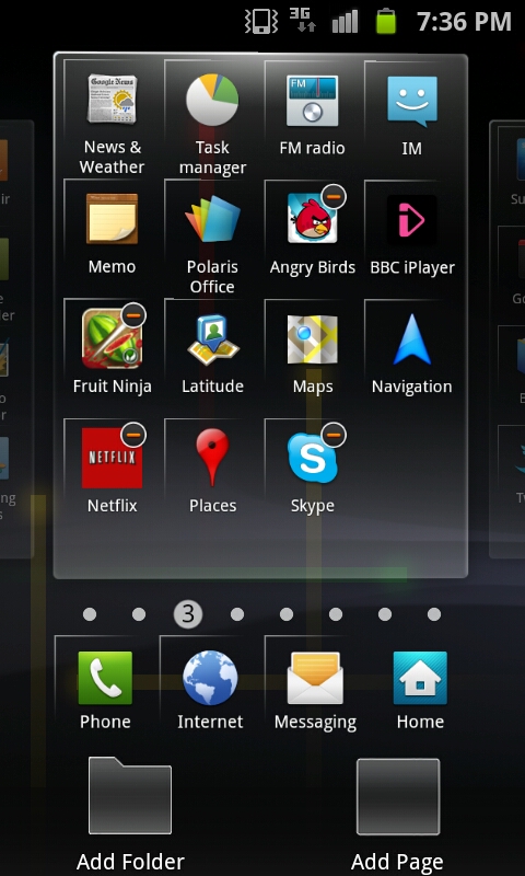
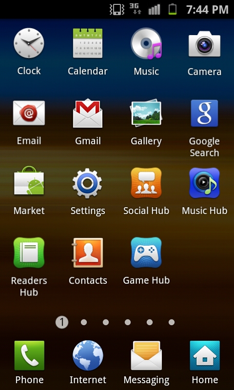
By default the applications launcher presents icons in a 4x4 paginated layout, though you can toggle a list view as well and just scroll up and down. Menu edit brings you to a view just like the home screen customization page, where you can move icons around and also change the bottom row of shortcuts. There’s also folder support for organization. One major plus is that icons no longer have the chicklet-like background colors that made everything square and applications difficult to identify quickly. Thankfully, that’s gone, and the result feels far less tacky than the previous iteration.
Just like the home screen, you can change between pages of applications by tapping on the page number dot, or scroll back and forth quickly by sliding along the bar. This results in the same animated sliding view that the homescreen shows. I guess that’s one positive thing this go-around with TouchWiz, if anything you can’t criticize it for being inconsistent. For the most part honestly the launcher and homescreen TouchWiz components are pretty tolerable.
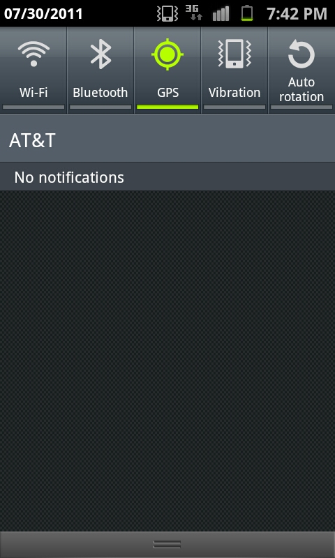
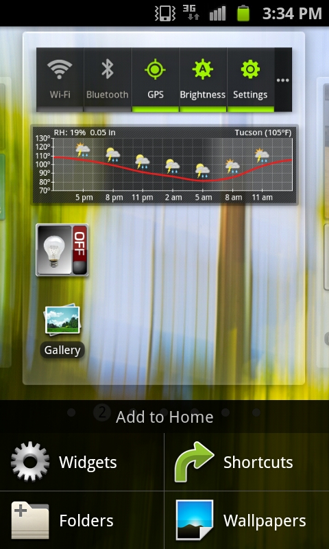
Just like in the past, the notifications shade drop down includes toggles for WiFi, Bluetooth, GPS, Sound, and Auto Rotate. It all works just like you’d expect it to. One small thing here is that if you’re in manual brightness mode, press and holding on the notifications bar and dragging left or right will change brightness along the scale. It’s a quick way to get analog control over brightness if you’re in manual setting mode.


132 Comments
View All Comments
rawrmien - Tuesday, April 3, 2012 - link
love this phone. the only thing im waiting for now that ive finally gotten one is the galaxy 3 which will be amazing. anyways was looking for advice on a pouch for this phone. i was looking at this one (link below) but was wondering about some suggestions.http://www.accessorywiz.com/fonus/black-leather-si...
yanagiba - Tuesday, June 26, 2012 - link
hi brian,is it possible to replace just the button battery cell in galaxy s2 beside entire motherboard?
still hoping, my gs2 button battery cell ( the samsung service centre sai
d it's name is 'backup battery' got rust because of extreme heat since i flashing roms too much.
thx