Back to the Mac: OS X 10.7 Lion Review
by Andrew Cunningham, Kristian Vättö & Anand Lal Shimpi on July 20, 2011 8:30 AM ESTNow that we've talked a bit about how things look in general, let's talk a bit more about the Finder specifically.
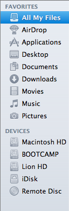
My first impression of the Finder was that it had lost some weight - Finder windows, in general, can now show the same amount or more using the same number of pixels, though that does come at the expense of some functionality. The arrangement and spacing of the left sidebar has been adjusted to take up less space than before, which is especially welcome on 11” and 13” Macs. Note that the Devices field now shows up at the bottom of the list instead of the top, another small step toward obscuring the filesystem (and, as well, steering newbie users away from just dumping everything on the desktop or the root of their drive).
Finder windows also shed some pixels (and, yes, I’m going to harp on this some more, downplay the notion of “files” and “disk space”) by removing the bottom toolbar by default - the one that shows the number of items in a given folder and the amount of disk space remaining on the volume, along with the slider that allows users to easily change the size of the icons. Thankfully, those who miss these features can switch them back on by opting to “Show Toolbar” up in the View menu.
Also missing is the button in the upper right-hand corner that would invoke icon-only view - those of you who use it will have to become acquainted with Alt+Command+T, a keyboard shortcut that toggles this change.
The default view when you open up a new Finder window now is called “All My Files,” which uses Spotlight’s file indexing to show you all files of a certain type no matter where they are on your hard drive - this is similar to Windows 7’s Libraries in that it groups your files together in one place without actually altering the fundamental directory structure (i.e., documents show up in All My Files, but they're still physically stored in the Documents folder).
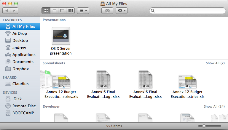
All My Files is organized by rows, and by default, you’ll be shown just the first few files of a given type in each row - clicking on the left and right-hand side of the row will allow you to navigate through the files, and you can also click “show all” to see your icons tiled in a more traditional Finder view.
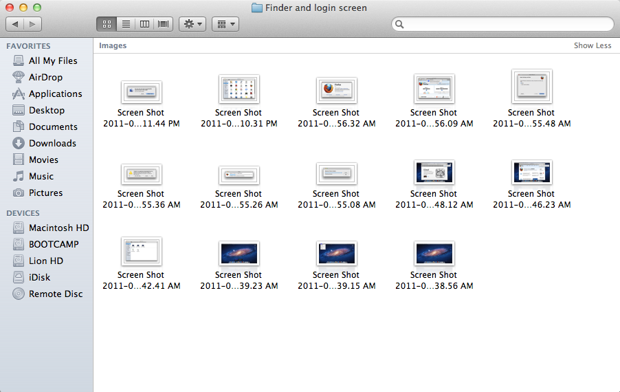
Snow Leopard introduced the ability to thumb through multi-page documents, PDFs, and presentations, and Lion further enhances that functionality by adding a full screen mode to Quick Look (which is still invoked by selecting a file and hitting the spacebar).
Finally, Finder gains some abilities that Windows Explorer has had, like, forever: the ability to merge two folders of the same name, and the ability to keep two files of the same name during a copy operation by renaming one of them. It's boring stuff and Windows has done it for years, but that doesn't make me appreciate it less now that Apple has finally implemented it.


106 Comments
View All Comments
rs2 - Wednesday, July 20, 2011 - link
Okay, it makes sense on a touch device where your finger is actually making contact with the thing you are scrolling. But a mouse cursor is *not* a finger. It is not an analog for a finger. It is a different input paradigm entirely, and trying to make it behave as if the mouse cursor is your finger by making scrolling go backwards is stupid.It's good that they put in an option to disable the nonsense that is "natural" scrolling.
name99 - Thursday, July 21, 2011 - link
Not at all. The issue is simple : what is the metaphor?When I move my finger, am I moving
- the window container? OR
- the content?
Claiming that one is more "natural" than the other is as stupid as claiming that English is more natural than Chinese. It's simply that you are used to one and, like a good American, you simply cannot imagine that the world could possibly be different --- after all, Jesus spoke English.
rs2 - Thursday, July 21, 2011 - link
Not at all. There is no "finger" when using a mouse. Touch and mouse-driven are distinct input paradigms. If a touch-based interface ever scrolled content in the opposite direction that the user moved their finger, then people would say that it was broken. And rightly so. Moving content in the same direction as the touch is the intuitive operating mode of a touch interface.And similarly, moving content in the opposite direction of the scroll (or more accurately, moving the scrollbar in the same direction of the scroll) is the intuitive operating mode for a mouse-driven interface. By your logic scrollbars themselves should also be inverted.
As a side-note, a direct analog to touch style scrolling does exist in the mouse-driven paradigm, it is the drag operation. It is available in some things like Adobe PDF documents, and also work on any scrollbar. In this operation you choose an anchor-point, and then that anchor point moves in the same direction that you move, and it all makes sense. The problem with scrolling is that it has no anchor point, it is a distinct operation from a drag operation, and by conflating the two Apple has broken their interface. At least until they start incorporating touch into every computer they sell.
Mouse-driven and touch interfaces are not the same thing, and just because a metaphor makes sense in one does not mean that it also makes sense in the other.
Uritziel - Friday, July 22, 2011 - link
Agreed.CharonPDX - Wednesday, July 20, 2011 - link
On page 23 "Performance: Similar to Snow Leopard", you have a couple bar graphs comparing Snow Leopard to Lion performance. Unfortunately, you use a generic "compared to before as 1.0" metric, with no indication on a per-test basis whether higher or lower is better. In the Core 2 Duo graph, you talk about boot time skyrocketing, and the boot time graph for Lion shows Lion as "about 1.4" of Snow Leopard, yet you also talk about iPhoto having a "greater than 10% increase in performance", where the graph shows "about 1.1" of Snow Leopard. So in one line in the graph, higher is worse, in the other line, higher is better.You either need a per-test identifier (Higher is better / Lower is better) or you need to to standardize them all (so 'benchmark' ones would stand as-is, while 'timing' ones would use the inverse, so that both would be 'higher is better', or example.)
Deaffy - Thursday, July 21, 2011 - link
Did anyone check to see whether Apple has included a UI element to enable IPv6 privacy extensions for statelest address autoconfiguration?And did DHCPv6 to get IPv6 addresses from your ISP's cable via IPv6 finally make it's entry?
Deaffy - Thursday, July 21, 2011 - link
Oh yeah, and maybe the ability to query a name server via IPv6?kevith - Thursday, July 21, 2011 - link
they are more and more returning to the Linux it came from. Who knows, they might even go bact to open source:-)Omid.M - Thursday, July 21, 2011 - link
Anand/Andrew/Christian,If you right click on a YouTube video, does it say the rendering AND decoding is "accelerated" ? I thought Lion was supposed to bring that.
If this is now the case, it'd be enough reason for me to buy Lion and a new MBP 15". I can't stand the fans on my 2008 MBP 15 going nuts every time I watch a 30 second YouTube clip. The laptop gets unreasonably hot right now.
@moids
P.S. I'm not a fan of the way buttons appear on the upper borders of windows. There's no typical button "design" to signify that the text is clickable, at least not from the screen shots I saw in the article.
Omid.M - Thursday, July 21, 2011 - link
I guess it's disabled:http://www.macrumors.com/2011/07/21/adobe-suggests...