Motorola Droid X2 Review - A Droid X with Tegra 2
by Brian Klug on July 7, 2011 8:31 AM ESTDisplay - qHD RGBW PenTile
Probably the most significant change (other than Tegra 2) between the X and X2 is of course the display. As we mentioned before, that has been upgraded from a 4.3” FWVGA (854 x 480) IPS LCD to a qHD (960 x 540) LCD with the same diagonal size. What’s special about the X2’s screen, however, is that it comes with an RGBW PenTile subpixel rendering layout.
We’ve talked about the RGBG PenTile subpixel structure before in the context of devices which came with AMOLED or Super AMOLED displays. The chief complaint back then was that black text on webpages and UI elements didn’t always look super sharp. RGBW is a different layout with different purpose, and dare I say different results.

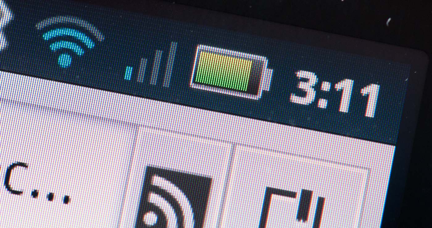
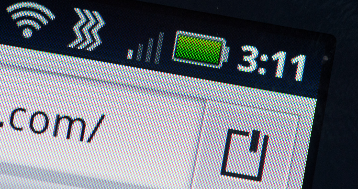
A 100% crop of the AT homepage on the Droid X2's RGBW display
As its name implies, RGBW PenTile includes a fourth, white, subpixel. The idea here is that light throughput for the panel can be vastly increased by simply adding a subpixel with no color filter. That increase in throughput then can be exploited to either get equivalent visual brightness with less backlight power, or you can crank things up all the way and get extreme brightness for the same backlight power. That translates to power savings most of the time, and extremely bright whites other times when you need it. It actually does make a lot of sense, especially when you consider things like browsing webpages which is still largely black text on a white background.
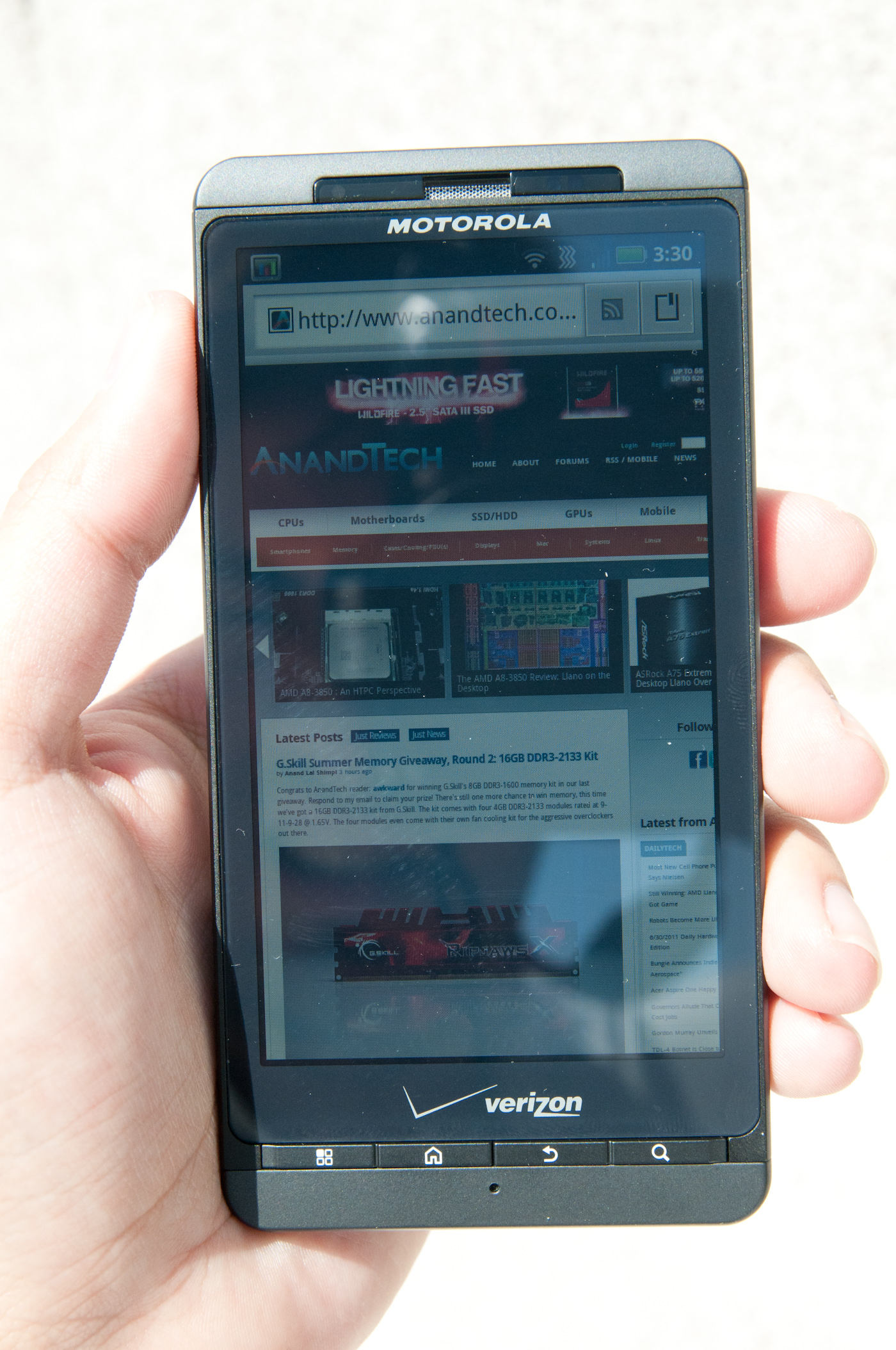
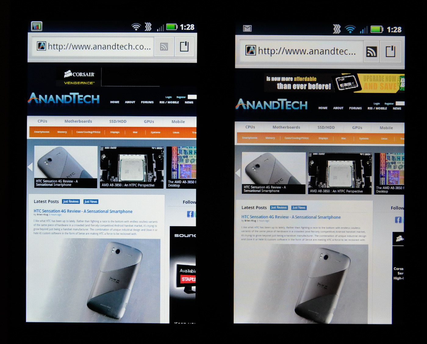 Left: Droid X2, Right: Droid X
On webpages, RGBW actually looks pretty good, with black text being nice and sharp on a white background. This is one place where RGBG just never could do a perfect job, but RGBW does. I actually have no problem with RGBW for black text on white backgrounds.
Droid X:
Droid X2:
The only place you can still dramatically tell that this is PenTile is either by looking at regions that are solid green, or red. At green in particular, you can see a bit of that grain from the subpixel structure - green is most visible because visual acuity peaks in the green. Red is also sometimes also shows a bit of that telltale grain, but nothing too dramatic. Human visual acuity isn’t very good for blue, so that looks pretty homogeneous.
In our tests, the X2 results definitely show how much having that white subpixel can help.
Motorola has had a pretty steady track record for putting great displays in their devices, going all the way back to the original Motorola Droid which included an IPS display. It’s nice to see that they haven’t compromised with the X2 either.
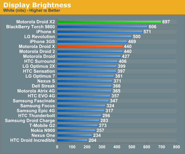
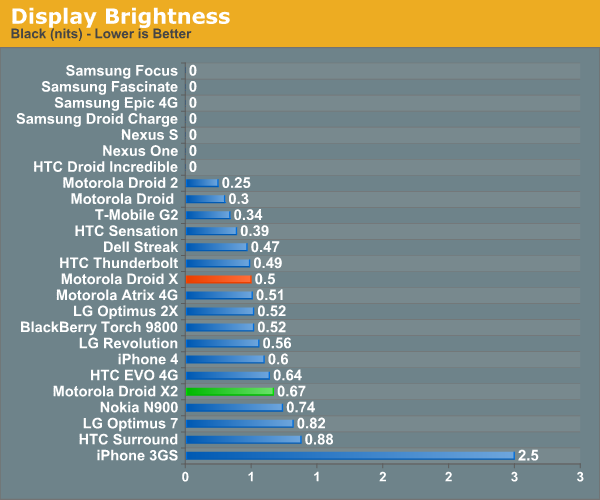
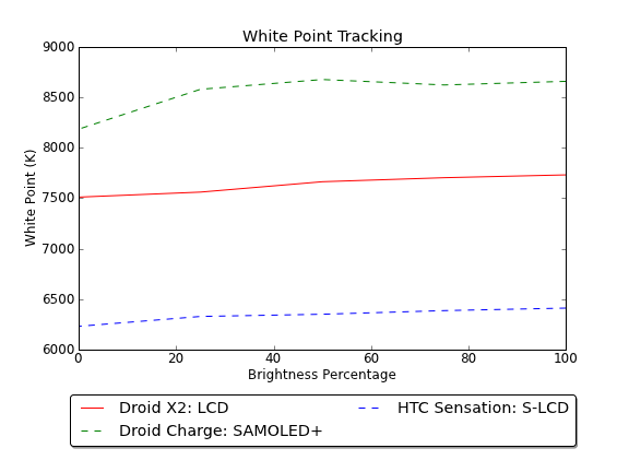
We’ve also been measuring display brightness and white point at 25% brightness increments on displays lately, and the X2 is no exception from this treatment. Alongside the Motorola Droid X, the X2 looks substantially bluer. Looking at the white point on the X2 it’s easy to see where that comes from. At 7500K it’s closer to sanity than the 8500K for Super AMOLED Plus, but still not quite perfect.
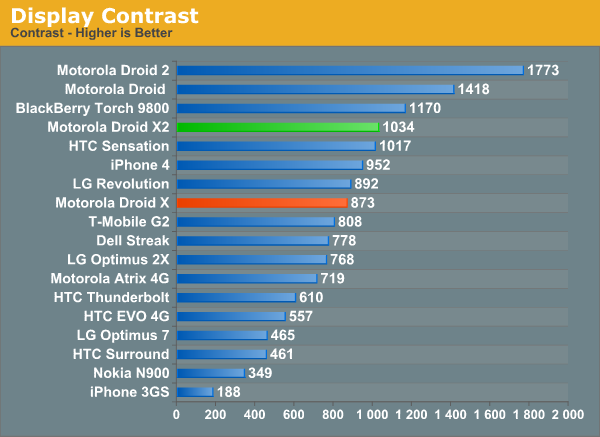
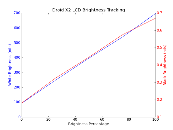
Moving onto the brightness (white and black) graph, we can see something finally reminiscent of a LCD, showing steady contrast as black and white both climb in a nice linear fashion as we ramp up brightness. The Droid X2 stays pretty contrasty, moreso than we originally measured the Droid X as being, but still not quite chart topping.
Viewing angles on the X2 seem subjectively better than the original X. You can see colors on the X fade off and turn strange at the extreme vertical angles and a bit as well at horizontal extreme angles. I don’t remember the X looking this bad, it could be that the device I borrowed has a worse panel than the original X we were sampled last year.


Outdoors the X2 seems pretty readable, no doubt thanks to having that white subpixel and extremely high brightness. Even in the extremely bright, direct Arizona sunlight the X2 seemed a bit more readable than other devices from recent memory.
Again the real nice thing about the X2 display is that qHD resolution which makes it able to both have a bit more text smoothing on webpages, and also just look better. I was especially thankful for that extra resolution when using things like remote desktop and maps from the X2, as a result, things on similarly sized WVGA displays look cartoonishly huge.


72 Comments
View All Comments
HangFire - Thursday, July 7, 2011 - link
When are you going to review the Charge? Now, there's a screen!HangFire - Thursday, July 7, 2011 - link
Oops I see it has been reviewed, but it is missing in the third comparison graph- Contrast- on page 2.HangFire - Thursday, July 7, 2011 - link
Page 5? I'm sorry I'm used to MODERN comments section with at least a 60 second edit feature.Brian Klug - Thursday, July 7, 2011 - link
It isn't missing, it simply isn't included. The effective contrast of the SAMOLED+ panels is undefined (divide by zero).-Brian
Vepsa - Thursday, July 7, 2011 - link
What app do you show in the GPS testing screenshots?Brian Klug - Thursday, July 7, 2011 - link
I like to use GPS Test Plus, it does a decent job.-Brian
cditty - Thursday, July 7, 2011 - link
No reason to upgrade... I bought my Droid X for .01 from Amazon when I rid myself of the craptastic AT&T in my market.It is the best phone I ever had (I was an iPhone 4 user on AT&T). Verizon's network is what makes me say that, because ALL of the phone works ALL of the time (calls & data).
The original X is plenty fast. My next upgrade will be when my market goes LTE (a long way off). By then, there will be some great phones to be excited about. Funny how phones are the new *upgrade* hobby for old school computer enthusiast.
silow675 - Thursday, July 7, 2011 - link
Brian I think you have the best mobile handset reviews. Great work on including thorough reviews on mobile displays - something lacking in most mobile reviews.Spoelie - Thursday, July 7, 2011 - link
That thing looks hideous compared to recent HTC ventures, like some 80's throwback.Mind you, I'm not talking about performance or usability or screen quality or ... It's purely my own opinion on physical styling of the device.
jonup - Thursday, July 7, 2011 - link
Well, we spent the 90s and the better part of the last decade making phones smaller and more portable... and then all the effort went down the drain.You can thank Apple for that. After the iphone everyone try better them with bigger and heavier phone. Remember, in America bigger is better!