The BlackBerry PlayBook Review
by Anand Lal Shimpi on April 13, 2011 9:00 PM EST- Posted in
- Tablets
- Smartphones
- RIM
- BlackBerry
- PlayBook
- Mobile
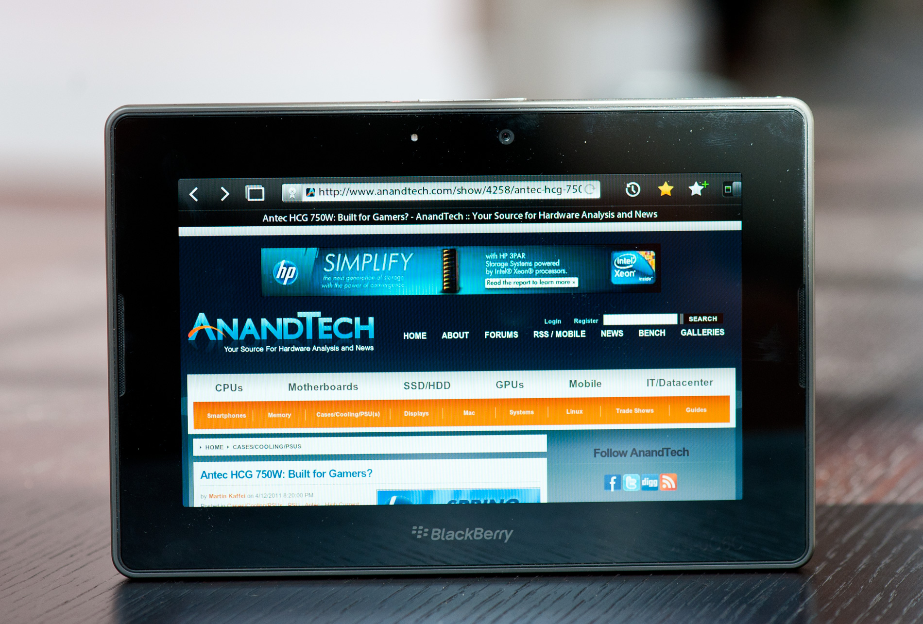
A Functional Bezel
The PlayBook supports all of the basic gestures we've come to expect from mobile devices with a capacitive touchscreen. There's flick to scroll, pinch to zoom and pretty much anything else you'll encounter on an iOS or Android based device. What RIM adds with the PlayBook are gestures that originate in the bezel of the device.
Any gestures within the 7-inch LCD area control the currently running app. Any gestures that originate in the bezel around the screen however are a different story. The first is the unlock gesture. Swipe up/down, left/right or the opposite direction when the PlayBook is asleep and you'll wake it up. There's no support for passcode locking and no physical unlock switch (although the power button will work in a pinch) - all you need to do is take one finger starting from a point on the bezel and slide it up or across. I've noticed that you have to be pretty committed when unlocking, anything less than swiping up/across 50% of the screen won't register as an unlock swipe. I suspect this is to ensure that no accidental swipes unlock the PlayBook when in your pocket/purse/othercavity.
Once unlocked, a swipe up from the bottom bezel will do one of two things depending on the state of the PlayBook. If you're at the home screen, swiping up from the bottom bezel brings up the entire app launcher instead of just the top row of apps. If you're in an app, a swipe up will reduce the active app to a thumbnail, expose the webOS-style task switcher and display a part of the home screen.

Swipe from the top bezel downward within an app and you'll either reveal a contextual menu for the app or you'll pull down the system settings page.
What about the left/right bezel? That's what you use to quickly switch between apps of course. Imagine an infinitely wide desktop where your viewport is big enough to hold on full screen app. To get to any active (even paused) app to the left or right of what you're currently looking at, just swipe left (or right) beginning in the bezel and you'll swap apps. If you only have one app running the OS will try to animate your current app sliding away but it'll bounce back, as if to tell you that you've reached the end of the horizontal list.
The bezel gestures don't stop there. Swipe up from the lower left corner and you'll bring up the PlayBook's virtual keyboard, in any app. This is a particularly puzzling gesture because you can bring up the keyboard even in apps that can't use a keyboard. And no, the keyboard shortcuts from the BlackBerry OS don't work on the PlayBook.
The lower right corner doesn't do anything but swipe from either of the upper two corners and you activate what RIM calls the peek gesture. The peek gesture gives you a quick look at the top status bar - including any notifications, date/time and battery status.
The bezel based gestures work well on the PlayBook although I'm not sure how long term of a solution this will be. Users tend to prefer thinner bezels - a direction I ultimately see all tablets going.


77 Comments
View All Comments
PeeluckyDuckee - Thursday, April 14, 2011 - link
The Android platform UI is very unpleasant to work with and an eye sore, looks like something from yesteryears. The hardware supporting it is slow and lag is quite apparent, whether that is a software or hardware issue doesn't matter as in the end the user experience leaves a bitter taste in my mouth.Apps is a non issue imo as time goes on it will slowly come. The major titles will be available cross platform. I buy it for what it offers me now, I don't rely solely on what will come later.
The QNX UI is very smooth and true multitasking is available. 7" form factor is perfect for my needs. Battery life is less of an issue as it will be rarely transported, but if I do need it for extended periods outside of the house it'll be either plugged into the car charger, into my USB battery pack, or plugged into the USB charger in the plane.
5" is too small and 12" is too big for me, so I will eventually have the best of both worlds and juggle between the 7" Playbook and the 10" iPad 2. Both are priced cheap enough that it doesn't have to be mutually exclusive, considering how much laptops/desktops/tablets used to cost it's a no brainer.
bplewis24 - Thursday, April 14, 2011 - link
If you expected anybody to read your post, you shouldn't have destroyed your credibility with your opening sentence.Stuka87 - Thursday, April 14, 2011 - link
It seems like many of the Tablets (and even phones in some cases) these days are being rushed out. I can understand the rush to get a product to market to try and grab market share early before competing products get to well entrenched, but coming out with a product that is short of features seems like it could be just as bad.Take WP7 for instance, in general it has some good concepts, but is missing a lot of features, as well as a usable browser. Updates will fix this, but the initial reviews have hurt it I think.
Then you have Android 3.0 which only works on Tablets, and has issues with them as it is. It was definitely rushed out to try and grab some market share before Apple gets much more entrenched.
Then we have this device, which has some cool features, but many features that will not be available until sometime this summer.
I realize the companies have to found a balance between getting a product out and finishing it, but it seems in some cases its cut too close. And we end up with a product that could have been great if only it had spent a bit more time in development.
On a side note, I do NOT like the screen on this device. Its way to narrow. I would not enjoy having a screen with that aspect ratio.
xype - Thursday, April 14, 2011 - link
"It seems like many of the Tablets (and even phones in some cases) these days are being rushed out."Just shows how much of a lead Apple actually has with the iPad. Most of the stuff out by now can't even compete with iPad 1, much less 2.
And even _when_ they get some small details right, it's the overall experience that makes the iPad's competition suffer.
Also, I quite like iPad's 4-finger-gestures for multitasking—too bad you have to set up your iPad as a development device to activate the preference in the first place…
medi01 - Thursday, April 14, 2011 - link
No "confusing" memory card slots, eh?melgross - Thursday, April 14, 2011 - link
The problem with memory slots are that what happens to your data and apps when you want to add another card? Usually you can't do that, you're stuck with what you've got, because part of the app resides on the card, and the rest in built in memory. So show lose the card, or it gets damaged, and you're in trouble.Manufacturers are using slots to make their devices look less expensive,
Urging the responsibility on the buyer to spend the extra cash to expand their memory. The problem is that most people, even those who are technically adept (or who pretend to be), don't realize that cheap Flash memory cards are a lot slower than the Flash inside their device. In order to keep the speed, they've got to buy more expensive memory cards. They haven't really saved much, if anything, if they do that. I'd rather pay upfront, and know that what I'm using is what I'm supposed to be using.
silverblue - Thursday, April 14, 2011 - link
The date format of the video of the dog is in YYYY-MM-DD format... sorry, I just enjoy seeing non-American date formats for once. :)It's a promising tablet design, but they've got a way to go before it can be a true competitor to the iPad 2. The lack of an e-mail client doesn't sit well with me, but the inclusion of 1080p High Profile H.264 support is excellent, and it's light.
Conficio - Thursday, April 14, 2011 - link
I'm usually not that interested in video in such devices, but your sample videos could really use some image stabilization.On such a large device that should be mandatory.
Griswold - Thursday, April 14, 2011 - link
An otherwise very interesting product suffers from two shortfalls:1) Too small. As mentioned in the article, its a matter of what you do, where you do it and personal preference. Personally I prefer the 9-10" size.
2) Its far from finished. Every other thing needs tning, tweaking, polishing or is completely missing. Why bother handing out review units, RIM? You're just damaging your products reputation!
GnillGnoll - Thursday, April 14, 2011 - link
"I've complained in the past about the input problem on tablets, and I do believe it's actually worse on the PlayBook thanks to its cramped screen resolution."While higher resolution might help a little by allowing text to be slightly smaller while keeping it legible, this is really about area not resolution. You can't make the on-screen keyboard or address bar much smaller physically without significantly affecting their touch usability.