Motorola Xoom Review: The First Honeycomb Tablet Arrives
by Anand Lal Shimpi on February 23, 2011 11:57 PM ESTValidation
With the iPad, Apple built a device that I wanted ten years ago, at a time when my workload wouldn’t allow me to use it. I spend most of my days in meetings, producing content, benchmarking and researching. Only the latter is better done on the iPad than a more conventional computing device. The killer apps on the iPad continue to be centered around content consumption and, more recently, gaming. Productivity apps exist, however there are still many usage models that demand the fast response time of a full blown PC or the convenience of a keyboard/mouse, higher resolution display and real working desktop.
That’s just me however. As is evidenced by the number of people I see in airports and airplanes who have traded in their Thinkpads for an iPad, this new era of tablets is serious business. I’m continually amazed by the number of people I see on a regular basis using an iPad, even though I understand why. It’s light, it has a long battery life, it’s easy to use, performance is more predictable than a netbook (thanks to the use of NAND flash vs. a conventional HDD), it’s got a beautiful screen and for some usage models, touching is better than pointing.
A Brief History of Android
Google found itself in an unfortunate predicament in the battle against Apple in the mobile OS space. The iPhone was released in June 2007, but the first Android phone didn’t make it out until October 2008. If Apple were a complacent giant with a stagnant mobile roadmap, showing up 16 months later wouldn’t be an issue. Unfortunately for Google, Apple was anything but that. Execution is critical in any innovation driven industry and Apple has executed extremely well. Since 2007 we’ve seen yearly OS releases (with subreleases in between them) and yearly hardware updates. Since 2007 the hardware updates have come like clockwork, every June we’ve had a new iPhone.
So how do you compete with a company that has a 12 - 24 month head start? Emulation isn’t the answer.
Google would have to out-execute Apple. Similar yearly OS/hardware releases wouldn’t be enough, because Apple would always be ahead at that point. Google wanted to pursue a more open path, with multiple hardware vendors and fully customizable UIs. While that’s great for the consumer, it made Google’s plight that much more difficult.
Apple only had to worry about a single hardware platform that it updated every year. With a dozen or so customers all with varying underlying hardware, Google would have to take longer (or dedicate even more resources) to developing an OS for all of those platforms. Google needed another strategy.
Apple has committed to a 12-month release cadence for OS/hardware, so Google would have to do better than that. On average we get a major Android release every 5 months. Granted Apple does update iOS more frequently than once a year, but Google has definitely come a longer way in the same amount of time thanks to its late start.
A more aggressive release schedule alone isn’t enough. Google wanted to bring Android to more than one hardware manufacturer, but doing so would make out executing Apple nearly impossible. The solution was to pick a hardware and a device partner for each major Android release. Google would work closely with those partners to release the flagship device for that version of Android. All of the other players in the Android ecosystem would be a bit behind the curve. It was a necessary evil in order to rev Android up quickly enough to compete with iOS.
The hardware and device makers were evaluated based on their roadmaps as well as their ability to execute. Last round Samsung was selected as both the SoC and device partner with the Nexus S. Before that it was Qualcomm and HTC with the Nexus One. For Honeycomb, the tablet exclusive release of Android, Google’s SoC partner is newcomer NVIDIA with its Tegra 2. And the device partner? Motorola with the Xoom.
Google and Motorola worked very closely together on the Xoom and as a result, starting tomorrow, the Xoom will be the first Android tablet available running Honeycomb (Android 3.0). Other Honeycomb tablets based on NVIDIA’s Tegra 2 will follow shortly thereafter (Samsung’s Galaxy Tab 10.1, LG’s Optimus Pad) however the Xoom will be first. Down the road we can also expect to see Honeycomb tablets based on other hardware as well.
The Hardware
The Xoom looks and feels like a more rugged iPad. You lose the aluminum finish, but you gain something that feels a lot more grippy and utilitarian. The back is made of the same soft plastic with an almost velvet feel to it that we’ve seen on many smartphones in the past.
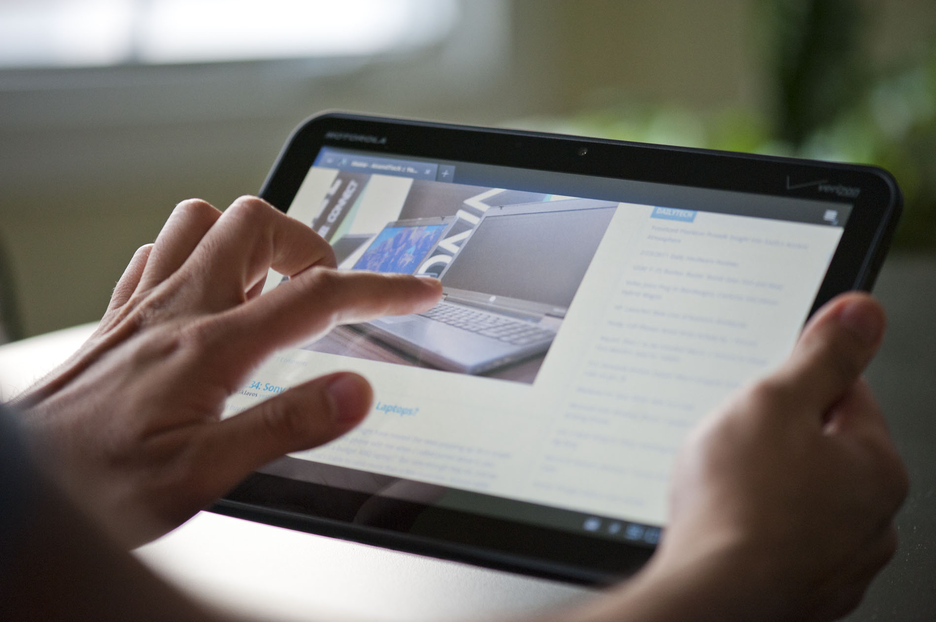
The front is all glass of course, however the screen has a much narrower bezel than the iPad making it look a lot more modern. The aspect ratio is also more widescreen than the iPad. The 10.1” screen has a 1280 x 800 display (16:10) vs. the iPad’s 1024 x 768 panel (4:3). As a result the Xoom is the same width in landscape as the iPad, but it’s noticeably shorter (and a little thinner). This gives the Xoom a slightly more manageable feel, although it’s still not as borderline pocketable as a 7-inch tablet.

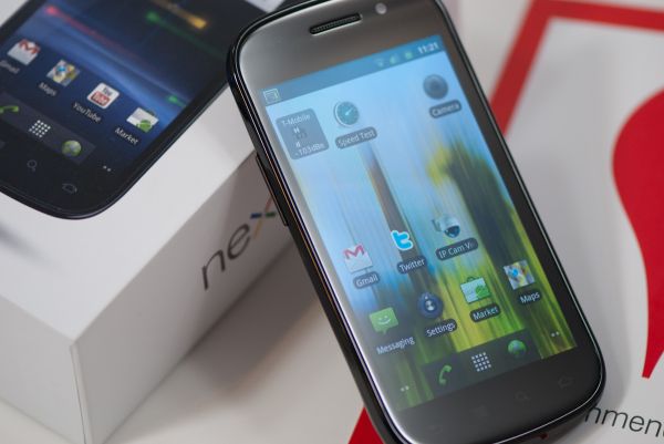
Motorola Xoom (left) vs. Apple iPad (right)
There are only three physical buttons on the Xoom: volume up, volume down and power/lock. The volume buttons are located along the left edge of the Xoom when held in portrait mode. The power/lock button is actually located on the back of the tablet, near the camera. When held in a landscape orientation the power/lock button should be near the index finger on your left hand. It’s location is actually not that bothersome when you’re holding the Xoom in landscape, it’s when you don’t know how you’re holding the tablet that you run into problems.
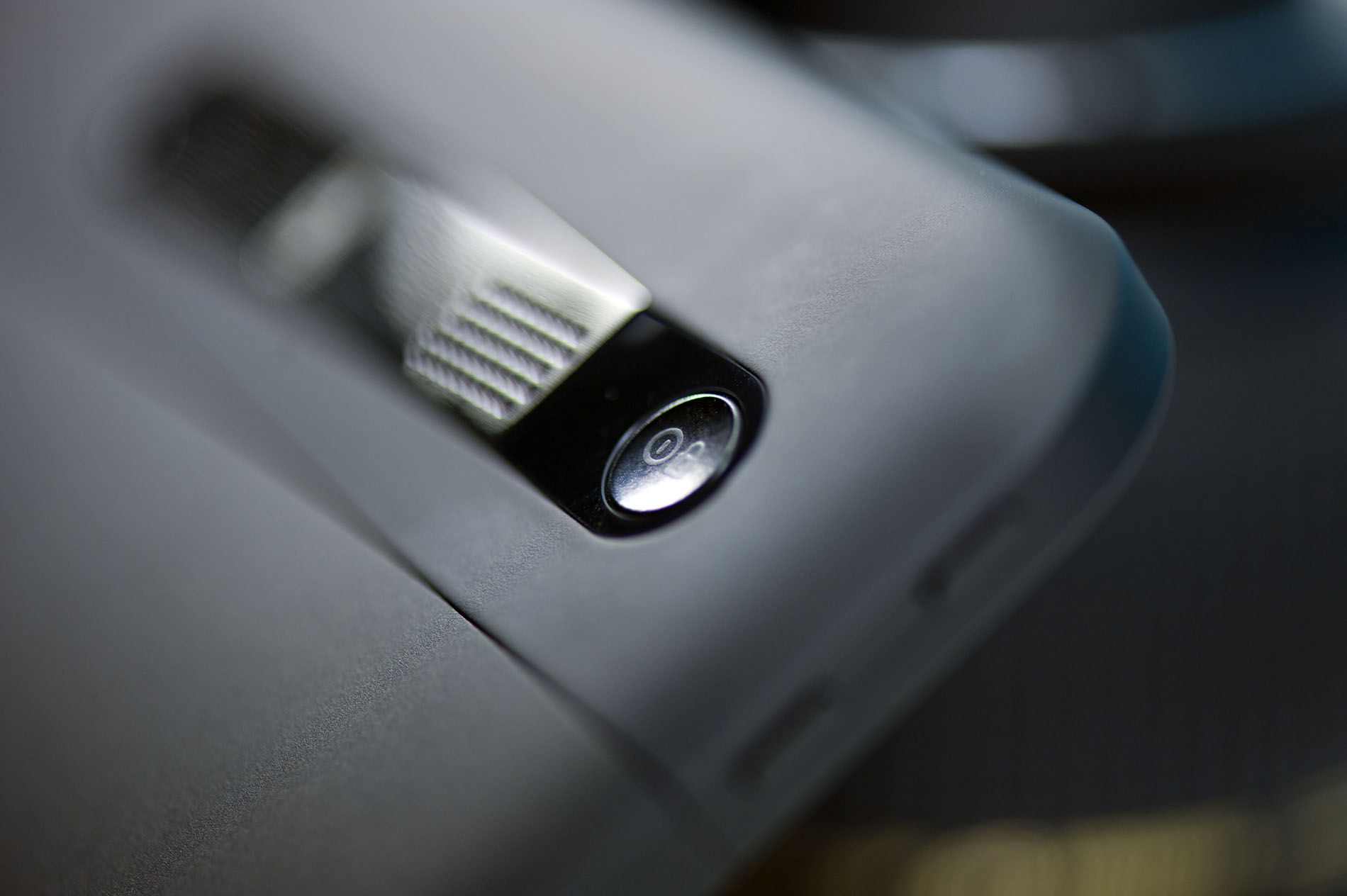
The power/lock button
The lack of any physical buttons on the face of the Xoom give it a very clean look but also make it very difficult to tell what direction is up when you’re quickly grabbing the tablet. There’s an integrated accelerometer that allows the OS to know how to orient the screen, however when you first pick up the Xoom with the screen off you need to blindly feel around the back for the power/lock button rather than knowing exactly where it is.
Compared to the iPad the accelerometer/rotation magic seems to take longer on the Xoom. The lag between rotating the Xoom and the OS rotating the desktop seems to be just slightly greater on the Xoom compared to the first generation iPad. It’s not a deal breaker, but just a bit odd. Because of the widescreen aspect ratio I found myself using the Xoom in a landscape orientation more than portrait.
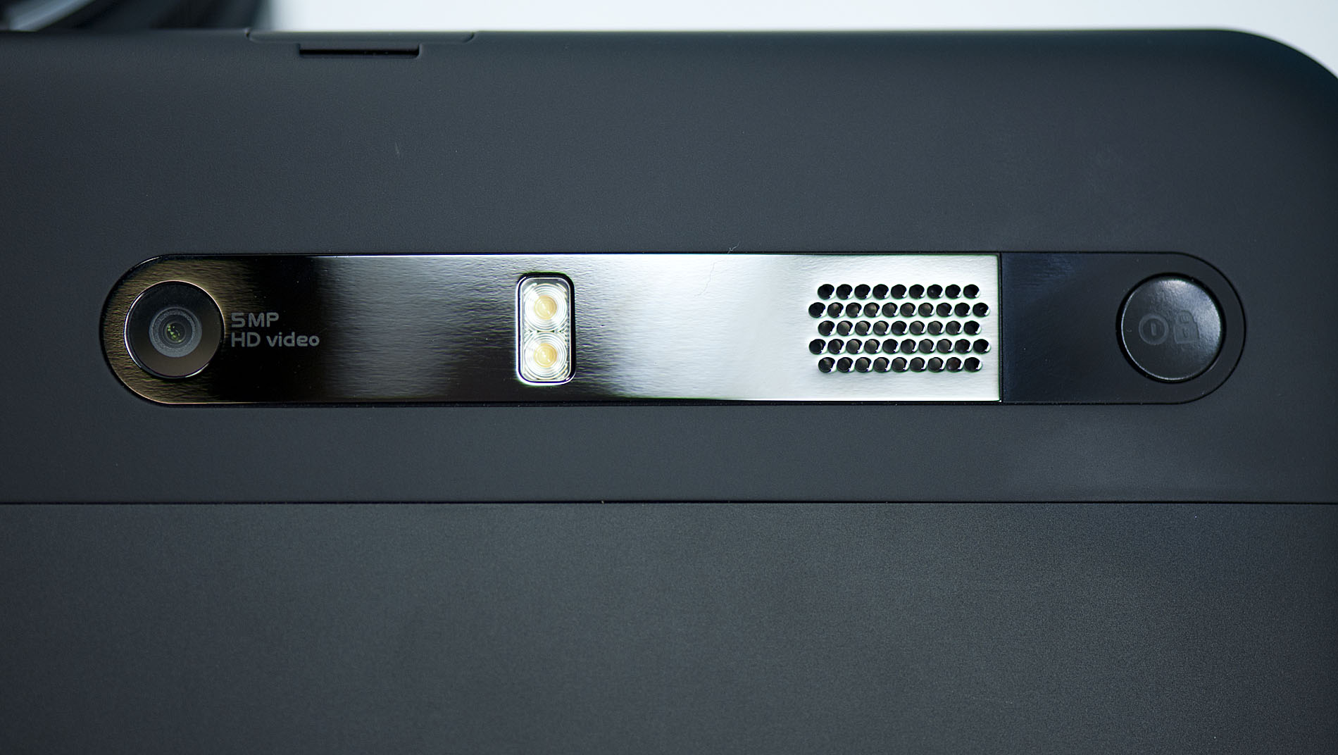
There are two cameras on the Xoom: a front facing 2MP and a rear facing 5MP camera with LED flash. The latter is capable of recording up video at up to 720p30. The front facing camera has a red LED next to it that illuminates when the camera is active. Rounding out the light fx are a green charge LED and a white notification LED strip on the front of the Xoom.
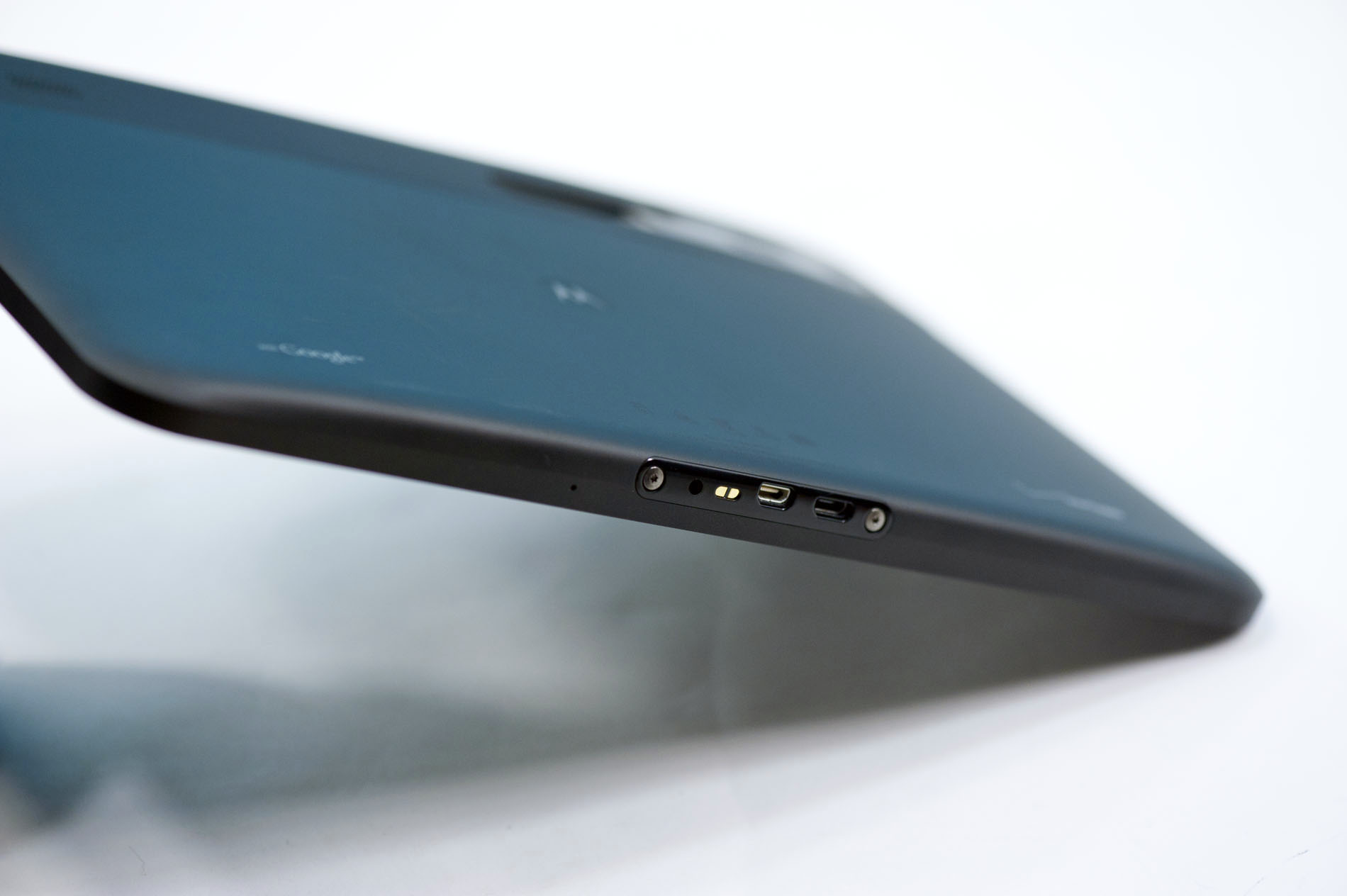
There are two speakers on the back of the Xoom, a 1/8” headset jack up top and a micro USB, micro HDMI and power input along the bottom. The micro HDMI port can't be used for mirroring, it looks to be exclusively for getting video out through some of the docks Motorola plans on selling. Update: HDMI mirroring is supported. I couldn't get it working on my Onkyo 508/Samsung UN55C7000 setup however I'll be tinkering around to see why the setup isn't working.
Internally the Xoom has a dual-core NVIDIA Tegra 2 SoC (T20) running at 1GHz. This is the tablet version of the Tegra 2 so it’s a physically larger package but it should have the same performance characteristics. Motorola also includes an Atrix-like 1GB of memory and 32GB of MLC NAND on board. There’s an external facing LTE SIM card tray that also hides the microSD slot in the Xoom.
The Xoom is launching with only one SKU at first: a 32GB 3G (LTE-ready) version priced at $799 through Verizon. This is an unsubsidized cost and it requires a single month of the $20/1GB data plan to function even over WiFi (thank you VZW). The closest Apple competitor is the 32GB iPad 3G priced at $729, a difference of $70. Granted the Xoom does give you two more cameras and two much faster CPU cores than what you get in the iPad, however I’m guessing the more fair comparison will be to the upcoming iPad 2.
| Tablet Specification Comparison | ||||
| Apple iPad | Motorola Xoom | |||
| OS | Apple iOS 4.2.1 | Google Android 3.0 (Honeycomb) | ||
| Dimensions | 242.8mm x 189.7mm x 13.4mm | 249.1mm x 167.8mm x 12.9mm | ||
| Display | 9.7-inch 1024 x 768 | 10.1-inch 1280 x 800 | ||
| Weight |
730g 680g (WiFi only) |
730g | ||
| Processor | 1GHz Apple A4 (Cortex A8) | 1GHz NVIDIA Tegra 2 (2 x Cortex A9) | ||
| Memory | 256MB | 1GB | ||
| Storage | 16GB up to 64GB | 32GB + microSD card | ||
If you want a lower up front cost you can opt for a $599 subsidized version, however that requires a 2-year service agreement at $20. If you’re going to pay for the data plan anyway this may be a better option.
What’s missing of course is a plain old WiFi only Xoom. Motorola says this is coming and will be priced at around $600.


112 Comments
View All Comments
softdrinkviking - Thursday, February 24, 2011 - link
anand writes... "I suspect the ideal tablet UI is probably not too far off what modern desktop OSes have become. While a smartphone’s UI must be dramatically different due to the lack of screen real estate, a tablet UI just needs to be more efficient than its desktop counterpart - not necessarily very different."this is an interesting thought, and I am wondering if you are considering the, potentially, drastically different usage models that tablets need to be built for.
not only will people be using these things on the run, but the ways I see people using them now are really different from desktops.
tablets really lend themselves to task integration, where you have a specific reason to use it over and over.
for example, I have seen the subway/train information officers using them here in Japan to give people directions, and I see store clerks using them to implement inventory management software.
that kind of usage demands quick access to a limited number of functions and a low level of file maintenance.
If anything, I would have guessed it the other-way around, where tablets will need to be closer to a smartphone OS, but adjusted for the larger screen real estate.
mlambert890 - Thursday, February 24, 2011 - link
100% spot on. This is where the enthusiast niche that follows forums, and the reviewers and bloggers that server them, can't seem to "get it"For tech geeks, a slightly tweaked desktop metaphor is what they want from a tablet (for the ones that even want one at all). For the vast majority of the target audience, this absolutely misses the mark which is why iOS on iPad, despite all of the nerd rage towards it, has done so well.
I'm as geek as geek gets with 20+ years in this industry, but these days as an old guy, I am also a mobile professional. On the road, which is all the time, for work, i need exactly what you describe. Quick, efficient, task focused access.
I'm not geeking out at a Starbucks or doing proofs of concept (WoW on emu on Android on Xoom!!!) for YouTube. I'm doing email, note taking, Webex and reading/presenting on the go.
If google inches towards a tweaked desktop UX paradigm they will be making the same mistake MSFT did (and continues to) with their tablet efforts.
The hardcore tech crowd might be happy, but they are a micro percentage of this market.
bplewis24 - Thursday, February 24, 2011 - link
Did you miss the part of the review where Honeycomb was better in all of those areas? Or did you just focus on a quote taken out of context which compares this OS to a desktop OS?Never mind, I already know the answer.
Brandon
ccrobopid - Thursday, February 24, 2011 - link
I was waiting for your review of the Xoom. Goog job on your part, but I must say I'm a little disappointed with the hardware. On a tablet the screen quality sure is one of the most important elements, and at this price point I don't think I'll buy it. I also don't get the 16:10 aspect. Widescreen had sense in BIG screens because we have more degrees of vision sidewards, but at this screen size I prefer a 4:3 format because I feel it's more useful for web browsing, reading and apps in general.ccrobopid - Thursday, February 24, 2011 - link
Complementing my post, if it wasn't for the too boxed experience, I still feel like iPad is the device to have. Let's see if iPad2 launches and throws away some of that "boxeness" :Dmacs - Thursday, February 24, 2011 - link
Honeycomb needs:- an update to solve the youth problems
- great screen (at least as good as iPad)
- 16gb and wifi only for 499$
Apple needs:
- to catch up Honeycomb on software side (multitasking,browser,... I don't think that an iPad 2 still running iOS 4.x would be enough...)
- faster SoC (A5 dual core)
- Facetime Camera
- Video Out
Shadowmaster625 - Thursday, February 24, 2011 - link
I have a great idea. Let's all go spend $800 (+ $50 in tax) to have a tablet that crashes constantly and cant be viewed outside. Crackhead.Mr Alpha - Thursday, February 24, 2011 - link
I would really like to see minimum brightness numbers. The ability to turn the back-light way down is important in order to avoid a headache when reading something in a low light situation. The iPad for example has a too high minimum brightness.josephandrews222 - Thursday, February 24, 2011 - link
...you wrote this:"Things like this combined with the instability I mentioned earlier makes me feel like Honeycomb was a bit rushed, perhaps to hit the streets before one other major tablet announcement coming this year?"
...you referring to the iPad2 or HP's 'Pad'?
I really enjoyed this review. A lot. Thanks.
Jinded - Thursday, February 24, 2011 - link
On the Multitasking page, you mention the following about widgets:"In Gingerbread and prior version of Android, widgets were fairly constrained and two dimensional. You could display information within the widget but there was no depth and no concept of scrolling."
I don't think this is quite true, as several launchers (like LauncherPro) support vertically scrolling widgets. I myself use Agenda Widget as a scrollable 1x4 calendar widget. The Samsung TouchWiz interface (and I'm sure others as well) also comes with several widgets set up rolodex-style, displaying maybe the last 10 or so notifications/pictures/events that can be scrolled using up/down buttons. Not quite the same thing as a scrollable widget, but I think it counts as having depth.