The Windows Phone 7 Review
by Anand Lal Shimpi & Brian Klug on October 20, 2010 7:00 PM EST- Posted in
- Smartphones
- Windows Phone 7
- Microsoft
- Mobile
The Keyboard
The virtual keyboard is software replaceable under Android. If you don’t like what comes on your phone just download another one. Microsoft took the Apple approach and doesn’t allow swapping of keyboards. Instead, Microsoft put together what it feels is the perfect virtual keyboard. While I won’t call it perfect, it is a nice blend of Apple’s simplicity and the text replacement bar you get with some Android keyboards.
Each keypress has an ultramodern typewriter sound to it. Hold down the shift key and you’ll hear an extra tap indicating that caps lock is now active.
There are three keyboard configurations by default if you’re typing in a text field. The default one is very similar to the iOS keyboard with a few android-like additions. You get a comma and period keys as well as the emoticon button. Tapping the latter gives you two pages of emoticons for your expressive needs.

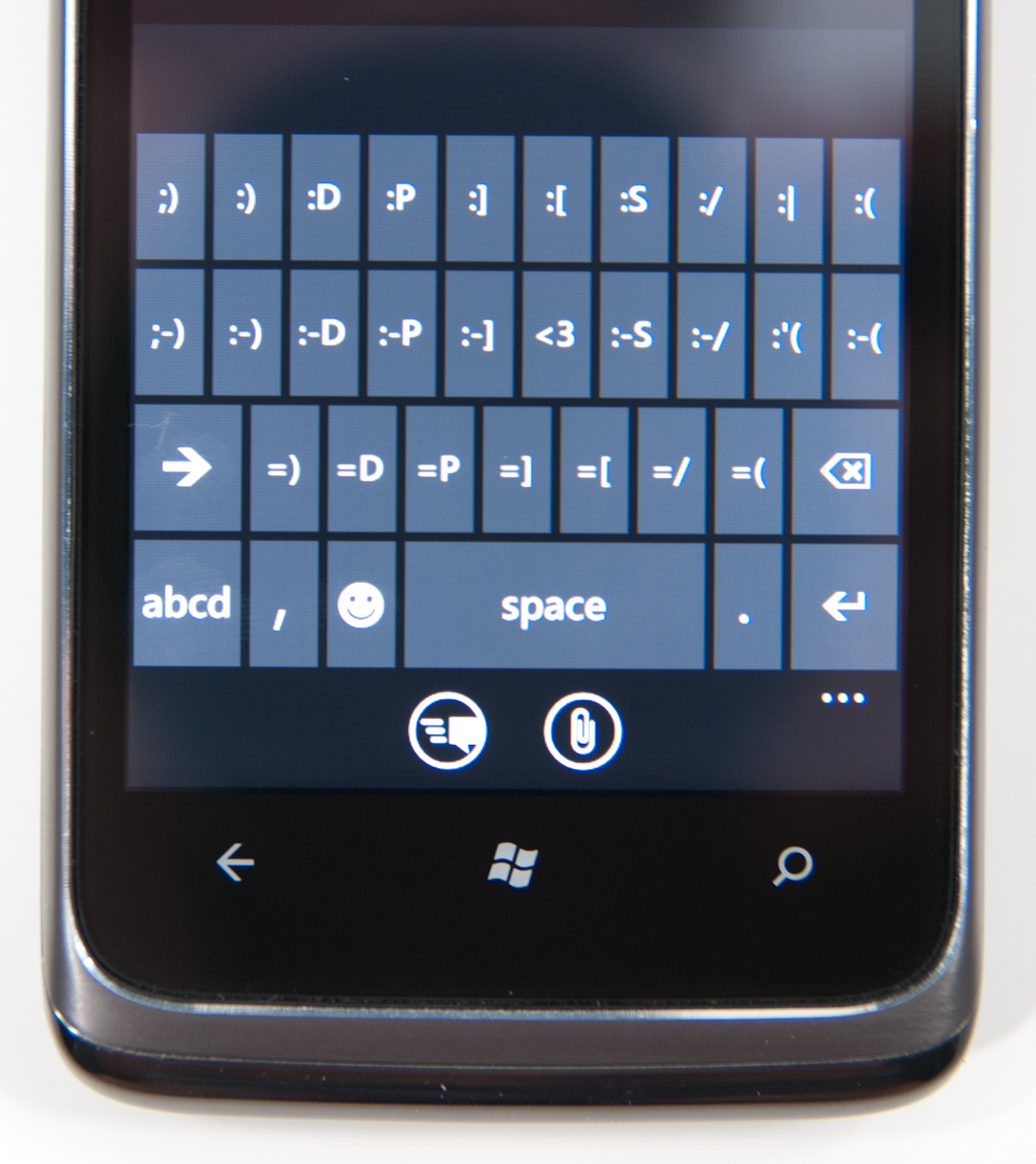
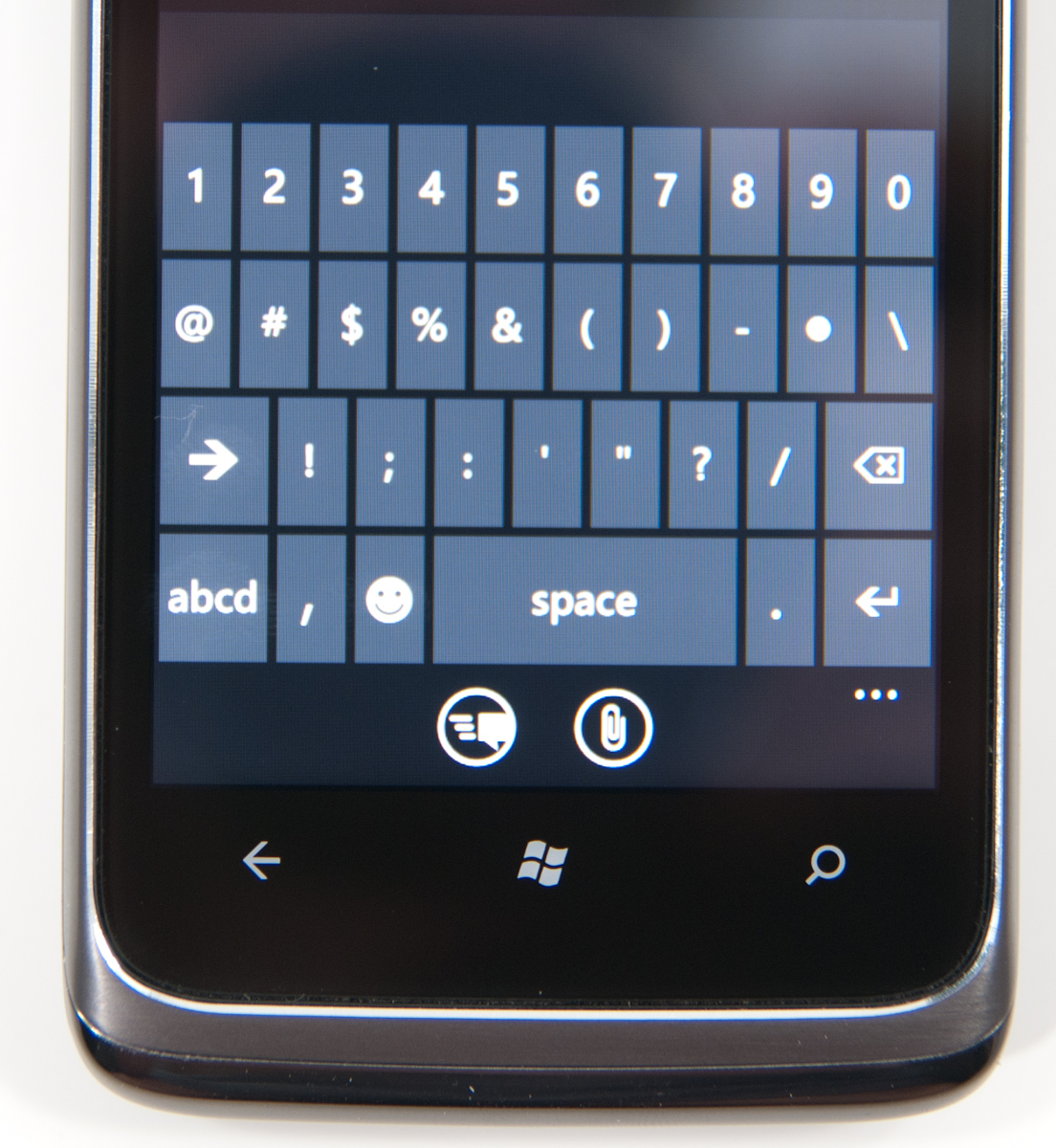
Hit the &123 key and you’ll get numbers and symbols. Hit the right arrow and you’ll see the second page. The numbers remain intact across both symbol keyboards making typing complex passwords a bit easier.

Microsoft doesn’t inject as much key spacing into the keyboard as Apple does, which can throw off iOS users. The learning curve isn’t steep though. The keyboard will autocorrect simple errors. Corrections happen based on length of word typed and location of keys pressed. For more ambiguous errors it’ll present you with a list of options in a bar above the keyboard. You can tap to select a replacement or scroll left/right to find one that may not be among the top suggestions.
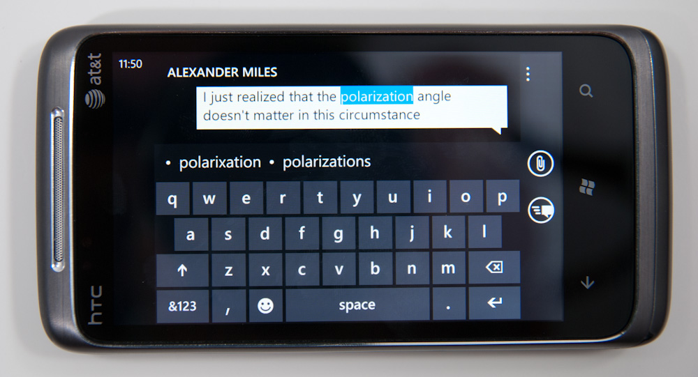
If a word incorrectly shows up as misspelled, tap once to highlight and hit the + key in the suggestion bar to add it to the dictionary.
There’s typically a separate confirm/send button below the keyboard for anything that’s a non-recoverable action (e.g. sending an SMS). This is so you don’t accidentally hit enter and send something when you thought you were putting a space in between some lines.
Of course the whole point of a virtual keyboard is that it should change based on the application. Windows Phone 7 is no exception. If you’re typing in a URL box you get a dedicated .com key for example. Typing in an email field gives you dedicated @ and .com key. The calculator app has its own custom keyboard layouts (one for portrait and one for landscape).
To position a cursor in iOS you tap and hold until you get a magnifying lens that helps you fine position your cursor. Android relies on arrow keys or a trackball (optical/physical). Windows Phone once again borrows from Apple. You tap and hold but instead of getting a magnifying lens, a theme-colored cursor appears above your finger. Simply drag your finger down and out of the way to position the cursor exactly where you want it. It feels awkward at first, but it makes a lot of sense once you get used to it.
Overall the keyboard is great. If you’re used to iOS, there’s a bit of an adjustment period but you’ll pick it up right away. If you’re coming from Android (except for Swype) I believe you’ll find it a pleasant balance between iOS and Android keyboards. And if you’ve never used a virtual keyboard before, you couldn’t have a better starting point.


125 Comments
View All Comments
Hrel - Friday, December 3, 2010 - link
Am I the only one who sees that the "brown" option for the UI color is red? Am I losing my sight? My tv is adjusted perfectly to THX standards. All the other colors look right. Or is it just the camera you used to take the shot?Hrel - Saturday, December 4, 2010 - link
As far as I'm concerned any phone that doesn't have a "fine me" feature with the ability to lock it doesn't even exist. Seriously, why has it taken SOOO long to have this? It should be standard on all phones. Now I want to be able to make my phone the key for my car.Hrel - Sunday, December 5, 2010 - link
I'm the same as your dad. I mean I want to view everything is the proper aspect ratio; but I also REALLY want usefull pixels filling the whole screen. That's why I wish everything was just filmed in 16:9. I mean, that's plenty wide. When I want movies on DVD I just zoom in once so the whole screen is filled and with the exception of far right/left text in some movies I honestly don't miss out on anything. It doesn't cut off very much on the sides and really when you're filming who's gonna point the camera so where you're supposed to be looking is at the edge of view? No one. 16:9 is the only aspect ratio visual media should be in. That way everything is uniform and just fits.Hrel - Sunday, December 5, 2010 - link
ie no trade offsnatewaddoups - Friday, December 23, 2011 - link
The article mentioned the confusing behavior of IE's back button... The confusion starts when you open IE from the start menu, because at that point IE throws away your browsing history, so that the back-button will return you to the start menu. It makes sense if you were opening IE to look at a new web page, but it's maddening if you were opening IE to resume a browsing session that had useful stuff in the web navigation history.The workaround is to switch to IE by holding down the back-button and selecting IE from the list of running apps. That opens IE without throwing away your browsing history, so that the back-button continues to work for web navigation.
I actually removed the IE tile from the start menu, just to prevent myself from accidentally throwing out the browser history. I've always got two or three tabs open in IE, with meaningful history in each tab, so it was always aggravating to press the back button and get kicked back to the start menu.
If you'd like to see this fixed in a future version of Windows Phone, please vote for it here:
http://windowsphone.uservoice.com/forums/101801-fe...