Apple's iPad - The AnandTech Review
by Anand Lal Shimpi, Brian Klug & Vivek Gowri on April 7, 2010 9:39 PM EST- Posted in
- Smartphones
- Mac
- Apple
- iPad
- Mobile
A Testament to UI Efficiency, Distinctively Apple
I've always called the iPhone OS a very efficient UI. The ease at which you can perform primary tasks on the iPhone is what I mean by that. By comparison, many earlier tablet and handheld computer concepts used full blown desktop OSes scaled down so much that you could hardly get anything done. UI elements were far too small to be navigated with portable screens. On the flip side, if you scaled the iPhone UI to a 22" desktop PC you'd also lose efficiency, the UI simply wasn't designed for that purpose. You use the right tool for the job and that's exactly what the iPhone OS, webOS and Android try to do. They are great smartphone interfaces.
The success of the iPad's UI is really determined by how well it scales up to the larger screen size and resolution of the display. Simply running iPhone apps on the iPad doesn't cut it, something that is made obvious by how little I wanted to use them on my iPad.

An iPhone app running on the iPad
Thankfully, with the exception of running iPhone apps, Apple has ensured at that all elements of the iPad UI are enhanced specifically for the larger screen. The most obvious is the larger keyboard but there's also liberal use of columns in apps. You'll also note that there's very little forced consistency between the look and feel of iPad applications. Their UI is determined entirely by their function.

The popup dialog is also widely used throughout the iPad OS:
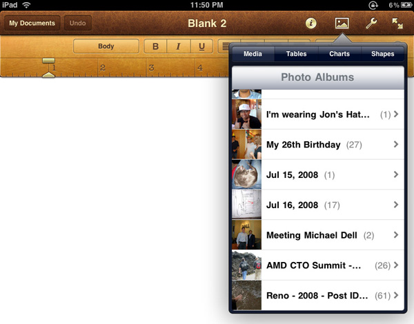

Thanks to the A4 SoC inside, multitouch gestures react even faster and smoother than they do on the iPhone. Particularly the pinch and stretch gestures for zooming in and out. Apple also introduced a new pinch/stretch to zoom feature in its Photos app. To expand or collapse any album or event simply take two fingers and stretch them apart or pinch them together. It seemed gimmicky when I first heard about it but in practice it works really well and I'd like to see it used in more places.

While not really significant to the plot, there are some nice touches that Apple has included with the iPad that are worth mentioning. The home screen is, er, home to a lot of the more prevalent examples of Apple flair. All the icons have a nice drop shadow behind them.
Bringing up the home screen from another app causes all the icons to fly in from the outside as if they're all scurrying home before you get there. Rotating the home screen also results in a sweet zoom out then in effect.
Despite having the screen real estate Apple doesn't get wasteful with UI elements. They are all fairly tiny and not intrusive.

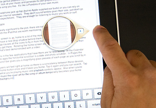
Scroll bars in the few applications that have them are far less boring. In the Calendar and Photo apps the horizontal scroll bar is a date and photo scrubber. In Pages the vertical scroll bar gives you a magnifying glass preview of each page as you scroll by it.
iPhone users will feel right at home as there is a consistency between these devices. Tap the home button once and it takes you home. Tap it again and you can search. Tap it twice while you're playing music and playback controls appear. Also, when you're playing music the cover art for the song or album temporarily becomes your home screen background.
Although there's no mute button, holding the volume down rocker for 2 seconds mutes the device instantly.
There are dozens of little features like these that show an attention to detail that is missing from most products. Rushed or not, the iPad still has the little things that do make it an Apple product.


108 Comments
View All Comments
zodiacfml - Thursday, April 8, 2010 - link
Another quality review, useful as trying the device myself.I'm not buying Apple products but you touched on features that it should have.
One is the ability to stand on its own to function as a picture frame, movie screen, and reader while someone is eating or something else.
Support for mouse device and keyboard when it can already stand on its own.
Support for uploading media such as video and photos from either flash cards or directly from cameras. it is such a good device to use with cameras.
one more thing, they could get the intel atom cpu once it gets to a smaller process to improve size and energy efficiency.
Spivonious - Thursday, April 8, 2010 - link
Anand, I love your writing and have read the site since the GeoCities days, but please learn the difference between "lay" and "lie".crimson117 - Thursday, April 8, 2010 - link
My biggest pet peeve with the iPhone UI is the lack of an indicator for when an app is visible but busy processing something and not currently accessible.The default Notepad app on the iPhone 3G is a great example - as soon as you tap the icon, the yellow Notepad interface pops right up. However, it actually takes several seconds to finish loading until you can tap to edit a note or tap the (+) sign to start a new note. There's no indicator at all of when the loading is complete - you have to keep tapping periodically until it finally works.
The same is true for resizing a web page using multitouch - there's no indicator that your input has been received but it's going to take a few moments to make it happen.
In Windows 7 when an app is "thinking" and thus you can't interact with it, your mouse pointer becomes a a little circle (aka an hourglass). If an app is ever extremely busy thinking, the app may even gray out to indicate that even Windows can't get it to respond at that time.
The iPhone's lack of this feature just smells of Apple trying to make the device appear on the surface to be more responsive than it really is. Perhaps you'll question whether you tapped correctly, and won't realize that the device is just slower than you expect it to be.
archcommus - Thursday, April 8, 2010 - link
This article, like your others, despite being 22 (!) pages long, is a quick, refreshing read. It feels more like you're talking about your experiences and less like you're writing an article as a journalist (which can make some other long reviews a little boring). Also seemed pretty unbiased and highlighted the good and bad. Another solid article, thanks.Mumrik - Thursday, April 8, 2010 - link
Hehe, this isn't a big deal - it's just amusing:"Although there's no mute button, holding the volume down rocker for 2 seconds mutes the device instantly."
Nope. Sounds to me like it takes about two seconds to mute the device :)
AstroGuardian - Thursday, April 8, 2010 - link
Good one. My thought exactly...leospagnol - Thursday, April 8, 2010 - link
I'm planning to buy one of them when I travel to US next month. THe Eee 1001P is $ 280.00, and the iPad $499.00 at least. I usually read more than I write during classes and I have wifi available during class. I'll probably buy the Eee, but wich do you think suits this task best?Mumrik - Thursday, April 8, 2010 - link
Imagine the iPad lying flat on your desk and then imagine the position you would have to sit in all lecture long if you wanted to be able to write.Then imagine how much of the time you'd have to look down at what you were writing because you didn't have the physical response of a keyboard to make touch typing easy.
Now imagine not being able to multitask.
It would not be a difficult choice for me - Anand said it himself - the iPad is generally not a laptop substitute.
videogames101 - Thursday, April 8, 2010 - link
I love the M3, great episode there.Good to know I can watch it on the iPad, lol.
AstroGuardian - Thursday, April 8, 2010 - link
As far as i remember, this was not mentioned in the review (the overheating problem):http://www.dailytech.com/article.aspx?newsid=18075
Personally i don't think it's worth commenting. It's not just the iPad but all other electronic devices will overheat when put out on the sun. And i wouldn't call it overheating but more like misuse.