Core i7 Giveaway Winner, AT on Kindle, Site Redesign Preview and More
by Anand Lal Shimpi on November 13, 2009 12:00 AM EST- Posted in
- CPUs
We have a winner to our Core i7 giveaway from last week: Gregory Peng from California (user name Possum). Congratulations Gregory! I've just sent you an email to confirm your details, drop me a response and I'll get this out to you.
Below are the specs of the iBuypower system that Gregory won:
| iBuypower Core i7 System | |
| Case | Chimera Inferno |
| CPU | Intel Core i7 870 |
| CPU Cooler | Asetek Liquid Cooler |
| Motherboard | ASUS P7P55D-LE |
| Memory | 4GB DDR3-1600 |
| Video Card | ATI Radeon HD 4890 1GB |
| HDD | Intel 80GB SSD, 1TB |
| Optical | LG Blu-ray Reader |
| PSU | NZXT 800W |
| Media | 12-in-1 Card Reader |
| OS | Windows Vista Home Premium 64-bit |
| KB & Mouse | iBuypower Keyboard & Mouse |
| Monitor | ASUS 23.6" Widescreen LCD Monitor |
We're already working on gathering hardware for the next giveaway, so this won't be your only opportunity to win. Thanks again to Intel and iBuypower for sending in the hardware for this giveaway and thanks to all of you for entering.
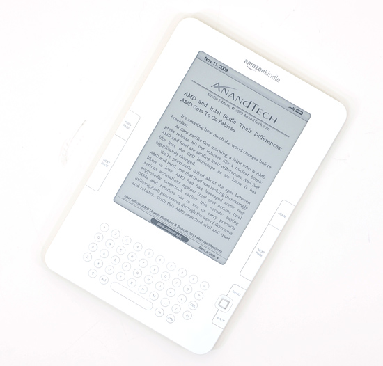
Next on the Agenda: AnandTech is now Available on Amazon Kindle Devices
I'm a Kindle 2 owner and I have to admit, it's sort of exciting seeing AnandTech on the device. Our 10 most recent articles are available for reading (subscription required) on the Kindle through Amazon's Kindle Store. If you've got a Kindle, check it out.
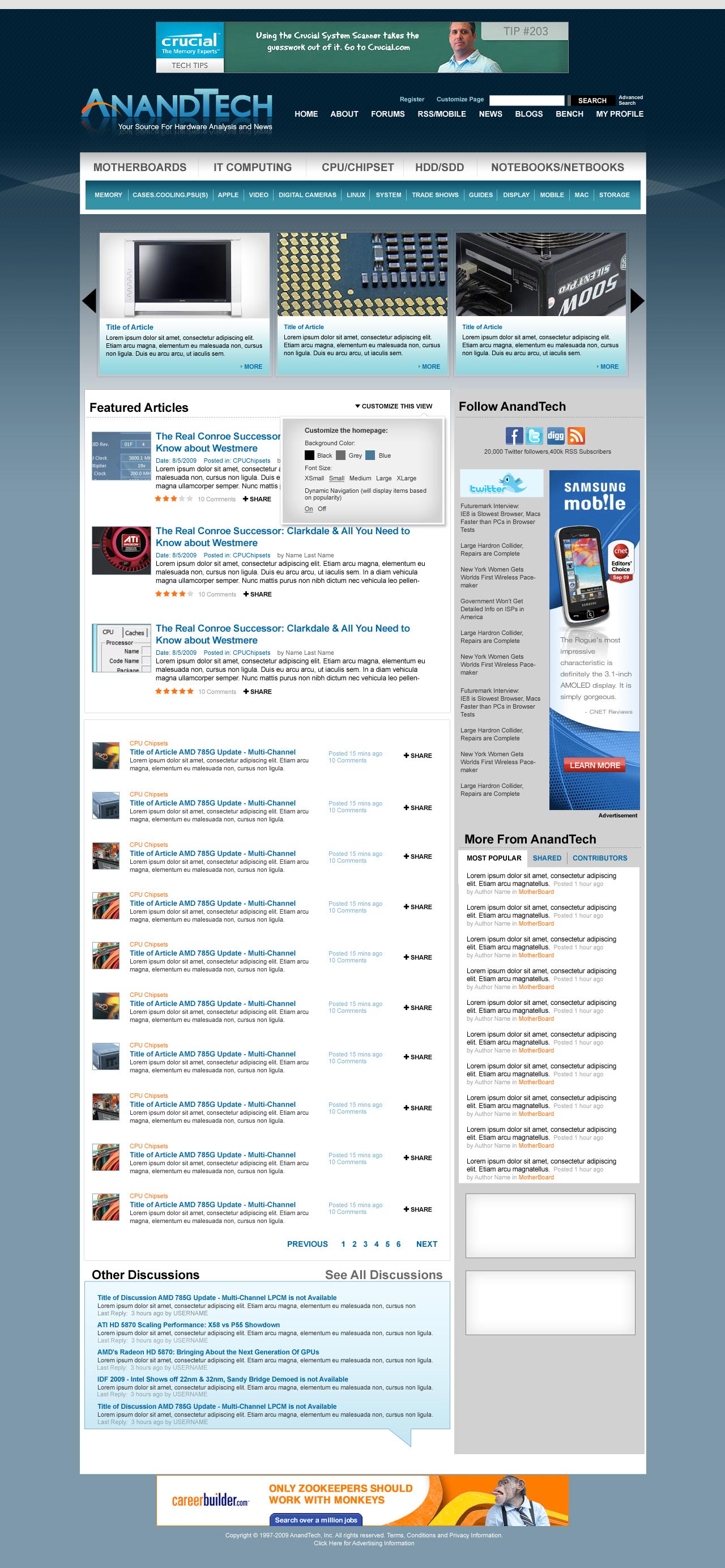
The AnandTech Redesign
I mentioned this a while ago, but we're finally at a point where we can give you guys an idea of what's coming. Have a look at the new AnandTech and be sure to leave your feedback in the comments section. We haven't implemented it in HTML so there's still room to tweak.
Not all of the ad placements are in (something I want to get your input on shortly) and there's going to be a ton of customization options offered as well. So keep those two in mind. The main carousel up top with three big article images will actually automatically rotate through a set number of articles so you'll be able to get a good idea of the past several articles on the main site without any scrolling.
Our main goal here was to make the site look and feel a lot more modern, as well as bring its functionality where it should be for 2010. There's a lot of cool stuff coming with more giveaways, more content and more categories of Bench next year. Here it is, constructive criticism is always appreciated :)
Coming Soon: A Call for Writers
It's a bit premature but I just wanted to give you all a heads up that we'll be looking for some new writers in the near future. If you've ever wanted the chance to get into the industry, it may be time to start polishing off your writing skills. Get those writing samples ready folks!
More details soon...
Anand Goes to India?
From 12/1 - 12/15 I will be traveling to India for the first time in 10 years. If you're an AnandTech reader in/around Mumbai, Delhi or Jaipur let me know. If we can get enough folks together we might do a reader meetup :)


97 Comments
View All Comments
Mr Alpha - Saturday, November 14, 2009 - link
There are a few things I don't like:1. At the top you have three levels of link. The middle one, starting with motherboards and then IT computing, doesn't make sense. I assume IT computing is a link to it.anandtech.com and it doesn't really fit with the others. And why you need to elevate a few of the hardware categories over the others I don't understand.
2. Under the menu links you have a horizontal strip of three articles, and under them you have three more articles with under the title Featured Articles. What is the difference between them, and why do you need both? Seems like a horrible waste of space.
3. The Customize This view link: Is it for the whole site or only for the Featured Articles section? From where it is placed and the way the link is phrased it seems to be only for the Featured Articles section, and that seems pretty useless.
4. The ratings on articles is a horrible idea. Sure, that the authors get some kind of feedback can be nice, but I am not sure a number is very useful for them versus real feedback. As for exposing the rating to everybody, that's a can of worms you do not want to open and will only make your site seem tacky.
5. The Follow Anandtech is too big. This is a feature most people only need once, and spending all that screen real-estate on it is overdone.
6. In the long list of articles you have info on how long ago it was posted, while in the Featured Articles section you have the date on which it was posted. This is inconsistent. Either do one or the other.
7. In the long list of articles you also waste a lot of space on the +Share link. A smaller link and more test about the article would definitely be a better use of the space.
8. On the side you have the More from Anandtech section. That title isn't really clear. It is in the same sidebar as Twitter and the other social and web 2.0 stuff. Is it more Twittery like stuff? If it is more articles then why are these articles more, but the long list of articles to the left of it not more?
9. You have Most Popular as a tab title in the more section, but the Shared tab titles isn't "Most". Does this mean that the Shared isn't a list of the most shared, but ordered by some other mean? This is confusing.
10. What is the contributor tab in the More Anandtech section? Authors, commentators, sponsors? Why is this list interesting? Why does it need exposure?
11. At the bottom you have the Other Discussion section. Other than what? What is different about this discussion? More importantly, what discussion is this?.
As a conclusion I might add that this seems very much like me-too redesign. Just doing what everybody else is doing regardless of whether it is a good or bad idea or whether it fits Anandtech.
Also, I seriously hope that you will make a better commenting system than what you have now.
SpatulaCity - Saturday, November 14, 2009 - link
It would be helpful to have the most recent articles, reviews and analysis on top and listed in descneding order from publish date. Avid readers, like myself, often check the site multiple times a day to see what is new. I would hate to miss an important article because it wasn't displayed on the front page. Perhaps, create a cookie that keeps track of last visits and mark which ones are new, like Dailytech does.Also, please don't set the big 3 carousel to auto rotate on some predefined timer. Different people have different attention spans and different reading speeds. I hate websites that have a carousel and rotate the top 3 automatically example: jpl.nasa.gov It pisses me off when the page changes before I am finished reading the blurb.
fiftysixtius - Saturday, November 14, 2009 - link
I appreciate the DailyTech headlines in the margin, and would miss them if they were gone. I guess I always assumed that DailyTech was part of the Anand "empire" but perhaps the association is not as strong as I thought.Lezmaka - Saturday, November 14, 2009 - link
The first thing I noticed before even looking at anything specific is that there is A LOT of bluegreen/teal color going on. When looking at the full size screenshot, when I'm at the top (sections/3 articles) and the bottom (Other Discussions), it just doesn't look right. I think it reminds me of the default Vista colors too much or something. Or maybe it seems like almost everything is a variation of the same color, making it look kinda stale?Maybe use more of the blue and orange in the new logo?
Like this (please forgive the shoddy quality of the changes, just made quick changes to get my idea across)
http://www.searchbarpro.com/images/anandtech.jpg">http://www.searchbarpro.com/images/anandtech.jpg
Just my opinion
ilkhan - Saturday, November 14, 2009 - link
Am I the only one who hates even the concept of featured stories? I want a simple chrono view of stories so that when something new comes out I can easily see it at the top of the list. Yes, new are almost always featured, and yes anand does it right (as opposed to xbit, who seems to think putting a 2 week old story up top AND removing it from the chrono listing is a good idea), but its still a little annoying.But the rest looks decent enough. No option to keep the current layout?
Spivonious - Monday, November 16, 2009 - link
Meh, that's what RSS is for.Mk4ever - Saturday, November 14, 2009 - link
Totally unrelated to this article, but I thought I should say something about it.SSD prices are going up for indilinx and samsung drives. Intel prices are going down, but still nowhere near MSRP prices (esp the 160GB G2). Many drives are out of stock. Newegg eliminated a lot of SSD vendors from its site, including SuperTalent and G.Skill. Problems at the 32nm chips. New sata 6Gbps. New Sandforce deal with OCZ.
What's going on?
I would really appreciate a new article addressing the current situation of SSDs and manufacturers for the end of the year, the first few months of the next year, and throughout the whole next year.
This would give us an idea why prices are going up. It would also shed a light to know if we should get it over with and get SSDs soon, or if we are better off waiting the start of next year.
A general article covering all aspects of SSD availability, pricing, new/upcoming technologies and which manufactorurers plan/are committed to update firmwares would be really nice.
Thank you for your time.
gss4w - Saturday, November 14, 2009 - link
The main thing I care about on this site is the content, so I think that is good already. Also I don't really have many complaints about the current site layout, but the new one looks good too.The main criticism I have about the current site is the comments. It's annoying to try to read through a large number of comments on an article. So that is the area I hope is improved the most. I can't really tell anything from the preview you have, but I hope things are improved on the new site.
Anand Lal Shimpi - Saturday, November 14, 2009 - link
The comments section will be improved! You'll get a listing of a certain number of comments at the bottom of every page, but if you click more you'll get a huge listing of them (at least 50 per page) :)Thanks for the feedback guys, keep it coming.
Take care,
Anand
imaheadcase - Friday, November 13, 2009 - link
Why is it that even "new" sites don't scale on monitors. Take a look at CNN, its so small i can't even read it..so much wasted screen space.