The All-in-One Battle: Dell's XPS One 24 vs. Apple's iMac
by Anand Lal Shimpi on October 30, 2008 3:00 PM EST- Posted in
- Systems
Insert: Obligatory Matrix Reference Here
Dell has been working quite a bit on improving the industrial design of its products, and while the biggest changes are coming on the mobile side, the new XPS One 24 does look good.
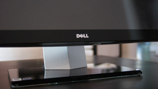
It sits low and wide thanks to the speakers on either side of the display, which are honestly the most awkward parts of the system. However given that Dell opts for function over form here you actually get speakers that aren't terrible, they are at least better than what's in Apple's iMac. You're still better off with an external set of speakers but that would defeat the purpose of the all-in-one now wouldn't it?
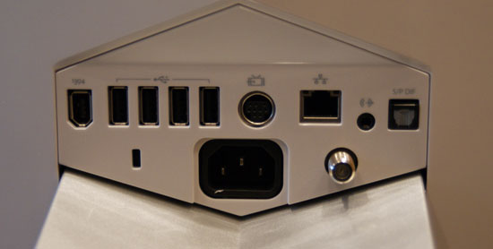
There are a flurry of ports at the back of the XPS One 24, you've got one FireWire, four USB, one video input, 10/100/1000 Ethernet, 1/8" audio out, optical audio out and coax in for cable TV.
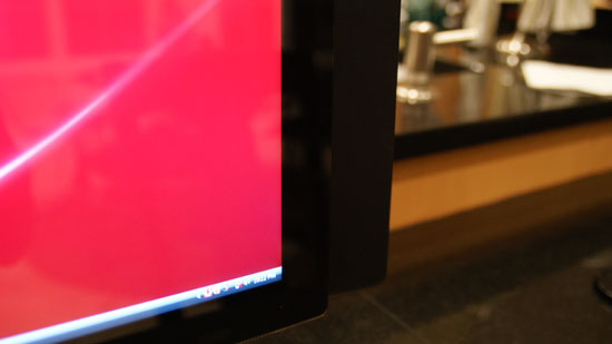
At rest this is what the lower right corner looks like...
By far the coolest feature of the XPS One are the touch controls on the right side of the machine. Bring you hand close to the right edge of the display and the touch controls light up, you can control volume, control music playback or eject a disc. The touch controls do offer some feedback, they will vibrate a little once your input is recognized.
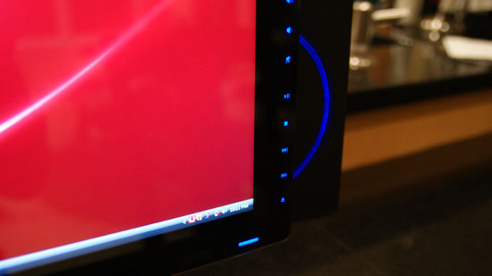
Bring your hand closer and you've got controls
The volume/playback buttons are nice, but they don't work properly with iTunes. If iTunes is in the foreground then you're ok, have it in the background and you're screwed - the playback control buttons do nothing. Obviously this isn't the case with Windows Media Player 11, but limiting the usefulness of these controls to a single application is silly. Part of this limitation may be the unfortunate reality that Dell doesn't control the entire software stack being run on the XPS One, it may simply be a limitation of iTunes under Vista, but regardless of the cause it's an annoyance.
Dell has implemented a nice, very Apple-like brightness and volume OSD whenever you adjust either of these things. But once again there are limitations. I installed Pidgin to, you know, talk to people on this thing - but unfortunately with Pidgin in the foreground Dell's volume control and brightess OSD doesn't appear anymore. Again this seems like a software/OS limitation, but it's one area where the XPS One falls short of something like the iMac.
I'll get to the discussion of what Dell has done to close the Apple gap on the software side of things in a moment, but for now let's keep ogling the exterior.
Dell's claim to fame with the XPS One is that you only need a single cable, for power, the rest of the machine is totally wireless. While there's an Ethernet jack on the back, but you've got a built in Broadcom 802.11n wireless adapter for Internet access and the machine ships with a wireless keyboard and mouse as well as Bluetooth for any additional peripherals.
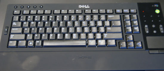
The One's keyboard is quite stylish but it falls short in a few key areas (wow, terrible pun). In order to satisfy the design requirements there's no dedicated numeric keypad, instead you've got to rely on the top row of numbers or use a function key combination.
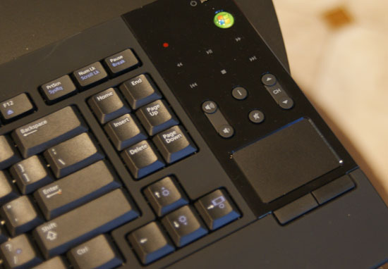
Like a laptop keyboard, the XPS One's keyboard has a function key that you can use to put the computer to sleep, eject a disk, or increase/decrease brightness. Since the XPS One's mouse is pretty much terrible, I found myself using the keyboard's built in trackpad quite a bit. Now here's where I was surprised - I actually didn't mind, in fact, I wanted a larger trackpad. I'm so used to trackpads from using notebooks all the time that for an all-in-one machine like this a builtin trackpad just made sense, but honestly it needs to be larger. I get the reasoning for a compact keyboard, but it seems like there's just a lot of wasted space on the design, especially near the trackpad. Have a look at Apple's latest MacBook/MacBook Pro, I want a trackpad of that size, maybe a bit smaller and you can do away with the mouse altogether if you'd like (except for gaming of course). The trackpad unfortunately has no way of scrolling, which is a sad limitation. I'd like a two finger scroll gesture here please, thanks.
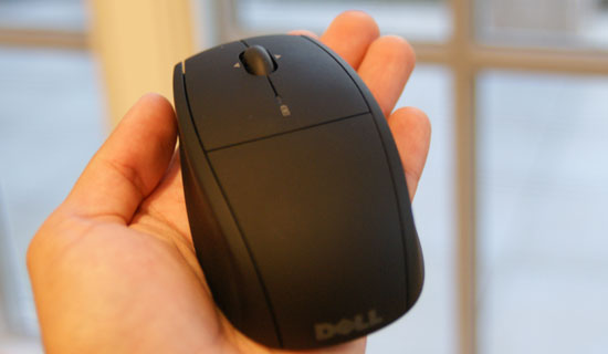
I spoiled much of the surprise already, but I was not a fan of Dell's bundled mouse. While tracking is mostly ok the mouse doesn't appear to be very precise, resulting in jerky behavior when trying to make small movements on the screen. Instead of smoothly moving from one point to another it tends to stairstep. Now the mouse itself isn't reason to avoid the XPS One 24, I would simply encourage Dell to bundle something a little more respectable.
The other issue is that both the keyboard and mouse rely on two AA batteries, two for the keyboard and two for the mouse. It would be nice to have both of these devices be USB rechargeable or perhaps have some sort of integrated charge dock in the base of the XPS. Again, not a deal breaker but room for improvement should Dell decide to perfect the approach to including wireless peripherals.
Admittedly the one-wire setup is a bit liberating, it's very notebook-like in its ability to be put anywhere without disturbing the natural flow of things. For this very purpose I conducted today's review with the XPS One 24 in my kitchen.
A very important consideration for a machine that could end up someplace you normally wouldn't find a computer is noise, or more appropriately, lack thereof. The XPS One uses a Seagate Barracuda 7200.11 3.5" SATA drive which is great from a performance standpoint, but it's deceptively noisy in the XPS One. You can hear disk accesses very clearly, which is distracting since the whole system is incredibly quiet. I hate to keep advocating for the use of SSDs given how expensive they are, but in a system like this it makes total sense. Every other aspect of the XPS One is absolutely silent, but the drive is distracting. It almost sounds like the interference noise you get when you've got a cellphone too close to computer speakers. For an otherwise silent machine, this stands out.


60 Comments
View All Comments
Eidorian - Thursday, October 30, 2008 - link
It's not that hard.8800M GTS > 9600M GT
HanSolo71 - Thursday, October 30, 2008 - link
thanks for the top gear reference i wish more people in america would actually get thatsxr7171 - Tuesday, November 4, 2008 - link
Well we have BBC America. But people don't watch it much.Jovec - Thursday, October 30, 2008 - link
Well, that is the behavior of the MS Intellitype software - it will only control iTunes if it is in the foreground. By contrast, Logitech's Setpoint will control iTunes in the background. I have no idea if Logitech does something extra to make this work, or if MS is purposely limiting their keyboards. Had this exact same issue that encouraged me to move back to a Logitech KB.mfed3 - Thursday, October 30, 2008 - link
this has to do with the keypresses binding to windows commands. they will all work in media player, media center, and all windows programs.it has to do with itunes controls not mapping directly to the same commands.
logitech's software must look at the media process running and send the correct command
epyon96 - Thursday, October 30, 2008 - link
Not sure why the author insists on having a Mac OSX bias. I see nothing wrong with the Start menu nor do I find it outdated. Usually, it's 3 clicks max to get to a program with minimal mouse movement. I am not saying Mac OSX has a bad interface but I see nothing wrong with the Start menu unless you are a devoted OSX fan.I am slightly annoyed why Apple still insists on a single button mouse. For some strange reason, Jobs still insists that computer users are too stupid to learn to effectively use a two button mouse. So what does he give us? A one button mouse that tries to emulate two-button mouse behaviour. Sure it looks cool and has that novelty effect but it wears off after the showroom. It begs the question why?
What does the article mean when it says that the 24" inch flat panel monitors have trouble with 24 FPS 1080 Non-interlaced Blu ray playback? Is it trying to say that 24 FPS refresh rate is not possible on the flat panel without ghosting?
CMcK - Friday, October 31, 2008 - link
Apple haven't shipped a single button mouse with desktops or laptops for a few years now. The Mighty Mouse has four buttons - left, right, side (squeeze) and centre (press the trackball). Very useful. I have mine set for left click, right click, Expose and show desktop.Even the single, or indeed no button, Apple laptops have a left and right click. Just place a second finger on the trackpad and press the button or pad and you have a right click.
I don't find that I actually need to right click often while using OS X.
mikeepu - Friday, October 31, 2008 - link
Frankly I don't really sense a bias in the article. If anything the author is critical of both systems and just states his (keyword alert) 'personal' preference at the end of the article.But I do agree with you that there is nothing wrong with the Start Menu, its just that the Apple Dock is simpler in that only one click is required to start a program located on the dock or just two clicks if you have the Applications folder (the equivalent of the Programs folder in the Windows Start menu) attached to the Dock. But then again, where’s the harm in a few extra clicks to get to a program?
But man Do i want that Dell all-in-one for a Desktop media center :)
MrDiSante - Thursday, October 30, 2008 - link
I am also surprised at the obvious pro-Mac OS X bias in the article. Usually Anand is far more impartial, but this is more than a bit on the Engadget side. Pretty as Mac OS X is, I find that Vista actually offers the more practical solutions to task management problems.The taskbar is far better at showing the user what is and isn't running than the dock (something that Microsoft is mistakenly changing with Windows 7 and will hopefully reconsider). As the fact that there is text with the icons allows me to efficiently differentiate between the numerous windows I have open (again, something Microsoft should not change; OS X looks prettier, but Vista takes the usability prize here).
The start menu still makes more sense than Apple's solution since there is in fact a central place to go for all of your programs (although I personally think Linux does a better job of that).
Alt+tab scales far better than expose does. They both work fine if you're running 5 or fewer programs, but expose just gets messy really fast if you exceed that. If you have 10 or more programs open, with stickies gadgets/widgets etc, then Expose gets downright unusable.
Finally, Windows tends to be far more shortcut friendly. Start + number, and start + 3-4 characters + enter usually launch just about any application I need. Alt+tab switches to just about any program I need. Expose and the dock both struggle with shortcut-friendliness.
DCstewieG - Sunday, November 2, 2008 - link
Actually Apple was first on the shortcuts you're talking about. Pressing Apple+Space brings up Spotlight which lets you type the first few characters of the app to find it and Enter to run it.As for Anand's Mac bias, it's a very interesting story. Here you have a devoted editor of a PC hardware site who decided to give a Mac a spin for a month to write an article about it. What happens? He becomes a huge fan in the process.
You see a lot of comments saying that people use Macs because Steve Jobs put them in a trance or because they look nice or something, but here's a guy who came in fresh and decided he liked it a lot by actually using it.
If you haven't read it: http://www.anandtech.com/mac/showdoc.aspx?i=2232">http://www.anandtech.com/mac/showdoc.aspx?i=2232 (though it is a bit outdated now)